Google Reports Mobile error 'Text Size Too Small'
Hi
Google analytics keeps reporting that my text is too small to read when rendered on a mobile device.
I've checked and Google have access to index both my css and JS files (robots.txt is not blocking anything).
My mobile css sets the font-size to 16px which I've read is Google recommended minimum font size?
Still if I run the mobile friendliness test I get
X Text too small to read
X Links too close together
X Content wider than screen
Can someone point me in the right direction, what am I missing?
Regards,
Pete
Tom Beck
Hard to say without seeing the site, but it sounds like your site is not responsive down to mobile screen size ("Content wider than screen"). So basically your page shows the same way on mobile as it does on a desktop and visitors are forced to zoom in and scroll around to read the content. Google has made its requirements for mobile compatibility more strict recently. Essentially, all sites must be mobile friendly to get Google's seal of approval. Otherwise your SEO rating suffers.
SOLUTION
membership
This solution is only available to members.
To access this solution, you must be a member of Experts Exchange.
ASKER
Sorry Troops link to homepage
The site 'should' render a different size and load a different css on a mobile device so either I've set that up wrong, or its not working?
Thanks for the replies
P
The site 'should' render a different size and load a different css on a mobile device so either I've set that up wrong, or its not working?
Thanks for the replies
P
SOLUTION
membership
This solution is only available to members.
To access this solution, you must be a member of Experts Exchange.
ASKER
Now I'm even more confused http://mobiletest.me/iphone_5_emulator/#u=http://www.petenetlive.com
ASKER CERTIFIED SOLUTION
membership
This solution is only available to members.
To access this solution, you must be a member of Experts Exchange.
ASKER
OK - Ive replaced the Google Tracking code with the latest one - its still in the <head>
Ive changed the CSS and the footer now appears to resize correclty
Ive removed those three meta tags.
Can you recheck http://www.petenetlive.com/home_test.html to see how it renders now?
Cheers
P
Ive changed the CSS and the footer now appears to resize correclty
Ive removed those three meta tags.
Can you recheck http://www.petenetlive.com/home_test.html to see how it renders now?
Cheers
P
ASKER
On a brighter note Google now categories that page as
'Awesome! This page is mobile-friendly.'
So we are making some progress
P
'Awesome! This page is mobile-friendly.'
So we are making some progress
P
It certainly renders better in the iOS Simulator.
 Still, that iFrame just below the <html> tag seems strange. Maybe I just never noticed that behavior before.
Still, that iFrame just below the <html> tag seems strange. Maybe I just never noticed that behavior before.
ASKER
Hi Tom,
Im going to quit while I'm ahead, Time to do a site backup and roll the change out sitewide.
Thanks for your help - If ever you have a broken firewall I hope I can repay the favour :)
What simulator are you using? is it freely available?
Pete
Im going to quit while I'm ahead, Time to do a site backup and roll the change out sitewide.
Thanks for your help - If ever you have a broken firewall I hope I can repay the favour :)
What simulator are you using? is it freely available?
Pete
Using the iOS Simulator that comes with xCode on a Mac. But you could just as well use Chrome Developer Tools. There's an icon in the upper left that lets you choose a mobile device by screen size.
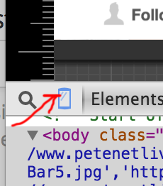
Apologies, I should have stated I was using Google Chrome's developer tools as Tom just showed you.
I've been trying to keep up to date on Google's algorithm for Mobile Optimization by reading some good articles here and there that explain it very well.
http://moz.com/blog/9-things-about-googles-mobile-friendly-update
http://searchenginewatch.com/sew/how-to/2402354/mobile-optimization-and-the-google-algorithm-change-7-steps-to-stay-friendly#
Believe me, Experts Exchange is going through this same overhaul, despite just having released its Mobile App!
o/
ASKER
Cheers guys much appreciated :)
Anytime! o/