[.Net]How to create a custom window using WPF
Published:
Browse All Articles > [.Net]How to create a custom window using WPF
This is just a little tutorial on how to create a custom window
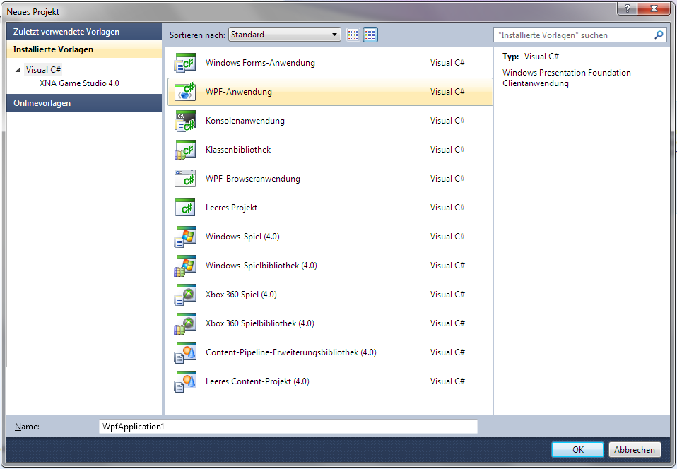
1. Create a new project and choose WPF-Application
![Screenshot 1]()
2. Add
Your XAML should now look like this
2. Add a "Border"-tag inside the grid. You can add attributes to it like CornerRadius to make rounded corners.
3. Now we're setting the background. I'll use a linear gradient.
for this you add a "Border.Background"-Tag inside the border and a "LinearGradientBrush"-Tag inside it.
Your XAML should now look like this
4. Now the creative part. Put this inside the LinearGradientBrush tags:
Add a few other options to these tags.
Than you can change the
My XAML now looks like this
![Screenshot2]()
5. Now you can add a shadow to you're application. This is pretty simple. Just add
Little explanation:
Color: Color
Opacity: How opaque the shadow is. 1=100% 0=0%
Direction: Shadow direction in degrees
Softnes: How soft the shadow is
ShadowDeph: How far the shadow is behind the window.
To make the shadow visible, you have to add a little margin to the Border
My XAML now looks like this
6. Now we have to care about the positioning of the elements (i.e. Buttons)
Do this by adding a grid insitde the border and add a "Grid.RowDefinitions" and a "Grid.ColumnDefinitions" tag to it
I use 5 colums and 3 rows. 1 Column for the icon, one for the header and the rest for min/max/close.
My XAML now looks like that.
7. Add the buttons, icons and labels.
Put this code inside the grid.
Grid.Row: The Row, where its positioned
Grid.Column: The Column, where its positioned
Grid.RowSpan: How many rows its height
Grid.ColumnSpan: How many Columns its height
Source: Image source
FontFamily: Font
FontSize: Font size
Foreground: Font color
Content: Buttons text
My final XAML looks like that:
![Screenshot3]()
I hope you liked my tutorial and found it helpful.
1. Create a new project and choose WPF-Application
2. Add
AllowsTransparency="True" Background="Transparent" WindowStyle="None"Your XAML should now look like this
<Window x:Class="WpfApplication1.MainWindow"
                              xmlns="http://schemas.microsoft.com/winfx/2006/xaml/presentation"
                              xmlns:x="http://schemas.microsoft.com/winfx/2006/xaml"
                              Title="MainWindow" Height="350" Width="525" AllowsTransparency="True" Background="Transparent" WindowStyle="None">
                          <Grid>

                          </Grid>
</Window>2. Add a "Border"-tag inside the grid. You can add attributes to it like CornerRadius to make rounded corners.
3. Now we're setting the background. I'll use a linear gradient.
for this you add a "Border.Background"-Tag inside the border and a "LinearGradientBrush"-Tag inside it.
Your XAML should now look like this
<Window x:Class="WpfApplication1.MainWindow"
                              xmlns="http://schemas.microsoft.com/winfx/2006/xaml/presentation"
                              xmlns:x="http://schemas.microsoft.com/winfx/2006/xaml"
                              Title="MainWindow" Height="350" Width="525" AllowsTransparency="True" Background="Transparent" WindowStyle="None">
                          <Grid>
                              <Border CornerRadius="20">
                                  <Border.Background>
                                      <LinearGradientBrush>

                                      </LinearGradientBrush>
                                  </Border.Background>
                              </Border>
                          </Grid>
</Window>4. Now the creative part. Put this inside the LinearGradientBrush tags:
<GradientStop Offset="0" Color="Gray"/>Add a few other options to these tags.
Than you can change the
<LinearGradientBrush><LinearGradientBrush StartPoint="1,1" EndPoint="0,0">My XAML now looks like this
<Window x:Class="WpfApplication1.MainWindow"
                              xmlns="http://schemas.microsoft.com/winfx/2006/xaml/presentation"
                              xmlns:x="http://schemas.microsoft.com/winfx/2006/xaml"
                              Title="MainWindow" Height="350" Width="525" AllowsTransparency="True" Background="Transparent" WindowStyle="None">
                          <Grid>
                              <Border CornerRadius="20">
                                  <Border.Background>
                                      <LinearGradientBrush StartPoint="0.5,1" EndPoint="1,0.5">
                                          <GradientStop Offset="0" Color="White"/>
                                          <GradientStop Offset="0.1" Color="Black"/>
                                          <GradientStop Offset="0.2" Color="White"/>
                                          <GradientStop Offset="0.3" Color="Black"/>
                                          <GradientStop Offset="0.4" Color="White"/>
                                          <GradientStop Offset="0.5" Color="Black"/>
                                          <GradientStop Offset="0.6" Color="White"/>
                                          <GradientStop Offset="0.7" Color="Black"/>
                                          <GradientStop Offset="0.8" Color="White"/>
                                          <GradientStop Offset="0.9" Color="Black"/>
                                          <GradientStop Offset="1" Color="White"/>
                                      </LinearGradientBrush>
                                  </Border.Background>
                              </Border>
                          </Grid>
                      </Window>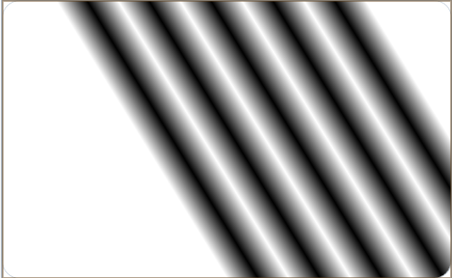
5. Now you can add a shadow to you're application. This is pretty simple. Just add
            <Border.BitmapEffect>
                                      <DropShadowBitmapEffect Color="Black" Opacity="1" Direction="50" Softness="0.5" ShadowDepth="10" />
</Border.BitmapEffect>Little explanation:
Color: Color
Opacity: How opaque the shadow is. 1=100% 0=0%
Direction: Shadow direction in degrees
Softnes: How soft the shadow is
ShadowDeph: How far the shadow is behind the window.
To make the shadow visible, you have to add a little margin to the Border
<Border CornerRadius="20" Margin="20">My XAML now looks like this
<Window x:Class="WpfApplication1.MainWindow"
                              xmlns="http://schemas.microsoft.com/winfx/2006/xaml/presentation"
                              xmlns:x="http://schemas.microsoft.com/winfx/2006/xaml"
                              Title="MainWindow" Height="350" Width="525" AllowsTransparency="True" Background="Transparent" WindowStyle="None">
                          <Grid>
                              <Border CornerRadius="20" Margin="20">
                                  <Border.Background>
                                      <LinearGradientBrush StartPoint="0.5,1" EndPoint="1,0.5">
                                          <GradientStop Offset="0" Color="White"/>
                                          <GradientStop Offset="0.1" Color="Black"/>
                                          <GradientStop Offset="0.2" Color="White"/>
                                          <GradientStop Offset="0.3" Color="Black"/>
                                          <GradientStop Offset="0.4" Color="White"/>
                                          <GradientStop Offset="0.5" Color="Black"/>
                                          <GradientStop Offset="0.6" Color="White"/>
                                          <GradientStop Offset="0.7" Color="Black"/>
                                          <GradientStop Offset="0.8" Color="White"/>
                                          <GradientStop Offset="0.9" Color="Black"/>
                                          <GradientStop Offset="1" Color="White"/>
                                      </LinearGradientBrush>
                                  </Border.Background>
                                  <Border.BitmapEffect>
                                      <DropShadowBitmapEffect Color="Black" Opacity="1" Direction="50" Softness="0.5" ShadowDepth="10" />
                                  </Border.BitmapEffect>
                              </Border>
                          </Grid>
</Window>6. Now we have to care about the positioning of the elements (i.e. Buttons)
Do this by adding a grid insitde the border and add a "Grid.RowDefinitions" and a "Grid.ColumnDefinitions" tag to it
            <Grid>
                                      <Grid.RowDefinitions>

                                      </Grid.RowDefinitions>
                                      <Grid.ColumnDefinitions>

                                      </Grid.ColumnDefinitions>
</Grid>I use 5 colums and 3 rows. 1 Column for the icon, one for the header and the rest for min/max/close.
My XAML now looks like that.
<Window x:Class="WpfApplication1.MainWindow"
                              xmlns="http://schemas.microsoft.com/winfx/2006/xaml/presentation"
                              xmlns:x="http://schemas.microsoft.com/winfx/2006/xaml"
                              Title="MainWindow" Height="350" Width="525" AllowsTransparency="True" Background="Transparent" WindowStyle="None">
                          <Grid>
                              <Border CornerRadius="20" Margin="20">
                                  <Border.Background>
                                      <LinearGradientBrush StartPoint="0.5,1" EndPoint="1,0.5">
                                          <GradientStop Offset="0" Color="White"/>
                                          <GradientStop Offset="0.1" Color="Black"/>
                                          <GradientStop Offset="0.2" Color="White"/>
                                          <GradientStop Offset="0.3" Color="Black"/>
                                          <GradientStop Offset="0.4" Color="White"/>
                                          <GradientStop Offset="0.5" Color="Black"/>
                                          <GradientStop Offset="0.6" Color="White"/>
                                          <GradientStop Offset="0.7" Color="Black"/>
                                          <GradientStop Offset="0.8" Color="White"/>
                                          <GradientStop Offset="0.9" Color="Black"/>
                                          <GradientStop Offset="1" Color="White"/>
                                      </LinearGradientBrush>
                                  </Border.Background>
                                  <Border.BitmapEffect>
                                      <DropShadowBitmapEffect Color="Black" Opacity="1" Direction="50" Softness="0.5" ShadowDepth="10" />
                                  </Border.BitmapEffect>
                                  <Grid>
                                      <Grid.RowDefinitions>
                                          <RowDefinition Height="30"/>
                                          <RowDefinition Height="*" />
                                          <RowDefinition Height="20" />
                                      </Grid.RowDefinitions>
                                      <Grid.ColumnDefinitions>
                                          <ColumnDefinition Width="30" />
                                          <ColumnDefinition Width="*" />
                                          <ColumnDefinition Width="50" />
                                          <ColumnDefinition Width="50" />
                                          <ColumnDefinition Width="75" />
                                      </Grid.ColumnDefinitions>
                                  </Grid>
                              </Border>
                          </Grid>
</Window>7. Add the buttons, icons and labels.
Put this code inside the grid.
                <Image Grid.Column="0" Grid.ColumnSpan="1" Grid.Row="0" Grid.RowSpan="1" Source="anypicture.png />
                                      <Label Grid.Column="1" Grid.ColumnSpan="1" Grid.Row="0" Grid.RowSpan="1" FontFamily="Arial" FontSize="12" Foreground="Black" >My Text</Label>
                                      <Button Grid.Column="2" Grid.ColumnSpan="1" Grid.Row="0" Grid.RowSpan="1" Background="Black" Content="_" Foreground="White" />
                                      <Button Grid.Column="3" Grid.ColumnSpan="1" Grid.Row="0" Grid.RowSpan="1" Background="Black" Content="¦" Foreground="White" />
<Button Grid.Column="4" Grid.ColumnSpan="1" Grid.Row="0" Grid.RowSpan="1" Background="Black" Content="X" Foreground="White" />Grid.Row: The Row, where its positioned
Grid.Column: The Column, where its positioned
Grid.RowSpan: How many rows its height
Grid.ColumnSpan: How many Columns its height
Source: Image source
FontFamily: Font
FontSize: Font size
Foreground: Font color
Content: Buttons text
My final XAML looks like that:
<Window x:Class="WpfApplication1.MainWindow"
                              xmlns="http://schemas.microsoft.com/winfx/2006/xaml/presentation"
                              xmlns:x="http://schemas.microsoft.com/winfx/2006/xaml"
                              Title="MainWindow" Height="350" Width="525" AllowsTransparency="True" Background="Transparent" WindowStyle="None">
                          <Grid>
                              <Border CornerRadius="20" Margin="20">
                                  <Border.Background>
                                      <LinearGradientBrush StartPoint="0.5,1" EndPoint="1,0.5">
                                          <GradientStop Offset="0" Color="White"/>
                                          <GradientStop Offset="0.1" Color="Black"/>
                                          <GradientStop Offset="0.2" Color="White"/>
                                          <GradientStop Offset="0.3" Color="Black"/>
                                          <GradientStop Offset="0.4" Color="White"/>
                                          <GradientStop Offset="0.5" Color="Black"/>
                                          <GradientStop Offset="0.6" Color="White"/>
                                          <GradientStop Offset="0.7" Color="Black"/>
                                          <GradientStop Offset="0.8" Color="White"/>
                                          <GradientStop Offset="0.9" Color="Black"/>
                                          <GradientStop Offset="1" Color="White"/>
                                      </LinearGradientBrush>
                                  </Border.Background>
                                  <Border.BitmapEffect>
                                      <DropShadowBitmapEffect Color="Black" Opacity="1" Direction="50" Softness="0.5" ShadowDepth="10" />
                                  </Border.BitmapEffect>
                                  <Grid>
                                      <Grid.RowDefinitions>
                                          <RowDefinition Height="30"/>
                                          <RowDefinition Height="*" />
                                          <RowDefinition Height="20" />
                                      </Grid.RowDefinitions>
                                      <Grid.ColumnDefinitions>
                                          <ColumnDefinition Width="30" />
                                          <ColumnDefinition Width="*" />
                                          <ColumnDefinition Width="50" />
                                          <ColumnDefinition Width="50" />
                                          <ColumnDefinition Width="75" />
                                      </Grid.ColumnDefinitions>
                                      <Image Grid.Column="0" Grid.ColumnSpan="1" Grid.Row="0" Grid.RowSpan="1" />
                                      <Label Grid.Column="1" Grid.ColumnSpan="1" Grid.Row="0" Grid.RowSpan="1" FontFamily="Arial" FontSize="12" Foreground="Black" >My Text</Label>
                                      <Button Grid.Column="2" Grid.ColumnSpan="1" Grid.Row="0" Grid.RowSpan="1" Background="Black" Content="_" Foreground="White" />
                                      <Button Grid.Column="3" Grid.ColumnSpan="1" Grid.Row="0" Grid.RowSpan="1" Background="Black" Content="¦" Foreground="White" />
                                      <Button Grid.Column="4" Grid.ColumnSpan="1" Grid.Row="0" Grid.RowSpan="1" Background="Black" Content="X" Foreground="White" />
                                  </Grid>
                              </Border>
                          </Grid>
                      </Window>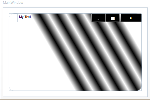
I hope you liked my tutorial and found it helpful.
Have a question about something in this article? You can receive help directly from the article author. Sign up for a free trial to get started.
Comments (0)