Pie Chart Techniques


1998: C++ - SQL Server 6.5
2000-2007: C++, VB6, C#, java - SQL Server 7.0-2005
2008-...: SQL Server 2005-2016
2014-2017: MVP Data Platform
2000-2007: C++, VB6, C#, java - SQL Server 7.0-2005
2008-...: SQL Server 2005-2016
2014-2017: MVP Data Platform
Published:
Browse All Articles > Pie Chart Techniques
Written by Valentino Vranken.
A while ago I wrote an article called Chart Optimization Tips. This article explained how to optimize a Column Chart. Today I have returned to show you some Pie Chart implementation techniques.
As usual, I will be using the AdventureWorks2008 database, available at CodePlex. The chart itself will be implemented using SQL Server 2008 Reporting Services.
The dataset in our report uses the following query:
This query illustrates a bad coding practice: never use "SELECT *". Ideally you should only retrieve the columns that you need for the report. That will optimize performance when generating the report. But that is not the goal of this article so I'll leave the query as it is.
To get started with our Pie Chart I have selected the third icon in the list of Shape charts. This adds a regular 3D pie chart to the report.
![Select Chart Type window]()
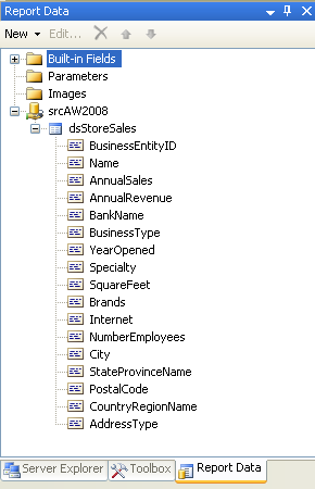
To set up the chart I dragged AnnualSales from the Report Data pane into the "Drop data fields here" area and StateProvinceName into the "Drop category fields here".
In case you don't see the Report Data view (it has a tendency to disappear now and then), you can open it through the main menu: View > Report Data.
![Report Data Pane]()
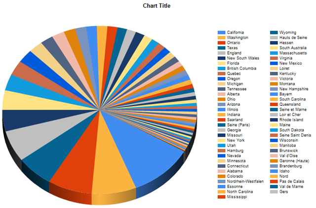
This is what our report looks like in Preview:
![Basic Pie Chart]()
Wow, we've still got some work to do, this looks like a kids color book! You wouldn't say that this chart is showing the annual sales, would you? There aren't even any numbers on it! Let's get started on improving this.
A good implementation practice is to sort the slices from large to small. If the slices are not sorted, it's difficult to tell which state is performing better than another. Just take a look at the previous image and compare the following two slices:
Which one is the larger of the two? Indeed, "I don't know" is the right answer.
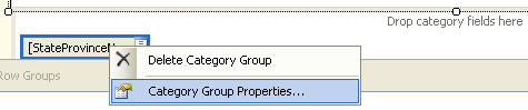
To implement the sorting you need to think about what you want to achieve. What is it that we want to sort? The states. And these are shown as categories on the chart, so we should take a look at its properties. As shown in the following screenshot, right-clicking on the [StateProvinceName] button gives a pop-up menu. Select Category Group Properties.
![Context menu for Category Group]()
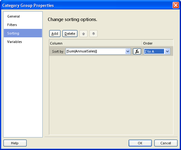
Then we need to think about how we want the states to get sorted. For that we should look at what is being shown as data of the chart. In our case that is the sum of the AnnualSales field.
In the Category Group Properties, select the page called Sorting. Clicking the Add button will add a line in the sorting options list. Use the following expression for the "Sort by" field:
As we want to sort the largest values first, select "Z to A" for the Order dropdown.
![Category Group Properties]()
Right, time to have another look at our report in Preview.
![Sorted Pie Chart]()
So, we went from a colorful mess to an ordered colorful mess. Chaos has been reduced a bit, but this is still one difficult-to-read report.
On to the next improvement!
As you have noticed, a pie chart is not suitable to show that many categories. We need to find a way to reduce the slices. One way to do that is by adding a filter. Another way is to add the smallest slices together into one slice. This can be interesting in cases where we want to use all the data but we're only interested in the larger slices. Luckily, this can be done using standard pie chart properties.
Click on the pie itself, this will select the Chart Series. One way to tell if you've selected the correct part of the chart is by looking at the Properties pane. Its selection should show something like "AnnualSales Chart Series", where AnnualSales is the name of the chart series. Another way to tell is by the small white selector bulbs: they should be surrounding the pie.
Now, among the properties of the Chart Series you will find a property group called CustomAttributes. Open this one by clicking the plus icon in front of it. Change the CollectedStyle property to SingleSlice. This tells the chart that we want to group the smallest slices into one slice.
Other interesting properties here are CollectedThreshold and CollectedThresholdUsePercent . I've put CollectedThreshold to 2 and CollectedThresholdUsePercent to True (which is its default). This means that any slice smaller than 2 percent of the pie will be added into the "collected slice".
More useful properties are CollectedLabel, that's the text that is shown on the slice itself, and CollectedLegendText, the text shown in the legend.
![Chart Series - collected slice properties]()
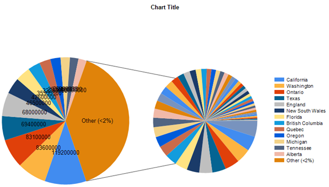
The CollectedStyle property has another option besides the one I've shown, called CollectedPie. Choosing that will generate a second pie next to the main one to represent all the small slices. See the following screenshot for what it looks like. In some cases this may be an interesting option but not in our example here.
![Pie Chart showing a CollectedPie]()
The collected pie can also show labels by setting the CollectedChartShowLabels property to True, and the categories shown on the collected pie can be shown in the pie's legend by setting CollectedChartShowLegend to True.
If you'd like the collected slice to jump out, there's a property called CollectedSliceExploded. Setting it to True will produce something like the following:
![Exploded Collected Slice]()
As you have noticed, the previous screenshots have started to show text on the slices. This can be easily activated by right-clicking the pie and selecting the Show Data Labels menu item.
![Context menu on pie chart - Show Data Labels]()
And the next screenshot shows what our chart currently looks like.
![Pie chart with collected slice]()
The small slices have been replaced by a really large one, and the text on the large slice is our customized version. The other slices are showing some rather large numbers, so we still have some work to do.
Let's customize the label shown on the slices. As the numbers are really large, I recommend to divide them by 1,000. As long as it's clearly mentioned on the report, it will make everything more readable.
Furthermore I'll show you how to use built-in chart keywords (only available to ToolTips, custom legend text, and data point label properties), such as #PERCENT.
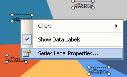
Right-click on one of the data labels and select Series Label Properties.
![Context menu of data labels - Series Label Properties]()
Click the expression (fx) button on the General page and enter the following expression:
The first part divides the sum of AnnualSales by 1,000 and then applies the FormatCurrency function to the result. The second parameter for FormatCurrency tells the function that we don't want any decimals. The result of this function call is concatenated with the second part using Visual Basic string concatenation (&).
The second part looks like a regular string but it contains a built-in keyword: #PERCENT. This will show the percentage that the slice represents. Furthermore, there's a custom string formatter appended: P1. By default the percentage would show 2 decimals. This way it will only use one digit for the decimal fraction.
See here for a list of all built-in keywords and this page for more information on the available formatting options.
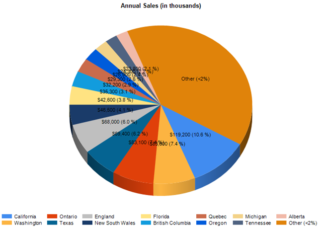
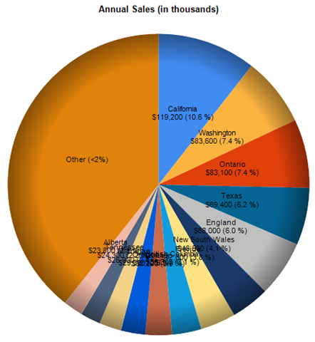
And following screenshot shows what our chart now looks like.
![Pie chart showing percentages on slices]()
I've also given it a clear title, decreased the Data Label font size to 8 and moved the legend down.
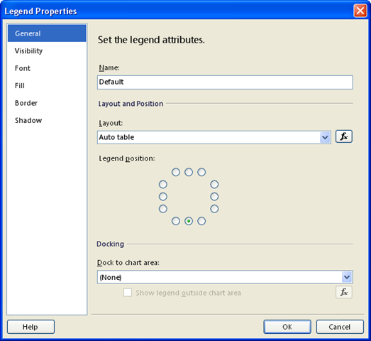
To move the legend: right-click it, select Legend Properties and play with the radio buttons for the Legend Position.
![Legend Properties]()
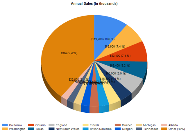
So, we've now got a fairly readable chart. It's not perfect, some labels are overlapping, but it's doable. However, we won't rest here. On to the next tip.
Some people may ask you, "Why on earth does the first slice (the blue one representing 10.6% in our example) start at this weird angle at 4 o'clock? Why can't it start at 12:00?".
Again we're lucky because this can be controlled using a standard property. Among the Chart Series CustomAttributes property group there are still some properties which haven't been mentioned earlier. One of them is called PieStartAngle. By default it is set to zero. Funny enough, zero stands for 30°. Try it out and enter 30 for the property value. Did you see the effect? Indeed, nothing happens! Now enter 90. Did you see the chart rotate, even in Design mode? Switch to Preview to get a better view of what the impact is. As you can see, setting it to 90 will cause the first slice to start at 06:00. To make it start at 12:00, we thus need to set the property to 270 degrees.
![Pie Chart with customized rotation angle]()
Other people may tell you, "But I don't want all these labels on the pie itself, I want them next to it.".
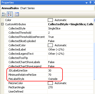
We're still lucky because again this can be achieved using standard properties. Still in the Chart Series CustomAttributes, there's a property named PieLabelStyle. Its default value is Inside. Switching it to Outside will render the labels outside the pie, with lines attaching them to their respective slice.
Other interesting properties for the outside labeling are 3DLabelLineSize and MinimumRelativePieSize.
3DLabelLineSize defines the amount of space used for drawing the line between the label and its corresponding slice and is a percentage of its default size. Values range from 30 to 200. I've put it to 30 to get as much space as possible for the pie itself and the labels.
MinimumRelativePieSize represents a percentage of the chart area size and defines the minimum acceptable pie size. Values range from 10 to 70. I've put this one to 70 to maximize the size of the pie.
![Chart Series properties with properties for outside labeling highlighted]()
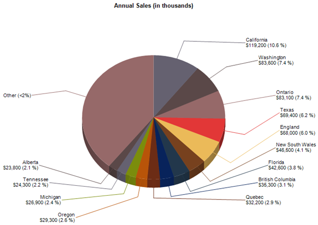
With these modifications we've actually gotten some extra space for the labels. Let's take advantage of that and add extra information in the labels. Change the Data Label expression to the following:
Our expression uses another built-in keyword: #LEGENDTEXT. This will add the legend text to the label itself, which means the legend becomes obsolete. So I've removed it.
And this is what our chart now looks like:
![Pie chart showing labels on the outside]()
With Halloween coming up I thought it would be nice to create a spidery chart :-)
I've already mentioned several CustomAttribute properties of the Chart Series and I'd like to mention one more. This property is called PieDrawingStyle and it will only appear in the list of properties when 3D is not enabled. After disabling 3D I could set it to either SoftEdge or Concave. I also noticed that labels outside of a pie chart will only have lines attached to them when rendered in 3D, so I've switched back to Inside for the PieLabelStyle property.
This is what SoftEdge looks like. I think it's rather nice.
![Pie chart using SoftEdge drawing style]()
To conclude, there may be some people who tell you, "I don't like those colours, and I don't like any of the predefined sets. I want to specify custom colours.".
So again we're lucky because even that is supported by default.
To get started with our color customization, select the chart object. To know if you've made the correct selection, the Property pane should show "Chart" as non-bold part of the dropdown. Alternatively you can just use that dropdown to select the Chart. As Chart is a main object on the report, it is shown in the list (whereas parts of a Chart, such as Chart Series and Chart Area, are not shown in that list).
With the Chart selected, locate the Palette property. By default it is set to BrightPastel. In case you're happy with one of the predefined palettes you can just select it here. But we go for Custom, located at the bottom.
Next, locate the CustomPaletteColors property. Selecting the property will show a button with an ellipsis as button text. Click this button to get to the ReportColorExpression Collection Editor (what a name for a popup window!). This window allows you to specify a list of colors. I've specified the following 10 colors:
![ReportColorExpression Collection Editor]()
And finally this is what our report looks like. To stay in the theme, I've specified some colors which are suitable for Halloween charting.
![Pie chart with custom colors - Halloween-style!]()
And now to really conclude this article I'd like to mention one additional tip related to chart coloring. In some occasions it may be interesting to have coloring consistency between different charting periods. With that I mean that California would always show in grey, no matter whether it came first or not, Washington as brown, and so on. This is currently not the case. With the current implementation it's the first pie that gets the grey color, the second pie is brown, and so on.
The best way to achieve that is to store the colors in the database and then fetch them in the same dataset that is used to retrieve the chart data. The AdventureWorks database hasn't got any color codes stored so I'll just illustrate what I mean using a little cheat.
In order to get our dynamic coloring working, we will override the colors from the palette. This is how it's done. Right-click on the pie and select Series Properties. Select the Fill page and click the Expression (fx) button to define the color. In the case where you're selecting the color code as one of the database fields, your expression would look similar to this (assuming that colors are stored using their 6-digit hexadecimal representation with 000000 being black and FFFFFF being white):
To imitate dynamic coloring I've used the following expression:
The expression gives three states their own color and all the others will be colored a kind of grey.
This is what it looks like:
![Pie Chart using dynamic colors]()
So, I hope you've enjoyed reading this article. Feel free to post any comments should you wish to do so, and... happy charting!
As usual, if you liked what you've just read, may I kindly ask you to click that small blue button that has the letters YES printed on it? It's located just a little under this line, to the right of the "Was this article helpful?" text.
Thank you,
Valentino.
References
Originally appeared on my personal website: http://blog.hoegaerden.be/2009/10/25/pie-chart-techniques
SQL Server 2008 Books Online: Pie Charts
How to: Collect Small Slices on a Pie Chart
Formatting Data Points on a Chart
How to: Define Colors on a Chart Using a Palette
A while ago I wrote an article called Chart Optimization Tips. This article explained how to optimize a Column Chart. Today I have returned to show you some Pie Chart implementation techniques.
As usual, I will be using the AdventureWorks2008 database, available at CodePlex. The chart itself will be implemented using SQL Server 2008 Reporting Services.
1. Retrieving The Data
The dataset in our report uses the following query:
select SWD.*, SWA.City, SWA.StateProvinceName, SWA.PostalCode, SWA.CountryRegionName, SWA.AddressType
                      from Sales.vStoreWithDemographics SWD
inner join Sales.vStoreWithAddresses SWA on SWA.BusinessEntityID = SWD.BusinessEntityIDThis query illustrates a bad coding practice: never use "SELECT *". Ideally you should only retrieve the columns that you need for the report. That will optimize performance when generating the report. But that is not the goal of this article so I'll leave the query as it is.
2. A Basic Pie Chart
To get started with our Pie Chart I have selected the third icon in the list of Shape charts. This adds a regular 3D pie chart to the report.

To set up the chart I dragged AnnualSales from the Report Data pane into the "Drop data fields here" area and StateProvinceName into the "Drop category fields here".
In case you don't see the Report Data view (it has a tendency to disappear now and then), you can open it through the main menu: View > Report Data.
This is what our report looks like in Preview:
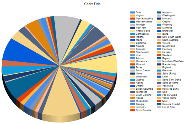
Wow, we've still got some work to do, this looks like a kids color book! You wouldn't say that this chart is showing the annual sales, would you? There aren't even any numbers on it! Let's get started on improving this.
3. Sorting The Numbers
A good implementation practice is to sort the slices from large to small. If the slices are not sorted, it's difficult to tell which state is performing better than another. Just take a look at the previous image and compare the following two slices:
the pie shown in grey at 12:00
the pie shown in yellow at 03:00
Which one is the larger of the two? Indeed, "I don't know" is the right answer.
To implement the sorting you need to think about what you want to achieve. What is it that we want to sort? The states. And these are shown as categories on the chart, so we should take a look at its properties. As shown in the following screenshot, right-clicking on the [StateProvinceName] button gives a pop-up menu. Select Category Group Properties.
Then we need to think about how we want the states to get sorted. For that we should look at what is being shown as data of the chart. In our case that is the sum of the AnnualSales field.
In the Category Group Properties, select the page called Sorting. Clicking the Add button will add a line in the sorting options list. Use the following expression for the "Sort by" field:
=Sum(Fields!AnnualSales.Value)As we want to sort the largest values first, select "Z to A" for the Order dropdown.
Right, time to have another look at our report in Preview.
So, we went from a colorful mess to an ordered colorful mess. Chaos has been reduced a bit, but this is still one difficult-to-read report.
On to the next improvement!
4. Limiting The Pies
As you have noticed, a pie chart is not suitable to show that many categories. We need to find a way to reduce the slices. One way to do that is by adding a filter. Another way is to add the smallest slices together into one slice. This can be interesting in cases where we want to use all the data but we're only interested in the larger slices. Luckily, this can be done using standard pie chart properties.
Click on the pie itself, this will select the Chart Series. One way to tell if you've selected the correct part of the chart is by looking at the Properties pane. Its selection should show something like "AnnualSales Chart Series", where AnnualSales is the name of the chart series. Another way to tell is by the small white selector bulbs: they should be surrounding the pie.
Now, among the properties of the Chart Series you will find a property group called CustomAttributes. Open this one by clicking the plus icon in front of it. Change the CollectedStyle property to SingleSlice. This tells the chart that we want to group the smallest slices into one slice.
Other interesting properties here are CollectedThreshold and CollectedThresholdUsePerce
More useful properties are CollectedLabel, that's the text that is shown on the slice itself, and CollectedLegendText, the text shown in the legend.

The CollectedStyle property has another option besides the one I've shown, called CollectedPie. Choosing that will generate a second pie next to the main one to represent all the small slices. See the following screenshot for what it looks like. In some cases this may be an interesting option but not in our example here.
The collected pie can also show labels by setting the CollectedChartShowLabels property to True, and the categories shown on the collected pie can be shown in the pie's legend by setting CollectedChartShowLegend to True.
If you'd like the collected slice to jump out, there's a property called CollectedSliceExploded. Setting it to True will produce something like the following:

As you have noticed, the previous screenshots have started to show text on the slices. This can be easily activated by right-clicking the pie and selecting the Show Data Labels menu item.
And the next screenshot shows what our chart currently looks like.
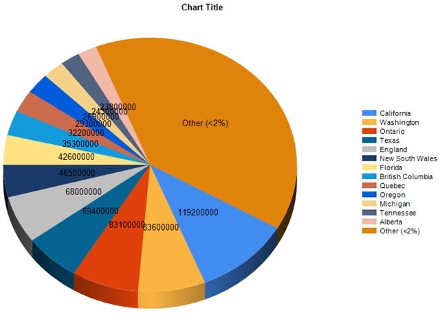
The small slices have been replaced by a really large one, and the text on the large slice is our customized version. The other slices are showing some rather large numbers, so we still have some work to do.
5. Displaying Percentages
Let's customize the label shown on the slices. As the numbers are really large, I recommend to divide them by 1,000. As long as it's clearly mentioned on the report, it will make everything more readable.
Furthermore I'll show you how to use built-in chart keywords (only available to ToolTips, custom legend text, and data point label properties), such as #PERCENT.
Right-click on one of the data labels and select Series Label Properties.
Click the expression (fx) button on the General page and enter the following expression:
=FormatCurrency(Sum(Fields!AnnualSales.Value) / 1000, 0) & " (#PERCENT{P1})"The first part divides the sum of AnnualSales by 1,000 and then applies the FormatCurrency function to the result. The second parameter for FormatCurrency tells the function that we don't want any decimals. The result of this function call is concatenated with the second part using Visual Basic string concatenation (&).
The second part looks like a regular string but it contains a built-in keyword: #PERCENT. This will show the percentage that the slice represents. Furthermore, there's a custom string formatter appended: P1. By default the percentage would show 2 decimals. This way it will only use one digit for the decimal fraction.
See here for a list of all built-in keywords and this page for more information on the available formatting options.
And following screenshot shows what our chart now looks like.
I've also given it a clear title, decreased the Data Label font size to 8 and moved the legend down.
To move the legend: right-click it, select Legend Properties and play with the radio buttons for the Legend Position.
So, we've now got a fairly readable chart. It's not perfect, some labels are overlapping, but it's doable. However, we won't rest here. On to the next tip.
6. Rotating The Pie
Some people may ask you, "Why on earth does the first slice (the blue one representing 10.6% in our example) start at this weird angle at 4 o'clock? Why can't it start at 12:00?".
Again we're lucky because this can be controlled using a standard property. Among the Chart Series CustomAttributes property group there are still some properties which haven't been mentioned earlier. One of them is called PieStartAngle. By default it is set to zero. Funny enough, zero stands for 30°. Try it out and enter 30 for the property value. Did you see the effect? Indeed, nothing happens! Now enter 90. Did you see the chart rotate, even in Design mode? Switch to Preview to get a better view of what the impact is. As you can see, setting it to 90 will cause the first slice to start at 06:00. To make it start at 12:00, we thus need to set the property to 270 degrees.
7. Labels Outside Pie Chart
Other people may tell you, "But I don't want all these labels on the pie itself, I want them next to it.".
We're still lucky because again this can be achieved using standard properties. Still in the Chart Series CustomAttributes, there's a property named PieLabelStyle. Its default value is Inside. Switching it to Outside will render the labels outside the pie, with lines attaching them to their respective slice.
Other interesting properties for the outside labeling are 3DLabelLineSize and MinimumRelativePieSize.
3DLabelLineSize defines the amount of space used for drawing the line between the label and its corresponding slice and is a percentage of its default size. Values range from 30 to 200. I've put it to 30 to get as much space as possible for the pie itself and the labels.
MinimumRelativePieSize represents a percentage of the chart area size and defines the minimum acceptable pie size. Values range from 10 to 70. I've put this one to 70 to maximize the size of the pie.
With these modifications we've actually gotten some extra space for the labels. Let's take advantage of that and add extra information in the labels. Change the Data Label expression to the following:
="#LEGENDTEXT" & vbcrlf &
FormatCurrency(Sum(Fields!AnnualSales.Value) / 1000, 0) & " (#PERCENT{P1})"Our expression uses another built-in keyword: #LEGENDTEXT. This will add the legend text to the label itself, which means the legend becomes obsolete. So I've removed it.
And this is what our chart now looks like:

With Halloween coming up I thought it would be nice to create a spidery chart :-)
8. One More Custom Attribute
I've already mentioned several CustomAttribute properties of the Chart Series and I'd like to mention one more. This property is called PieDrawingStyle and it will only appear in the list of properties when 3D is not enabled. After disabling 3D I could set it to either SoftEdge or Concave. I also noticed that labels outside of a pie chart will only have lines attached to them when rendered in 3D, so I've switched back to Inside for the PieLabelStyle property.
This is what SoftEdge looks like. I think it's rather nice.
9. Custom Coloring
To conclude, there may be some people who tell you, "I don't like those colours, and I don't like any of the predefined sets. I want to specify custom colours.".
So again we're lucky because even that is supported by default.
To get started with our color customization, select the chart object. To know if you've made the correct selection, the Property pane should show "Chart" as non-bold part of the dropdown. Alternatively you can just use that dropdown to select the Chart. As Chart is a main object on the report, it is shown in the list (whereas parts of a Chart, such as Chart Series and Chart Area, are not shown in that list).
With the Chart selected, locate the Palette property. By default it is set to BrightPastel. In case you're happy with one of the predefined palettes you can just select it here. But we go for Custom, located at the bottom.
Next, locate the CustomPaletteColors property. Selecting the property will show a button with an ellipsis as button text. Click this button to get to the ReportColorExpression Collection Editor (what a name for a popup window!). This window allows you to specify a list of colors. I've specified the following 10 colors:

And finally this is what our report looks like. To stay in the theme, I've specified some colors which are suitable for Halloween charting.
10. Coloring Consistency Using Dynamic Colors
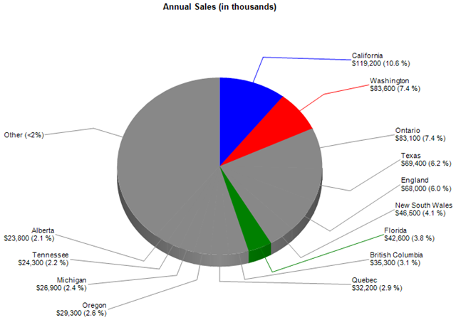
And now to really conclude this article I'd like to mention one additional tip related to chart coloring. In some occasions it may be interesting to have coloring consistency between different charting periods. With that I mean that California would always show in grey, no matter whether it came first or not, Washington as brown, and so on. This is currently not the case. With the current implementation it's the first pie that gets the grey color, the second pie is brown, and so on.
The best way to achieve that is to store the colors in the database and then fetch them in the same dataset that is used to retrieve the chart data. The AdventureWorks database hasn't got any color codes stored so I'll just illustrate what I mean using a little cheat.
In order to get our dynamic coloring working, we will override the colors from the palette. This is how it's done. Right-click on the pie and select Series Properties. Select the Fill page and click the Expression (fx) button to define the color. In the case where you're selecting the color code as one of the database fields, your expression would look similar to this (assuming that colors are stored using their 6-digit hexadecimal representation with 000000 being black and FFFFFF being white):
="#" & Fields!ColourCode.ValueTo imitate dynamic coloring I've used the following expression:
=Switch
                      (
                      	Fields!StateProvinceName.Value = "California", "Blue",
                      	Fields!StateProvinceName.Value = "Washington", "Red",
                      	Fields!StateProvinceName.Value = "Florida", "Green",
                      	True , "#888888"
)The expression gives three states their own color and all the others will be colored a kind of grey.
This is what it looks like:
So, I hope you've enjoyed reading this article. Feel free to post any comments should you wish to do so, and... happy charting!
As usual, if you liked what you've just read, may I kindly ask you to click that small blue button that has the letters YES printed on it? It's located just a little under this line, to the right of the "Was this article helpful?" text.
Thank you,
Valentino.
References
Originally appeared on my personal website: http://blog.hoegaerden.be/2009/10/25/pie-chart-techniques
SQL Server 2008 Books Online: Pie Charts
How to: Collect Small Slices on a Pie Chart
Formatting Data Points on a Chart
How to: Define Colors on a Chart Using a Palette
1998: C++ - SQL Server 6.5
2000-2007: C++, VB6, C#, java - SQL Server 7.0-2005
2008-...: SQL Server 2005-2016
2014-2017: MVP Data Platform
2000-2007: C++, VB6, C#, java - SQL Server 7.0-2005
2008-...: SQL Server 2005-2016
2014-2017: MVP Data Platform
Have a question about something in this article? You can receive help directly from the article author. Sign up for a free trial to get started.
Comments (3)
Commented:
http://www.perceptualedge.com/articles/08-21-07.pdf
Author
Commented:Commented: