Data Visualizations in d3.js
Published:
Browse All Articles > Data Visualizations in d3.js
We will take a look at the d3.js library for visualizations. I will provide a walkthrough of a short bar graph example as well as introduce you to the d3.js API. We also will explore links of other examples and further information regarding SVG's.
Making Data-Visualizations using D3.js
What is it?
According to d3js.org (where you will download d3.js) D3.js is a JavaScript library for manipulating documents based on data. D3 helps you bring data to life using HTML, SVG, and CSS. D3’s emphasis on web standards gives you the full capabilities of modern browsers without tying yourself to a proprietary framework, combining powerful visualization components and a data-driven approach to DOM manipulation.
What it is not.
Before we get started looking at a visualization, we should clarify what d3.js is not. It is not a replacement or competitor to angular, backbone or any other web UI framework, nor is it meant to replace jQuery, a popular (Document Object Model) selection/manipulation framework. It is true that you can do data visualizations using jQuery, plain old javascript or many of the UI frameworks but d3.js’s power is really its ability to bind arbitrary data to the (DOM).
Examples
There are numerous examples of data visualizations using d3.js. Unfortunately, almost all examples use a .TSR datasource, which would be a flat file that sits on your server. If you are here wanting to learn about d3.js you are likely interested in its dynamic properties. You don’t want to write your data into a flat file and stick it out on the web. You're hopefully more interested in implementing dynamic real time data visualizations, and consequently in this tutorial we will be working with JSON for our data source unlike most of the tutorials out there. This will better allow you to get started quickly in creating real-time data visualizations for the web. You can look at other examples below after you have followed through on this tutorial.
Sample d3.js visualizations (http://christopheviau.com/d3list/gallery.html )
Lets get started
D3.js has really opened up the possibilities for data visualizations. The sky is really the limit and there are some amazingly creative charts or visualizations that you can make. That being said, the bar graph is STILL a time tested and effective mechanism to display the message of data effectively. I wanted to give you something that you could implement today in projects you might be working on and the visualization that is likely still most applicable is going to be the bar graph. There are many other examples you can look at once you get the basics down. So lets get started.
You can download d3.js at http://d3js.org/ or you can use a hosted absolute reference like I will be doing as below.
If you have spent time as a front end developer, you know how tedious it can be to modify the W3C specified DOM. JQuery’s popularity in recent years is many explained by its approach to simplify this methodology. jQuery typical calls these “Selectors”. In d3.js, they work similarly but are called … well “Selections”. Working with “Selections” in mass gives d3.js a lot of its power.
Selections
selectAll() and select() are some of the main selections used. For example
You could just as easily select an individual element as well
Chaining methods
Like jquery you can chain methods saving time in d3.js.
Lets do a full example.
We will use a popular example by Mike Bostock as a starting point, however as mentioned before we will be using JSON data instead. We will adjust other elements as well. I will also be including some references to the API to allow you to dig a little deeper on each line of code if you have questions.
THE CSS
I'll start with the CSS, I won’t spend much time here as you will likely see how this affects the project as it comes together, but here is the CSS we will be using
The one element you are probably not familiar with is shape-rendering: crispEdges
This is part of CSS that can help us define our SVG elements. Remember SVG are Vector Graphics instead of Pixel based graphics and consequently some of the new CSS specifications help us to deal with them. We are going to want crispEdges so we will include the new shape-rendering: crispEdges to accomplish this.
Other than that most of the CSS should be a pretty self-explanatory. If you still have additional questions just google the attributes you don't understand and you should be able to answer everything. After all this is about d3.js not CSS :).
THE JAVASCRIPT
I'll post it all initially then spend some time going over each section...
THE JSON
Lets Break It Down
To start off you see we call for the d3.js script. Below that we start to write our javascript. We start with a simple javascript object called margin where we set different margins to help us kind of set the display frame for our chart.
Next we want to get the length of our x and y axis for the chart. We use ordinal() and linear() here. We are going to set our Y axis to be a linear range between the height of our chart and 0. Note: we start with height so that we display the highest value first then moving down to 0 on the y-axis. Our x axis we will start with 0 and move to our desired width with a little padding. The rangeRoundBands method computes range values so as to divide the chart area into evenly-spaced, evenly-sized bands, as in a bar chart.
d3.select("#chart") looks for the ID of chart within our html much like jquery selectors. Once we find an HTML element with an ID of chart we are going to attach our chart to it. We can use .append() to add our svg elements and we set the .attr() or attributes of width and height for the chart.
Next we set our actually svg axises of x and y. We use the .scale() attribute with our linear and ordinal lengths from above. We can also set the x axis to .orient() it horizontally and the y axis to orient it vertically on the left. Technically we are not rendering anything yet, we are just setting up xAxis and yAxis to be used later when we append them to g. Not sure what g is? Well keep reading...
Since there is exactly one rect and one text element per g element, we can .append() these elements directly to the g. In a few moments we will append a rect and text that will inherit data from their parent g element, and can use the associated data to determine positions.
This was just a quick walkthrough of a bar chart using potentially dynamic data. Hopefully if nothing else it has exposed you to some of the d3.js API's, numerous examples and more information regarding SVG's.
You can download the attached d3.zip to see it all in one place and run it yourself.
You can also see a picture of the final product below...
![final.jpg]()
What is it?
According to d3js.org (where you will download d3.js) D3.js is a JavaScript library for manipulating documents based on data. D3 helps you bring data to life using HTML, SVG, and CSS. D3’s emphasis on web standards gives you the full capabilities of modern browsers without tying yourself to a proprietary framework, combining powerful visualization components and a data-driven approach to DOM manipulation.
What it is not.
Before we get started looking at a visualization, we should clarify what d3.js is not. It is not a replacement or competitor to angular, backbone or any other web UI framework, nor is it meant to replace jQuery, a popular (Document Object Model) selection/manipulation framework. It is true that you can do data visualizations using jQuery, plain old javascript or many of the UI frameworks but d3.js’s power is really its ability to bind arbitrary data to the (DOM).
Examples
There are numerous examples of data visualizations using d3.js. Unfortunately, almost all examples use a .TSR datasource, which would be a flat file that sits on your server. If you are here wanting to learn about d3.js you are likely interested in its dynamic properties. You don’t want to write your data into a flat file and stick it out on the web. You're hopefully more interested in implementing dynamic real time data visualizations, and consequently in this tutorial we will be working with JSON for our data source unlike most of the tutorials out there. This will better allow you to get started quickly in creating real-time data visualizations for the web. You can look at other examples below after you have followed through on this tutorial.
Sample d3.js visualizations (http://christopheviau.com/
Lets get started
D3.js has really opened up the possibilities for data visualizations. The sky is really the limit and there are some amazingly creative charts or visualizations that you can make. That being said, the bar graph is STILL a time tested and effective mechanism to display the message of data effectively. I wanted to give you something that you could implement today in projects you might be working on and the visualization that is likely still most applicable is going to be the bar graph. There are many other examples you can look at once you get the basics down. So lets get started.
You can download d3.js at http://d3js.org/ or you can use a hosted absolute reference like I will be doing as below.
<script src="https://cdnjs.cloudflare.com/ajax/libs/d3/3.5.6/d3.min.js" charset="utf-8"></script> If you have spent time as a front end developer, you know how tedious it can be to modify the W3C specified DOM. JQuery’s popularity in recent years is many explained by its approach to simplify this methodology. jQuery typical calls these “Selectors”. In d3.js, they work similarly but are called … well “Selections”. Working with “Selections” in mass gives d3.js a lot of its power.
Selections
selectAll() and select() are some of the main selections used. For example
d3.selectAll(“p”).style(“font-size”, 12);You could just as easily select an individual element as well
d3.select(“body”).style(“font-size”, 12);Chaining methods
Like jquery you can chain methods saving time in d3.js.
d3.select(“body”)
                      .style(“font-size”, 12)
.style(“color”, “#333333”);Lets do a full example.
We will use a popular example by Mike Bostock as a starting point, however as mentioned before we will be using JSON data instead. We will adjust other elements as well. I will also be including some references to the API to allow you to dig a little deeper on each line of code if you have questions.
THE CSS
I'll start with the CSS, I won’t spend much time here as you will likely see how this affects the project as it comes together, but here is the CSS we will be using
<style>

                      #chart rect{
                        fill: #4aaeea;
                      }

                      #chart text{
                        fill: black;
                        font: 10px sans-serif;
                        text-anchor: end;
                      }

                      .axis text{
                        font: 10px sans-serif;
                      }

                      .axis path, .axis line{
                        fill: none;
                        stroke : #333;
                        shape-rendering: crispEdges;
                      }

                      body{

                        color : #333333;
                        padding-top : 50px;
                      } </style>
The one element you are probably not familiar with is shape-rendering: crispEdges
This is part of CSS that can help us define our SVG elements. Remember SVG are Vector Graphics instead of Pixel based graphics and consequently some of the new CSS specifications help us to deal with them. We are going to want crispEdges so we will include the new shape-rendering: crispEdges to accomplish this.
Other than that most of the CSS should be a pretty self-explanatory. If you still have additional questions just google the attributes you don't understand and you should be able to answer everything. After all this is about d3.js not CSS :).
THE JAVASCRIPT
I'll post it all initially then spend some time going over each section...
<script src="https://cdnjs.cloudflare.com/ajax/libs/d3/3.5.5/d3.min.js"></script>
                      <script>

                      var margin ={top:40, right:40, bottom:40, left:40},
                          width=900-margin.left - margin.right,
                          height=500-margin.top-margin.bottom;


                      var x = d3.scale.ordinal().rangeRoundBands([0, width], .5);


                      var y = d3.scale.linear().range([height, 0]);

                      var chart = d3.select("#chart")
                                    .append("svg")  //append svg element inside #chart
                                    .attr("width", width+(2*margin.left)+margin.right)    //set width
                                    .attr("height", height+margin.top+margin.bottom);  //set height
                      var xAxis = d3.svg.axis()
                                    .scale(x)
                                    .orient("bottom");

                      var yAxis = d3.svg.axis()
                                    .scale(y)
                                    .orient("left");


                      d3.json("data.json", function(error, data){
                        var pxAboveBar = 10;
                        var ymax = d3.max(d3.values(data));
                        x.domain(data.map(function(d){ return d.country}));
                        y.domain([0, ymax.gdp + 2]);

                        var bar = chart.selectAll("g")
                                          .data(data)
                      					.enter()
                                          .append("g")
                                          .attr("transform", function(d, i){
                                            return "translate("+x(d.country)+", 0)";
                                          });

                        bar.append("rect")
                            .attr("y", function(d) {
                              return y(d.gdp);
                            })
                            .attr("x", function(d,i){
                              return x.rangeBand();
                            })
                            .attr("height", function(d) {
                              return height - y(d.gdp);
                            })
                            .attr("width", x.rangeBand());

                        bar.append("text")
                            .attr("x", x.rangeBand() + (x.rangeBand()/1.5) )
                            .attr("y", function(d) { return y(d.gdp) - pxAboveBar  ; })
                            .attr("dy", ".75em")
                            .text(function(d) { return d.gdp; });

                        chart.append("g")
                              .attr("class", "x axis")
                              .attr("transform", "translate("+margin.left+","+ height+")")
                              .call(xAxis);

                        chart.append("g")
                              .attr("class", "y axis")
                              .attr("transform", "translate("+margin.left+",0)")
                              .call(yAxis)
                              .append("text")
                              .attr("transform", "rotate(-90)")
                              .attr("y", 6)
                              .attr("dy", ".71em")
                              .style("text-anchor", "end")
                              .text("GDP in trillions");
                      });
</script>THE JSON
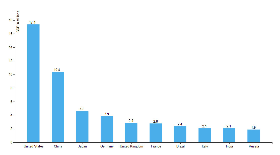
[
                      	{	"country":"United States",
                      		"gdp":17.4
                      	},
                      	{	"country":"China",
                      		"gdp":10.4
                      	},
                      	{	"country":"Japan",
                      		"gdp":4.6
                      	},
                      	{	"country":"Germany",
                      		"gdp":3.9
                      	},
                      	{	"country":"United Kingdom",
                      		"gdp":2.9
                      	},
                      	{	"country":"France",
                      		"gdp":2.8
                      	},
                      	{	"country":"Brazil",
                      		"gdp":2.4
                      	},
                      	{	"country":"Italy",
                      		"gdp":2.1
                      	},
                      	{	"country":"India",
                      		"gdp":2.1
                      	},
                      	{	"country":"Russia",
                      		"gdp":1.9
                      	}
]Lets Break It Down
 <script src="https://cdnjs.cloudflare.com/ajax/libs/d3/3.5.5/d3.min.js"></script>

                      <script>
                      var margin ={top:40, right:40, bottom:40, left:40},
                          width=900-margin.left - margin.right,
height=500-margin.top-margin.bottom;To start off you see we call for the d3.js script. Below that we start to write our javascript. We start with a simple javascript object called margin where we set different margins to help us kind of set the display frame for our chart.
var x = d3.scale.ordinal().rangeRoundBands([0, width], .5);
var y = d3.scale.linear().range([height, 0]);Next we want to get the length of our x and y axis for the chart. We use ordinal() and linear() here. We are going to set our Y axis to be a linear range between the height of our chart and 0. Note: we start with height so that we display the highest value first then moving down to 0 on the y-axis. Our x axis we will start with 0 and move to our desired width with a little padding. The rangeRoundBands method computes range values so as to divide the chart area into evenly-spaced, evenly-sized bands, as in a bar chart.
var chart = d3.select("#chart")
                                    .append("svg")  //append svg element inside #chart
                                    .attr("width", width+(2*margin.left)+margin.right)
                                    .attr("height", height+margin.top+margin.bottom);
                      var xAxis = d3.svg.axis()
                                    .scale(x)
                                    .orient("bottom");

                      var yAxis = d3.svg.axis()
                                    .scale(y)
.orient("left");d3.select("#chart") looks for the ID of chart within our html much like jquery selectors. Once we find an HTML element with an ID of chart we are going to attach our chart to it. We can use .append() to add our svg elements and we set the .attr() or attributes of width and height for the chart.
Next we set our actually svg axises of x and y. We use the .scale() attribute with our linear and ordinal lengths from above. We can also set the x axis to .orient() it horizontally and the y axis to orient it vertically on the left. Technically we are not rendering anything yet, we are just setting up xAxis and yAxis to be used later when we append them to g. Not sure what g is? Well keep reading...
d3.json("data.json", function(error, data){
                        var pxAboveBar = 10;
                        var ymax = d3.max(d3.values(data));
                        x.domain(data.map(function(d){ return d.country}));
                        y.domain([0, ymax.gdp + 2]);

                        var bar = chart.selectAll("g")
                                          .data(data)
                      					.enter()
                                          .append("g")
                                          .attr("transform", function(d, i){
                                            return "translate("+x(d.country)+", 0)";
});Since there is exactly one rect and one text element per g element, we can .append() these elements directly to the g. In a few moments we will append a rect and text that will inherit data from their parent g element, and can use the associated data to determine positions.
  bar.append("rect")
                            .attr("y", function(d) {
                              return y(d.gdp);
                            })
                            .attr("x", function(d,i){
                              return x.rangeBand();
                            })
                            .attr("height", function(d) {
                              return height - y(d.gdp);
                            })
                            .attr("width", x.rangeBand());

                        bar.append("text")
                            .attr("x", x.rangeBand() + (x.rangeBand()/1.5) )
                            .attr("y", function(d) { return y(d.gdp) - pxAboveBar  ; })
                            .attr("dy", ".75em")
                            .text(function(d) { return d.gdp; });

                        chart.append("g")
                              .attr("class", "x axis")
                              .attr("transform", "translate("+margin.left+","+ height+")")
                              .call(xAxis);

                        chart.append("g")
                              .attr("class", "y axis")
                              .attr("transform", "translate("+margin.left+",0)")
                              .call(yAxis)
                              .append("text")
                              .attr("transform", "rotate(-90)")
                              .attr("y", 6)
                              .attr("dy", ".71em")
                              .style("text-anchor", "end")
.text("GDP in trillions");This was just a quick walkthrough of a bar chart using potentially dynamic data. Hopefully if nothing else it has exposed you to some of the d3.js API's, numerous examples and more information regarding SVG's.
You can download the attached d3.zip to see it all in one place and run it yourself.
You can also see a picture of the final product below...
Have a question about something in this article? You can receive help directly from the article author. Sign up for a free trial to get started.
Comments (0)