
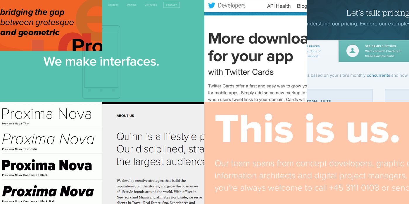
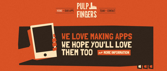
Big and Bold – these typefaces are currently a huge hit on websites. Bold typography works so marvelously in website design because it exudes the power in messages, helping brands stand out and strengthen their identity. It’s the perfect typography for minimalist websites, which maintain their popularity as the cleanest, most elegant and UX-oriented. Bold typography emphasizes this concept of saying more through simplicity, ideally complementing stark minimalist websites by giving them contrast and providing visual interest. It might be just the thing your website design needs, and here’s how to utilize its potential.
Let it speak for itself
This is what bold typography was made for – to send a clear and concise message as the main focal point on the page. The typography does so much for your text itself that you really don’t need (and shouldn’t have) a lot of text packed into your bold typeface. It puts a visual emphasis on your point, giving it gravity. That’s why it works best for short and edgy titles, giving them the kick they need so readers are drawn in. It also works with short but effective phrases – with bold type, there’s no need to say more.
And don’t hesitate to put a period in the end even though you normally wouldn’t have one; this can emphasize your concept as simple and effective. You’ll also have to consider the font color carefully so that it complements your message and provides a contrast to the background, grabbing the reader’s attention, which brings us to the next part.
Use contrast effectively
Contrast grabs attention and gives the web page edge. The color of your text will depend on your overall design, so it’s best to think about the typeface as an inherent part of the whole picture. If you think about everything in advance, you have the advantage of placing bold text that gives the background a punch and you won’t have to compromise on the color. The best thing you can do is choose the background that gets the most out of your design and then reverse the color for the text, and you’ll want to make sure that the contrast is high. To increase readability, choose a typeface with a regular or thicker stroke.
source: DESGR.COM
Use it with a full-screen HD image
We’re seeing more and more graphic design agencies use this trick for different brands, and the results are really striking. The image can add some depth to an otherwise flat background so that it’s both a contrast to your bold text and something to visually soften the page. Essentially, the bold text becomes a part of the image and they complement each other. When you try this and find just the right combination, you’ll see how something crucial seems to be missing from the image when you remove the text. You’ll know you’ve created a perfect symbiosis.
Additionally, you can make your text oversized (big and bold at its best) – this is one of the simplest ways to make an impact. You’ll want to use a sans-serif typeface in that case, because its simplicity only contributes to the overall concept. However, you want to be mindful of the size and scale, so try out different versions and let your eye guide you to what’s the most impactful and visually appealing.

source: https://pxhere.com
Every year brings exciting typography trends and practices in website design, and this year, bold typography is giving us a lot of elegant and charming designs. It’s widely used with sans-serif typefaces because they emphasize the effect, but make no mistake – serifs are back as well and we’ll be seeing more of them. Along with gradients, hand-drawn letters, and retro motifs, there’s a rising trend of companies using custom fonts in order to set themselves apart. We can expect these trends to intertwine, and no doubt that we’ll be seeing big and bold custom typefaces. Why not try this yourself and give your website more authenticity?
Have a question about something in this article? You can receive help directly from the article author. Sign up for a free trial to get started.
Comments (0)