
Empowering a web application with data visualization capabilities can be challenging.
Firstly, as a developer, you have to find a tool that fits into the existing tech stack of your application.
Secondly, this tool has to fulfill specific functional and non-functional requirements of the project.
To simplify your searches, I'd like to suggest taking a look at those interactive data visualization tools that I prefer to use most in my projects.
I hope you will find this overview useful for your web project that requires data reporting and visualization features.
Common types of data visualization tools
The most popular data visualization tools are charts and pivot tables. Combined together, they work great as a new kind of data visualization instrument - a dashboard. This is why I decided to pay particular attention to them during my research.
This leads us to a couple of important questions: what the dashboard is and how it can be created with these data visualization components.
What is the purpose of a dashboard
A dashboard is a set of data visualization elements that are placed on a single page and united by a common goal.
Why is a dashboard important?
A dashboard provides a glance at the main metrics and KPIs.
It lets the data analysts look at the data from multiple angles, draw their own conclusions about its meaning, and uncover trends.
All this makes up the core strength of the dashboard as an instrument for data reporting and decision making.
Pivot table visualization
A pivot table is a data visualization technique that presents data in a summarized form. It also allows grouping, sorting, filtering, changing an aggregation, and rearranging data records and serves as a primary tool for reporting.
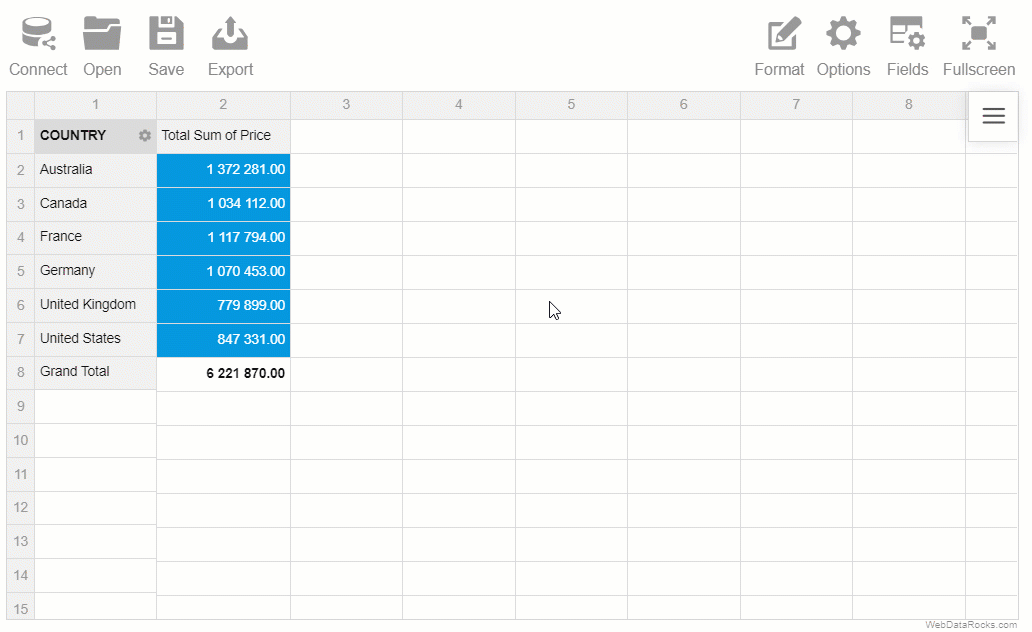
One of the brightest representatives of web pivot controls is WebDataRocks Pivot Table. This client-side component is designed to allow end-users to kick-start a data analysis project in minutes by loading their JSON or CSV data.
Users get a lot of flexibility to control how the data should be prepared: they can pick an aggregation function, create calculated values, and decide how to filter and sort the results.
Plus, support of a CSV data format makes loading Excel data to the web pivot table seamless.
Another important feature of the pivot table is its interactivity. Once the reporting tool is set up in an application, an end-user can compose reports on the fly.
This pivot table can be used as a stand-alone data analysis tool or as a part of a dashboard. In the latter case, it will act as an engine that takes raw data and pre-processes it according to the user's goals.
Charts visualization
Charts highlight those aspects of data that are not easy to notice in a tabular data visualization. Each chart has its own purpose. Depending on what your data visualization aims are, you can choose charts for visualizing data distribution, correlation, data composition, and more.
The most popular charting libraries that you can use are Google Charts, amCharts, Highcharts, FusionCharts. Most of them are free for non-commercial purposes but some of them are free for commercial projects as well, e.g., Google Charts.
Now bring together pivot tables and charts to create a data dashboard and get your perfect data dashboard.
And here’s how.
How to create a dashboard using a pivot table and charts
You can integrate WebDataRocks Pivot with Google Charts, amCharts, Highcharts, or FusionCharts and create a powerful interactive dashboard.
The resulting web-based dashboards can fit a wide range of purposes: sales dashboard, marketing analysis dashboard, customer service dashboard, and more.
Since all these libraries integrate with the top front-end frameworks, you can build a data visualization project in a Vue, Angular, React, or React Native application.
Here are a few demos to give you a feel of what you can achieve with these JS libraries:
-
Dashboard with a pivot table and a world map chart by FusionCharts
-
Dashboard with a pivot table and a geo chart by Google Charts
Wrapping it all up
This time, we had a quick overview of an approach to building dashboards in web apps using free data visualization libraries.
From the developer's standpoint, the process is straightforward: using the integration guides, a developer can set up a pivot table in the application, feed it with data, integrate the table with charts, and customize the resulting dashboard according to users' needs.
Besides, WebDataRocks Pivot provides an extensive JavaScript API for the components' behavior and appearance customization.
At the same time, end-users get a tool that allows them to compose reports interactively, export them to PDF, Excel, or HTML, and present data findings to the audience.
I hope you will find it useful for your case. Feel free to leave your feedback in the comments section below.
Have a question about something in this article? You can receive help directly from the article author. Sign up for a free trial to get started.
Comments (2)
Commented:
Commented: