

Browse All Articles > Adapting an Unordered List for a Horizontal Menu With Dropdown and Popup
Unordered lists (HTML ul tags) are very handy to create menus of all types, shapes and sizes. All it takes is a little knowledge of CSS and the possibilities are endless.
First off, you should know the general format for menus created using the unordered lists or ul tags. The actual menu links are contained within each of the ul’s list-item (li) tags in a manner similar to this:
If you wish to add submenu items to the list, you simply need to contain another ul similar to what you have above within the li tag that you wish to contain the submenu items like so:
You can continue this process, adding submenu items to submenu items if you wish to create sub-submenu items and beyond:
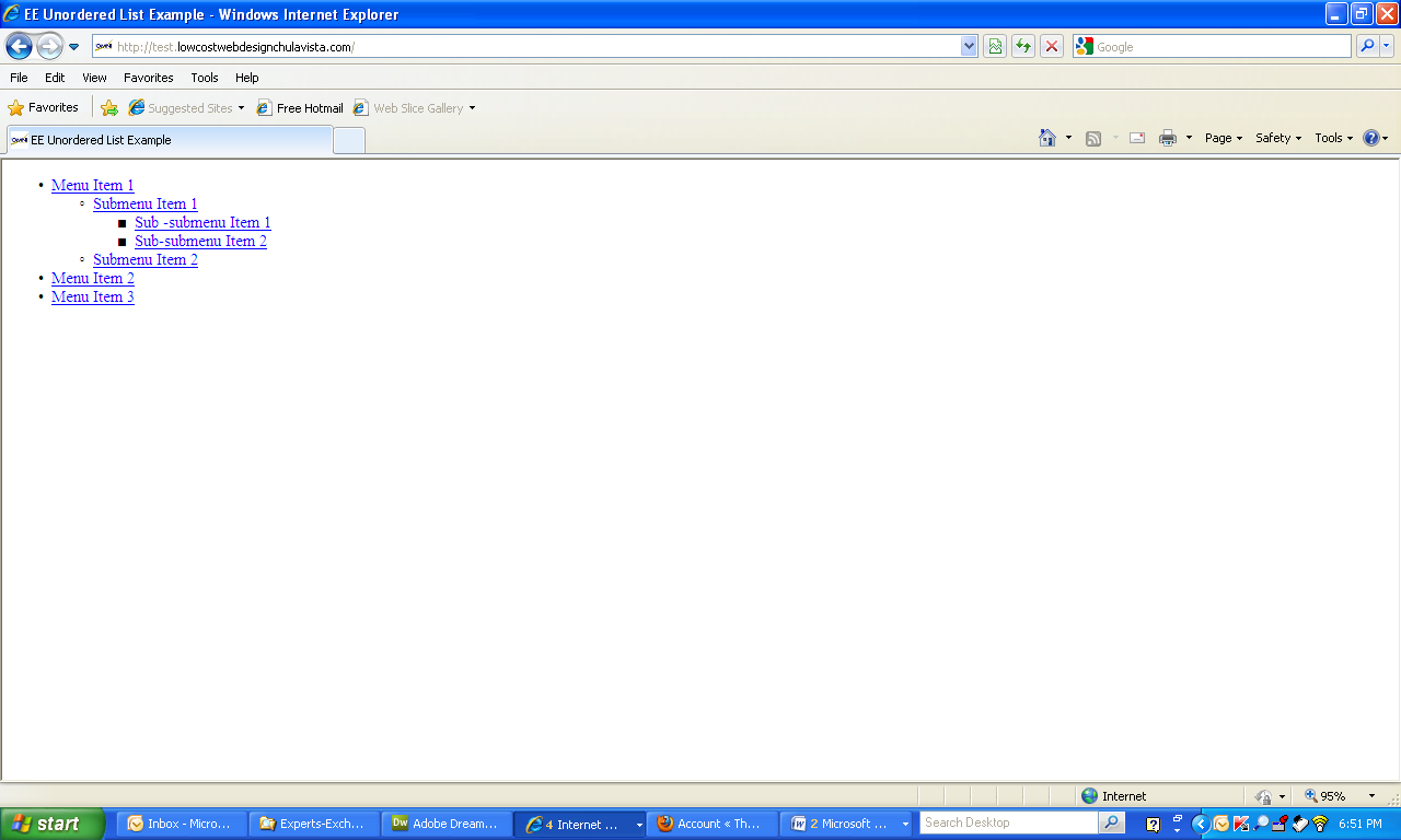
Now, if you do this, your end result will look similar to this:
![Unordered List Display]()
Not very impressive, is it? Not to worry, here is where the magic of CSS comes into play. For my example, I will use the last ul structure I gave you since it is the most complicated, and will demonstrate the power of some well placed CSS.
In this article, I will be setting up a horizontal menu, with a vertical drop-down submenu and a popup to the right sub-submenu.
First off, let’s add some well placed classes and id’s to the mix (you can do this any way you feel is best. Use mine simply as an example):
There are a variety of different ways you can achieve the effect of the horizontal menu. I will be sharing with you the method that works best for me.
Now that we have the HTML laid out properly with some strategically placed classes and id’s, let’s go ahead and start putting together the horizontal menu.
My method involves the use of floats, so you need to be sure that any floats that you have set on your page before this menu have been properly cleared otherwise you will not get the results as I will be describing them to you.
There are some browser set margins and padding that could interfere with your menu setup, so it is important that you do some preliminary CSS at the beginning of your CSS file:
The asterisk is a universal CSS selector and will reset all elements margins and paddings back to 0.
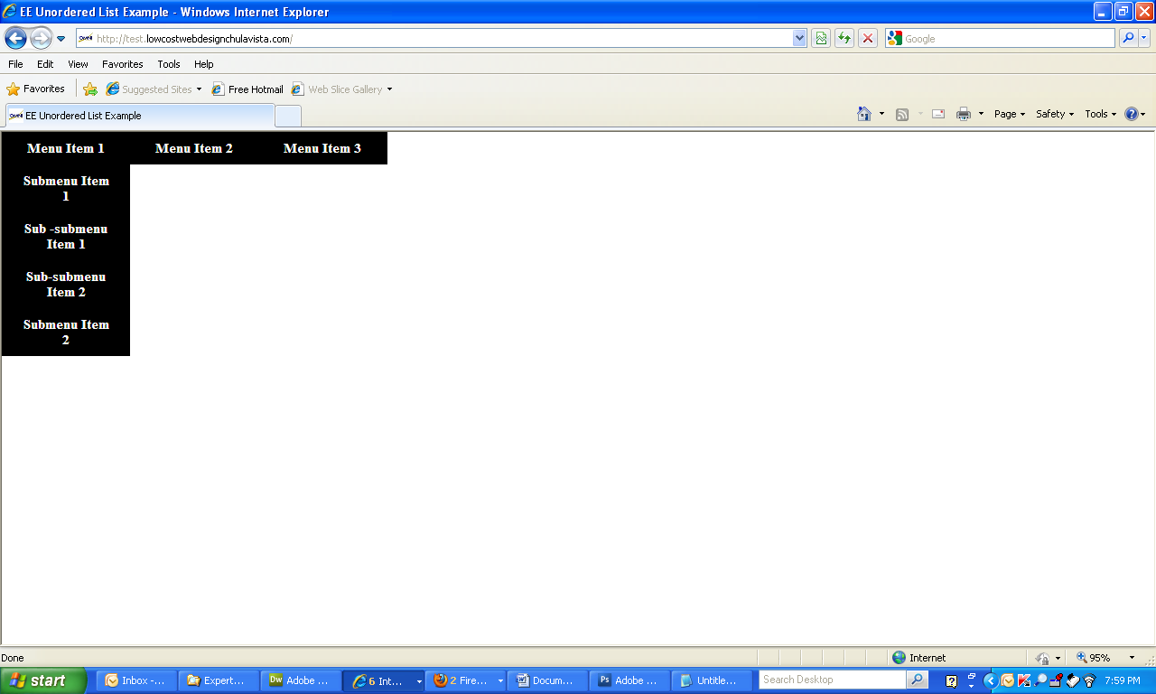
Now, let’s start by getting rid of the default list bullets and setting a float to the li’s in the list like so:
Doing that to our example menu gives us this:
![Unordered List Modified For Menu]()
Again, not too impressive, but you can see that the bullets are gone and that the menu items, for the most part, are together on the same line as the previous same level item. The only exceptions are the menu items that have submenu items, as these submenu items cause gaps in between the main menu items.
I would recommend at this point that you add a break or a div after the menu whose style is set to clear the floats so that the rest of your page doesn’t get messed up.
I use the following class:
and add it to a break at the end of the menu like so:
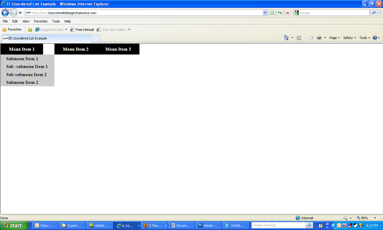
Since our goal was to create a vertical dropdown under the main menu items, let’s set the float on the submenu items to none as follows:
This gives us the following:
![Menu Modified For Vertical Dropdown]()
As you can see, the submenu items are now going down vertically as was our original intention, but it appears that the sub-submenu items are also in the same column. Let’s not worry about this for now. We will fix that later.
Right now, let’s start making these ugly looking links look more like menu buttons. Add some CSS for the main menu buttons by setting the styles for the main menu anchor tags:
Adding the above CSS makes the unordered list look like the following:
![Stylized Menu Buttons]()
But, oh wow, what happened? Didn’t we add CSS just to the li.main a elements? Why then are all the submenu items styled as well?
The submenus anchor tags got styled because they are considered to also be li.main a tags (in other words, anchor tags within an li.main tag). It is important to realize that the selector, li.main a, is telling your browser to style all anchor tags within an li.main element. It doesn't matter if that anchor is found encased several elements deep within li.main.
In order to correct this, we need to style the submenus. Remember as you style the submenus, that any style you do not override in your submenu styles will be carried over from the li.main a styling.
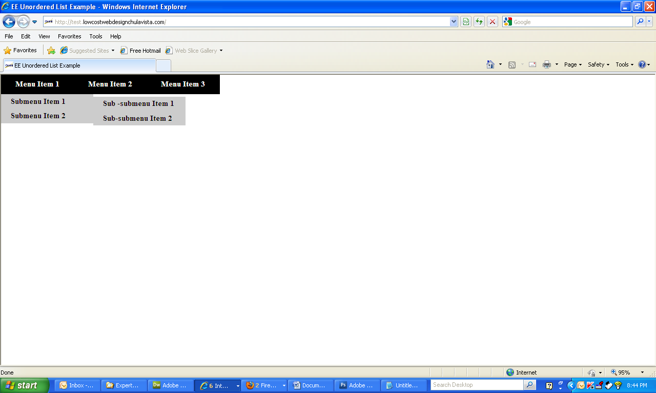
Let’s set up the submenus a little different, and let’s increase the width so that the menu labels don’t have to wrap, and set the text alignment to the left:
This gives us something like this:
![Stylized Submenus]()
“Now it’s starting to look like something”, you say, “But we still have the gap between the first and second main menu items and the sub-submenu items are still in line with the submenu items?”
Not to worry. This is where a little absolute and relative positioning come into play.
First, let’s make the li’s relatively positioned so that they can act as containers for the absolutely positioned ul’s we will need by adding that style to the already existing ul#menu li like so:
Now we can set the positions of the ul’s for each of the sub and sub-submenus by using absolute positioning:
Doing so gives us the following:
![Submenus Correctly Positioned]()
“Hey, that’s pretty good!”, you say, “but didn’t you say the submenus were supposed to be drop-down and the sub-submenus pop-up?”
Thanks for noticing. That is the last step in our process. In order to achieve this effect, we need to take the styles we just added and modify them slightly by simply adding display: none to the indicated selectors, then use display: block on the hover pseudo-class of the affected li and ul tags like so:
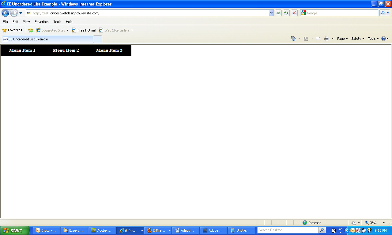
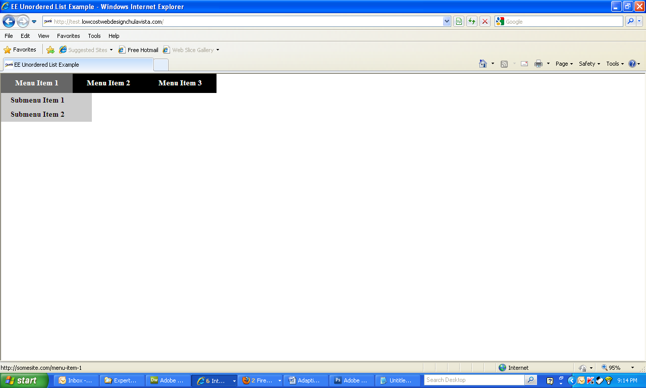
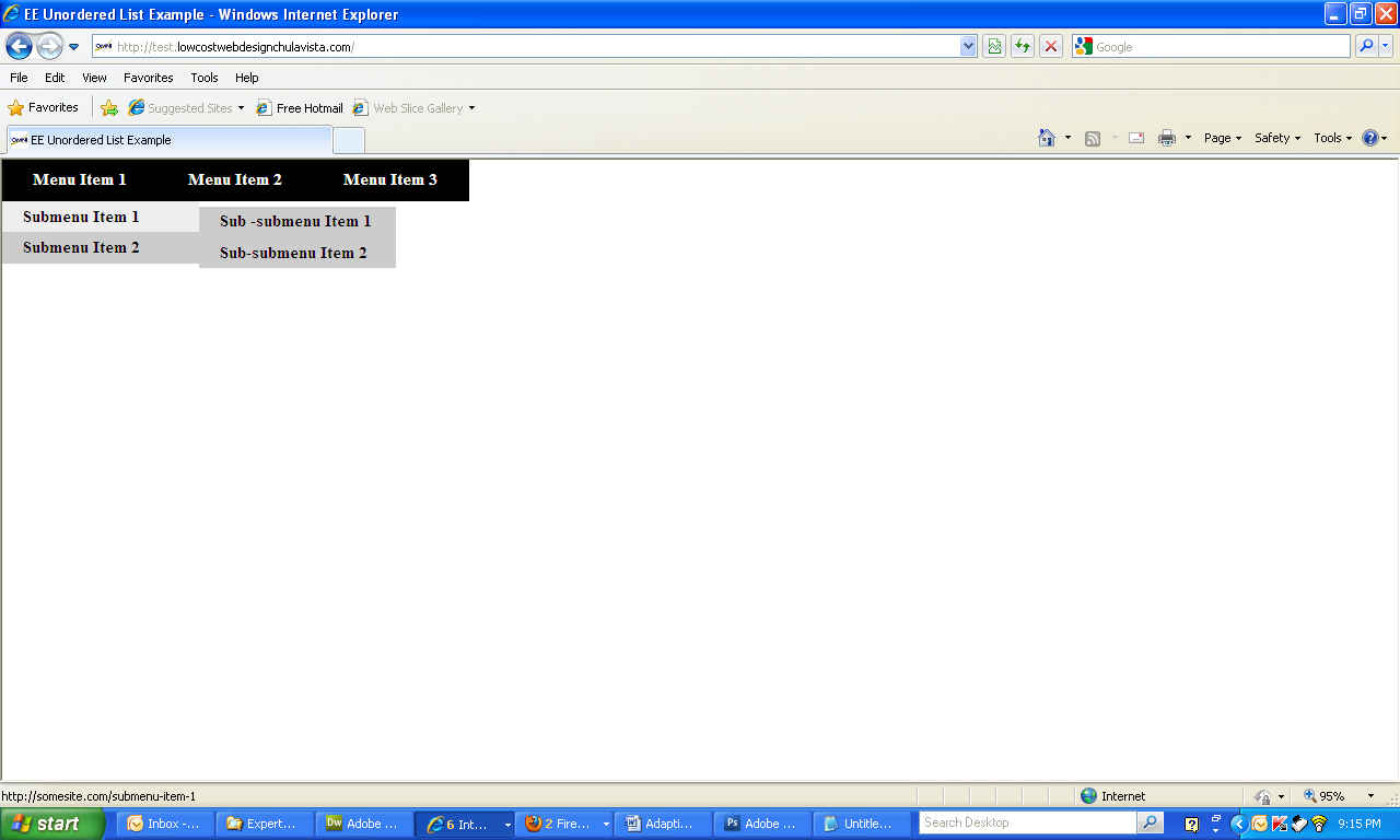
Your menu now should look similar to the following:
![Menu With Dropdown and Popup]()
![Hover Over Main Menu Item]()
![Hover Over Submenu Item]()
That’s all it takes to make a very basic, but fully functional horizontal menu with dropdowns and popups. You can add as many submenus and sub-submenus as you like and there will be little if no further need to change the CSS. Deeper level submenus (e.g. sub-sub-submenus, etc.) can be set up by simply following the logic of the CSS flow. If you desire something different, you can use your own ingenuity by adding more CSS, background images, and maybe even some javascript. Really there is no limit to what you can achieve with a little knowledge and a little creativity.
Should you have any problems in setting up your menus, I do invite you to make use of the experts here at EE. We can help you set up just about any menu you can think of.
The complete CSS for this menu is as follows:
Best of luck to you on all your future projects!
First off, you should know the general format for menus created using the unordered lists or ul tags. The actual menu links are contained within each of the ul’s list-item (li) tags in a manner similar to this:
<ul>
                      <li><a href=”http://somesite.com/menu-item-1”>Menu Item 1</a></li>
                      <li><a href=”http://somesite.com/menu-item-2”>Menu Item 2</a></li>
                      <li><a href=”http://somesite.com/menu-item-3”>Menu Item 3</a></li>
</ul>If you wish to add submenu items to the list, you simply need to contain another ul similar to what you have above within the li tag that you wish to contain the submenu items like so:
<ul>
                      <li><a href=”http://somesite.com/menu-item-1”>Menu Item 1</a>
                      <ul>
                      <li><a href=”http://somesite.com/submenu-item-1”>Submenu Item 1</a></li>
                      <li><a href=”http://somesite.com/submenu-item-2”>Submenu Item 2</a></li>
                      </ul>
                      </li>
                      <li><a href=”http://somesite.com/menu-item-2”>Menu Item 2</a></li>
                      <li><a href=”http://somesite.com/menu-item-3”>Menu Item 3</a></li>
</ul>You can continue this process, adding submenu items to submenu items if you wish to create sub-submenu items and beyond:
<ul>
                      <li><a href=”http://somesite.com/menu-item-1”>Menu Item 1</a>
                      <ul>
                      <li><a href=”http://somesite.com/submenu-item-1”>Submenu Item 1</a>
                      <ul>
                      <li><a href=”http://somesite.com/sub-submenu-item-1”>Sub -submenu Item 1</a></li>
                      <li><a href=”http://somesite.com/sub-submenu-item-2”>Sub-submenu Item 2</a></li>
                      </ul>
                      </li>
                      <li><a href=”http://somesite.com/submenu-item-2”>Submenu Item 2</a></li>
                      </ul>
                      </li>
                      <li><a href=”http://somesite.com/menu-item-2”>Menu Item 2</a></li>
                      <li><a href=”http://somesite.com/menu-item-3”>Menu Item 3</a></li>
</ul>Now, if you do this, your end result will look similar to this:
Not very impressive, is it? Not to worry, here is where the magic of CSS comes into play. For my example, I will use the last ul structure I gave you since it is the most complicated, and will demonstrate the power of some well placed CSS.
In this article, I will be setting up a horizontal menu, with a vertical drop-down submenu and a popup to the right sub-submenu.
First off, let’s add some well placed classes and id’s to the mix (you can do this any way you feel is best. Use mine simply as an example):
<ul id="menu">
                      <li class="main"><a href="http://somesite.com/menu-item-1">Menu Item 1</a>
                      <ul>
                      <li class="sub1"><a href="http://somesite.com/submenu-item-1">Submenu Item 1</a>
                      <ul>
                      <li class="sub2"><a href="http://somesite.com/sub-submenu-item-1">Sub -submenu Item 1</a></li>
                      <li class="sub2"><a href="http://somesite.com/sub-submenu-item-2">Sub-submenu Item 2</a></li>
                      </ul>
                      </li>
                      <li class="sub1"><a href="http://somesite.com/submenu-item-2">Submenu Item 2</a></li>
                      </ul>
                      </li>
                      <li class="main"><a href="http://somesite.com/menu-item-2">Menu Item 2</a></li>
                      <li class="main"><a href="http://somesite.com/menu-item-3">Menu Item 3</a></li>
</ul>There are a variety of different ways you can achieve the effect of the horizontal menu. I will be sharing with you the method that works best for me.
Now that we have the HTML laid out properly with some strategically placed classes and id’s, let’s go ahead and start putting together the horizontal menu.
My method involves the use of floats, so you need to be sure that any floats that you have set on your page before this menu have been properly cleared otherwise you will not get the results as I will be describing them to you.
There are some browser set margins and padding that could interfere with your menu setup, so it is important that you do some preliminary CSS at the beginning of your CSS file:
*
                      {
                           margin: 0;
                           padding: 0;
}The asterisk is a universal CSS selector and will reset all elements margins and paddings back to 0.
Now, let’s start by getting rid of the default list bullets and setting a float to the li’s in the list like so:
ul#menu
                      {
                           list-style: none;
                      }

                      ul#menu li
                      {
                            float: left;
}Doing that to our example menu gives us this:

Again, not too impressive, but you can see that the bullets are gone and that the menu items, for the most part, are together on the same line as the previous same level item. The only exceptions are the menu items that have submenu items, as these submenu items cause gaps in between the main menu items.
I would recommend at this point that you add a break or a div after the menu whose style is set to clear the floats so that the rest of your page doesn’t get messed up.
I use the following class:
.clearfloat { /* this class should be placed on a div or break element and should be the final element before the close of a container that should fully contain a float */
                          clear:both;
                          height:0;
                          font-size: 1px;
                          line-height: 0px;
}and add it to a break at the end of the menu like so:
<ul id="menu">
                      <li class="main"><a href="http://somesite.com/menu-item-1">Menu Item 1</a>
                      <ul>
                      <li class="sub1"><a href="http://somesite.com/submenu-item-1">Submenu Item 1</a>
                      <ul>
                      <li class="sub2"><a href="http://somesite.com/sub-submenu-item-1">Sub -submenu Item 1</a></li>
                      <li class="sub2"><a href="http://somesite.com/sub-submenu-item-2">Sub-submenu Item 2</a></li>
                      </ul>
                      </li>
                      <li class="sub1"><a href="http://somesite.com/submenu-item-2">Submenu Item 2</a></li>
                      </ul>
                      </li>
                      <li class="main"><a href="http://somesite.com/menu-item-2">Menu Item 2</a></li>
                      <li class="main"><a href="http://somesite.com/menu-item-3">Menu Item 3</a></li>
</ul><br class="clearfloat" />Since our goal was to create a vertical dropdown under the main menu items, let’s set the float on the submenu items to none as follows:
ul#menu li ul li
                      {
                            float: none;
}This gives us the following:

As you can see, the submenu items are now going down vertically as was our original intention, but it appears that the sub-submenu items are also in the same column. Let’s not worry about this for now. We will fix that later.
Right now, let’s start making these ugly looking links look more like menu buttons. Add some CSS for the main menu buttons by setting the styles for the main menu anchor tags:
ul#menu li.main a
                      {
                         width: 110px;
                         height: 20px;
                         padding: 10px 20px;
                         display: block;
                         font-weight: bold;
                         background-color: #000;
                         color: #FFF;
                         text-decoration: none;
                         text-align: center;
                      }

                      ul#menu li.main a:hover
                      {
                         background-color: #666;
}Adding the above CSS makes the unordered list look like the following:
But, oh wow, what happened? Didn’t we add CSS just to the li.main a elements? Why then are all the submenu items styled as well?
The submenus anchor tags got styled because they are considered to also be li.main a tags (in other words, anchor tags within an li.main tag). It is important to realize that the selector, li.main a, is telling your browser to style all anchor tags within an li.main element. It doesn't matter if that anchor is found encased several elements deep within li.main.
In order to correct this, we need to style the submenus. Remember as you style the submenus, that any style you do not override in your submenu styles will be carried over from the li.main a styling.
Let’s set up the submenus a little different, and let’s increase the width so that the menu labels don’t have to wrap, and set the text alignment to the left:
ul#menu li.main ul li.sub1 a
                      {
                         width: 150px;
                         padding: 5px 20px;
                         background-color: #CCC;
                         color: #000;
                         text-align: left;
                      }

                      ul#menu li.main ul li.sub1 a:hover
                      {
                         background-color: #EEE;
}This gives us something like this:
“Now it’s starting to look like something”, you say, “But we still have the gap between the first and second main menu items and the sub-submenu items are still in line with the submenu items?”
Not to worry. This is where a little absolute and relative positioning come into play.
First, let’s make the li’s relatively positioned so that they can act as containers for the absolutely positioned ul’s we will need by adding that style to the already existing ul#menu li like so:
ul#menu li
                      {
                      	float: left;
                      	position: relative;
}Now we can set the positions of the ul’s for each of the sub and sub-submenus by using absolute positioning:
ul#menu li.main ul
                      {
                      	position: absolute;
                      	top: 40px;
                      }

                      ul#menu li.main ul li.sub1 ul
                      {
                      	position: absolute;
                      	top: 5px;
                      	left: 190px;
}Doing so gives us the following:
“Hey, that’s pretty good!”, you say, “but didn’t you say the submenus were supposed to be drop-down and the sub-submenus pop-up?”
Thanks for noticing. That is the last step in our process. In order to achieve this effect, we need to take the styles we just added and modify them slightly by simply adding display: none to the indicated selectors, then use display: block on the hover pseudo-class of the affected li and ul tags like so:
ul#menu li.main ul
                      {
                      	position: absolute;
                      	top: 40px;
                      	display: none;
                      }

                      ul#menu li.main:hover ul, ul#menu li.main ul:hover
                      {
                      	display: block;
                      }

                      ul#menu li.main ul li.sub1 ul
                      {
                      	position: absolute;
                      	top: 5px;
                      	left: 190px;
                      	display: none;
                      }

                      ul#menu li.main ul li.sub1:hover ul, ul#menu li.main ul li.sub1 ul:hover
                      {
                      	display: block;
}Your menu now should look similar to the following:
That’s all it takes to make a very basic, but fully functional horizontal menu with dropdowns and popups. You can add as many submenus and sub-submenus as you like and there will be little if no further need to change the CSS. Deeper level submenus (e.g. sub-sub-submenus, etc.) can be set up by simply following the logic of the CSS flow. If you desire something different, you can use your own ingenuity by adding more CSS, background images, and maybe even some javascript. Really there is no limit to what you can achieve with a little knowledge and a little creativity.
Should you have any problems in setting up your menus, I do invite you to make use of the experts here at EE. We can help you set up just about any menu you can think of.
The complete CSS for this menu is as follows:
*
                      {
                      	margin: 0;
                      	padding: 0;
                      }

                      ul
                      {
                           list-style: none;
                      }

                      ul#menu li
                      {
                      	float: left;
                      	position: relative;
                      }

                      ul#menu li ul li
                      {
                            float: none;
                      }

                      ul#menu li.main a
                      {
                         width: 110px;
                         height: 20px;
                         padding: 10px 20px;
                         display: block;
                         font-weight: bold;
                         background-color: #000;
                         color: #FFF;
                         text-decoration: none;
                         text-align: center;
                      }

                      ul#menu li.main a:hover
                      {
                         background-color: #666;
                      }

                      ul#menu li.main ul
                      {
                      	position: absolute;
                      	top: 40px;
                      	display: none;
                      }

                      ul#menu li.main:hover ul, ul#menu li.main ul:hover
                      {
                      	display: block;
                      }

                      ul#menu li.main ul li.sub1 ul
                      {
                      	position: absolute;
                      	top: 5px;
                      	left: 190px;
                      	display: none;
                      }

                      ul#menu li.main ul li.sub1:hover ul, ul#menu li.main ul li.sub1 ul:hover
                      {
                      	display: block;
                      }

                      ul#menu li.main ul li.sub1 a
                      {
                         width: 150px;
                         padding: 5px 20px;
                         background-color: #CCC;
                         color: #000;
                         text-align: left;
                      }

                      ul#menu li.main ul li.sub1 a:hover
                      {
                         background-color: #EEE;
}Best of luck to you on all your future projects!
Have a question about something in this article? You can receive help directly from the article author. Sign up for a free trial to get started.
Comments (0)