melwong
asked on
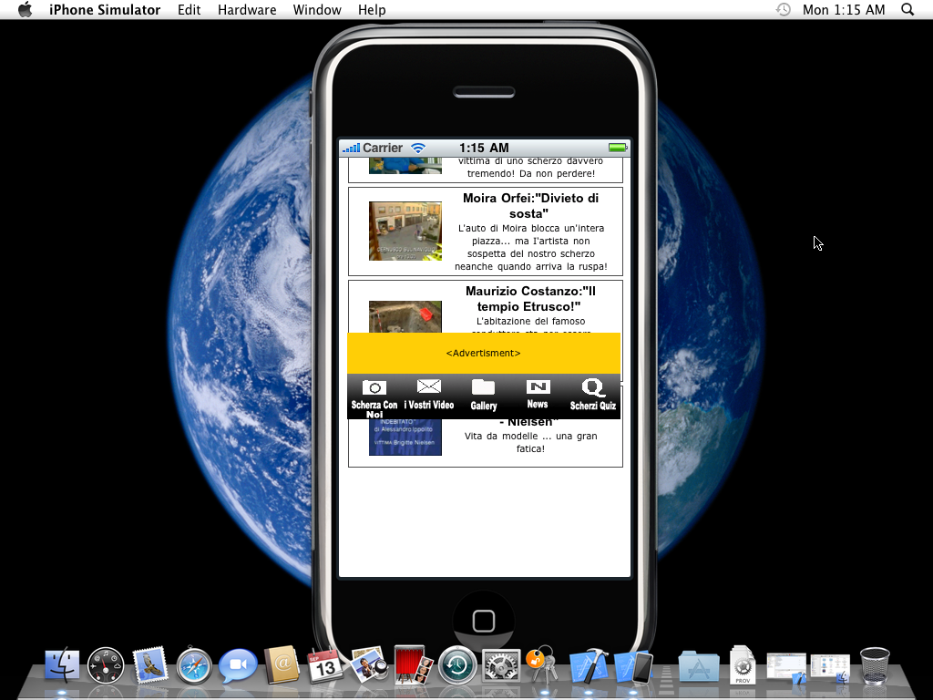
How to make div footer bar stays at the bottom of screen
we're making a simple iphone app where the whole app is actually a website packaged into an iphone app. We have is that we created a footer bar using div that suppose to stay at the bottom of the screen, when the page is scrolled up and down. Prob is the footer bar tends to follow the motion of the scrolling.
How do we force the footer bar to stay at the bottom?
How do we force the footer bar to stay at the bottom?
<!DOCTYPE html PUBLIC "-//W3C//DTD XHTML 1.0 Transitional//EN" "http://www.w3.org/TR/xhtml1/DTD/xhtml1-transitional.dtd">
<html xmlns="http://www.w3.org/1999/xhtml">
<head>
<meta http-equiv="Content-Type" content="text/html; charset=utf-8" />
<meta name = "viewport" content = "initial-scale = 1.0; width=device-width" />
<title>Scherziaparte - Invia il tuo video</title>
<link href="menuLink.css" rel="stylesheet" type="text/css" />
</head>
<body>
<div style="z-Index:1000;position:fixed;width:300;height:80px;text-align:center; top:0%;">
<?php require_once "headerIphone.php"; ?>
<?php require_once "menuLink.php"; ?>
</div>
<table width="300" height="83" border="0" cellspacing="0" cellpadding="0">
<tr>
<td></td>
</tr>
</table>
<table width="300" border="0" cellspacing="0" cellpadding="0">
<tr>
<td>
<table width="300" border="0" align="center" cellpadding="0" cellspacing="0">
<tr>
</tr>
</table>
<table width="300" height="300" border="0" cellspacing="0" cellpadding="0">
<tr>
<td valign=top>
<!-- Scroll bar-->
<!--<div id=ajaxLink class="tab_container" style="position:absolute; width:300px; height:300px; background-color:#ffffff; overflow:auto;">
-->
<div id=ajaxLink class="tab_container" >
<table width="300" border="0" cellspacing="0" cellpadding="0">
<tr>
<td></td>
</tr>
</table>
<?php require_once "video.php"; ?>
</div>
</td>
</tr>
</table>
<div style="z-Index:1000;position:fixed;width:300;height:480;text-align:center; bottom:0%; padding-left:1px">
<?php require_once "advertisment.php"; ?>
<?php require_once "footer.php"; ?>
</div>
</td>
</tr>
</table>
<p> </p>
</body>
</html>
SOLUTION
membership
This solution is only available to members.
To access this solution, you must be a member of Experts Exchange.
See the attached document. I have not done much programming for the iPhone but from what I understand basic HTML and CSS rules should apply (at least the ones that Safari would normally adhere to).
I also tested this by viewing it on my iphone; you can test for the time being here (http://sscharlau.com/test.php) and it worked fine. You'll have to use two fingers in order to slide the content however (information about that can be found here: http://darklaunch.com/2009/05/11/iphone-css-overflow-overflow-x-overflow-y-support)
Ultimately I believe what you may have been missing was an overflow tag as without it, the div doesn't know when to stop expanding.
let me know
test.php
please refer: http://mark-allen.net/notes/layout/footer/
ASKER
We tried all the above prior to posting this question and all didn't work. The prob is the footer stayed when the page is viewed in browser like FF, IE, Safari, but not in IPhone.
ASKER CERTIFIED SOLUTION
membership
This solution is only available to members.
To access this solution, you must be a member of Experts Exchange.
ASKER
Prob solved.
Try a layout something like this:
HTML file:
<head>
<link type="text/css" rel="stylesheet" href="new.css">
<!—[if lt IE 7]>
<link rel="stylesheet" type="text/css" href="ie6.css" />
<![endif]—>
</head>
<body>
<div id="container">
<div id="header">Header</div>
<div id="nav">
<ul>
<li><a href="#">Home</a></li>
<li><a href="#">Page 1</a></li>
<li><a href="#">Page 2</a></li>
</ul>
</div>
<div id="content">Content Here.</div>
<div class="clearfooter"></div>
</div><!—End Container—>
<div id="footer">Footer Here.</div>
CSS (new.css):
html, body {
height: 100%;
}
#container {
min-height: 100%;
margin-bottom: -200px;
position: relative;
}
#footer {
height: 200px;
position: relative;
}
.clearfooter {
height: 200px;
clear: both;
}
#container {
height: 100%;
}