Chart or Pivot Chart in Access
I need to create a Chart which seems like it should be easy. At least it is easy in Excel.
To get the Total RIF it would be
DCount("*","[Main-RIFInfo]
Similarly to get the total for each of the categories would be
DCount("*","[Main-IIFInfo]
DCount("*","[Main-ATRInfo]
DCount("*","[Main-StartupI
I also have a table of errors. This table is not indexed and has a simple structure like [Stage],[CDN] [AddDate]
So the total number of RIF Errors would be DCount("*","[TBL_Performan
DCount("*","[TBL_Performan
DCount("*","[TBL_Performan
DCount("*","[TBL_Performan
What is the best method for creating a graph like above with my information distributed like it is.
Thanks
ASKER
I just whipped up a new database.
In my chart I need Total number of records in RIF table vs. Number of records in TBL_Errors where category is RIF etc...
Database5.accdb
In my chart I need Total number of records in RIF table vs. Number of records in TBL_Errors where category is RIF etc...
Database5.accdb
I'm confused?
Can you tell me if the data in the sample DB matches the data in the Chart you posted?
If it does not, then can you tell me, (or post a new chart) than shows a chart based on the data in the sample DB?
Can you tell me if the data in the sample DB matches the data in the Chart you posted?
If it does not, then can you tell me, (or post a new chart) than shows a chart based on the data in the sample DB?
Also, I am not sure if your data structure is optimal for what you are trying to do.
You have 4 tables here all seemingly in a 1:1 relationship to each other...
...and an "Errors" table that I am not sure how to join (relate) to the others to make one query to get the results you are looking for...
Can you post an Excel File (with this same data) and create the same chart?
This is so I can see how you managed to do this in Excel, then duplicate this in Access.
Thanks
JeffCoachman
ASKER
I just entered the data in in Excel manually.
These tables are linked on a field called IDTag that I didn't include in the sample database. But the data between RIF, IIF, ATR, and Startup with TBL_Errors is unrelated. TBL_Errors is just a storage dump. If certain things happen over time, it generates an error in this table. I just need the counts of them by stage.
These tables are linked on a field called IDTag that I didn't include in the sample database. But the data between RIF, IIF, ATR, and Startup with TBL_Errors is unrelated. TBL_Errors is just a storage dump. If certain things happen over time, it generates an error in this table. I just need the counts of them by stage.
So,... will you be posting the Excel file with the raw data and the chart?
ASKER
ASKER
Any suggestions?
I find it hard to believe that something so simple in Excel cannot be made in Access.
I'm not very familiar with Charts and Pivot Charts.
I find it hard to believe that something so simple in Excel cannot be made in Access.
I'm not very familiar with Charts and Pivot Charts.
<Any suggestions?>
Yes, please keep in mind that I, like most Experts here work full time and only volunteer here.
Again, the charts in the screenshot and the Excel file you posted does not seem to match the data in the Database file you posted.
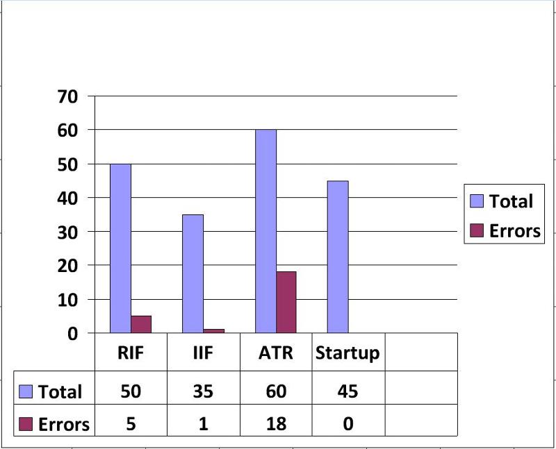
How are you getting a "RIF" value of 50 in your charts based on the 25 records in the RIF Table?
Also, I cannot reconcile if the "Error" value is a sum or a count.
In other words your charts seems to be based on "Summarized" data, yet you do not show how the Raw data in the sample DB translates into these summary values.
Please clarify, or better yet post the table data that corresponds to "your" charts, ...or create a new chart based on the DB raw table data.
The explain how each summarized value is obtained.
JeffCoachman
Yes, please keep in mind that I, like most Experts here work full time and only volunteer here.
Again, the charts in the screenshot and the Excel file you posted does not seem to match the data in the Database file you posted.
How are you getting a "RIF" value of 50 in your charts based on the 25 records in the RIF Table?
Also, I cannot reconcile if the "Error" value is a sum or a count.
In other words your charts seems to be based on "Summarized" data, yet you do not show how the Raw data in the sample DB translates into these summary values.
Please clarify, or better yet post the table data that corresponds to "your" charts, ...or create a new chart based on the DB raw table data.
The explain how each summarized value is obtained.
JeffCoachman
ASKER
<<Any suggestions?>
Yes, please keep in mind that I, like most Experts here work full time and only volunteer here>
I volunteer on here as well answering questions and work full time as well, I know exactly how it goes.
Let me try this over again to clear up anything and everything.
Database5.accdb
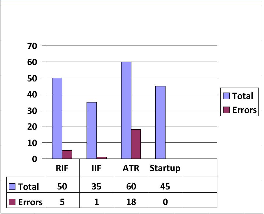
This is a database that has sample data. We will start with these 4 tables:
ATR - 38 Total Records
RIF - 33 Total Records
IIF - 40 Total Records
Startup - 45 Total Records
Then there is TBL_Errors
We will break this table down where stage =
ATR - 14 records
IIF - 2 Records
RIF - 9 Records
Startup - 5 Records.
This would produce a graph like this:
EE-Example-Report.xlsx
So to summarize: The Blue (Total) bar comes from the total number of records in their respective table. The Red (Errors) bar comes from the number of records in TBL_Errors where the stage is equal to that respective category.
I hope this clears is up. Sorry my data was unrelated and vague. This should be more explicit and how the original question should have been worded.
Yes, please keep in mind that I, like most Experts here work full time and only volunteer here>
I volunteer on here as well answering questions and work full time as well, I know exactly how it goes.
Let me try this over again to clear up anything and everything.
Database5.accdb
This is a database that has sample data. We will start with these 4 tables:
ATR - 38 Total Records
RIF - 33 Total Records
IIF - 40 Total Records
Startup - 45 Total Records
Then there is TBL_Errors
We will break this table down where stage =
ATR - 14 records
IIF - 2 Records
RIF - 9 Records
Startup - 5 Records.
This would produce a graph like this:
EE-Example-Report.xlsx
So to summarize: The Blue (Total) bar comes from the total number of records in their respective table. The Red (Errors) bar comes from the number of records in TBL_Errors where the stage is equal to that respective category.
I hope this clears is up. Sorry my data was unrelated and vague. This should be more explicit and how the original question should have been worded.
Sorry buddy, ...I'm still confused.
1. You state: "This would produce a graph like this:"
The word "This" being singular, but in the Excel file there are 6 charts.
(Six, being plural)
Did you mean to say: "These"?
If, However, you are referring to only one chart ("This"), then which one specifically?
2. On the first chart, you have 50 for RIF.
It is still not clear to me where this "50" comes from.
Meaning in the Access "Database", (I can clearly see where the 50 comes from in the spreadsheet) what comprises this 50?
50 What? ...from what table(s)?
3. In the Spreadsheet charts you are graphing data by the month, ..Yet I so no dates whatsoever in the Access data?
Am I missing something here?
How am I to produce charts by month with no dates in the data?
Where is this Access data coming from?, and how does it correspond to the Excel data and charts?.
Again, perhaps I am missing something simple, but I do not see how any of the Access data values translates into any of the Excel data values?
In the Excel file:
Total Errors
RIF 50 8
IIF 35 2
ATR 88 19
Startup 60 7
Please tell me how these values are derived from the Access table data?
For example:
50 is for RIF in Excel.
In Access the RIF table has 33 records, no match there...
In tblErrors, there are 9 RIF records, no correlation there either...
If tblErrors, the Sum of discrepancies is 797, still no correlation...
Again, where/how are you getting 50 for RIF in the Access data?
I needed to see the Charts and the data in excel.
This you have done.
But I also need to see this *exact* same data represented in the Access data.
(I don't care what form it takes, I just need to see that the 50 in Excel can be derived from the Access data.
This is what we are missing here.
I am anxious to get started in this, but i am still confused...
Jeff
Another example:
You state:
"The Blue (Total) bar comes from the total number of records in their respective table."
in the Access data the RIF table has 33 records, not 50.
In fact, none of the tables have 50 records.
This "50 "is very elusive in the Access data...
;-)
I need matching data.
You state:
"The Blue (Total) bar comes from the total number of records in their respective table."
in the Access data the RIF table has 33 records, not 50.
In fact, none of the tables have 50 records.
This "50 "is very elusive in the Access data...
;-)
I need matching data.
ASKER CERTIFIED SOLUTION
membership
This solution is only available to members.
To access this solution, you must be a member of Experts Exchange.
ASKER
Jeff,
I was struggling yesterday. I clicked and opened the wrong excel file to post!!!!!!!!! arg!!!!!
Yes!!!!!!!!!!!!!! You got it! That is what I was looking for, and I gave you wrong terrible direction the whole way. you didn't necessarily have to do it for me, but thanks!
I've never used Charts or Pivot Charts, but with your example I will do a little studying and become more familiar.
Thanks again,and Sorry again!
OK,
But here is some background.
The Temp table could probably be a SQL query, but not knowing enough about how to Union two queries that contain only aggregate functions, prohibited me from doing so.
;-)
The other issue is the structure of this data.
As far as I can tell, the RIF, IIF, ATR, and Startup data should all be in the same table.
This way you avoid all of the "Aggregation Aggravation".
I am also curious as to why each table has an RIF_status Field? (When RIF is it's own table, so even RIF has an RIF Status filed...?).
Finally what's the deal with the "Description" Field, that only contains the word "Description"?
That's like having a "New York" field, that only contains "New York" for every record...
Why?
JeffCoachman
<What is the best method for creating a graph like above with my information distributed like it is.>
AFAICT, You would need to create a basic chart.
Remember that the chart can summarize the data, so there may not be a need for the summaries you posted.
In other words, we just need to see the raw data.
So can you post a sample of this database?
Sample database notes:
1. Back up your database(s).
2. Combine the front and back ends into one database file.
3. Remove any startup options, unless they are relevant to the issue.
4. Delete any objects that do not relate directly to the issue.
5. Remove any references to any "linked" files (files outside of the database, Images, OLE Files, ...etc)
6. Remove any references to any third party Active-x Controls (unless they are relevant to the issue)
7. Remove, obfuscate, encrypt, or otherwise disguise, any sensitive data.
8. Compile the code. (From the database window, click: Debug-->Compile)
9. Run the compact/Repair utility.
10. Remove any Passwords and/or security.
11. Post explicit steps to replicate the issue.
12. Test the database before posting.
In other words, ...post a database that we can easily open and immediately see the issue.
Thanks
JeffCoachman