Not sure why this happens on Safari for iPad
http://www.listinventory.com
It looks all "squished" on the iPad.
Been tasked with finding out why.
Worked fine until adding the featured product block on the right yesterday.
What did I screw up? It doesn't do this in Safari for Windows.
It looks all "squished" on the iPad.
Been tasked with finding out why.
Worked fine until adding the featured product block on the right yesterday.
What did I screw up? It doesn't do this in Safari for Windows.
ASKER
which one you talking about?
I can't tell what it is. In chrome it is in the upper left and has a weird box when you scroll over it. To the left of the header/title image.
ASKER
I don't care about Chrome. I was asking for iPad views.
ASKER
In Safari 4 Windows it looks just fine but in iPad, not.
I know. But I think that is causing the issue. I looked at it on my iPad. There is some funky code there causing the issue.
ASKER
Those images are coming from a jQuery plugin called jQZoom.
ASKER
Even when I disable the plugin, it still happens
ASKER
My boss just left with his iPad, I can't check it on my own now, sigh!
ASKER
Also looks fine on my Android, except for the Flash. I don't get the jQZoom effect on the images, though because there is no pointer on the phone.
Well, I am looking at it again right now, and the reason it looks "Squished" is because there is horizontal scrolling for a significant distance. probably about 5000-6000 pixels.
Also, your main div isn't centered.
I don't know of any debugging consoles for iPad. I will look around some more.
Also, your main div isn't centered.
I don't know of any debugging consoles for iPad. I will look around some more.
ASKER
Wonder what has a width set to that much? I don't see it.
I am sure that it is just some weird code somewhere that is causing the issue.
Could you try removing the JQZoom object temporarily so I can recheck to see if that is possibly causing the issue?
Could you try removing the JQZoom object temporarily so I can recheck to see if that is possibly causing the issue?
ASKER
#container has
width: 1100px;
and
#inner_content has
width: 1080px;
and
#navigation has
text-indent:-9999px;
Could those be the culprits? This just started happening yesterday, though.
width: 1100px;
and
#inner_content has
width: 1080px;
and
#navigation has
text-indent:-9999px;
Could those be the culprits? This just started happening yesterday, though.
ASKER
jqZoom disabled now.
Thanks. I was wrong. Not the issue. Still has the crazy horizontal scrolling. I will keep researching it.
ASKER
I wrote code to essentially disable jQZoom. I check for the userAgent and if it's iPhone or iPad, I don't even include the jQZoom code.
Now, you don't think it could be the AddThis "plugin" do you? I see this code in the rendered HTML:
Now, you don't think it could be the AddThis "plugin" do you? I see this code in the rendered HTML:
<div style="visibility: hidden; height: 1px; width: 1px; position: absolute; z-index: 100000;" id="_atssh">...</div>
I will check when I get back to my desk. Sorry I got caught up and haven't been near my ipad.
ASKER
Have you come up with anything? I thought it was the width of the Featured Products block on the upper right that made the viewport too wide. I modified it
to be the same as the adsense block and still, it squishes it. I have even moved the block back to the left side and still it is squished.
How am I going to figure this one out?
to be the same as the adsense block and still, it squishes it. I have even moved the block back to the left side and still it is squished.
How am I going to figure this one out?
Sorry I had a crazy busy weekend with family. I will look at it some more this morning.
ASKER
Can you test it now to see if it still comes up squished? I have made some changes.
Also, could you see if the images for the board posts at the bottom have a zoomer.
I'm not sure how you would do that on an iPad since it usually takes a cursor.
Also, could you see if the images for the board posts at the bottom have a zoomer.
I'm not sure how you would do that on an iPad since it usually takes a cursor.
Still doing it.
It is definitely a mobile browser issue. It is doing the same thing on my iPhone.
Still digging through the code.
It is definitely a mobile browser issue. It is doing the same thing on my iPhone.
Still digging through the code.
I did make some progress.
I got firebug lite for safari installed and enabled the ipad render mode for safari. working through it now.
I got firebug lite for safari installed and enabled the ipad render mode for safari. working through it now.
ASKER CERTIFIED SOLUTION
membership
This solution is only available to members.
To access this solution, you must be a member of Experts Exchange.
ASKER
know what line in what CSS file? Don't find one if those in my CSS.
if you can't find it, just put this in your css:
img.center {
  margin: 0 !important;
}
BOOM!
Looks great!
Looks great!
ASKER
Is it this one?
what that CSS does is center the small image in the QuickDeals section of the header.
img.center {
  margin: 0 -999em;
}what that CSS does is center the small image in the QuickDeals section of the header.
ASKER
Know of any other way to do it?
Well, it looks centered to me and the margin fix made it work on the ipad.
Here is a screen shot.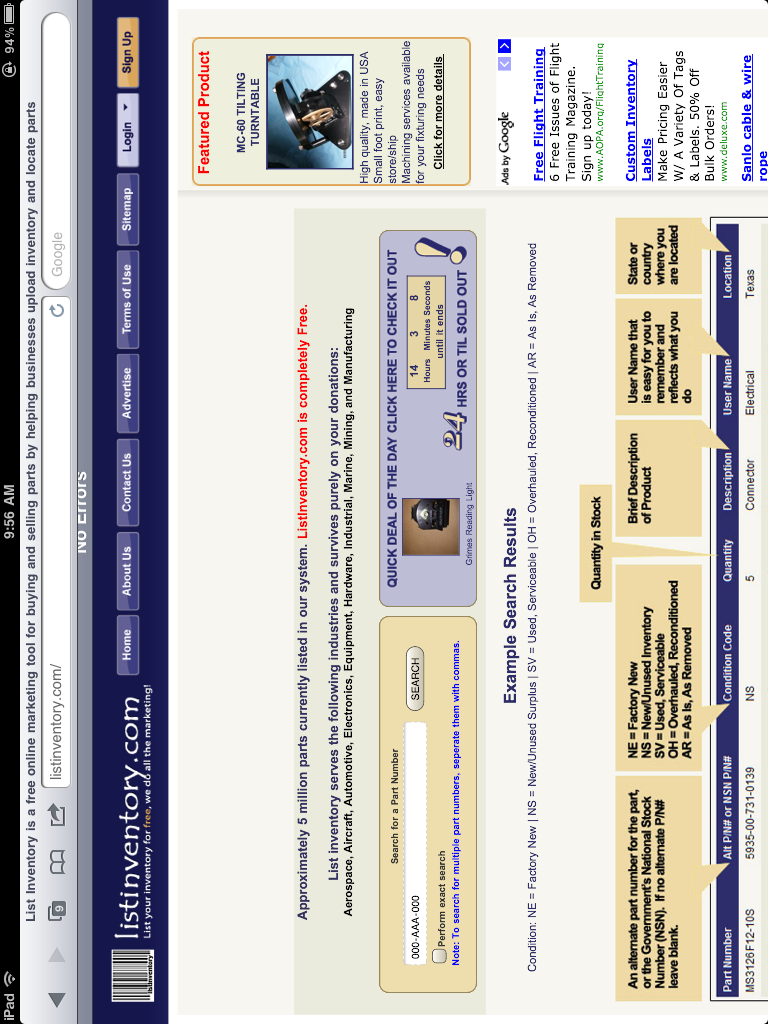
Here is a screen shot.
I just checked every browser, and it is centered in all and the iPad and iPhone look great too.
Looks like the margin of that img.center class fixed the issue.
Looks like the margin of that img.center class fixed the issue.
ASKER
the image of the Grimes Reading Light is not centered. Can you also check the click functionality of the div around the Featured Product on the right?
The entire div has a click bound to it, not just the anchor.
The entire div has a click bound to it, not just the anchor.
The featured product clicking is great.
What do you mean Grimes Reading Light?
What do you mean Grimes Reading Light?
ASKER
The photo of the little light in the QuickDeal Of The Day area next to the countdown timer
From what I can tell that image has a width of 60px defined in the css but it is not 60px wide.
If you remove the 60px width, it stretches to its normal size.
It is the #link_img selector.
If you remove the 60px width, it stretches to its normal size.
It is the #link_img selector.
ASKER
I want it to be 60px tall.
I will remove the width attribute, that takes care of it I think.
I will remove the width attribute, that takes care of it I think.
Yeah, that is what I meant..........
Anything else?
Anything else?
ASKER
He's gonna have to live with that one because he's the one clamoring to make this work for all of our 30 iPad visitors last month, .vs 100,000 visitors on all the other browsers combined.
ASKER
Excellent work, thanks a lot.
That thing doesn't even appear in FF.