Logo Ideas
Hello EE,
I'm having trouble coming up with an identity (logo) for my business. I have tried coming up with the following keywords that best describes me and what services I offer but not sure what type of shape(s) to use to represent the keywords that I would like to use.
Keywords that I would like to use to come up with an identity logo:
- Reliable
- Professional
- Honest
- Computer, Data, Web and Network related Services
- Friendly
The name of my business is called "One Click Away IT" but I'm also not sure if I should just use "OCAIT" for short.
I'm using a bold professional looking font for starters but just drawing a blank for the logo/shape to use for my brand identity.
Any help would be greatly appreciated...
ASKER CERTIFIED SOLUTION
membership
This solution is only available to members.
To access this solution, you must be a member of Experts Exchange.
Interesting question, in all honesty, I would take a look around at competition and companies related to your field and get a feel for what people are used then. That will give you a gauge of colors/fonts to use. Here are two interesting blog posts about brand design/color:
Colors in Corporate Brands
A Guide to Choosing Colors
Along with looking at the competition, I would look at companies that represent the characteristics you describe and notate the things that stand out to you. This will give you a bunch of ideas of what you do and don't like and how other companies are branding themselves. Your logo should be iconic enough where your customers will engage with it, but also you should love your logo as well.
A website that my friends have had success with Logo Tournament. Essentially, it is a tournament where designers from all over the world compete to make a logo that best fits your needs. You can input all the information you provided in this question with examples companies you want to follow and you let the designers do the work. You go through and rank the logos and comment on what you like and don't like. The designers then make tweaks to the design until you come to something you like. The minimum cost is $275 (which is a bargain for the design work you get) and tournament lasts 7 days. Just an option if you are looking for an inexpensive way to get a professional logo created.
Good luck
Matt
ASKER
I plan on using 4 different colors but also want to make sure that the logo that i choose to use looks fine black and white as well as color. Are there certain shapes to use for certain purposes or is it just up to the designer what they want to use?
Here is another blog post that can help you with that touches on shapes: What Your Logo Says About You
Shape - Shape is a very powerful thing when constructing a logo. It can be used to represent your company's stability, flexibility, or power, depending on what shapes or lines are used. Long, angular shapes, like rectangles, are said to be somewhat dominating; while round, proportionate shapes symbolize harmony and/or perfection. Just using lines can convey an array of emotions, so be cautious of how you use them. Curves and slight edges can help your company create a softer, more casual image. The sharp edges found in a square may represent formality or tension. They are often used for technology-based logos. Use the shape or line structure that best reflects the vision of your company.
I've been admiring a logo that I saw on the Chase banking website. It's basically a simple mouse where the cord forms a new shape. Since your business has 'one click' in the name it might be cool to use the mouse idea in your logo, and have the cord form one or two of the letters. Take a look at the image I attached, the first one is the logo from Chase that I like, then a simple example of what I was thinking for your logo.
The mouse is good to, because it can work in multiple colors and would probably even be good in black and white, if you needed to use it that way.
Hopes this helps.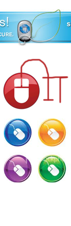
The mouse is good to, because it can work in multiple colors and would probably even be good in black and white, if you needed to use it that way.
Hopes this helps.
The name of my business is called "One Click Away IT" but I'm also not sure if I should just use "OCAIT" for short.
Using initialism to describe your company is best reserved for business that have been established for long enough that the public begins using the initials as a common short-hand. GE was General Electric for decades before it became GE, same goes for IBM. FedEx operated for 23 years as Federal Express before adopting the name that they had come to be known as.
I doubt that any of your customers call you OCAIT. "We're having computer troubles again? Better give OCAIT a call."
An acronym can sometimes be good - where the initials spell out a familiar word, but OCAIT is not likely to stick in peoples memory. Besides, it is easily to be confused with OCCULT, not a good marketing name to be associated with.
I would stick to using your full name, or full name combined with a meaningful symbol.
ASKER
Hi D_Brugge,
Would you be able to creatiqe the two symbols that I have attached in the pdf file? I have the name typed out fully and never took into consideration what you said on your last post but it makes perfect sense. Alot of people know me as being respectable, professional, trustworthy and I offer Computer, Data, Web and Network services. I have read that squares help with the meaing of my site but wanted to get critiques by you experts.
Thanks in advance!!!
ee.pdf
I like the first one. The square symbol brings to mind a computer monitor and the size and shape help to balance the "IT" at the other end. The type face is nice having the lower case "i" with a square to echo the square symbol.
The second logo does just the opposite. You lose the balance. All of the attention goes to the center of the cross hairs, and I don't get a sense of what the cross is suppose to convey.
I suggest that you change the lettering from black to the darkest color of your symbol in order to tie the two together more. I would also reduce the space between the words, and close up the space between the A and the w. I would then increase the space between the I and the T so that it is more easily read as I.T. and not the word "it."
I would also work with variations to see if there is a way to stack some of the words in order to make a square (or at least, more square) version for when you need your logo to fit into a tight space.
SOLUTION
membership
This solution is only available to members.
To access this solution, you must be a member of Experts Exchange.
ASKER
Hi D_Brugge,
What do you think about these two. Same symbl but two different thicknesses. Let me know what you think.
ee.gif
What do you think about these two. Same symbl but two different thicknesses. Let me know what you think.
ee.gif
I would really like to hear from the other folk here to see what they think.
I like them both, but the thicker one has more presence. Perhaps try making the bars tapered, so that they are thinner at one end than the other.
Also, tuck the period after the capital T closer so that it is the same distance from the stem as the period is from the capital letter I, and move the w a bit closer to the capital letter A
ASKER
Hi D_Brugge,
Not sure what you mean by tapered so that they are thinner at one end than the other. Do you mean make the left and right bar thinner and leave the top and bottomer bar thicker?
Also, what's your opionion on the way the colors flow, does it matter that i'm going clockwise from green to dark purple?
Not sure what you mean by tapered so that they are thinner at one end than the other. Do you mean make the left and right bar thinner and leave the top and bottomer bar thicker?
Also, what's your opionion on the way the colors flow, does it matter that i'm going clockwise from green to dark purple?
I was thinking something like this... 
Perhaps even rotate them on their axis a bit. It might not be a solution, just an idea to play with.
Perhaps even rotate them on their axis a bit. It might not be a solution, just an idea to play with.
Here is an example how one designer went through the process of developing a logo. This is of course, a very condensed version. It doesn't show all of the wrong paths that he went down first.
http://www.theatlantic.com/magazine/archive/2011/05/michael-bierut/8456/
http://www.theatlantic.com/magazine/archive/2011/05/michael-bierut/8456/
I just went through this one myself for my new IT company.
I used http://www.logomaker.com/ and came up with a nice logo for myself, which is attached.
I am in no way creatively inclined but it seems to work nicely.
Give it a try.
Thanks,
Kelly W.
I used http://www.logomaker.com/ and came up with a nice logo for myself, which is attached.
I am in no way creatively inclined but it seems to work nicely.
Give it a try.
Thanks,
Kelly W.
ASKER
Hi K Wilke,
Could you critique this for me? I saw the site that you posted and I like it but trying to come up with something different. Please critique and don't hold back :)
OCAIT-Logo.png
Could you critique this for me? I saw the site that you posted and I like it but trying to come up with something different. Please critique and don't hold back :)
OCAIT-Logo.png
I like it but I would put some color into it.
Black and white logos are very forgettable and when you are presenting yourself to a future client you want to grab their attention.
Just stay away from all red since red creates emotions of anger.
Thanks,
Kelly W.
Black and white logos are very forgettable and when you are presenting yourself to a future client you want to grab their attention.
Just stay away from all red since red creates emotions of anger.
Thanks,
Kelly W.
ASKER
Sounds good. I will repost once I determine what colors to use. Thanks.
ASKER
Hi K Wilke/D_Brugge,
Could either one of you two or both critique what I came up with? I'm still not sure or understnad how one is to use/decide on a symbol to represent their logo for their company. I'm very confused by this.
Untitled-1.png
Could either one of you two or both critique what I came up with? I'm still not sure or understnad how one is to use/decide on a symbol to represent their logo for their company. I'm very confused by this.
Untitled-1.png
SOLUTION
membership
This solution is only available to members.
To access this solution, you must be a member of Experts Exchange.
ASKER
Hi K Wilke,
Ok, I'm going to try and answer what you posted and could you then tell me if I have a good choice of the symbol(s) that I picked and why?
>> 1) What best represents what I do?
I offer Computer, Web, Data and Network services.
>> 2) For new clients can they easily recognize and remember my logo?
I would think that the Number 1 and the Arrow would be easy to remember but not sure if I should just stick with one symbol instead.
>> 3) What do I want to convey to anyone who just sees the logo and not my slogan?
Not sure how to answer this one since I don't have a slogan. I guess I would like them to know that I offer a wide variety of Technology based services. Now the question would be is does this symbol(s) represent "wide variety" of Technology based services?
These are questions that only you can answer.
Look around at different IT companies on the internet that are close to your name or any logos that snap your attention and then ask why. That will get you going in a huge way on this.
Thanks,
Kelly W.
Look around at different IT companies on the internet that are close to your name or any logos that snap your attention and then ask why. That will get you going in a huge way on this.
Thanks,
Kelly W.
ASKER