xedge88
asked on
Problem with table border with text justify
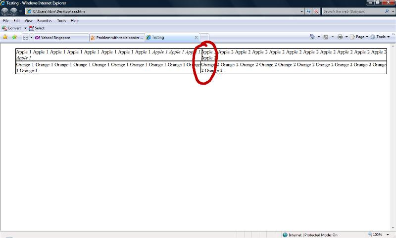
I had problem with the border of my table when there are text happen to be italics and justify, it pushed my table border.
CSS problem? Or I should change the way my CSS? I had attached the sample html for your reference
aaa.html
CSS problem? Or I should change the way my CSS? I had attached the sample html for your reference
aaa.html
Jagadishwor Dulal
There is no problem in your table. It's the problem of content text change copy all orange of your second row you will find the content is ok.
ASKER
I need the words which are Apple to be italics,but is affecting my table border. I do not quite understand your solution, you might want to make the changes in my html and let me see? I am currently viewing this in Internet Explorer.
That is one of the oddest pages I've seen. It looks like the pages that Microsoft Word generates. I can't tell what you want the results to be.
ASKER
This sample html is wriiten by myself using text editor.
You could view the html in IE and firefox to view the border aligmnnent differences.
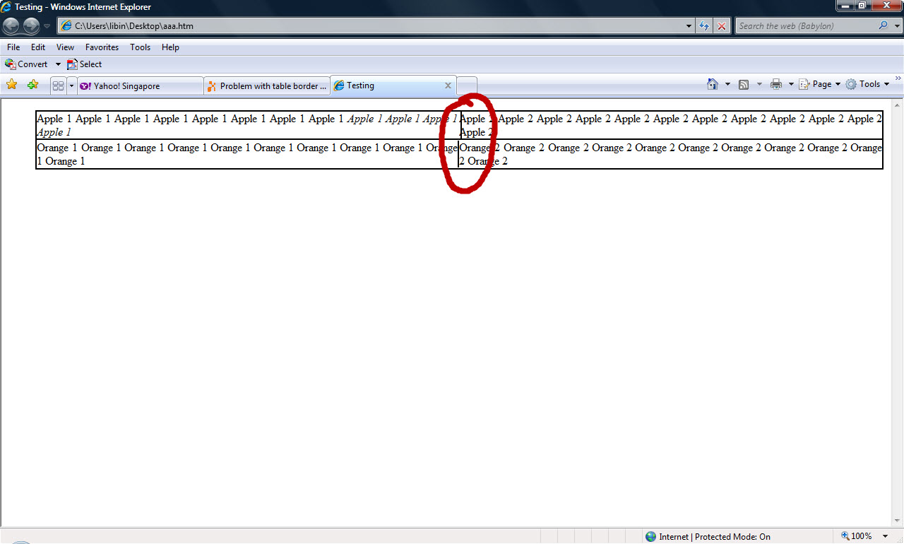
The results i want it to be is that the right border line of "Apple 1" and "Orange 1" to be align together like what firefox is displaying.
Does anyone have any idea how could it be done?
You could view the html in IE and firefox to view the border aligmnnent differences.
The results i want it to be is that the right border line of "Apple 1" and "Orange 1" to be align together like what firefox is displaying.
Does anyone have any idea how could it be done?
This is what it looks like in Firefox on my computer.
AppleTableAlignment.jpg
AppleTableAlignment.jpg
ASKER
Yup. Firefox is displaying exactly the way i need.
But in IE, it's different.
But in IE, it's different.
What you're seeing there is that IE uses different font rendering than the other browsers. You should also realize that on screens that are larger or smaller, your alignment will change also because your width will change.
ASKER
I understand that but is there a way in CSS to fix this as per firefox display
I don't believe so because it isn't CSS that is causing the problem, it's the difference in font rendering. And since there are so many things that will break the alignment anyway, I simply wouldn't be trying to do that. If in a real situation you needed that kind of precision, I would tell you to use an image because it will be displayed pixel for pixel in all browsers.
Other than an image suggested above, if you allow enough padding in each cell for the text (like 5 px left and right) and center the text, the problem will probably go away. This type of variability almost always comes from trying to cram text into too small a cell with too little or no white space around the text -- which is always a bad practice, as it will break (literally to another line) in some browser or other. But as the push comes for more crammed text to fit on tablets and iphones, the problem becomes pervasive.
Hi!
This is a bug in IE since IE6 and is still a problem in IE 8. I do not know if this is fix in IE9 can't test it.
The solution is simply this:
Put overflow:auto; and zoom:1 in your paragraph element, as shown below.
<p style="text-align: justify; zoom: 1; overflow: auto;">
Cheers,
Jehova is Great!
This is a bug in IE since IE6 and is still a problem in IE 8. I do not know if this is fix in IE9 can't test it.
The solution is simply this:
Put overflow:auto; and zoom:1 in your paragraph element, as shown below.
<p style="text-align: justify; zoom: 1; overflow: auto;">
Cheers,
Jehova is Great!
ASKER CERTIFIED SOLUTION
membership
This solution is only available to members.
To access this solution, you must be a member of Experts Exchange.
ASKER
Thanks PagodNaUtak, your solution is great and most relevant.