i need to plot three different sets of time-series data on one graph
Hi,
I need to create one graph for each of the three tabs in the attached spreadsheet. (Each tab contains water level and rainfall data obtained at different sets of wells.)
Each graph will depict three sets of time series data. One set will be vertical bars on a secondary y axis (from columns A (date) and B (rainfall). The second will be an x-y line plot from columns D (date) and E (water levels at well a). The third set will be an x-y line plot from columns G (date) and H (water levels at well b). Each graph should have tic marks at Jan 1, Feb 1, Mar 1, etc.
Thanks!
TC WL-vs-rain-for-expert-exchange.xls
SOLUTION
membership
This solution is only available to members.
To access this solution, you must be a member of Experts Exchange.
ASKER
These are water level elevations, relative to sea level. On tabs 1 and 2, the x-y data plot close enough together, as long as rainfall is on the secondary axis. On tab 3, the water level elevations are quite different between the two wells, which makes it hard to see any differences when plotted at a scale to see them both. I don't know a workaround unless Excel offered a third (teriary) Y axis. (I'll have to figure out some workaround on my own I guess.)
Does this help?
Does this help?
SOLUTION
membership
This solution is only available to members.
To access this solution, you must be a member of Experts Exchange.
ASKER
Yes, that would work.
I would normalise as suggested by GlennLRay: and use look-up as amount of data an periods do not match.
See what you think of attached graph for Site 4:
WL-vs-rain-for-expert-exchange-C.xlsx
See what you think of attached graph for Site 4:
WL-vs-rain-for-expert-exchange-C.xlsx
ASKER
Thanks cben. The dates for rainfall do not seem to match the x axis. Also, if I normalized I would want to do it in a way in which both x-y graph line variations are readable. And I do not really need the moving average rainfall. Although this solution does not work, I appreciate your input.
Also, I don't want to shift the focus away from the plot problem itself, as outlined in my opening description. (Getting an accurate plot for the data contained in each tab is more important than the normalizing issue for the data in tab 3.)
This question is still open.
Also, I don't want to shift the focus away from the plot problem itself, as outlined in my opening description. (Getting an accurate plot for the data contained in each tab is more important than the normalizing issue for the data in tab 3.)
This question is still open.
Hi trcamp,
Okay, one of the big problems arising from all the new data is the the time required for Excel to process large quantities of data for this chart. So, I preserved your original data, but am only showing a subset of results in the chart as an example.
Before uploading the workbook, let me know if the following shows how you would like the graph to appear:
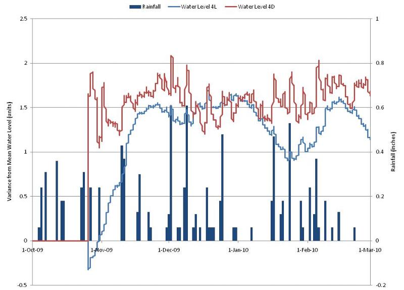
This is from data in your original question (which I assume is unchanged in the file attached in this question). I normalized the water levels for 4L and 4D against their means across all reported values (4L-3797, 4D-3628).
Normally, a metric like rainfall would not have a negative component, but its scale was made so in order that it would be proportional to the scale needed for the water level variance.
Again, this is only a subset. Trying to produce this chart for approximate 35000 data points for only two wells is VERY processing intensive on Excel's part (about 4 mins to generate after any change or activation of the chart).
-Glenn
Okay, one of the big problems arising from all the new data is the the time required for Excel to process large quantities of data for this chart. So, I preserved your original data, but am only showing a subset of results in the chart as an example.
Before uploading the workbook, let me know if the following shows how you would like the graph to appear:
This is from data in your original question (which I assume is unchanged in the file attached in this question). I normalized the water levels for 4L and 4D against their means across all reported values (4L-3797, 4D-3628).
Normally, a metric like rainfall would not have a negative component, but its scale was made so in order that it would be proportional to the scale needed for the water level variance.
Again, this is only a subset. Trying to produce this chart for approximate 35000 data points for only two wells is VERY processing intensive on Excel's part (about 4 mins to generate after any change or activation of the chart).
-Glenn
ASKER
Yes, this looks great. Not sure why the negatives appear but otherwise it's what I'm looking for. Also, I was thinking there were a few rainfalls above an inch(?)
Anyway, this is what I'm looking for. I can remove more values per day - say use every 4th value - (WLs only.....all rainfall rows need to remain) to get the total number of rows down.
TC
Anyway, this is what I'm looking for. I can remove more values per day - say use every 4th value - (WLs only.....all rainfall rows need to remain) to get the total number of rows down.
TC
RE: rainfall totals...I will check my formulas to ensure that 2-hour cumulative totals are being shown (I might have missed that)
RE: negative values. This just means that the water level reported happens to be BELOW the norm chosen. I will provide a couple of cells (one for each well) that will allow you to choose your own "norm" which would allow you to phase shift each into positive territory, if so desired. I should probably have the chart display that value automatically (easily done).
I have to leave work early due to a personal matter but will follow up (with file) as soon as I can.
SOLUTION
membership
This solution is only available to members.
To access this solution, you must be a member of Experts Exchange.
SOLUTION
membership
This solution is only available to members.
To access this solution, you must be a member of Experts Exchange.
ASKER
Increasing the points to 400 to try to get this one wrapped up. Thanks everyone.
ASKER
Still seeking solution.....Please read original post for a clear description of what I need.
Think we are confused as your request and the other comments ambiguous. For example "ALL rainfall values must be plotted" then points can removed.
Could be that you should start with purpose, then perhaps someone can fulfil that.
Could be that you should start with purpose, then perhaps someone can fulfil that.
ASKER
Sorry for any confusion cben.
ASKER CERTIFIED SOLUTION
membership
This solution is only available to members.
To access this solution, you must be a member of Experts Exchange.
ASKER
Thanks all.
ASKER
GlennLRay was only supposed to get 100 points here. Not sure where the 225 came from....?
Thanks.
Thanks.
OK - hate to not complete this project.
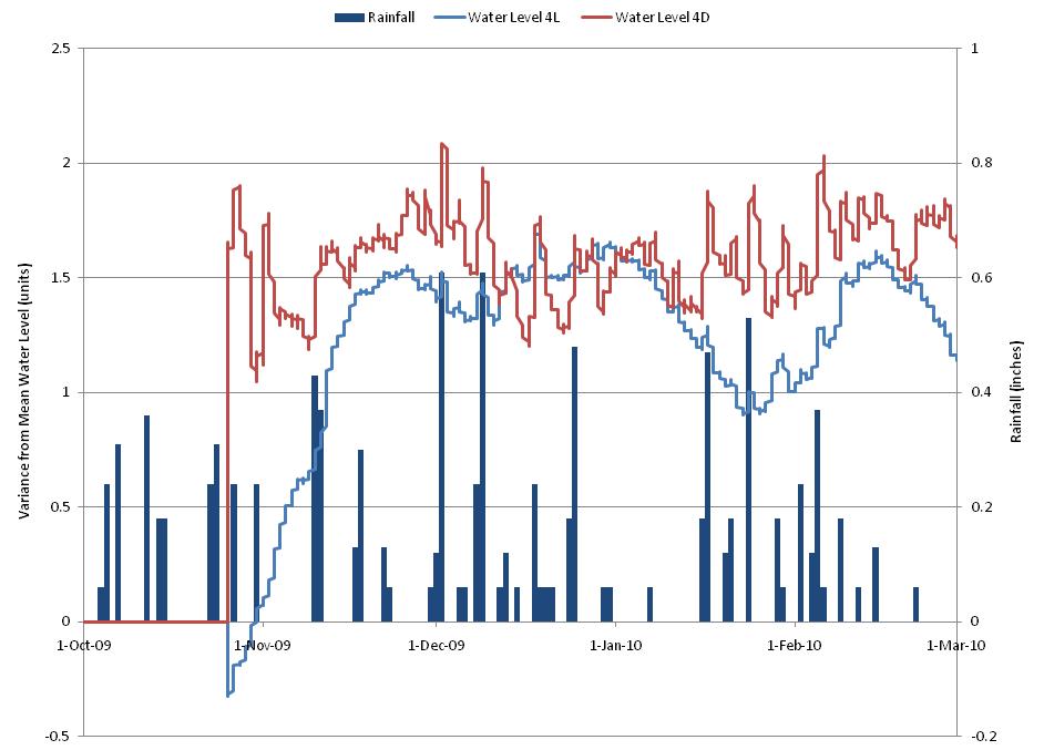
With a bit of forcing and dropping data where there is no WL to go with rainfall or visa versa I got this.
Hope it helps
WL-vs-rain-CBB3.xlsx
With a bit of forcing and dropping data where there is no WL to go with rainfall or visa versa I got this.
Hope it helps
WL-vs-rain-CBB3.xlsx
The original data set was significantly lower (ranging 8-16) than now (3600-3800). Additionally the differences between the two water levels (avg. 175 units) is so large that if you plot them both on a chart, you cannot really see the changes in the water level.
Can these two sets of values be normalized (as I believe they were in the first instance)? If so, just provide more detail about what is being measured here.