3 divs in line and dinamic width for middle one
Greetings Experts,
My question will be a little tricky,
I need to make HTML page layout with 3 div's in line:
1.left position
2.Center position
3.Right position
It should be:
Global width: 1000px
DIV Left: 200px
DIV Right: 200px
DIV Center: should be stretched to width that left (600px)
Till now it simple. Now my problem, "DIV Left" and "DIV Right" are div's that not ALWAYS present on a page. I mean that combination of div's can be different:
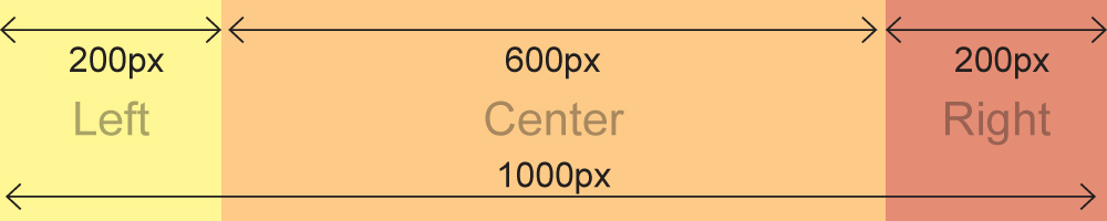
1. DIV LEFT+DIV CENTER+DIV RIGHT (200px+600px+200px)
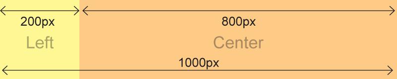
2. DIV LEFT+DIV CENTER (200px+800px)
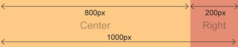
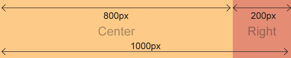
3. DIV CENTER+DIV RIGHT (800px+200px)
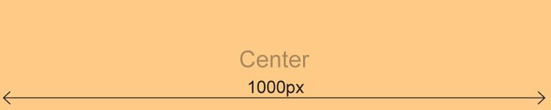
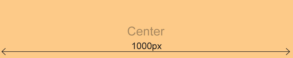
4. DIV CENTER (1000px)
My problem: "CENTER DIV" width should be dynamically resized to cover ALL free width of global 1000px in case LEFT DIV, RIGHT DIV or BOTH of them are disabled
I tried to do it , but unfortunately i stuck.
I need CSS/HTML code of this
Graphic explanation of what do i mean attached.
Please dear EXPERTS HELP, you're my only hope...!!!
Very best regards,
Dan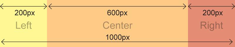
My question will be a little tricky,
I need to make HTML page layout with 3 div's in line:
1.left position
2.Center position
3.Right position
It should be:
Global width: 1000px
DIV Left: 200px
DIV Right: 200px
DIV Center: should be stretched to width that left (600px)
Till now it simple. Now my problem, "DIV Left" and "DIV Right" are div's that not ALWAYS present on a page. I mean that combination of div's can be different:
1. DIV LEFT+DIV CENTER+DIV RIGHT (200px+600px+200px)
2. DIV LEFT+DIV CENTER (200px+800px)
3. DIV CENTER+DIV RIGHT (800px+200px)
4. DIV CENTER (1000px)
My problem: "CENTER DIV" width should be dynamically resized to cover ALL free width of global 1000px in case LEFT DIV, RIGHT DIV or BOTH of them are disabled
I tried to do it , but unfortunately i stuck.
I need CSS/HTML code of this
Graphic explanation of what do i mean attached.
Please dear EXPERTS HELP, you're my only hope...!!!
Very best regards,
Dan

ASKER CERTIFIED SOLUTION
membership
This solution is only available to members.
To access this solution, you must be a member of Experts Exchange.
Dynamic div width is based on content, not available space. The only way to make a div wider than the content is to give it a fixed width. I would include the content of the center div in a fixed 1000px width div. Then nest the left and right divs inside it, before the content.
<div style="width: 1000p;">
   <div style="width: 200px; float: left;">Left Column Content</div>
   <div style="width: 200px; float: right;">Right Column Content</div>
   Center Column Content
</div>
Glad to be of help. Thanks!
ASKER
IENAXXX
DUDE, not work for me :(
DUDE, not work for me :(
I know it's too late to reassign the points for this question. But did you try my solution?
ASKER
Xmediaman: thank you, i solved it other way.
Please Dan, let us know the solution that worked for you.
ASKER
Hello,
This one was good for me with some modification
<div style="width=100%; border:2px solid #dadada;">
<div style="width:50px; float: left;"><img src="myleftimage" /></div>
<div style="width:50px; float: right;"><img src="myrightimage" /></div>
<div style="display:TABLE; margin-left:auto; margin-right: auto;">Content Goes Here</div>
<div style="clear:both"></div>
</div>
ASKER
Thank you so much!!!