Help with a CSS mystery- Text Alignment
I can't link to my site or even come close to linking, so please forgive me-- but the site is at: www.
s
d
s
l
a
w
a
z
dot
com
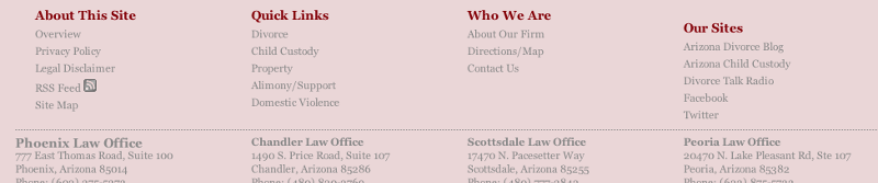
Can anyone tell me why (in the footer) section of the page, the title of the column "Our Sites" is not lined up with the other column titles? The code looks consistent to me for every column.
THIS HAS ME GOING CRAZY!
Thank you in advance!
s
d
s
l
a
w
a
z
dot
com
Can anyone tell me why (in the footer) section of the page, the title of the column "Our Sites" is not lined up with the other column titles? The code looks consistent to me for every column.
THIS HAS ME GOING CRAZY!
Thank you in advance!
On lines 405 and 418, you have some unwanted whitespace after the "ul>". Sometimes that will throw a layout off.
ASKER
Thank you both...
@pritamdutt -- that fixed the column headings linking up horizontally-- THANK YOU!
However, when I implemented your change, it looks like all of the columns, now shifted 22 pixels to the left.
I am sorry that I am unfamiliar with CSS design, but if you can tell me how to get the columns to line up, I would be very, very grateful!
ASKER
I am attaching a file attachment... This is how I want it to look-- IDEALLY...
I have to be at work in 7 hours; I really need to figure this out. Anybody?
I have to be at work in 7 hours; I really need to figure this out. Anybody?

Hi,
Make the following changes and that should address the problem.
div#footer ul {
display: block;
float: left;
height: 100%;
list-style-type: none;
width: 239.5px;
}
Btw I was the first one to tell you the problem and the solution for you image issues as well.. I deserved some appreciation for that too...
I wish i knew you had no knowledge of CSS
btw hope this helps!!!
ASKER
@pritamdutt--
You do deserve appreciation! Thank you!
I should have posted both of my problems in the same question though, because I am still lost.
If I leave the padding that you suggested for the images, the images shift 22px to the right and they still don't match up.
I just removed the 22px padding, that you suggested for the vcard class and now the addresses are back to where they (almost) should be.
If you look at the page, you can see the Phoenix address lines up just fine... but as we get further and further, the addresses keep moving away from lining up with the column above.
And you're right--- I don't know CSS.
Any way I could get you to look at this one last time?
Could we make 4 different vcard classes? (vcard1, vcard2, etc)
And then position each one exactly where we want it?
Thank you!
ASKER CERTIFIED SOLUTION
membership
This solution is only available to members.
To access this solution, you must be a member of Experts Exchange.
ASKER
Thank you SO MUCH. You are very kind.
Open in new window
Regards,