Graph - How Do I???
I need a graph similar to this:
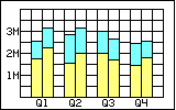 Obviously there are eight columns, two for each quarter. Each of the two columns for each quarter represents two years (2011 and 2012). Each column represents two values, Income (yellow) and Expense (Cyan)
In the Chart Expert, I select 'For each record' to be year and 'Show Values' of Income and Expense.
I can get a single set of two columns (any particular quarter), but how do I get all quarters to show up as in the example graph?
My query currently returns Year, Value Type (I = income, E = expense) and the values for each month which I calculate to give me the values per quarter. So, I might have two records that return values such as this:
I can modify the query if needed.
Hopefully I got my needs across. :)
TIA
Obviously there are eight columns, two for each quarter. Each of the two columns for each quarter represents two years (2011 and 2012). Each column represents two values, Income (yellow) and Expense (Cyan)In the Chart Expert, I select 'For each record' to be year and 'Show Values' of Income and Expense.
I can get a single set of two columns (any particular quarter), but how do I get all quarters to show up as in the example graph?
My query currently returns Year, Value Type (I = income, E = expense) and the values for each month which I calculate to give me the values per quarter. So, I might have two records that return values such as this:
Year   Type   January   February   March     April
2011     I    600000    650000     500000    450000
2012     I    800000	900000     550000    600000
2011     E    800000	900000     900000    1000000
2012 E 900000 1000000 14000000 1000000I can modify the query if needed.
Hopefully I got my needs across. :)
TIA
ASKER
mlmcc,
I'm not quite following...
What date field? In which box?
There are no "group options" available that I can see. In the Data Tab there is a frame named "Layout" which has several buttons, all disabled except for "Advanced" which is currently selected. One of the disabled options is "Group" but I do not know how to enable it.
I'm prettry sure this is not possible using your data structure and teh standard CR charts
ASKER
GJParker,
Fair enough. So how do I need to change the data structure (or how do I use "non-standard" CR charts)?
Fair enough. So how do I need to change the data structure (or how do I use "non-standard" CR charts)?
First step is to see if there is a chart available that does what you need, You can purchase add on charts here http://www.threedgraphics.com/tdg/products/tools/crchart/product_info.php
Only then will you knwo what format the data needs to be in
Only then will you knwo what format the data needs to be in
ASKER
GJParker,
While the graphs from Three D Graphics look pretty cool, I'm not quite ready to plop down $1500 for one chart that may only be used one time.
While the graphs from Three D Graphics look pretty cool, I'm not quite ready to plop down $1500 for one chart that may only be used one time.
ASKER CERTIFIED SOLUTION
membership
This solution is only available to members.
To access this solution, you must be a member of Experts Exchange.
ASKER
I ended up using a different (line) chart. But the recommendation to seperate the quarters in the records (one record for each quarter) made life just a little easier.
Thanks.
Thanks.
You're welcome. Glad I could help.
James
James
Open the report
Right click the chart
CLick CHART EXPERT
Select the date field in the box
CLick CHANGE GROUP OPTIONS
Set the time to be QUARTER
mlmcc