Excel plot – Reverse Engineering
I have the plot below as a picture and I need to remake the graphic in Excel with the proper equation.
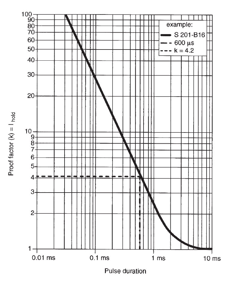
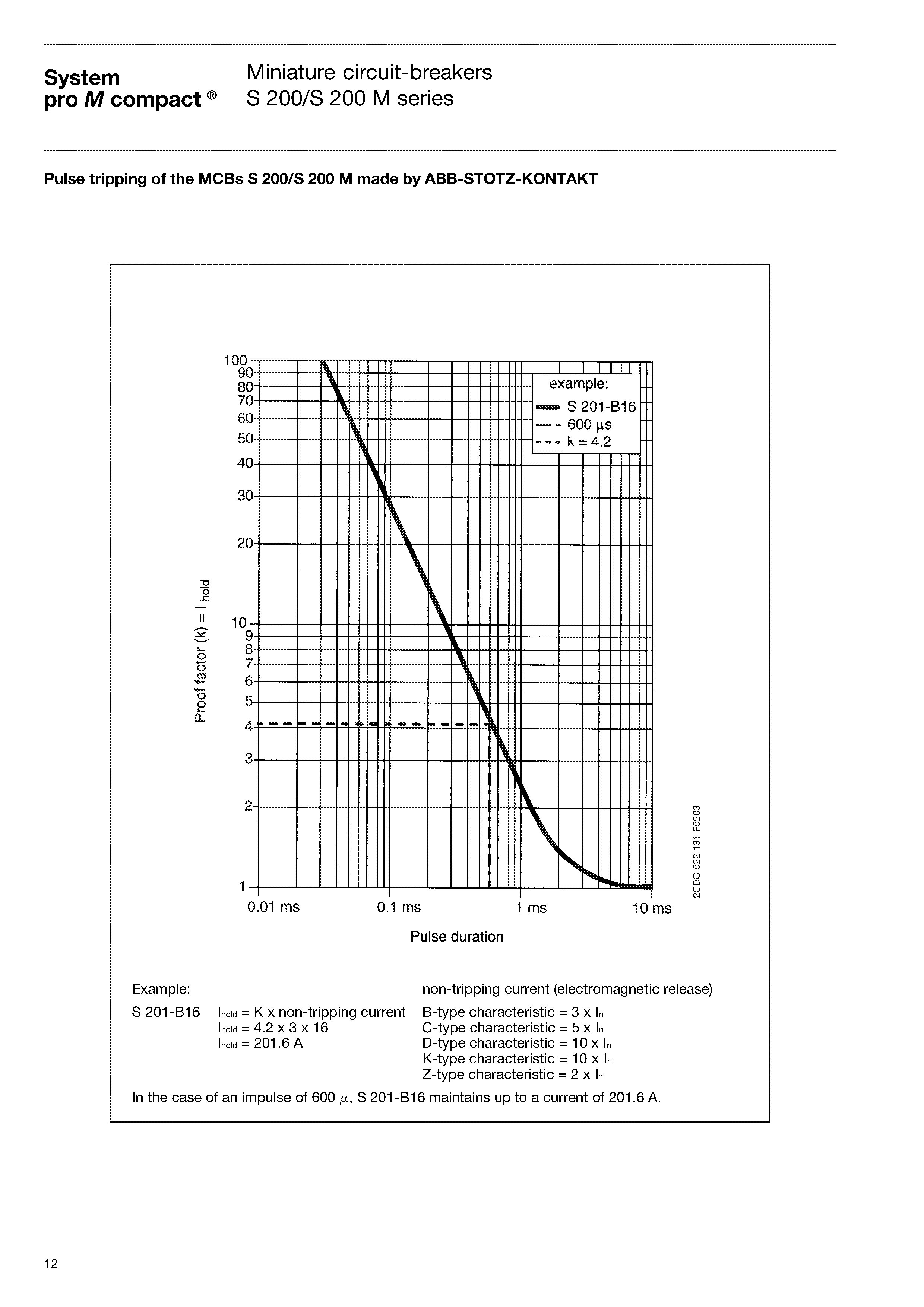
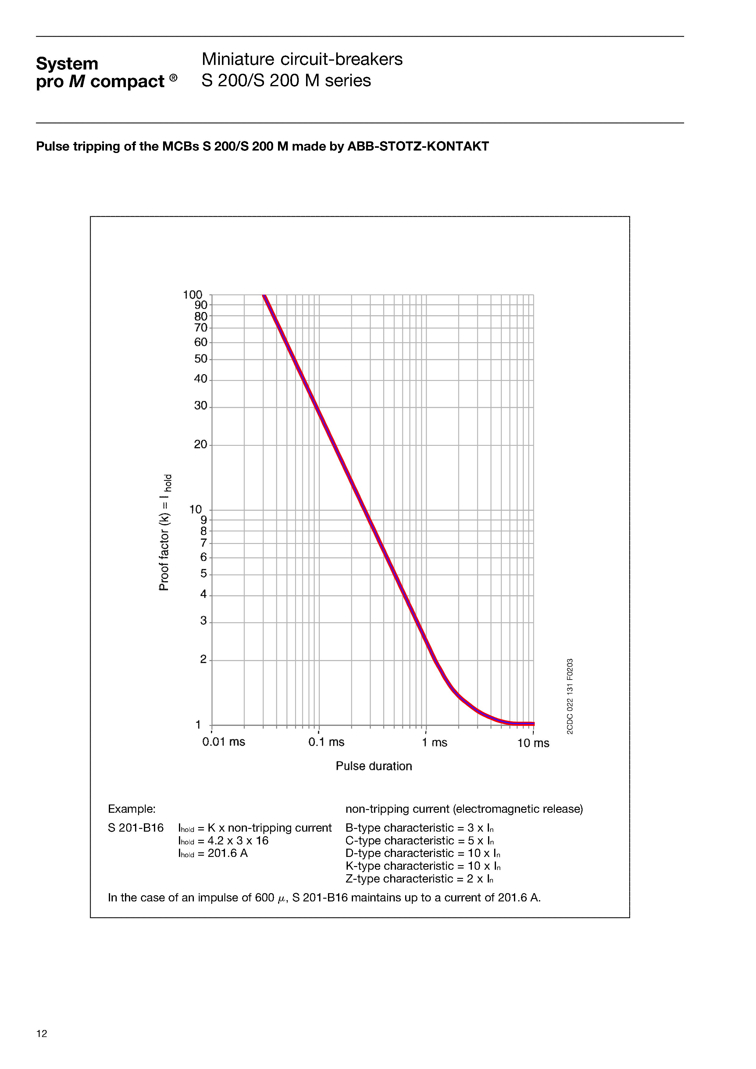
First I printed on the paper the graphic above and I measured with ruler various values that I could see.
I inserted those values in Excel and I made a XY Scatter graphic.
Then I added a trend line and I found that a power trend line fits almost perfect to the measured points.
Excel generates automatic the equation, found as y=2.3728*xpower(-1.067).
I calculated back the y values from x values using the found equation for a double check and looks good.
As we can see on x axes we have log10 scale on original graph. I did the same on Excel.
Now, I need few things:
1) To have also a log scale on y axes as we can see in the initial graphic. I could not find how to set the chart in excel to have the same as in initial graphic and I need that. That is the most important thing.
2) On x and/or at least on y axes I would like to have the values corresponding to minor gridlines.
Excel-plot---reverse-plotting.xlsx
ASKER CERTIFIED SOLUTION
membership
This solution is only available to members.
To access this solution, you must be a member of Experts Exchange.
ASKER
The solution has been found and was not easy.
In the beginning I thought that maybe in Excel cannot plot the data right when I use log scales.
Therefore I tried some other plotting programs from here:
http://en.wikipedia.org/wiki/List_of_information_graphics_software
From around 10 which I tried, I found 2 good enough for the present application:
1) DADiSP student free version which can handle 32000 points.
2) SciDAVis – free software.
DADiSP is moving faster when we use over 10K points.
Unfortunately I found out that was not my problem.
When we look on the initial graphic we can see that the top part of the curve is almost a straight line, but on log axes.
That means that the equation which may generate such line is from the “power family”.
Initially I was able to generate pretty the top side because Excel was able to emulate the power trendline.
The bottom side is not the same equation. It had to be emulated with a polynomial type, but excel offer only up to 6 degree of power and is needed more.
The initial approach was to print on A4 paper and to measure the x/y pairs of data.
Then I did it better, with more points on A4 paper.
Then I almost tried on A3. I stopped because I started to analyze the x, y pair on PC with picture editor – I made many thin lines ready to be printed. Then I stopped because another idea better came into my mind: to find software to do the job for me.
I found several, they are called graph digitizers. Then I got more data and more exactly.
Next was to find a better equation from bottom side of the curve.
Using other software for regression analysis I was able to find better emulating curves and equations for the bottoms ide, using polynomials up to 20 degrees.
With the found equations I came back in Excel and I calculated the Y data from given X.
Then I plot on the same axes the initial data from digitizers and the calculated from regression.
Takes time to find then point where the equations really overlap their Y value.
After the calculated curve was found I came back to the log axes.
I found that Excel cannot put labels as we want on the log axes.
I found next article which tricks Excel:
http://peltiertech.com/WordPress/logarithmic-axes-in-excel-charts/
At this point I could say I solved the problem: I have the equations and the plot in Excel with log axes and labels.
Now I had to make a proof for a non-mathematician that my chart is the same as original curve from picture.
Printing on paper and having the 2 similar A4 papers overlapped on the light will be a good proof.
Here comes the Excel problem again: it has no scale.
I follow:
http://www.techrepublic.com/blog/msoffice/turn-an-excel-sheet-into-graph-paper/2751
And read:
http://support.microsoft.com/kb/214123
And I was able to make an approx. 2x2 mm square graph paper sheet in Excel.
After printing and measuring with a ruler, few more times resize the chart was done until I got approx. good precision on the printed paper. I had to print several times.
That generated graph printed on the paper overlap the original pdf printed page pretty well.
To make it easier I used a photo editor and I replaced the original graph with mine.
I have now two pictures on the same size which can be printed and the curves can be checked.
A software analyzer can be also used to measure the deviations.
Practically the error in measurements with a ruler is a lot higher than the differences between original curve and the generated one.
Now a formula can be used instead of reading the initial graph from the picture.
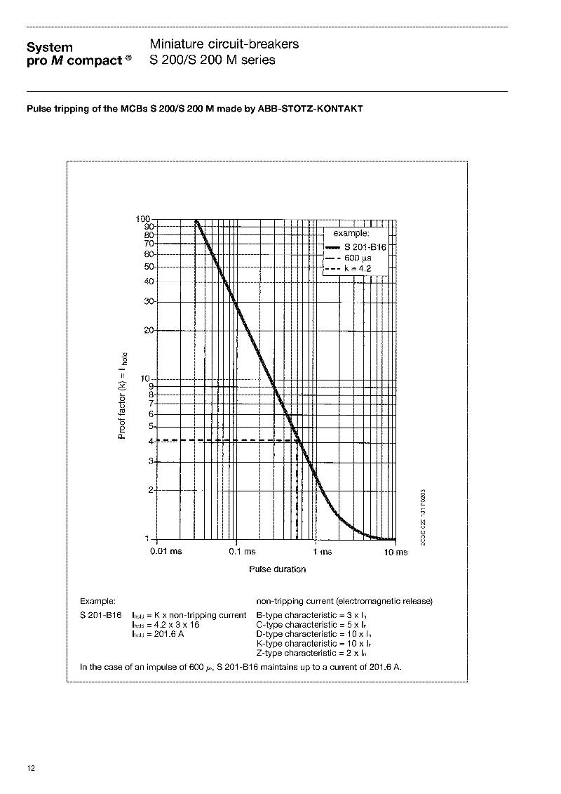
The equations used to emulate the original graph are:
1) When x = 0.03 to 1.193:
y = 2,4483*POWER(x;-1,062)
2) When x = 1.194 to 6.548
y = (-18,0056835370987)*X^0+(8
3) When x = 6.549 to 10
y = 1,02*1^(1/x)
P.S. I contacted the manufacturer of the graph (ABB) and I was informed that they have no formula for that graph. The graph was generated by many real measurements and a trendline was done.
I wanted to make these e comments because I thought it may be interesting for you too.
Maybe later I will write an article about it as general procedure and particular step by step example.
Open the above pictures in 2 different tabs of the browser and then click back and each tab to see the similarities.
Excel-plot---Reverse-Engineering.xls
In the beginning I thought that maybe in Excel cannot plot the data right when I use log scales.
Therefore I tried some other plotting programs from here:
http://en.wikipedia.org/wiki/List_of_information_graphics_software
From around 10 which I tried, I found 2 good enough for the present application:
1) DADiSP student free version which can handle 32000 points.
2) SciDAVis – free software.
DADiSP is moving faster when we use over 10K points.
Unfortunately I found out that was not my problem.
When we look on the initial graphic we can see that the top part of the curve is almost a straight line, but on log axes.
That means that the equation which may generate such line is from the “power family”.
Initially I was able to generate pretty the top side because Excel was able to emulate the power trendline.
The bottom side is not the same equation. It had to be emulated with a polynomial type, but excel offer only up to 6 degree of power and is needed more.
The initial approach was to print on A4 paper and to measure the x/y pairs of data.
Then I did it better, with more points on A4 paper.
Then I almost tried on A3. I stopped because I started to analyze the x, y pair on PC with picture editor – I made many thin lines ready to be printed. Then I stopped because another idea better came into my mind: to find software to do the job for me.
I found several, they are called graph digitizers. Then I got more data and more exactly.
Next was to find a better equation from bottom side of the curve.
Using other software for regression analysis I was able to find better emulating curves and equations for the bottoms ide, using polynomials up to 20 degrees.
With the found equations I came back in Excel and I calculated the Y data from given X.
Then I plot on the same axes the initial data from digitizers and the calculated from regression.
Takes time to find then point where the equations really overlap their Y value.
After the calculated curve was found I came back to the log axes.
I found that Excel cannot put labels as we want on the log axes.
I found next article which tricks Excel:
http://peltiertech.com/WordPress/logarithmic-axes-in-excel-charts/
At this point I could say I solved the problem: I have the equations and the plot in Excel with log axes and labels.
Now I had to make a proof for a non-mathematician that my chart is the same as original curve from picture.
Printing on paper and having the 2 similar A4 papers overlapped on the light will be a good proof.
Here comes the Excel problem again: it has no scale.
I follow:
http://www.techrepublic.com/blog/msoffice/turn-an-excel-sheet-into-graph-paper/2751
And read:
http://support.microsoft.com/kb/214123
And I was able to make an approx. 2x2 mm square graph paper sheet in Excel.
After printing and measuring with a ruler, few more times resize the chart was done until I got approx. good precision on the printed paper. I had to print several times.
That generated graph printed on the paper overlap the original pdf printed page pretty well.
To make it easier I used a photo editor and I replaced the original graph with mine.
I have now two pictures on the same size which can be printed and the curves can be checked.
A software analyzer can be also used to measure the deviations.
Practically the error in measurements with a ruler is a lot higher than the differences between original curve and the generated one.
Now a formula can be used instead of reading the initial graph from the picture.
The equations used to emulate the original graph are:
1) When x = 0.03 to 1.193:
y = 2,4483*POWER(x;-1,062)
2) When x = 1.194 to 6.548
y = (-18,0056835370987)*X^0+(8
3) When x = 6.549 to 10
y = 1,02*1^(1/x)
P.S. I contacted the manufacturer of the graph (ABB) and I was informed that they have no formula for that graph. The graph was generated by many real measurements and a trendline was done.
I wanted to make these e comments because I thought it may be interesting for you too.
Maybe later I will write an article about it as general procedure and particular step by step example.
Open the above pictures in 2 different tabs of the browser and then click back and each tab to see the similarities.
Excel-plot---Reverse-Engineering.xls
ASKER
On the top side of chart from the attached file there is a scroll bar.
Do you have any idea how to make that scroll bar to behave logarithmic?
If the chart would have been with linear axes then would be no problem for the scroll bar.
But now the scroll bar gives linear values and the blue/red lines do not move smooth/proportional/simila
Any ideas?
ABB-chart-emulation-2.xls
ASKER
ASKER
I gave you the points because I wanted to have the present solution added to the knowledge base for other users, not for your answer - because what you said I already tried before I asked the question.
On the other hand I think you know a lot about Excel looking at your qualifications.
Maybe you have been to busy with other things...
On the other hand I think you know a lot about Excel looking at your qualifications.
Maybe you have been to busy with other things...
viki2000,
you don't need to do that.
you can have your post at http:#a38811360 selected as the solution.
to change the selected answer click on the Request Attention located just below your original question, and ask to reopen the thread.
you don't need to do that.
you can have your post at http:#a38811360 selected as the solution.
to change the selected answer click on the Request Attention located just below your original question, and ask to reopen the thread.
ASKER
thanks,
that's all right
that's all right
ASKER
Did you try in the excel file above?
Do you get a chart which is looking similar with the initial plot from picture above?