How to resolve the over-flowing text in fluid grid layout in dreamweaver CC?
Dear EE experts,
Please see the attached embed image, for the screenshot of our work.
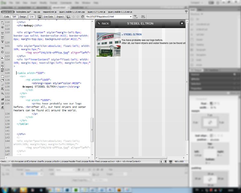 We would like to ask for tech support, on how to resolve the text is over flowing on the desired screen-size. As you can see from our screenshot, we are at mobile size, and we have a paragraph beside the image, but the problem is, it over flows to its screen size to the right. Even we tried to use DIV functions, until we change it into table, still the same.
What we want to happen is the message or text will just be inside its box (may it be DIV or table <td>), be fixed on its box size...
but it's over-flowing...
That is the only part that we're having problem and couldn't fix even we google for its solution...
Thank you & hope to hear soon...
What counts is how it looks live, not in the DW wysiwyg. I know this is frustrating. The DW wysiwyg will work great for sites with a static width. But for responsive sites, that is just the way it works. At least in DW 5.5 and below.
The other issue is we can't see all your code. Please post a link to the url so we can take a look at it.
fyi, The last thing you want is table for a layout in mobile.
The other issue is we can't see all your code. Please post a link to the url so we can take a look at it.
fyi, The last thing you want is table for a layout in mobile.
ASKER
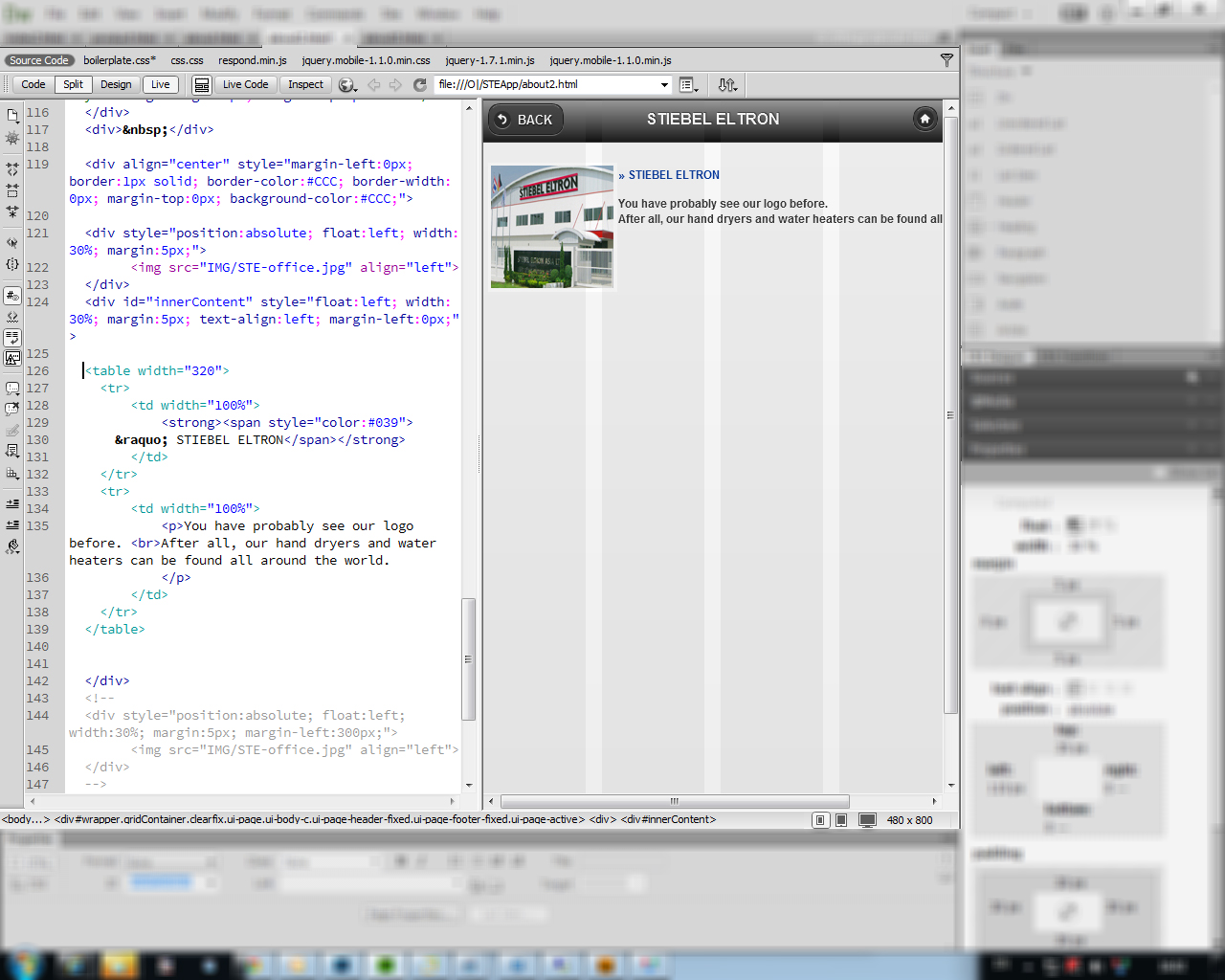
 For julianH, please see the attached embed screenshot.
<!doctype html>
<!--[if lt IE 7]> <html class="ie6 oldie"> <![endif]-->
<!--[if IE 7]> <html class="ie7 oldie"> <![endif]-->
<!--[if IE 8]> <html class="ie8 oldie"> <![endif]-->
<!--[if gt IE 8]><!-->
<html class="">
<!--<![endif]-->
<head>
<meta charset="utf-8">
<!--
<meta name="viewport" content="width=device-width, initial-scale=1">
-->
<meta name="viewport" content="width=device-width; initial-scale=1.0; maximum-scale=1.0; user-scalable=0;">
<meta name="apple-mobile-web-app-capable" content="yes" />
<meta http-equiv="Content-Type" content="text/html; charset=utf-8" />
<meta http-equiv="Content-Type" content="text/html; charset=iso-8859-1">
<meta http-equiv="Content-Type" content="text/html; charset=windows-874">
<meta name="GENERATOR" content="Mozilla/4.7 [en] (Win98; I) [Netscape]">
<meta name = "viewport" content = "user-scalable=yes,width=device-width" />
<meta name="apple-mobile-web-app-capable" content="yes">
<meta name="apple-mobile-web-app-status-bar-style" content="black" />
<title>Stiebel Mobile/Tablet site...</title>
<link href="boilerplate.css" rel="stylesheet" type="text/css">
<link href="css/css.css" rel="stylesheet" type="text/css">
<!--
To learn more about the conditional comments around the html tags at the top of the file:
paulirish.com/2008/conditional-stylesheets-vs-css-hacks-answer-neither/
Do the following if you're using your customized build of modernizr (http://www.modernizr.com/):
* insert the link to your js here
* remove the link below to the html5shiv
* add the "no-js" class to the html tags at the top
* you can also remove the link to respond.min.js if you included the MQ Polyfill in your modernizr build
-->
<!--[if lt IE 9]>
<script src="//html5shiv.googlecode.com/svn/trunk/html5.js"></script>
<![endif]-->
<script src="respond.min.js"></script>
<script type="application/x-javascript"> addEventListener("load", function() { setTimeout(
hideURLbar, 0); }, false); function hideURLbar(){ window.scrollTo(0,1); } </script>
<link rel="stylesheet" href="jquery.mobile-1.1.0.min.css" />
<script src="jquery-1.7.1.min.js"></script>
<script src="jquery.mobile-1.1.0.min.js"></script>
<style type="text/css">
#newspaper
{
text-align:justify;
text-indent: 0%;
}
#contenttable
{
padding: 12px;
width:100%;
height:200px;
position: fixed;
background-color: yellow;
top: 125px;
}
#innerContent
{
position: absolute;
right: 0;
left: 110px;
top: 35px;
bottom: 0;
width: 320px;
padding: 30px;
}
#content
{
padding: 10px;
opacity: 0.8;
width: 320px;
position: relative;
top: 50px;
left: calc(100% - 480px);
background-color: cyan;
}
</style>
</head>
<body>
<div class="gridContainer clearfix" data-role="page" id="wrapper">
<div data-role="header" data-position="fixed" id="header" class="fluid" style="width:100%; text-align:center">
<a href="javascript:history.back()" data-theme="a" data-role="button" data-icon="back" data-iconpos="left" style="margin-right:0px; margin-top:0px">BACK</a>
<h1>STIEBEL ELTRON</h1>
<a href="index2.html" data-theme="a" data-role="button" data-icon="home" data-iconpos="notext" style="margin-right:0px; margin-top:0px">HOME</a>
</div>
<div> </div>
<div align="center" style="margin-left:0px; border:1px solid; border-color:#CCC; border-width:0px; margin-top:0px; background-color:#CCC;">
<div style="position:absolute; float:left; width:30%; margin:5px;">
<img src="IMG/STE-office.jpg" align="left">
</div>
<div id="innerContent" style="float:left; width:30%; margin:5px; text-align:left; margin-left:0px;">
<table style="width: 320; border: 1px solid blue">
<tr>
<td width="100%">
<strong><span style="color:#039">
» STIEBEL ELTRON</span></strong>
</td>
</tr>
<tr>
<td width="100%">
<p>You have probably see our logo before. <br>After all, our hand dryers and water heaters can be found all around the world.
</p>
</td>
</tr>
</table>
</div>
<!--
<div style="position:absolute; float:left; width:30%; margin:5px; margin-left:300px;">
<img src="IMG/STE-office.jpg" align="left">
</div>
-->
<!--FOOTER-->
<div style="margin-top:100%;" data-position="fixed" data-role="footer" data-theme="a">
<p style="text-align:center"><font face="verdana">STIEBEL ELTRON ASIA LTD. ©2013</font></p>
</div>
<!-- /footer -->
</div>
</body>
</html>We don't know if there are some scripts from the jQuery mobile that are conflicting or controlling our script for that part...
Thank you & hope to hear again soon...
@stiebel, what you posted does not help. Look, this is what you gave us http://jsbin.com/ageyox/1/edit
You have a couple of options. 1) Post a link to your page. This should be very easy as you have it done. 2) Edit the jsbin I posted and get it to look like what you see.
You have a couple of options. 1) Post a link to your page. This should be very easy as you have it done. 2) Edit the jsbin I posted and get it to look like what you see.
ASKER
There are several files that are attached with this, so it would be better if we'll send it to you.
Please see the attached files...
boilerplate.css
css.css
respond.min.js
jquery.mobile-1.1.0.min.css
jquery-1.7.1.min.js
jquery.mobile-1.1.0.min.js
Please see the attached files...
boilerplate.css
css.css
respond.min.js
jquery.mobile-1.1.0.min.css
jquery-1.7.1.min.js
jquery.mobile-1.1.0.min.js
SOLUTION
membership
This solution is only available to members.
To access this solution, you must be a member of Experts Exchange.
SOLUTION
membership
This solution is only available to members.
To access this solution, you must be a member of Experts Exchange.
ASKER CERTIFIED SOLUTION
membership
This solution is only available to members.
To access this solution, you must be a member of Experts Exchange.
ASKER
Thank you very much & our apology to padas for the poor scripting :(
We're new to HTML5 & more of CSS... so we're kinda crawling for each line... :)
We're new to HTML5 & more of CSS... so we're kinda crawling for each line... :)
No apologies needed. However, if you are going to use this method it is important to get it right. It is important to get it right in order for your page to display properly in all browsers. In addition when you try and debug, it's hard to debug any real errors when there are a lot of coding errors.
It would be a great benefit to start here http://www.codecademy.com/tracks/web and spend a few hours going through the courses. It may seem remedial but a few hours now will save your 10 fold going forward. A good reference is http://www.w3schools.com/html/html5_intro.asp and quick start http://msdn.microsoft.com/en-us/hh549253.aspx and separately understanding css https://developer.mozilla.org/en-US/learn/css
It would be a great benefit to start here http://www.codecademy.com/tracks/web and spend a few hours going through the courses. It may seem remedial but a few hours now will save your 10 fold going forward. A good reference is http://www.w3schools.com/html/html5_intro.asp and quick start http://msdn.microsoft.com/en-us/hh549253.aspx and separately understanding css https://developer.mozilla.org/en-US/learn/css
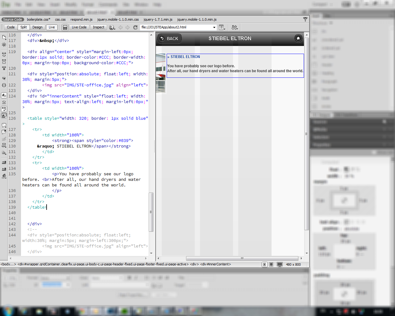
your <td> has a width of 100% - the screen shot shows a browser with a horizontal scrollbar so the text is going to fill the screen.
Try this
<table style="width: 320; border: 1px solid blue">
<td> ...
So we can see where the boundary of the table is.
Also, there may be styles applied that you are not showing us - for instance if the table or <td> elements has an overflow style set that might be causing it.
Right now your screen shot does not tell us much other than the html is doing what it is supposed to.