oo7ml
asked on
Responsive Websites
Hi, am i right in saying that responsive websites use two main functions, Media Queries and Breakpoints. Media Queries are used to determine the device and browser attributes of the device that is viewing the website.
If we take the following website - www.stripe.com - and compare the desktop to mobile version (screenshots attached) we can see that the header and menu have changed significantly.
DESKTOP
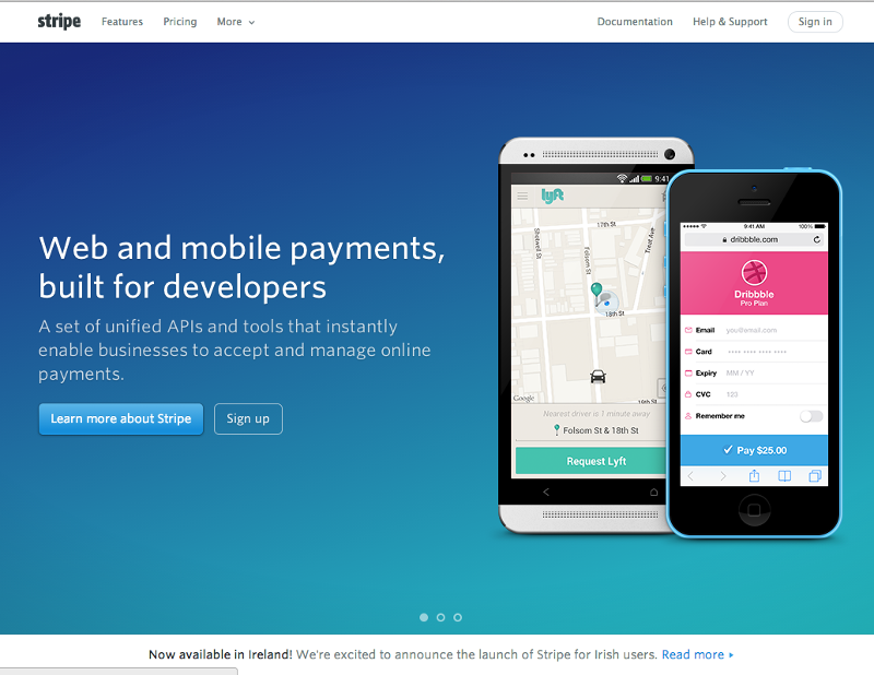
MOBILE

QUESTIONS
01 - does the mobile version just hide the a lot of the header and menu and then display it's own menu
02 - i thought responsive websites always had the same data, so how come both menus have different content (is it a case of coding two menus and then displaying one and hiding another based on the media query)
03 - does anyone have a good guide on how to create such a mobile slider menu
04 - do responsive websites just determine what CSS to execute OR can they also determine what HTML or even PHP to execute
If we take the following website - www.stripe.com - and compare the desktop to mobile version (screenshots attached) we can see that the header and menu have changed significantly.
DESKTOP

MOBILE
QUESTIONS
01 - does the mobile version just hide the a lot of the header and menu and then display it's own menu
02 - i thought responsive websites always had the same data, so how come both menus have different content (is it a case of coding two menus and then displaying one and hiding another based on the media query)
03 - does anyone have a good guide on how to create such a mobile slider menu
04 - do responsive websites just determine what CSS to execute OR can they also determine what HTML or even PHP to execute
Media queries have a limited application. The more advanced approach uses a combination of media queries combined with device/resolution detection to deliver alternate content.
media queries work well for smaller differences in size like the difference between a phne and tablet where the adjustment are relatively small.
When they are used to develop a compromise between the compact and full size presentation; they generally fail to render either of the extremes very well.
For that reason many of us who used to advocate using media queries widly; now recommend more moderate use and delivery of alternate layouts for desktop/laptops and phone/tablet.
Cd&
ASKER
Thanks for the replies guys...
"The more advanced approach uses a combination of media queries combined with device/resolution detection to deliver alternate content."
Is this not what a media query does / is?
Can you elaborate on the more advanced approach, as due to my lack of understanding, it seems you are saying you use a combination of media queries with media queries, thanks.
Aside from CSS, there's javascript:
Using javascript to detect mobile devices
Using javascript to detect mobile devices
The menu for both looks can be achieved with simple css.
Inline LI's for desktop so you get the horizontal menu and when the screen is smaller you just hide the UL and make the LI elements display:block so you get the list going down
Inline LI's for desktop so you get the horizontal menu and when the screen is smaller you just hide the UL and make the LI elements display:block so you get the list going down
ASKER
Thanks Gary, but there is different content in both menus
SOLUTION
membership
This solution is only available to members.
To access this solution, you must be a member of Experts Exchange.
ASKER
Ok cool, sorry i see that now... the Home button is not visible in the desktop version (display is set to none)
SOLUTION
membership
This solution is only available to members.
To access this solution, you must be a member of Experts Exchange.
ASKER
Ok cool, thanks Cd&
So basically you are referring to using Media Queries (client side) to execute css and PHP / server side queries also to execute actual page structure (html) etc...
So basically you are referring to using Media Queries (client side) to execute css and PHP / server side queries also to execute actual page structure (html) etc...
Yes, If you are going to have to do a lot of adjustments that are not easily done with alternate CSS rules, then it will generally be more efficient to have the alternate layout pre-defined on the server so it can just be plugged in and you don't chew up a lot of time making adjustments. It also means you don't run into problems with the initial rendering jumping around that you can get when you need a lot of scripting during the load.
Cd&
Cd&
ASKER
Ok, thanks... make good sense...
What is the PHP version of Media Queries called?
What is the PHP version of Media Queries called?
There is no such thing as media queries in PHP. That is strictly a CSS feature.
Cd&
Cd&
ASKER
I understand that but what is the equivalent to determine screensize etc in PHP
ASKER CERTIFIED SOLUTION
membership
This solution is only available to members.
To access this solution, you must be a member of Experts Exchange.
ASKER
Excellent, thanks for all your help...
2) They are likely showing/hiding a menu based on the client
3) Not off the top of my head, but it shouldn't be too hard to find one. (indeed: responsive sliding css menu search results)
4) HTML doesn't execute, per se, but PHP, javascript, ASPX, etc do, and can adapt to the client presentation as necessary.