CFbubu
asked on
Div page centering, alignment question
Hi Guys,
I have been stuck on this issue for quite sometime and still cannot figure it out. I do hope someone is willing to help me.
Please see the picture below for question clarity.
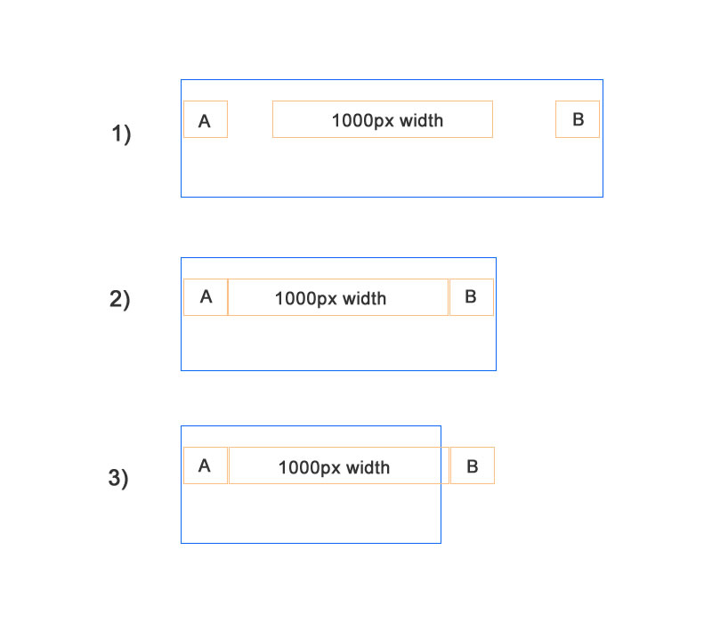
I would like to have the 1000px div aligned on the center of the page as seen in diagram 1.
However, at the same time, I would want to have div block 'A' and div block 'B' each aligned at each end of the page browser window.
When the user reduces the size of the browser window, the 1000px div will remain centered on the page, and the 2 other div blocks 'A' and 'B' will remain at each of the ends. (see diagram 2)
When the browser window is 'smaller' than all three, the div block 'A' , the 1000px centered div block and the div block 'B' will all remain in one line but of course portions of the div will only be visible depending on the size of the browser window.(see diagram 3)
How can this be achieved? I have spent countless hours and still cannot make this happen.
Thanks so very very much!
I have been stuck on this issue for quite sometime and still cannot figure it out. I do hope someone is willing to help me.
Please see the picture below for question clarity.
I would like to have the 1000px div aligned on the center of the page as seen in diagram 1.
However, at the same time, I would want to have div block 'A' and div block 'B' each aligned at each end of the page browser window.
When the user reduces the size of the browser window, the 1000px div will remain centered on the page, and the 2 other div blocks 'A' and 'B' will remain at each of the ends. (see diagram 2)
When the browser window is 'smaller' than all three, the div block 'A' , the 1000px centered div block and the div block 'B' will all remain in one line but of course portions of the div will only be visible depending on the size of the browser window.(see diagram 3)
How can this be achieved? I have spent countless hours and still cannot make this happen.
Thanks so very very much!
ASKER CERTIFIED SOLUTION
membership
This solution is only available to members.
To access this solution, you must be a member of Experts Exchange.
SOLUTION
membership
This solution is only available to members.
To access this solution, you must be a member of Experts Exchange.
Update version - HTML is the same. You will need to tweak the widths as I have set them low so I can see them in action
http://jsfiddle.net/GaryC123/kVB8z/5/
http://jsfiddle.net/GaryC123/kVB8z/5/
.container {
overflow:hidden;
    position:relative;
}
div {
    border:1px solid gray
}

.left {
    position:absolute;
    display:inline-block;;
    width:100px
}
.middle {
    display:block;
    width:200px;
    margin:0 auto;
}
.right {
   position:absolute;
    top:0;
    right:0;
    width:100px
}
@media all and (max-width:420px){
     .right {left:300px}
    .inner {overflow:hidden;width:4000px}
    .middle {margin:0 100px}
}
@media all and (min-width:403px){
    .inner {width:100%;min-width:403px}
}
@GaryC123: just as a warning that your solution doesn't work on older browsers...
IE<9 for sure... the others I don't know by heart :)
IE<9 for sure... the others I don't know by heart :)
ASKER
Thx for the super quick response again everyone!
I am sooo excited to try your solutions out :)
Let me get back to you guys asap once I try it out.
Much much thx!
I am sooo excited to try your solutions out :)
Let me get back to you guys asap once I try it out.
Much much thx!
If they need to support IE8 and lower (yawn we're on v11 now) then s/he can use
http://code.google.com/p/css3-mediaqueries-js/
There is no other way to do what he wants with pure CSS2
http://code.google.com/p/css3-mediaqueries-js/
There is no other way to do what he wants with pure CSS2
Actually I lie, your version works great once you add an overflow:hidden to the body.
ASKER
Hi GaryC123,
I am trying out your solution first and I noticed that when I set the middle centered block to a width of 1000px, and try to make the browser window smaller, the middle centered block would overlap the left block, and than as the browser size further shrank, the right block will overlap the center block.....
But if i used your example of setting the center block to a width of just 200px, everything worked fine....
Could you let me know which values I should be adjusting to ensure that when the middle centered block is set to 1000px width, the solution would work?
Thanks so much!
I am so excited I am finally seeing this come true!
I did not try your solution Alex yet as I have many other stlyes that would be affected by using the body tag as in your solution.
Thanks again so very much!
Just use Alex's example but instead of the BODY add another container DIV around your columns and apply the css to that instead of the body. But you will also need overflow:hidden on the BODY
If you cannot do anything like that with the body tag then with my example you just need to amend the media queries
Update jsfiddle
http://jsfiddle.net/GaryC123/kVB8z/6/
You will need to tweak the widths to take account of borders etc.
If you cannot do anything like that with the body tag then with my example you just need to amend the media queries
@media all and (max-width:1200px){
     .right {left:1100px}
    .inner {overflow:hidden;width:4000px}
    .middle {margin:0 100px}
}
@media all and (min-width:1200px){
    .inner {width:100%;min-width:1200px}
}Update jsfiddle
http://jsfiddle.net/GaryC123/kVB8z/6/
You will need to tweak the widths to take account of borders etc.
ASKER
Thanks for all your patience guys! I am still working through trying out both your solutions.
In my initial testing, it looked fine in my computer browser, but I am not sure why, when I viewed the page from my andriod device browser, the right hand side box with is supposed to be hugging the right hand side of the browser is showing a gap as though there was a margin right style when there is not...any clues?
Thanks.
ASKER
Thanks guys.....you gave me the correct and clear knowledge of achieving what I think I wanted to do.
I am very appreciative of the time and patience you guys gave to me!
Thank you so much.
Have a good evening! :)
I am very appreciative of the time and patience you guys gave to me!
Thank you so much.
Have a good evening! :)
Hi guys,
sorry I didn't say anything anymore but it was almost 1:30 AM here and I had to sleep! :)
Just saw this question and I absolutely had to give it a try :)
Cheers!
sorry I didn't say anything anymore but it was almost 1:30 AM here and I had to sleep! :)
Just saw this question and I absolutely had to give it a try :)
Cheers!
If you change these values you also need to rearrange the calculations.
basically colCenter has the same left value as the A width, and right value as B width.
I added the border so we can see what's going on.