slightlyoff
asked on
Wordpress Skeleton Responsive Style Issue
So, I'm using Skeleton to create a responsive WordPress theme and I'm stuck with a weird issue. Being new to Skeleton I'm not sure what the issue is.
I decided to take a step back and create a normal html page with the code I'm using.
When the viewport is resized, the "Show Nav" div seems to double in size.
It seems related to .nav-bar.
The navigation bar is supposed to be 40px tall. When the viewport is shrunk to less than 767px wide, the .main-nav class disappears and the #show-nav div appears. However, the #show-nav div is not the same height as the .main-nav class and I'm stumped as to why not.
Here's my CSS:
And here's the HTML:
I've attached the Skeleton CSS for easier access.
I hope this isn't too vague of a question, I've been battling it for hours and could really use some help.
Thank you!
skeleton.css
I decided to take a step back and create a normal html page with the code I'm using.
When the viewport is resized, the "Show Nav" div seems to double in size.
It seems related to .nav-bar.
The navigation bar is supposed to be 40px tall. When the viewport is shrunk to less than 767px wide, the .main-nav class disappears and the #show-nav div appears. However, the #show-nav div is not the same height as the .main-nav class and I'm stumped as to why not.
Here's my CSS:
html, body, div, span, applet, object, iframe,
h1, h2, h3, h4, h5, h6, p, blockquote, pre,
a, abbr, acronym, address, big, cite, code,
del, dfn, em, img, ins, kbd, q, s, samp,
small, strike, strong, sub, sup, tt, var,
b, u, i, center,
dl, dt, dd, ol, ul, li,
fieldset, form, label, legend,
table, caption, tbody, tfoot, thead, tr, th, td,
article, aside, canvas, details, embed,
figure, figcaption, footer, header, hgroup,
menu, nav, output, ruby, section, summary,
time, mark, audio, video {
	margin: 0;
	padding: 0;
	border: 0;
	font-size: 100%;
	font: inherit;
	vertical-align: baseline;
}
/* HTML5 display-role reset for older browsers */
article, aside, details, figcaption, figure,
footer, header, hgroup, menu, nav, section {
	display: block;
}
body {
	line-height: 1;
}
ol, ul {
	list-style: none;
}
blockquote, q {
	quotes: none;
}
blockquote:before, blockquote:after,
q:before, q:after {
	content: '';
	content: none;
}
table {
	border-collapse: collapse;
	border-spacing: 0;
}

body{
	background-color:#000;
}

.nav-bar {
	background-color:#7e0406;
	height:40px;
	display:block;
}

.main-nav ul, .main-nav li{
	display:inline;
}

.main-nav a{
	padding:0 15px 0 15px;

	text-decoration:none;
	line-height:40px;
	display:block;
	color:#fff;
	font-family:sans-serif;
}

.main-nav a:hover{
	background:#666;
}

.main-nav ul ul a{
	width:135px;
	line-height:20px;
	padding:0 20px;
	display:block;
}

.main-nav ul li {
	position:relative;
	float:left;
}

.main-nav ul ul {
	position:absolute;
	top:-99999999px;
	left:0;
	opacity:0;
	background-color:#666;
	text-align:left;
}

.main-nav ul li:hover > ul{
	position:absolute;
	top:100%;
	opacity:1;
}

#show-nav{
	display:none;
	background:#7e0406;
}

#close-nav {
	display:none;
	background:#7e0406;
	text-align:right;
	font-family:sans-serif;
}

#eyes{
	display:block;
}

@media only screen and (max-width: 767px) {
	.main-nav ul li {
		float:none;
	}

	.main-nav{
		display:none;
	}

	#eyes{
		display:none;
	}

	#show-nav{
		display:block;
	}


	#close-nav {
		display:none;
	}
}And here's the HTML:
<!DOCTYPE html>
<html>
	<head>
		<title>Test</title>

		<link rel="stylesheet" type="text/css" href="style.css">
		<link rel="stylesheet" type="text/css" href="skeleton.css">
	</head>
	<body>
		<div class="container">
        <header>
            <div class="main-nav sixteen columns" id="show-nav"><a href="#">Toggle Navigation</a></div>
            <div class="main-nav sixteen columns" id="close-nav"><a href="#">x</a></div>
            <div class="sixteen columns nav-bar">
				<nav class="main-nav">
                	<ul id="menu-main-nav" class="menu">
                    	<li id="menu-item-25" class="menu-item menu-item-type-post_type menu-item-object-page menu-item-25"><a href="#">Link 1</a></li>
						<li id="menu-item-28" class="menu-item menu-item-type-post_type menu-item-object-page menu-item-28"><a href="#">Link 2</a></li>
						<li id="menu-item-29" class="menu-item menu-item-type-post_type menu-item-object-page menu-item-29"><a href="#">Link 3</a></li>
					</ul>
                </nav>
            </div>
		</header>

        </div>
     </body>
</html> I've attached the Skeleton CSS for easier access.
I hope this isn't too vague of a question, I've been battling it for hours and could really use some help.
Thank you!
skeleton.css
ASKER
Thank you for your reply!
is taller than the two divs below it:
I've checked it in multiple browsers. When the screen is made smaller, the "Toggle Menu" text appears, but it's background bar is twice as tall as the normal navigation's background bar.
For example, here's a cropped image of the normal navigation: As the screen shrinks and fires the media-query this is how the small nav appears:
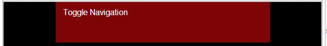
For some reason it's doubling in height...
Thanks again for responding. It's a tough problem to try to explain.
<div class="main-nav sixteen columns" id="show-nav"><a href="#">Toggle Navigation</a></div>is taller than the two divs below it:
<div class="main-nav sixteen columns" id="close-nav"><a href="#">x</a></div>
            <div class="sixteen columns nav-bar">
				<nav class="main-nav">
                	<ul id="menu-main-nav" class="menu">
                    	<li id="menu-item-25" class="menu-item menu-item-type-post_type menu-item-object-page menu-item-25"><a href="#">Link 1</a></li>
						<li id="menu-item-28" class="menu-item menu-item-type-post_type menu-item-object-page menu-item-28"><a href="#">Link 2</a></li>
						<li id="menu-item-29" class="menu-item menu-item-type-post_type menu-item-object-page menu-item-29"><a href="#">Link 3</a></li>
					</ul>
                </nav>
</div>I've checked it in multiple browsers. When the screen is made smaller, the "Toggle Menu" text appears, but it's background bar is twice as tall as the normal navigation's background bar.
For example, here's a cropped image of the normal navigation:
As the screen shrinks and fires the media-query this is how the small nav appears:For some reason it's doubling in height...
Thanks again for responding. It's a tough problem to try to explain.
ASKER CERTIFIED SOLUTION
membership
This solution is only available to members.
To access this solution, you must be a member of Experts Exchange.
ASKER
Thank you for your help! I'll give it a try when I get back to the office.
Which .main-nav are you referring to?
If its #close-nav in it then it has a rule to hide itself when under 767px in your own style.css file.
If you're referring to nav.main-nav then its also set to hidden when under 767px in your own style.css file.
If you're referring to #show-nav, then it is the same height since its the same div.
Are you looking at a specific browser that doesn't support media queries?