Need Logo Critiquing
Hello Experts,
I need some logo critiquing for my logo that I created. I'm no graphic designer but I have played around with Photoshop and Illustrator to create what I'm showing now. I'm looking for ways to improve what I have now.
When I say improve what I have now I want to know:
- Does my logo fit what I offer?
- Do I have two many colors?
- If too many colors, what color(s) should I stay with?
- Any other ideas that can help improve what I currently have.
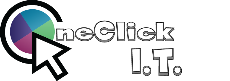
Attached is my current logo with the name of my company and the logo by itself.


I need some logo critiquing for my logo that I created. I'm no graphic designer but I have played around with Photoshop and Illustrator to create what I'm showing now. I'm looking for ways to improve what I have now.
When I say improve what I have now I want to know:
- Does my logo fit what I offer?
- Do I have two many colors?
- If too many colors, what color(s) should I stay with?
- Any other ideas that can help improve what I currently have.
Attached is my current logo with the name of my company and the logo by itself.
Hello,
From the logo, I gather that you offer a one-stop-shop for IT solutions.
I do feel like it's too many colors but I'm not sure if those are the colors that are part of your business. I prefer 2 colors and would towards the blue/green.
the O in One click reminds me of a G with the mouse pointer where it is.
As far as the type font goes, for logos I prefer something that is easier to read. Here are some examples: https://typekit.com/fonts/prenton-ultra-condensed
- Does my logo fit what I offer?
- Do I have two many colors?
- If too many colors, what color(s) should I stay with?
- Any other ideas that can help improve what I currently have.
From the logo, I gather that you offer a one-stop-shop for IT solutions.
I do feel like it's too many colors but I'm not sure if those are the colors that are part of your business. I prefer 2 colors and would towards the blue/green.
the O in One click reminds me of a G with the mouse pointer where it is.
As far as the type font goes, for logos I prefer something that is easier to read. Here are some examples: https://typekit.com/fonts/prenton-ultra-condensed
ASKER
Hi Dan,
>> For ex, why those colors? Why so dark? Why 4?
Very good questions you have Dan. I guess I should have mentioned that part. My company is called One Click Away I.T. (IT = Information Technology).
I offer 4 types of computer services. They are Computer, Web, Data and Network Services. So I thought it would be neat to have a color represent each service. Light Purple for Computer Services, Dark Purple for Web Services, Blue for Web Services and Green for Network Services. Those are just my favorite colors that I wanted to incorporate some how.
But please, I'm up for any ideas that you think I'm missing to make the logo better.
I was not sure what you meant by "FWIW". When you say information should flow can you explain what you mean by that in an easy way for me to understand.
FWIW: For What It's Worth.
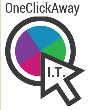
The white space inside the arrow was trapped. That information wasn't going anywhere.
While in some cases that might be what you want, in the case of IT (information technology) the information should flow (at least in my opinion).
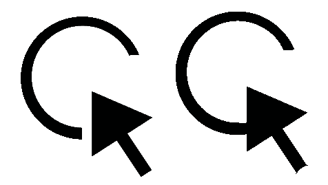
One tiny detail: you repeated the circle twice (on the actual circle - O - and on the C). I enforced that by cutting the stem of the arrow with a circle...
The white space inside the arrow was trapped. That information wasn't going anywhere.
While in some cases that might be what you want, in the case of IT (information technology) the information should flow (at least in my opinion).
One tiny detail: you repeated the circle twice (on the actual circle - O - and on the C). I enforced that by cutting the stem of the arrow with a circle...
Hi asp_net2,
The one thing I would say to do is to simplify. The more you can say with less the better. For the actual mark, you may want to move that out and have it on its own. By doing this you free of the text to breathe a bit more, and you are less likely to associate the mark as a "G".
As for colors, the more you use, the more muddled a logo can become. Try use flatter colors, or more subtle gradients.
The font needs to be fixed. There seems to be no harmony between the letters. They seem to be from separate font families. The kerning is not that great, and the proportions seem off. Not sure what kind of feel you are going for, but I used Open Sans. Not the greatest of typefaces, but it's free. It mimics premium fonts like Gotham, Brandon Grotesque text, etc.
Hope this helps!
ASKER
@D4N1,
Yes, I'm a one stop computer shop. What are your reasons for blue and green?
Yes, I'm a one stop computer shop. What are your reasons for blue and green?
ASKER
@Dan Cracium,
I agree with you as well that information technology should flow. Very good point mentioned. Should I remove the circle that the colors are in and just keep the outer black circle with the arrow?
I agree with you as well that information technology should flow. Very good point mentioned. Should I remove the circle that the colors are in and just keep the outer black circle with the arrow?
ASKER
@Adrian Crabtree,
I agree 100% in simplicity. I would love my logo to look simple and not complicated looking. When I design and develop web applications that is what i always shoot for is simplicity..
What do you think needs done to my logo to make it more simpler looking?
I agree 100% in simplicity. I would love my logo to look simple and not complicated looking. When I design and develop web applications that is what i always shoot for is simplicity..
What do you think needs done to my logo to make it more simpler looking?
No, I would keep the circle.
Like I said, if you've got good reasons for every element of your design, then they should stay, maybe with some refinements:
- grey instead of black (as in Adrian's image)
- separate a bit your colors

Like I said, if you've got good reasons for every element of your design, then they should stay, maybe with some refinements:
- grey instead of black (as in Adrian's image)
- separate a bit your colors
ASKER
@Dan Cracium,
The reason for every color is two represent a color for each service that I offer. I intend to show that on my website as well. In other words I will some how refer to each color for it's own service. Example: Purple = Computer Services, Dark Purple = Data Services, Blue = Web Services and Green = Network Services.
Also, as for the chunk that you took out of the arrow, does it make sense to do that? Just curious because before the arrow looked complete and now it does not. Any other way that I could somehow incorporate your flow that you suggested without removing that chunk from the arrow?
I like your logo. The only thing that needs updating is the font like what Adrian has done and I do like the completely closed arrow.
Similar to the spinning beach ball on mac without an exact copy.
You did a good job.
Similar to the spinning beach ball on mac without an exact copy.
You did a good job.
I hate having to say this publicly... but the domain oneclickaway.it is available
ASKER
@Scott Fell (padas),
Thank you. I do like the idea that Adrian mentioned about changing the font. Any idea what category of font (Sans serif, Sans, etc..) I should go with? Or how can I determine what font would be best to use. I don't know much about fonts and the purpose they serve when it comes to design. I can say for my company, I'm all about keeping stuff very simple. So, like Adrian mentioned earlier simplicity is best for me. So any idea of a font that speaks simplicity :)
Thank you. I do like the idea that Adrian mentioned about changing the font. Any idea what category of font (Sans serif, Sans, etc..) I should go with? Or how can I determine what font would be best to use. I don't know much about fonts and the purpose they serve when it comes to design. I can say for my company, I'm all about keeping stuff very simple. So, like Adrian mentioned earlier simplicity is best for me. So any idea of a font that speaks simplicity :)
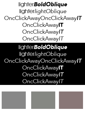
For the font, I think you should choose a sans serif. Look through http://www.dafont.com/theme.php?cat=501&text=OneClickIT and see what hits you.
For colors, I like your color wheel and I am sure you may already have use for them. Those colors are muted so I am not crazy about the gray outline. I like the darker outline better. You can use gray in your font though.
I am much better and picking out what I like and don't like than actually creating... as are most left brainers.
ASKER
@Scott Fell,
What do think about the 4 colors that I choose in regards to print? In other words, is it better these days to just stay with one or two main colors for your logo rather than the four that I have now? I have been seeing a lot of companies just use one color for print and I have four colors. What should I do about that?
What do think about the 4 colors that I choose in regards to print? In other words, is it better these days to just stay with one or two main colors for your logo rather than the four that I have now? I have been seeing a lot of companies just use one color for print and I have four colors. What should I do about that?
It's a small amount of color. Stick with what you have. However, you should come up with a one color version of your logo for when you print out in black and white. As it is now, it may just look muddy. Play with some gray scales.
FedEx office went with 4 colors.... http://www.fedex.com/us/office/
FedEx office went with 4 colors.... http://www.fedex.com/us/office/
ASKER
@Scott Fell,
Ok, thank you for your input. Do you think it would look ok if I made the circle with colors a solid single gray or solid white for black and white print out?
Ok, thank you for your input. Do you think it would look ok if I made the circle with colors a solid single gray or solid white for black and white print out?
I agree with the changing of the font. I have looked at it several times to see what pulled my focus. Just a suggestion, I think that the width of the dark black it IT and the O and arrow should be the same. I like the arrow closed. Also my eyes are continually drawn to the colors, could they remain together but faded slightly?
Stick with your very first choice you posted, but change the font. For B/W, play with outline circle sections with white, outline circle sections and 2 shades of gray. Make sure it is actually gray scale colors though and not some left over colors.
Print out to life size such as a business card, letterhead, golf shirt embroidery size to make your final decision.
For the name, play with the lighter font for OneclickAway and the oblique version for I.T.
You are on the right track.
Print out to life size such as a business card, letterhead, golf shirt embroidery size to make your final decision.
For the name, play with the lighter font for OneclickAway and the oblique version for I.T.
You are on the right track.
It pays to look at the inverted white space. People will notice it, just not usually on a conscious level.
Below you have the inverted white space for your original logo (left) and my modified one (right). On the right it looks like you have 2 arrows pointing.
Below you have the inverted white space for your original logo (left) and my modified one (right). On the right it looks like you have 2 arrows pointing.
ASKER
@Scott Fell,
>> For B/W, play with outline circle sections with white, outline circle sections and 2 shades of gray. Make sure it is actually gray scale colors though and not some left over colors.
Can you explain that to me a little more clearly?
>> For the name, play with the lighter font for OneclickAway and the oblique version for I.T.
Can you give me some ideas what you mean by "lighter" font and also what you mean by an oblique version?
Black is a mix of all colors and gray is a shade of black. When you are choosing colors for print, you are using the CMYK formula (Cyan, Magenta, Yellow and "k" is Black). When you are choosing your colors, make sure you are using a shade of black (grayscale) and not mixing in other colors or you could get some odd results. For the screen, there is not a black, it is a mix of RGB (Red, Green, Blue). If you are picking colors from a color wheel pop up, just make sure you are picking out pure black shades.
Oblique is italics
Oblique is italics
ASKER
@Scott Fell,
Ok, What are the three colors at the bottom of your example for? One looks gray, green and maroon.
Ok, What are the three colors at the bottom of your example for? One looks gray, green and maroon.
Shade of black, a little green and a little red. Just sample to show the difference. Easy to see here especially when compared to each other. Look at one at a time and it is not as easy.
ASKER
I do use a program called "ColorSchemer Studio" http://colorschemer.com/.
Would it be best to pick my RGB colors first for the web and then use the CMYK colors that the program picks out that resemble the RGB colors?
Or would it be best to pick colors from Pantone Solid Colors for print and find the RGB color that best fits from the CMYK color?
Also, did you recommend that I use black for the outline of the logo or gray instead?
ASKER
@Scott Dell,
Also, do I need to make sure my logo is designed using the golden ratio?
Also, do I need to make sure my logo is designed using the golden ratio?
My only comment about color was gray. When you use those color wheel things, it is easy to choose a gray that is made from multiple colors rather than a grayscale of black. It would be more for printing. Pantone is just a branded pre mix of rgb/cmyk on different formats.
I personally think your colors are good.
The fibonacci/golden ratio relates what is pleasing to the eye. Be aware of it, but don't stress on it. I like what you did with the original vertical logo over the centered logo on top, type on bottom. Just pick a nicer looking font.
I personally think your colors are good.
The fibonacci/golden ratio relates what is pleasing to the eye. Be aware of it, but don't stress on it. I like what you did with the original vertical logo over the centered logo on top, type on bottom. Just pick a nicer looking font.
ASKER
@Scott Fell,
When adding a new font should I add my name as the following below without spaces between each word?
OneClickAway IT
When adding a new font should I add my name as the following below without spaces between each word?
OneClickAway IT
I think you need to play with multiple formats and see what you like. Both with and without dots after the I and T. Or if you did snap up that domain name OneClickAway.IT
Make up a hand full of samples. Don't make any snap decisions unless something really stands out right away. I would stew on it a few days. Narrow it down and show to a few people that are not friends or family that will say yes to anything.
You are on the right path.
Make up a hand full of samples. Don't make any snap decisions unless something really stands out right away. I would stew on it a few days. Narrow it down and show to a few people that are not friends or family that will say yes to anything.
You are on the right path.
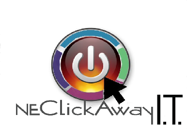
Can I offer you another pretty idea, not as professional as the other experts here but just as an idea.
I thought since it is an IT site and you want to use those 4 colours I combined them with the idea wth a computer power button. That's one click and IT> computers
It's a bit rough, maybe the arrow dimensions could be bigger.
It also depends on the layout of your page and the colours used. Will it clash with your web design and enviroments. Schemes?
 cheers
I thought since it is an IT site and you want to use those 4 colours I combined them with the idea wth a computer power button. That's one click and IT> computers
It's a bit rough, maybe the arrow dimensions could be bigger.
It also depends on the layout of your page and the colours used. Will it clash with your web design and enviroments. Schemes?
cheers
ASKER
All,
So based on your input I came up with the following. PLEASE, let me know all of your honest opinion's. I have fought tooth and nail over this design and just want to know if I'm missing ANYTHING..
Thanks in advance for all your help/input!!!!
I'm going to post the same logo but with different font. I would like to know which font goes best with the logo as well.
My 2 cents
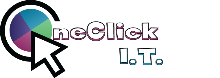
I feel that the small I.T. is losing the main focus of your site OneClickAway from what?
if I may say, I prefer Dans logo the way the center of the arrow meets with circle because it is open not filled hints of like a connection flow through that one clicking connects
and how he segregated the coloured pieces gives a hint of different departments
ASKER
Hi Merete,
Ok, I will make up another design with that in mind. As for the name of my business and the font style. What do you think?
Ok, I will make up another design with that in mind. As for the name of my business and the font style. What do you think?
ee2 is by far your best submission. The boldness of the font and the pointer draw the eye, but I agree with Merete it i.t. is totally lost. What it you put an IT in bold either in the center on the pointer or the color block? Personally I would Like to see it in the pointer, with OneClickAway centered.
ASKER
Ok, so I came up with another idea as well. Let me know all of your thoughts.
@Lounge Fox,
Can you give me an idea as to what I should do with the I.T.? I agree with you both that it does seem lost, just not sure what to do with it. My official business name is One Click Away I.T. which is why I need to use it. Just not sure were or how.

@Lounge Fox,
Can you give me an idea as to what I should do with the I.T.? I agree with you both that it does seem lost, just not sure what to do with it. My official business name is One Click Away I.T. which is why I need to use it. Just not sure were or how.
ASKER
@Merete,
As for the color separation, I agree but not sure about the purple and green colors. If I separate the blue and purple then it will look a little off since the other two don't have any white space between them, they may seem together.
As for the color separation, I agree but not sure about the purple and green colors. If I separate the blue and purple then it will look a little off since the other two don't have any white space between them, they may seem together.
Hi asp_net2
I liked the way you had incorperated the coloured circle as a Zeo representing the one of the name
Just the Font was a bit out of sorts.
What do you feel emphasis in the Fonts type?
What statement?
There is litteraly 1000's of fonts
 I'd stick with that and just play around with different Fonts.
My perception seems to be so different from other experts,. but drawing from the my experiences, there is banner and a logo.
To give you an example of one I made last year for my sisyer inlaw's Salt therapy Business
 The logo is as you would imagine is a male or female lying on white couch with salt crystals coming down on them
So the emphasis then was colours used matched the decor of the clinic reception and the white of the furniture, keeping in mind this logo banner would also used also for the stationary.
The Font was just a simple one.
So I do the same with yours, your business is IT with different services.
As you said>>
The reason for every color is two represent a color for each service that I offer.
I intend to show that on my website as well.
In other words I will some how refer to each color for it's own service.
Example: Purple = Computer Services, Dark Purple = Data Services, Blue = Web Services and Green = Network Services.
So this Oneclick is for the online web services where they book in?
Leaning trowards Dan's other idea with simple logo http:#a39872963
gives the one click attached to a semi circle no colours
What is the semi circle for now that you have removed the connection to big letter Zero part of the One
My line of thinking is that you are selling the oneclick idea but it doesnt really reflect your IT business.
Or define the different departments
Imagine being a customer and have no idea about your business and they open your web page, what do they see?
As yet I can't offer anything with that as I have no idea of what your web page will display.
But I would try and put more emphasis on the web page with a form of scrolling banner then you could put this logo on the top beside this or part of it.
If you wanted to test things
Create your own web site for free
Your thoughts
I liked the way you had incorperated the coloured circle as a Zeo representing the one of the name
Just the Font was a bit out of sorts.
What do you feel emphasis in the Fonts type?
What statement?
There is litteraly 1000's of fonts
I'd stick with that and just play around with different Fonts.My perception seems to be so different from other experts,. but drawing from the my experiences, there is banner and a logo.
To give you an example of one I made last year for my sisyer inlaw's Salt therapy Business
So the emphasis then was colours used matched the decor of the clinic reception and the white of the furniture, keeping in mind this logo banner would also used also for the stationary.
The Font was just a simple one.
So I do the same with yours, your business is IT with different services.
As you said>>
The reason for every color is two represent a color for each service that I offer.
I intend to show that on my website as well.
In other words I will some how refer to each color for it's own service.
Example: Purple = Computer Services, Dark Purple = Data Services, Blue = Web Services and Green = Network Services.
So this Oneclick is for the online web services where they book in?
Leaning trowards Dan's other idea with simple logo http:#a39872963
gives the one click attached to a semi circle no colours
What is the semi circle for now that you have removed the connection to big letter Zero part of the One
My line of thinking is that you are selling the oneclick idea but it doesnt really reflect your IT business.
Or define the different departments
Imagine being a customer and have no idea about your business and they open your web page, what do they see?
As yet I can't offer anything with that as I have no idea of what your web page will display.
But I would try and put more emphasis on the web page with a form of scrolling banner then you could put this logo on the top beside this or part of it.
If you wanted to test things
Create your own web site for free
Your thoughts
ASKER
Hi Merete,
Good points. That was my initial design, but then I want my site to appear clean, professional looking, and simple to navigate. I looked at my logo and thought that my own logo doesn't even represent what I want which is why I'm in the process of changing it. Also, adding my logo to my current site just seemed like it took up to much room but just my logo. I'm also going to recreate my site for a responsive design and my current logo will not look well with a responsive site.
As for a font. I'm looking for a font that represents the following below:
- professional and clean looking.
- it does not have to be a techie font unless others think differently.
ASKER
Also, I have had other graphic designers tell me that I.T. stuck out like a sore thumb from my initial design. I was told by other designers (Not EE) that I should not make the I.T. stand out big like that.
No!! lol the fonts dont need to be techy or anything special just readable for anyone who needs magnifyng glasses to read, especially if they use a computer a lot they all waer glasses.. simple straight fonts
Incorperating a simple logo with the OneClick "business name" and the banner is where you can add the colours and the technology services maybe in scrolling windows.
A picture paints a thousand words
Yes the IT stood out too much that stands for Internet Technology doesnt really say about your business
Your business
Example: Purple = Computer Services, Dark Purple = Data Services, Blue = Web Services and Green = Network Services.
My idea was incorperating the computer power button >>click on it
Now that I understand your computer business name I'll play around with some ideas and get back to you if you like.
A quick idea, just for ideas OK! if you like go ahead use it
open in the web page to see how the white of your arrow and the circle now kind of fits with your business name
 Regards Merete
PS
For OneClick ideas take a look at these OneClick Logos that's what I do
Your web page should make you feel proud and excited.
Incorperating a simple logo with the OneClick "business name" and the banner is where you can add the colours and the technology services maybe in scrolling windows.
A picture paints a thousand words
Yes the IT stood out too much that stands for Internet Technology doesnt really say about your business
Your business
Example: Purple = Computer Services, Dark Purple = Data Services, Blue = Web Services and Green = Network Services.
My idea was incorperating the computer power button >>click on it
Now that I understand your computer business name I'll play around with some ideas and get back to you if you like.
A quick idea, just for ideas OK! if you like go ahead use it
open in the web page to see how the white of your arrow and the circle now kind of fits with your business name
Regards MeretePS
For OneClick ideas take a look at these OneClick Logos that's what I do
Your web page should make you feel proud and excited.
asp_net2,
my idea
Perhaps the I.T. slightly larger.
my idea
Perhaps the I.T. slightly larger.
ASKER
ok, thanks Merete.
Yes I had thought of that, why not remove "away"
since your business name is OneClick I.T.
It sells itself by the icon arrow clicking
This looks really neat clean, and once you have the rest of your web side build it around this and then it woudl fall into place.
Sleep on it ;)

since your business name is OneClick I.T.
It sells itself by the icon arrow clicking
This looks really neat clean, and once you have the rest of your web side build it around this and then it woudl fall into place.
Sleep on it ;)
Make One Click bigger and I agree.
ASKER
@Lounge Fox / Merete,
My business name is One Click Away I.T.. Not just One Click I.T..
My business name is One Click Away I.T.. Not just One Click I.T..
ah !! sorry
That does change the logo a bit. Back to the drawing board ;P
the I.T. doesnt fit quite right
 Which Font are you using
That does change the logo a bit. Back to the drawing board ;P
the I.T. doesnt fit quite right
Which Font are you using
Then I still think the idea I did is viable. Unless you want the name all together. I feel that putting the I. T. In the point completes the thought circle. One click ( pointer- click) IT.
It is difficult when it is your baby, and you want the best. Any ideas of what you
Don't like.
It is difficult when it is your baby, and you want the best. Any ideas of what you
Don't like.
New idea

From all the above, stick with what you came up with http:#a39973843. That set is perfect. I like the font from ee1 or ee2. All you need to do is make the IT larger. Try playing with the same size or just a bit larger. Instead of gray i.t., try the purple.
When others told you the I.T. was too big, I agree if they were talking about the logo you first posted with the type all the way across.
When others told you the I.T. was too big, I agree if they were talking about the logo you first posted with the type all the way across.
ASKER
@Scott Fell (padas),
Which logo did you like better, the logo here ID: 39973843 or here ID: 39973943? Everything is the same except for the grey circle. The gray circle for one is closed and the other it's open.
Which logo did you like better, the logo here ID: 39973843 or here ID: 39973943? Everything is the same except for the grey circle. The gray circle for one is closed and the other it's open.
I like EE1 http:#a39973843 better than EE5 http:#a39973943 because the circle is open. I would like it better if you made the I.T. the same font size as the rest, but adjust the tracking to bring the two letters closer together when they enlarge.
If you are a bit outside the lines type of person, I might even think about an enso style open circle. (Still open to the right like a C) There are brushstrokes for PS to use.
Otherwise, I think you are good with the EE1/EE2 set. What you have is clean and easy.
If you are a bit outside the lines type of person, I might even think about an enso style open circle. (Still open to the right like a C) There are brushstrokes for PS to use.
Otherwise, I think you are good with the EE1/EE2 set. What you have is clean and easy.
ASKER
@Scott Fell,
Ok, not sure what you mean by "tracking", does that just mean move the letters closer to it each other?
I will do an enso style for the "C" for you to look at all with myself.
Ok, not sure what you mean by "tracking", does that just mean move the letters closer to it each other?
I will do an enso style for the "C" for you to look at all with myself.
Yea, tracking = character spacing. I played with that brush stroke on my own. I kind of like it for me.
Now I was reminded why I thought of that.... Kind of a buzzkill

Now I was reminded why I thought of that.... Kind of a buzzkill
ASKER
@Scott Fell,
Ok, so not sure how to create an enso brush :( I googled enso brushes but could not find any. Do you know were I can find enso brushes at?
Ok, so not sure how to create an enso brush :( I googled enso brushes but could not find any. Do you know were I can find enso brushes at?
Ah, the Enso is a Zen thing. http://en.wikipedia.org/wiki/Ens%C5%8D
You really just need a brush stroke http://blog.spoongraphics.co.uk/freebies/12-free-high-res-dry-brush-stroke-photoshop-brushes
You really just need a brush stroke http://blog.spoongraphics.co.uk/freebies/12-free-high-res-dry-brush-stroke-photoshop-brushes
asp_net2 your logos here http:#a39973843 are the best.
Just enlarge the IT and darken and you're done.
It's quite impressive how you keep trying to keep up with so many experts different suggestions but those are great as is clean and straight now.
Well I'll see you guys tomorrow.
Just enlarge the IT and darken and you're done.
It's quite impressive how you keep trying to keep up with so many experts different suggestions but those are great as is clean and straight now.
Well I'll see you guys tomorrow.
ASKER
@Scott Fell,
Ok, I'm using Illustrator and those brushes do not work with Illustrator. Do you mind giving me some steps to follow to do this in Photoshop? I created a text layer with "C" but not sure how to apply the brush stroke to it.
Ok, I'm using Illustrator and those brushes do not work with Illustrator. Do you mind giving me some steps to follow to do this in Photoshop? I created a text layer with "C" but not sure how to apply the brush stroke to it.
Before you go messing around with brushes, make sure you even like the concept. I just spent a minute to quickly throw in an image I found.
 oneclick.psd
oneclick.psd
ASKER
Well, to be honest with you it almost appears to make the arrow stand out more almost as if the arrow is floating on top of the circle. Do you mind telling me what steps you took in order to create that in Photoshop? Also, how would I create that in Illustrator?
Just keep your original idea with clean lines...
ASKER
ok, I will go ahead and post the font correction with the I.T.
I gave you the psd.
I started with this http://teppoudo.org/wp-content/uploads/2008/02/enso.png
Turned it around so the opening is like a C
Placed your existing logo inside
Shrank it to fit your color wheel
Used the circle tool to cut out from the middle to make it a narrower brush
Took the opaque down to match the current gray
Cut out the circle you have
ASKER
so over all you think it's best to stick with what I have?


> so over all you think it's best to stick with what I have?
Yea, I am getting into a different tangent. I'm sorry.
 oneclick.psd
Yea, I am getting into a different tangent. I'm sorry.
oneclick.psd
ASKER
@Scott Fell,
Ok, I'm ready to wrap up this post now :)
Before I do, just one more question (maybe two).
Do you think that I should use the closed gray circle or the "C" looking circle and why?
If I remove the color wheel from the closed gray circle it almost appears that it represents clicking inside of the circle, but it look odd if I remove the colorwheel from the "C" design. I don't plan on removing the color wheel but I just noticed that.
ASKER CERTIFIED SOLUTION
membership
This solution is only available to members.
To access this solution, you must be a member of Experts Exchange.
I am definately liking padas fatter circle black. It says everything you want to say and tells who you are. after all we have suggested, would you please show us you final logo? We would all like to see the finished product.
Thank you Cleo.
My thought for that was IT is always so ridged. But it really takes a lot of creative thinking to solve problems, just different then a right brainer would use. We also hear the term, "The art and science of..." where some things are more art and others more science.
The click is the science, the beach ball gets artsy and the messy lines are all left brain. In addition, the paint stroke is zen influenced. The enso represents, "It can symbolize emptiness or fullness, presence or absence." What is that in IT? On/Off, ones and zeros and that is IT.
ASKER
@Scott Fell,
>> Once you have your black and white version ready, then add color. Based on that, I would be more concerned on how you would treat the beach ball if you only have one or two colors.
I would then use a single solid color to replace the multi color beach ball.
>> Once you have your black and white version ready, then add color. Based on that, I would be more concerned on how you would treat the beach ball if you only have one or two colors.
I would then use a single solid color to replace the multi color beach ball.
ASKER
@Lounge fox,
>> I am definitely liking padas fatter circle black. It says everything you want to say and tells who you are
Which one are your referring too?
>> I am definitely liking padas fatter circle black. It says everything you want to say and tells who you are
Which one are your referring too?
This one
I am sure your head is spinning from all the ideas. Before you make your final choice, I suggest you print all that move you, the ones here and the ones you've done. Then take a couple of days not looking or thinking about it. When you are ready spread them all out and see which one jumps out at you.
I am sure your head is spinning from all the ideas. Before you make your final choice, I suggest you print all that move you, the ones here and the ones you've done. Then take a couple of days not looking or thinking about it. When you are ready spread them all out and see which one jumps out at you.
Great advice
So, for every element in your logo, you need a very good reason why it's there.
For ex, why those colors? Why so dark? Why 4?
You need to be able to answer those questions.
FWIW, I modified it to "open" it. The information should flow, so my intent was to make sure the white space (information) is not trapped.
Dan