burnedfaceless
asked on
Making logo look professional
Kyle Hamilton
here's a suggestion: move logo all the way up. get rid of the Text link there, you don't need it. left align body copy, and move footer text over.

Remove the bluish background, it serves no purpose other than to make the logo look strangely out of place on a gray background. Do that and it will fit into the page a lot better.
Is the logo as it is now absolutely required? If not and you want to keep the blue background then remove the two vertical lines and move the logo to your top nav bar (pushing everything else over a bit) - big obtrusive logo's are a thing of the past
Is the logo as it is now absolutely required? If not and you want to keep the blue background then remove the two vertical lines and move the logo to your top nav bar (pushing everything else over a bit) - big obtrusive logo's are a thing of the past
Quick mockup

I think logo3 is in a good spot but I do concur to remove the blue background.
::edited image to remove my browsing habits et al::
ASKER
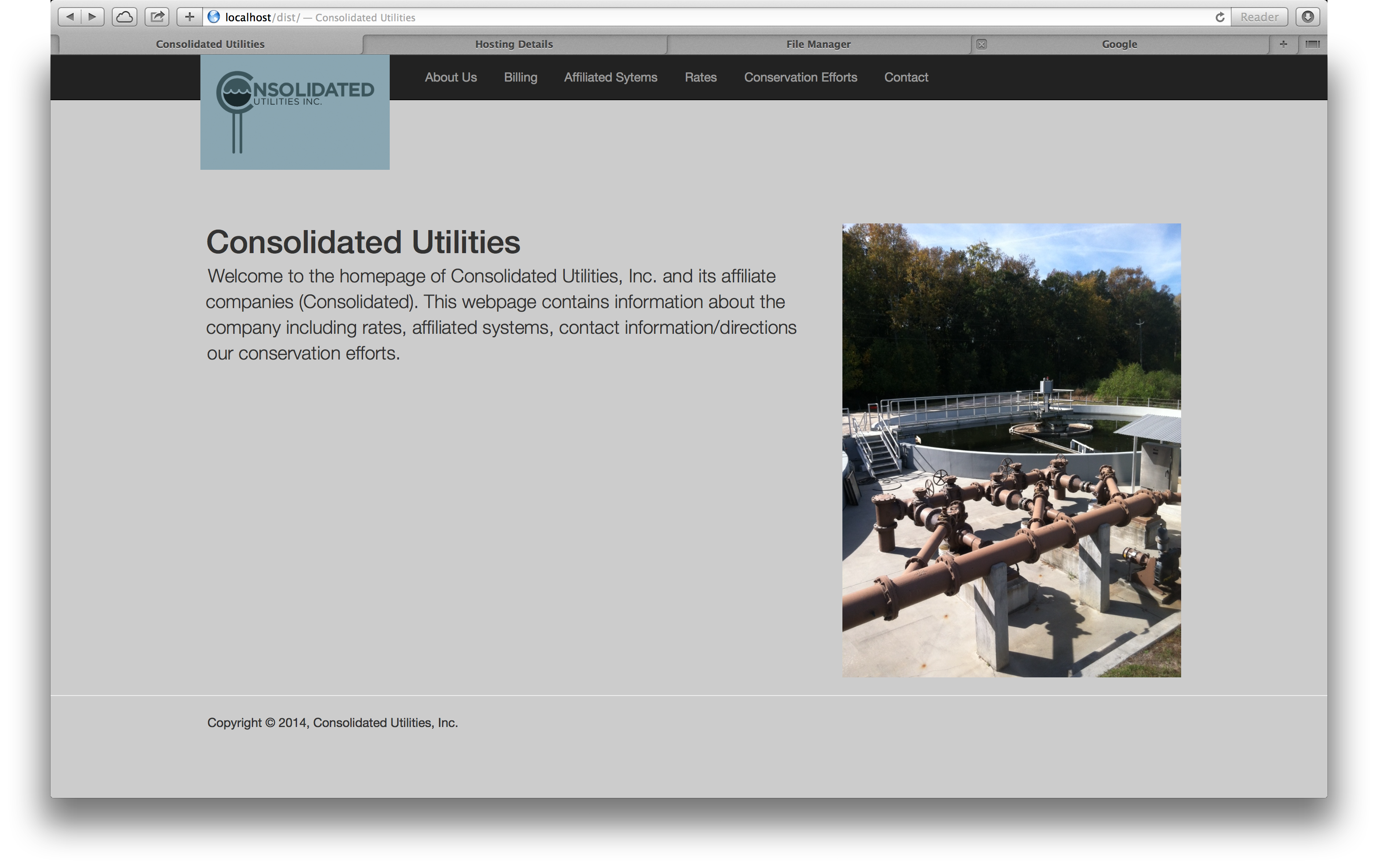
How does this look?
Screen-Shot-2014-04-24-at-9.16.1.png
Screen-Shot-2014-04-24-at-9.16.1.png
ASKER CERTIFIED SOLUTION
membership
This solution is only available to members.
To access this solution, you must be a member of Experts Exchange.
ASKER
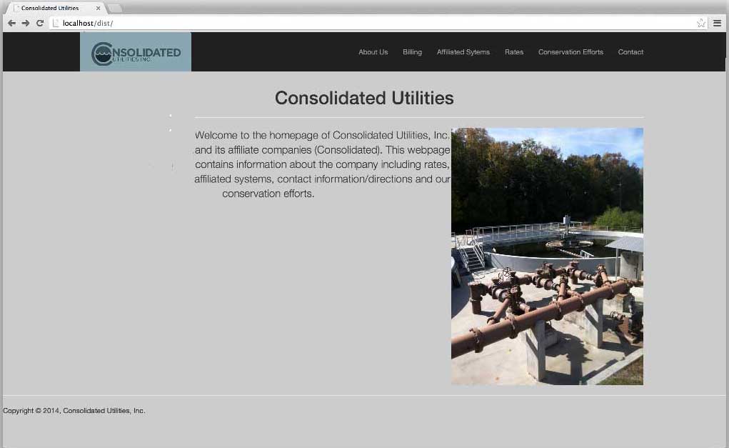
Here is another rendition.
Screen-Shot-2014-04-24-at-9.21.4.png
Screen-Shot-2014-04-24-at-9.21.4.png
ASKER
Here look at this http://consolidatedutilities.com
I added a break or two of them. Does it still look askew?
I added a break or two of them. Does it still look askew?
Your logo with the vertical stripes takes up a lot of unnecessary space. Can you eliminate the vertical stripes because it would make it look a whole lot better.
The two areas you have the name Consolidated Utilities in the top nav and as a page header are an unnecessary additional text that make no sense when you have a logo
The two areas you have the name Consolidated Utilities in the top nav and as a page header are an unnecessary additional text that make no sense when you have a logo
ASKER
Thanks Gary