Scale image with aspect ratio css.
Dear Support,
I have a div containing a image, I'm using max-width and max-height to scale the image in the div,
but the problem is when the image has more height than width, it doesn't stretch correctly.
I have this application released in this link: Symbiont Technologies
To get to the image just follow this steps:
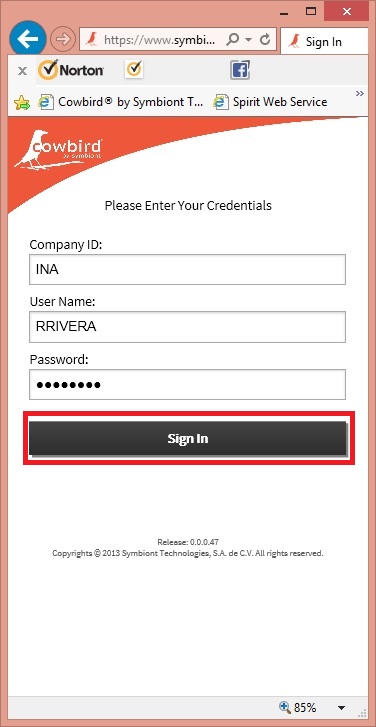
1. Sign In.
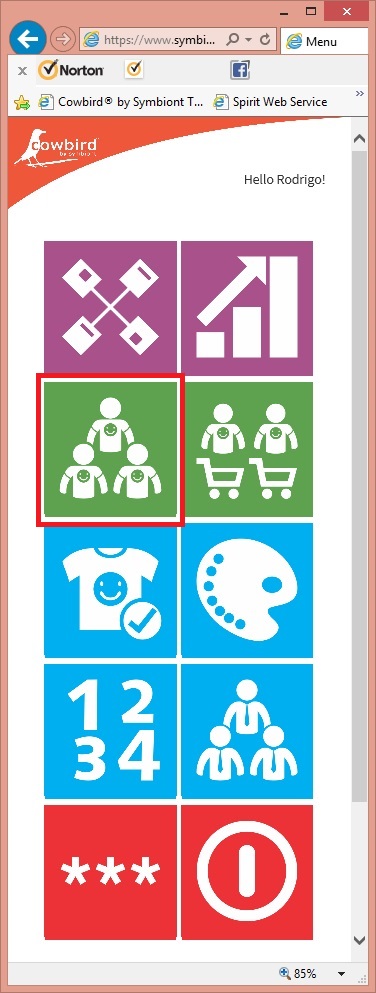
2. Select the green 3 little men image.
3. Slide the Mark Ecko until the "styles->" word appears.

4. Select the style 90302 from the styles combobox.
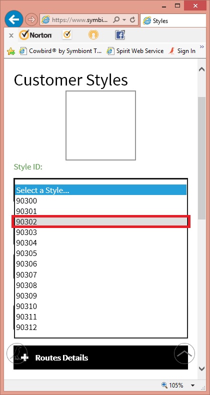
5. There is the image.
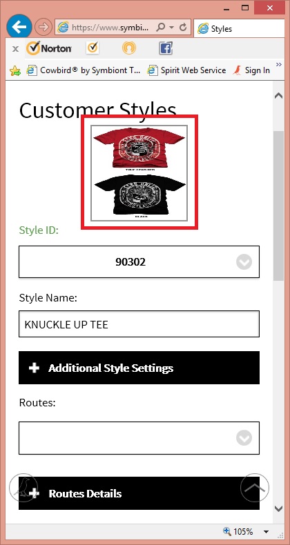
but in the other styles the images are fine, I believe that the problem has to be involved with the image height.
Thanks in Advance.
Best Regards.
I have a div containing a image, I'm using max-width and max-height to scale the image in the div,
but the problem is when the image has more height than width, it doesn't stretch correctly.
I have this application released in this link: Symbiont Technologies
To get to the image just follow this steps:
1. Sign In.
2. Select the green 3 little men image.
3. Slide the Mark Ecko until the "styles->" word appears.
4. Select the style 90302 from the styles combobox.
5. There is the image.
but in the other styles the images are fine, I believe that the problem has to be involved with the image height.
Thanks in Advance.
Best Regards.
I don't see the "styles" combobox? It seems to fly away when I drag the image in that row.
Are you using Bootstrap? The reason I ask is that within it, there are responsive images which will resize the image based on the screen / browser window size:
See http://getbootstrap.com/cs
See http://getbootstrap.com/cs
To keep it proportional when handling an array of images that may be different sizes, you need to set one dimension to be automatic. Bear in mind that one of the quirks of CSS is that using percentage with width and height styles relates to the available space i.e. within the parent container but max-height and max-width relate to the image itself i.e. width: 50% and max-width: 50% could well be two different numbers:
#imgStylesStyleImg {
    max-width: 130px
    height: auto
}

#frmImageStylesContainer {
    overflow: hidden
}ASKER
Hi experts,
I have this div with the ID: "frmImageStylesContainer " with a width of "130px" and a height of "130px" and it is also the image container.
What I really want is to fit the image inside that div keeping the aspect ratio, being the width and height of the container always the same.
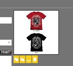
Something like this:
and this:
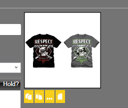
If you see the container always has the same size (it is a perfect square), the images changes size to fit the container keeping the aspect ratio.
That is what I want to do using the css in my app.
Thank you very much for your help.
Best Regards,
Rodrigo Rivera
I have this div with the ID: "frmImageStylesContainer " with a width of "130px" and a height of "130px" and it is also the image container.
What I really want is to fit the image inside that div keeping the aspect ratio, being the width and height of the container always the same.
Something like this:
and this:
If you see the container always has the same size (it is a perfect square), the images changes size to fit the container keeping the aspect ratio.
That is what I want to do using the css in my app.
Thank you very much for your help.
Best Regards,
Rodrigo Rivera
ASKER
Hi sbickerstaff,
I'm not using bootstrap.
Thanks for your comment.
I'm not using bootstrap.
Thanks for your comment.
ASKER
Hi Ray Paseur,
Could you please give a try loading the app again.
What did you mean with "flew away in the drag of the image"?
Thanks for your comment.
Could you please give a try loading the app again.
What did you mean with "flew away in the drag of the image"?
Thanks for your comment.
ASKER CERTIFIED SOLUTION
membership
This solution is only available to members.
To access this solution, you must be a member of Experts Exchange.
bootstrap does this to an image to make it responsive, note the width and height settings
display: block;
width: 100%;
max-width: 100%;
height: auto;ASKER
Thank you very much for all the help.
Best Regards.
Best Regards.
ASKER