Excel Chart
No arrays please.
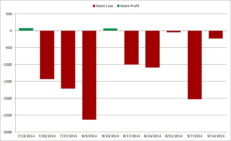
Attached are two screenshots of my spreadsheet. One is a shot of two columns -- one has a column for profit, and the other a column for loss. It only shows the total on every 7th day … Sundays … because for this exercise I just want one figure to show the profit or loss for the entire week Monday through Sunday.
The other shot is the graph.
How do I add a column, such that the columns in the graph aren't so spread out? Do I put a formula in a new column that searches for the first Sunday, and then +7, +14, +21 etc so that each week's result are in cells 1,2,3,4, etc?. Every year doesn't start on the same day, of course, so there must be some type of formal search for the first Sunday, then the Sundays after it.
I just want the chart columns to be next to each other, instead of with huge gaps in between the Sundays.
Thanks in advance. No arrays, please.
SnapNDrag1924.jpg
SnapNDrag1925.jpg
teylyn's answer is best. However, I'll augment it by noting that you'll want to create a stacked bar chart in order to keep the bars aligned with each week ending date. Also, set your chart area properties to "Don't move or size with cells" if you have this chart on the same sheet as your data (filtering/unfiltering would change its size, otherwise). A gap width of 50% should work.
 (I had used the WEEKDAY function to determine the ending day number and then filtered on that, but I like the TEXT function teylyn used as it is more intuitive).
-Glenn
(I had used the WEEKDAY function to determine the ending day number and then filtered on that, but I like the TEXT function teylyn used as it is more intuitive). -Glenn
ASKER
teylyn and Glenn:
We are definitely on the right track. However, it's not possible to manually filter or sort the new columns as time goes by, as the data is a entered daily in set of values than spans several columns, over the course of a year. Other charts reference that same information in the current order of rows.
It really needs to be a static spreadsheet using formulas to return the Sunday values.
Is there a way to simply add another column, and somehow reference all the Sundays from the 365 rows I'll eventually have, with their return values in a column 52 rows long?
Thanks so much, guys.
OK, then Plan B: build a contiguous table with the desired values as the basis for the chart. Columns A, B, and C have Date, Profit and Loss. Create a helper column in D with the formula
=IF(WEEKDAY(A2)=1,ROW(),""
Copy down.
Create a table for the chart with the three columns Date, Profit and Loss, labels in row 1. In row 2 use this formula for the Date:
=INDEX(A:A,SMALL($D:$D,ROW
Copy across for profit and loss. Let's say this table is in columns H to J. Create three dynamic range names using the following names and formulas:
Use the dynamic range names in the stacked column chart series and axis definitions. When you enter them, you must precede the range name with the sheet name or the file name, like =Sheet1!profit
See attached file.
Enter new data as required. Extend the reach of the formula in the helper table to span 52 weeks. The chart will only ever plot the rows with data. Just ensure the X axis is a text axis.
If you ever want to plot Saturdays instead of Sundays, just change the weekday formula.
And look: No arrays! :-)
SundayChart.xlsx
=IF(WEEKDAY(A2)=1,ROW(),""
Copy down.
Create a table for the chart with the three columns Date, Profit and Loss, labels in row 1. In row 2 use this formula for the Date:
=INDEX(A:A,SMALL($D:$D,ROW
Copy across for profit and loss. Let's say this table is in columns H to J. Create three dynamic range names using the following names and formulas:
chtLabels	=Sheet1!$H$2:INDEX(Sheet1!$H:$H,MATCH(99^99,Sheet1!$H:$H,1))
loss		=OFFSET(profit,0,1)
profit =OFFSET(chtLabels,0,1)Use the dynamic range names in the stacked column chart series and axis definitions. When you enter them, you must precede the range name with the sheet name or the file name, like =Sheet1!profit
See attached file.
Enter new data as required. Extend the reach of the formula in the helper table to span 52 weeks. The chart will only ever plot the rows with data. Just ensure the X axis is a text axis.
If you ever want to plot Saturdays instead of Sundays, just change the weekday formula.
And look: No arrays! :-)
SundayChart.xlsx
ASKER CERTIFIED SOLUTION
membership
This solution is only available to members.
To access this solution, you must be a member of Experts Exchange.
ASKER
Working with both suggestions now … and Glenn, I sure wish I could format a chart to have different colors for negative values … I'm using Excel for Mac, and it's impossible. :-(
More soon….
More soon….
I updated my example workbook to accomodate separate columns for profit and loss so that you can plot them with different colors.
-Glenn
EE-ChartProfitLoss.xlsx
-Glenn
EE-ChartProfitLoss.xlsx
there are several ways to do this.
The easiest might be to add a column to your source data that calculates the day of the week, for example, if the date is in column A, add a formula like this in a column, starting in row 2
=TEXT(A2,"ddd")
You can now filter the data table to show only rows where the day is "Sun". Ensure that the chart has a text X axis, not a time axis. Now only the Sundays show in the chart.
Other approaches involve building a consecutive table (without gaps) using formulas.
cheers, teylyn