Move the position of the data label inside the pie slice?
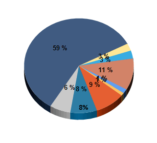
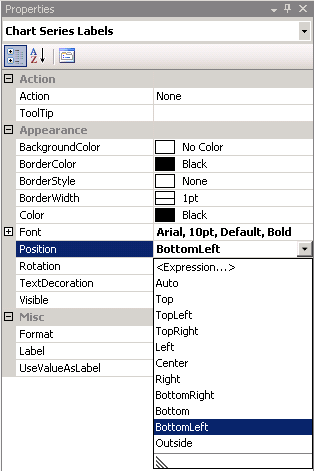
Is it possible to move the position of the label within the pie slice? Being in the middle of the slice makes the labels overlap and hard to read, as seen below. If the labels could be shifted towards the outside of the slice there would be less overlap. I've tried putting the labels outside the slices and they just look like a warped spider. on the Chart Series Labels properties I found an attribute after Font that is called Position and it seems like that would be what I need. But the options don't seem to do anything, except for Outside which moves the labels outside the chart like the demented spider.
All replies are greatly appreciated!!
All replies are greatly appreciated!!
ASKER
I have the Properties window open and pinned by default. The chart doesn't have a CustomAttributes node. The Chart Series does but the only options are Inside, Outside, Disabled and an Expression.
what year of SSRS are you using?
ASKER
2008
ASKER CERTIFIED SOLUTION
membership
This solution is only available to members.
To access this solution, you must be a member of Experts Exchange.
ASKER
I'll check out that article, thanks! I thought a pie chart would be good when comparing sections of a larger item in percentages. Such as how an employee's billable hours are broken up between various projects. A table can say you spent 80% of the last month working on Project X but a pie chart sums it up so nicely. I am to start looking at 2012 and how upgrading will affect my reports so I hope maybe it will be possible in that version.
ASKER
Thank you very much for confirming this!
Open the Properties pane. On the View tab, click Properties.
On the design surface, click the chart. The properties for the chart are displayed in the Properties pane.
In the General section, expand the CustomAttributes node. A list of attributes for the pie chart is displayed.
Select a value for the PieLabelStyle property.