projects
asked on
Convert length of time to percentages nvd3
I am looking for leads on how to convert time based events from seconds to hours into percentages which can be displayed properly on nvd3 graphs.
The problem currently is that when using a time based scale, the Y axis either dynamic or static, does not show all of the data properly.
For example, there are events which are 2 seconds long while there are others which are a few hours long. When putting both on the same scale, one ends up either being so small that it cannot be seen or so large that it just shows a huge bar on the graph.
Therefore, we need to convert the time based events to percentages so that a Y axis could work. Then users could mouse over each event to get finer details.
I am not the programmer, I am only looking for leads or input on how this could be done by others who may have done something similar.
Ray Paseur
Can you please show us some test data so we can see what we're working with? Thanks.
ASKER
Test data such as?
The data is time based events, so when you look at the database, you'll see
start_time
2014-09-11 18:58:12
and
end_time
2014-09-11 18:58:14
As you can see, the above is 2 seconds. The data is just that, but the time can range between seconds to hours.
Using nvd3, we need to show each of these events in a graph but since the range is go great, the data is not showing up very well as explained in my question. The answer seems to be to convert the time based events into percentages so they can be displayed on a graph properly.
Help me understand how you want to treat the outliers...
What amount of time is the maximum amount of time that would represent 100%?
Do you want a display for amounts of time that are less than 0.5%
What amount of time is the maximum amount of time that would represent 100%?
Do you want a display for amounts of time that are less than 0.5%
ASKER
I don't know any of these things, that's why I posted all of the info I have.
What I can tell you is that the range can be from seconds to hours.
That kind of data doesn't display on a graph so I need to find some alternative way to show this data on a graph.
One lead was using a logarithmic scale which lead to the idea of converting the time based output to percentages instead.
In terms of what to use for percentages, I don't know and is why I posted this question, to get some idea of how others may have dealt with something like this.
ASKER CERTIFIED SOLUTION
membership
This solution is only available to members.
To access this solution, you must be a member of Experts Exchange.
SOLUTION
membership
This solution is only available to members.
To access this solution, you must be a member of Experts Exchange.
Converting the data from ISO-8601 date/time strings to seconds is easy in PHP. You might use PHP to create the elements of the dataValue array in rrz's example.
<?php
$alpha = '2014-09-11 18:58:12';
$omega = '2014-09-11 18:58:14';
$diff  = strtotime($omega) - strtotime($alpha);
print_r($diff);ASKER
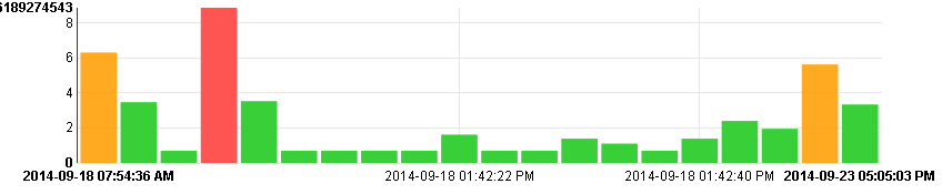
It isn't completed yet but it shows that this was doable. There is a range of 2 seconds to 5 hours on this chart. Amazingly, everything shows just as it should. When the user mouses over any bar, the details show up in an info bubble so this works nicely.
For each duration, we have used the function Math.log
We return a number between 0 and 10
So, our Y axis has a range of 0 to 10
Each bar has more information when you mouse over it for details.
Looks great. Would you be willing to share the JavaScript and CSS? Thanks, ~Ray
So, our Y axis has a range of 0 to 10How does that relate to
There is a range of 2 seconds to 5 hours? Why not label it with the actual values? Look at
http://en.wikipedia.org/wiki/Semi-log_plot
ASKER
@rrz; There is no actual relation, it's just a representation of time, as a percentage so that it can be displayed as it is. Otherwise, the 5 hour event for example would be nothing but a huge red bar on the screen. Or I'm not understanding your question.
@ray; I'm sure I can share the code but it's not done yet, including the labels.
I'll revisit this question once it's done.
However, once everything is done, gone over, good as can be, it may very well all end up being open source, free to use. I'm not sure how that will work just yet however. Lots to figure out.
There is no actual relation, it's just a representation of time, as a percentage so that it can be displayed as it is.But, you posted
For each duration, we have used the function Math.logSo, what is your Y-axis scale? I was envisioning something similar to
http://en.wikipedia.org/wiki/Semi-log_plot#Phase_diagram_of_water
Note the logarithmic scale for pressure.
ASKER
I don't know yet, we'll work on it later.