Plot a Grpah
I want to plot a graph with Date on X -Axis starting from 01jan2014 to 31 dec 2014 and Y -Axis with projects and just the pointers for the status.
I have attached the spread sheet.
let me know if I am not clear on any thing
I have attached the spread sheet.
let me know if I am not clear on any thing
Glenn Ray
Can you try re-attaching the spreadsheet?
ASKER
Attaching it again
Book1.xlsx
Book1.xlsx
Hello,
a chart has to have at least one axis that plots numbers. If the X axis has the dates, and the Y axis has the projects, what are the values that you want to chart?
Can you manually (or using the drawing tools) draft the desired chart? If Project A has Status "X" on 1/1/2014, how does that look in the chart? High? Low?
And if the Y axis also has projects B, C and D, how do their status texts for certain dates look in the chart?
If you can draft that and show us what you would like to see as the result, we will know what to aim for and can most probably find a way of doing it.
But right now, I have no idea what numeric values to plot in a chart when all the input is text.
Over to you.
cheers, teylyn
ASKER
SOLUTION
membership
This solution is only available to members.
To access this solution, you must be a member of Experts Exchange.
I'm wondering if an Gantt chart might be a good starting point for this. That would allow Project names to appear on the Y-Axis and then the dates could be treated like milestone points. The tricky part would be getting each point to be assigned the correct color.
Here's a quick sample with the first points for the three projects:
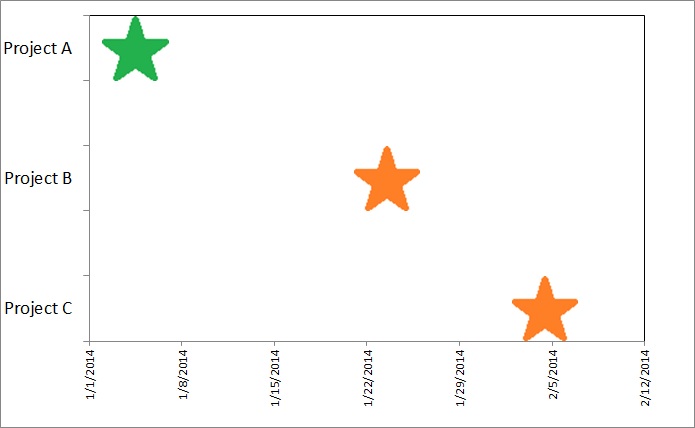 It uses a graphic (a colored star) for the fill property of each point. But the data points have to be manually updated to the color shown in the data table. That may need some automation to achieve.
-Glenn
Here's a quick sample with the first points for the three projects:
It uses a graphic (a colored star) for the fill property of each point. But the data points have to be manually updated to the color shown in the data table. That may need some automation to achieve.-Glenn
Malli,
The issue with what you're describing, is that you aren't asking for the status of a given project. What you are describing in your graph is, "During the course of a year, when did the green star move from "Status = Project A" to "Status = Project B"
Part of the problem is that you are trying to graph something qualitatively, which is impossible. Just think, where on a graph would I measure "red", or where would I measure "chocolate". They are just adjectives, not something quantifiable that can be graphed.
SOLUTION
membership
This solution is only available to members.
To access this solution, you must be a member of Experts Exchange.
ASKER
Thanks Guys
can you please tell me which chart to use.
Some brief instructions how to acheive this
can you please tell me which chart to use.
Some brief instructions how to acheive this
ASKER CERTIFIED SOLUTION
membership
This solution is only available to members.
To access this solution, you must be a member of Experts Exchange.