Complex 2 Axis Graphic
EE Pros,
I'm stumped on how to recreate a visual graphic into an Excel Graphic where I can use new data to change the graphic's look. Its a two Vertical Axis Graphic with Time on the Horizontal Axis and two different data sets on the Virticals. Not sure how to make this work and may take multiple passes. I intend to get one thing done at a time, work with it, hopefully modify it and then ask for some refinement.
Attached is my example of what I'm trying to recreate. The actual numbers at this point, don't matter. It's getting the graphic right so I can input the data and have it reproduce the graphic.
Thank you in advance.
b.
C--Data-Temp-Complex-2-Axis-Model.xls
ASKER
Teylyn,
Greetings! I so enjoy working with you on graphics.
OK.... so I've added some additional data points. Please feel free to modify any of the points or add to them if you like. I set it up as a Range in order to accomodate future data strings without having to recode the graphic (Datasets 1&2). I've changed it to a scatter chart. Not sure how to put in the overlay and not sure how to get the horizontal scale to match the beginning and end dates....they look right when I edit the set.
See what you think.... I really appreciate your help! Hope all is well in Z.
b.
C--Data-Temp-Complex-2-Axis-Modelv2.xls
Hello Bright,
all is well. Hope you are fine.
For the two alert values you have dates, but you also need Y values. How about using the max value of your other data. So in D6 use =MAX($C$3:$Q$4) and copy down.
Now edit the chart source and add a series. Series name in A6, Series X in C6, Series Y in D6.
Format the series to show the data marker, but no line (so you can see it). Add Error Bars. I hate when Excel does not let you choose which ones to add and always adds the wrong kind. Delete horizontal error bars. Format the vertical error bars to
Direction = minus
end style = no cap
Error amount = Percentage with 100 as the value
Format the error bar line with a color of your choice. If you Excel version has the line style, use a line style with an arrow head at the desired end.
Add a data label to the series. Format it to show the Series Name and set the Label Position to Center. Format the label with the desired fill color.
Repeat the process for the second alert.
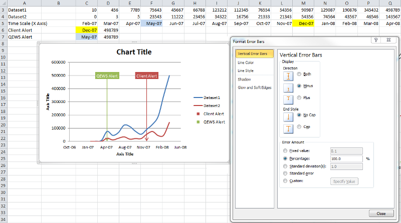
cheers, teylyn
C--Data-Temp-Complex-2-Axis-Modelv2.xls
all is well. Hope you are fine.
For the two alert values you have dates, but you also need Y values. How about using the max value of your other data. So in D6 use =MAX($C$3:$Q$4) and copy down.
Now edit the chart source and add a series. Series name in A6, Series X in C6, Series Y in D6.
Format the series to show the data marker, but no line (so you can see it). Add Error Bars. I hate when Excel does not let you choose which ones to add and always adds the wrong kind. Delete horizontal error bars. Format the vertical error bars to
Direction = minus
end style = no cap
Error amount = Percentage with 100 as the value
Format the error bar line with a color of your choice. If you Excel version has the line style, use a line style with an arrow head at the desired end.
Add a data label to the series. Format it to show the Series Name and set the Label Position to Center. Format the label with the desired fill color.
Repeat the process for the second alert.
cheers, teylyn
C--Data-Temp-Complex-2-Axis-Modelv2.xls
ASKER
Teylyn,
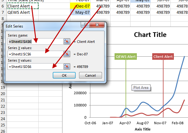
I tried it but I don't think I follow your logic. I Copied the second series of data (MAX) across (not down) and then tried to set up a second series. How do I format that second series because now there are actually 5 Series..........
Shouldn't I have a different set of values for the second set of Y data?
I'm afraid I'm out of my league on this one.
B.
C--Data-Temp-C--Data-Temp-Complex-2-Axis
Hi Bright,
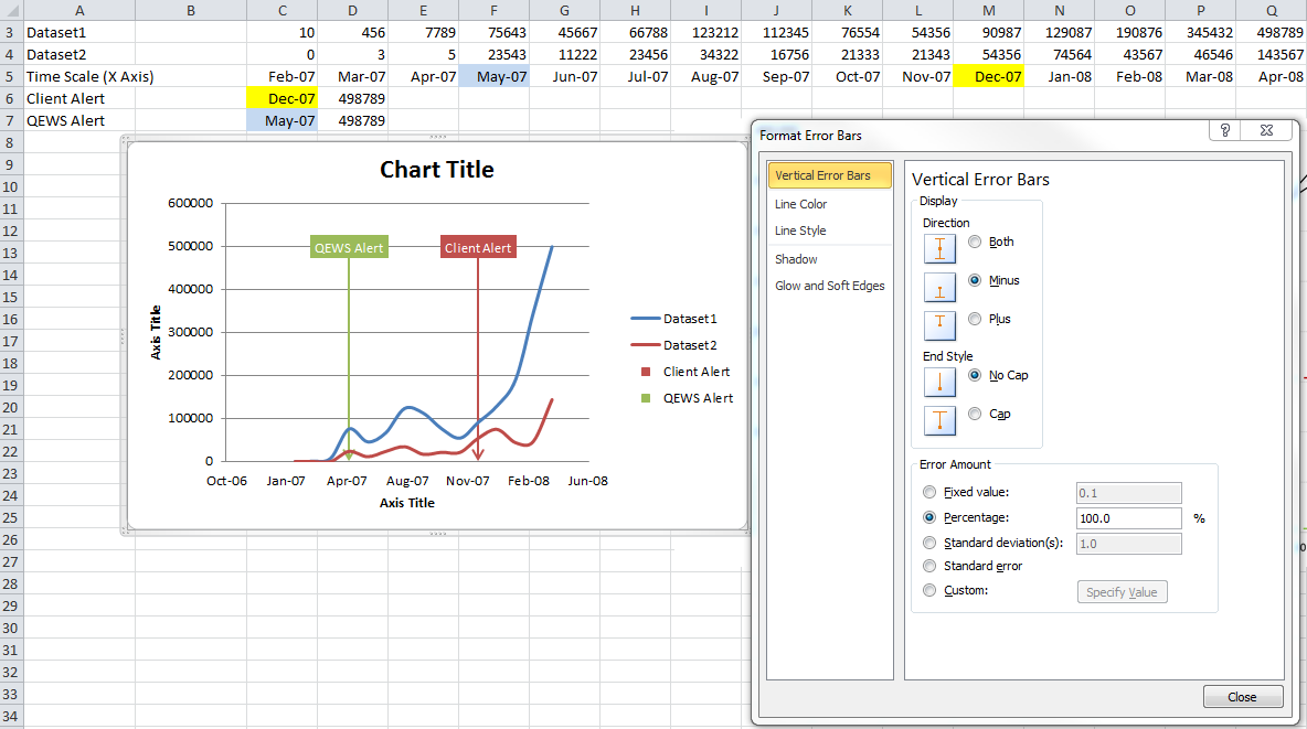
The blue line and the red line for dataset1 and dataset2 have many data points.
For the two alerts you need only one data point each. The data point consists of an X and a Y component. The X component is the date and determines where on the X axis the data point will be positioned. The Y component is a number and determines the vertical position of the data point.
My logic is to ensure that the label for the alert is always visible in the upper area of the chart, I could take the highest number from the two datasets and use that for the Y value.
When defining the new data series for the Client Alert, select A6 as the label, C6 as the X value and D6 as the Y value. For the QEWS Alert add a new data series with A7 as the label, C7 as the X value and D7 as the Y value. Since I want the labels to be at the same height, they need the same Y value. This was easiest to do by copying the Max() function from D6 down to D7. If you want, you could point the QEWS Alert Y value to D6 instead, so you don't have to duplicate the value. If you want to change the Y position of the label, just change the number (or formula) in D6.
After you add the data series to the chart, select the data series. If you don't see the new data point, it may be formatted with no marker. Since we have only one data point in the series, there is no line, since a line requires at least two points, if I recall my physics teacher correctly.
Since you can't see the series and cannot click it on the chart, you can select it via the Chart Tools > Format ribbon. There is a drop down with all chart elements at the very left of that ribbon. Select the chart element and then click "Format Selection". Here you need to format the Marker to have one of the built-in markers, like a square or a triangle. By default the XY Scatter chart with smoothed lines does not show markers.
In your last file, I see you added a series called "A6". The data point is hidden behind the red label of the Client Alert series that has the same value as your new series. You could delete the Client Alert series and your A6 series will become visible (if you have formatted the marker to show).
The little table with the name, x and y for the two alerts can be anywhere on the spreadsheet. It does not have to be underneath the dataset1 and dataset2 figures. I hope I could explain why you do not need to copy the Max() function across.
Let me know how you get on.
cheers, teylyn
ASKER
Teylyn,
Exactly right. Let me work on this .... back with you in about 12 hrs. I need to do more research on the data set(s).
Thank you for the insight and setting me streight.
B.
Exactly right. Let me work on this .... back with you in about 12 hrs. I need to do more research on the data set(s).
Thank you for the insight and setting me streight.
B.
ASKER
Teylyn,
I think I have it except for one issue. There are only 2 data sets needed as you pointed out. However, there should be two Y Axis points not one....... Sold, Claimed. And the numers on the "Claimed" should be lower but track to the second Y Axis (on the right side. My issue now is that I do not know how to build in the second axis. I have put a sample Y2 Data set in so you can see what the numbers may look like (Row 8).
B.
C--Data-Temp-C--Data-Temp-Complex-2-Axis
Hello,
First something not related to the chart: The max formulas in rows 6 and 7 refer to a range that is much larger than just the two data sets and the range includes the current cell. This is a circular reference. I think we have established that you only need two Max() functions in column E, and the formula should be =MAX($D$3:$R$4).
Now to the chart. You can select a data series and in its formatting dialog select to show it on the secondary axis. That will then show the secondary Y axis.
I'm not quite sure what version of Excel you are using. The files you attach have no extension, so you may be on a Mac? I cannot show a screenshot for that. In any case, I have plugged the data into the source table and sent the "Claimed" series to the secondary axis.
The danger with such a scenario is that it is not obvious from the lines which axis they are on and what value a data point has. As a visual indicator, I have formatted the axis labels with the same color as the line that relates to it.
See if that helps.
cheers, teylyn
C--Data-Temp-C--Data-Temp-Complex-2-Axis
ASKER
Teylyn,
Thank you! I almost have it! I have put in the second axis but can't get them lined up (i.e. both have a starting point of -0- at the same point. I think this may be a very small "tweek" at the formatting axis level.
Is there any way to produce the line that shows the exact Y axis intersection as in the dotted lines on the original graphic? That may not be possible.
With that said, this looks very good!
I'm using Excel 2010 Windows 32 bit.
B.
C--Data-Temp-C--Data-Temp-Complex-2-Axis
>> I'm using Excel 2010 Windows 32 bit.
I wonder why your files are uploading without an extension. I can rename them and add ".xls" to the file name, and then they work. Any idea why they don't have an extension? Also, if you are using 2010, why use the backward-compatible .xls format instead of the .xlsx? Maybe your files need to be compatible with many setups and .xls is your safest option.
With the "smoothed line" XY chart, values that are close to zero might cause Excel to extend the Y axis below 0, just to make sure that a smoothed curve can be drawn without cutting anything off. But you can manually format each Y axis and set their respective minimum value to 0.
See attached.
As I said before, with this representation, I have no indicator which axis belongs to which line, so I cannot really tell what value any point in a line actually represents. You MUST give the reader that information. Is the end point of the red line 8000 or 26000? I think this is what the arrows in the sample chart image are for, but even with the arrows it is not cut and dried.
Greetings from San Francisco.
Cheers, teylyn
C--Data-Temp-C--Data-Temp-Complex-2-Axis
ASKER
Teylyn,
SF..... one of the world's great cities! I hope you are having a great time.
So I modified it and saved it as an XLSX file....hopefully it comes through that way. I have posted two of the same files with different names and from different locations on my computer to see if that fixes the upload problem.
You have done a great job working with me on this and I think I now have it just right except for one thing. I don't think this is an easy ask so I'm not expecting a fix to this but would like your opinion. I have labeled the axis's correctly and made it a point chart rather then a smoothed line chart in order to get the Y Axis to line up. That's ok. But what is missing is the ability to identify the dotted line where the two Alerts intersect with both Y Axis values. In other words, if you look at the original graphic.... the Alerts show both "Sold" and "Claimed" values. The idea in automating this was to replicate the graphic so that you could change dates or values and the graphic would auto adjust. It works just like that now but does not include the Y Intersection values in the Graphic. This may be beyond what Excel can do. I'm not sure but thought I would ask.
B.
C--Data-Temp-C--Data-Temp-Complex-2-Axis
C--Complex-Model-v6.xlsx
ASKER CERTIFIED SOLUTION
membership
This solution is only available to members.
To access this solution, you must be a member of Experts Exchange.
ASKER
Outstanding work! I've used this graphic 4 times now and it works perfectly! Sorry it took a while to get back with you; my account got suspended due to a change in my CC (had to cancel and re-order). Off to S. Korea next week. Hoping to get to NZ in 2015 (Wellington).
Thanks again for outstanding work.
B.
Thanks again for outstanding work.
B.
conceptually, there are a few things:
- you may want to use an XY Scatter chart with smooth lines instead of a line chart.
- you will need an X axis value for every data point. Currently your datasets 1 and 2 only have values (vertical placement) but no relation to where in time they occurred (X axis placement)
- an XY scatter chart will bridge / interpolate time gaps in the data, so you don't need to have the exact same dates for dataset1 and dataset2
- for the "QEWS alert" and the "Client system alert" you can add two more series with just one data point each: the date for the X axis placement and a Y value that corresponds to where (vertically) this label should show. You can then use data labels or a text box to show the series name "QEWS alert" and use vertical error bars to drop a line with an arrow head to the X axis.
There are other elements like the dotted horizontal lines and the arrows that I can't quite place yet, but I'm sure with sufficient data they can be arranged.
Bottom line:
If you want to draw such nice, smooth curves, you need a few more data values and each value needs a date stamp.
Then we can start working out the details.
cheers, teylyn