Member_2_79173
asked on
How to use secondary axis for one column of data in Excel 2010
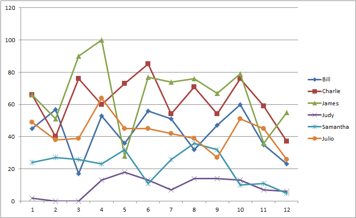
Please refer to the attached Excel workbook and image file. The Excel workbook contains monthly data for support tickets resolved by a fictitious IT support helpdesk for 2014. There is a column for each monthly total, for the average per staff member and for the total tickets resolved in 2014 for each staff member. Unfortunately the chart (see also image file) is unreadable because Y axis required for the totals cause the monthly numbers to be compressed at the bottom of the chart. I want to use a secondary axis for the yearly totals so that the monthly totals and average values are not compressed at the bottom of the chart. Normally one would use a secondary axis for a data series (row) but I want to use it for the yearly totals (column) and I cannot find how to do this when I search on the Internet.
Tickets-resolved-by-staff-for-each-month
Tickets-resolved-chart.jpg
Tickets-resolved-by-staff-for-each-month
Tickets-resolved-chart.jpg
ASKER
Sorry, I still didn't do it correctly but if you add .xls to the most recent file it will open in Excel.
Wow, you have a lot going on in this chart, but I think your main trouble was that your series were not congruous. What if you mapped the historical data based on the person? Then you could assign the total to the person, rather than have it counted as a point of time, as 1-12 are?
Check out the attached file. I re-charted it on a combo chart so that the total is on a secondary axis, and the average is a line, while everything else is a bar. Even if it's not exactly what you want, you could use it as a jumping off point, utilizing different series.
Tickets-resolved-by-staff-for-each-month
^^strangely, even though I added the file extension and saved it so, uploading it seemed to give me the same trouble your attachment gave you.
ASKER
Katie,
I was able to open the file after adding .xls and see your chart.
I don't think it is necessary for the average to be a separate type since it is in the same range as the monthly totals. Would it be possible for the monthly totals and average to be on a line chart and have the yearly totals be a bar chart with the secondary axis pertaining to that range?
Yeah, how about this one?
Tickets-resolved-by-staff-for-each-month
Tickets-resolved-by-staff-for-each-month
All above: EE can't handle filenames longer than 40 characters, including period and file extension (five characters if .xlsx). You'll need to shorten the main filename so that will work.
A separate set of series will need to be created for the yearly totals, but how exactly do you envision those totals displayed? Removing the averages and yearly totals from the current data set (i.e., only plotting B:M) reveals a rather tangled plot that might not be easy to view:
-Glenn
A separate set of series will need to be created for the yearly totals, but how exactly do you envision those totals displayed? Removing the averages and yearly totals from the current data set (i.e., only plotting B:M) reveals a rather tangled plot that might not be easy to view:
-Glenn
ASKER CERTIFIED SOLUTION
membership
This solution is only available to members.
To access this solution, you must be a member of Experts Exchange.
ASKER
Hi Glenn,
While I wanted to try to make it work on one chart, using two charts, one for the monthly totals (but also with average since it is in the same range as the monthly totals) and a second chart for the yearly totals looks good so I'm accepting your comment as the answer.
Thanks!
Don
While I wanted to try to make it work on one chart, using two charts, one for the monthly totals (but also with average since it is in the same range as the monthly totals) and a second chart for the yearly totals looks good so I'm accepting your comment as the answer.
Thanks!
Don
ASKER
Tickets-resolved-by-staff-for-each-month