smower
asked on
Responsive Website CSS Wrapping Issue on Header in Mobile
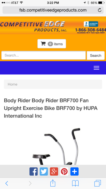
Hello, I have an eCommerce type website that is responsive, but having a display issue in the header in mobile that I would like some help fixing. When the site is in desktop mode, it shows the search box, search button and shopping cart all on the same row which I prefer. However, when viewing it in a mobile browser, the shopping cart wraps onto a second row and the search box and search button wrap onto a 3rd row while the search box grows in width like this:
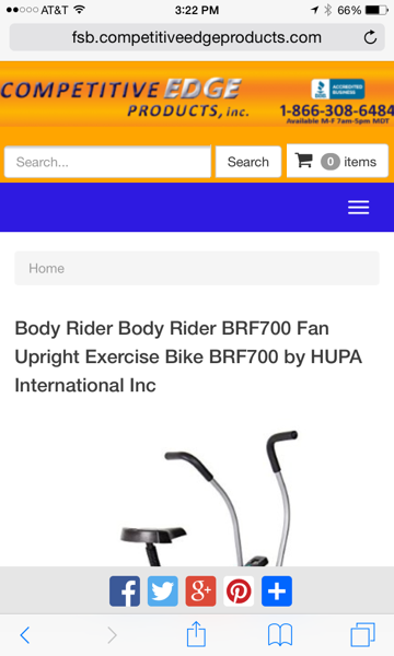
I would like the have the cart, search box and search button on the same row in mobile with a shorter text box so that the header doesn't get too tall in mobile like this:
Could anybody tell me what .css I would need to add or modify to fix this? I have attached screen shots of the current look and the desired look. This cart gives me a custom css code section that we can update the css with. It currently has the following:
The website is: http://fsb.competitiveedge
Thank you,
Shawn
I would like the have the cart, search box and search button on the same row in mobile with a shorter text box so that the header doesn't get too tall in mobile like this:
Could anybody tell me what .css I would need to add or modify to fix this? I have attached screen shots of the current look and the desired look. This cart gives me a custom css code section that we can update the css with. It currently has the following:
header {
background-color: orange;
margin-bottom: 0px;
margin-top: -19px;
margin-left: -20px;
margin-right: -20px;
}
a {
color: #9c9c9c;
}
.row {
padding-top: 10px;
margin-bottom: -10px;
}
#header-basket{
padding-right: 10px;
}
.social-follow {
margin-top: 0px;
}
.input-group-btn{
padding-left: 5px; padding-top: 1px;
}
.input-group{
padding-bottom: 15px; padding-left: 10px; padding-right: 10px;
}The website is: http://fsb.competitiveedge
Thank you,
Shawn
SOLUTION
membership
This solution is only available to members.
To access this solution, you must be a member of Experts Exchange.
@media only screen and (min-width: 219px and max-width = to the max width of your/users mobile device){
Styles go here,
You are targeting only the min width which may have no effect on the device you are trying to target. To be more specific you can use max-width as well however yo have three child elements that all together need not be more than 99% of it's container / context
So:
You can adjust the % values on the child elements to your needs but the % can't exceed 100% or 99% which is the containers width
}
Styles go here,
You are targeting only the min width which may have no effect on the device you are trying to target. To be more specific you can use max-width as well however yo have three child elements that all together need not be more than 99% of it's container / context
So:
.container{
width:100%;
}
.input-group{
width:50%;
}
.input-group-btn{
width:24%;
}
#header-basket{
width:24%;
}You can adjust the % values on the child elements to your needs but the % can't exceed 100% or 99% which is the containers width
}
ASKER
Thank you again. I am not sure what I am doing wrong, but it is not working for me. I tried to do it for iphone 6 plus which I believe the min and max is as follows:
@media only screen and (min-width: 414px and max-width: 736px)
I also tried adding your width contents to keep them less than 100% like you recommend, but it seems to make no visible difference on my iphone 6 plus or on my chrome mobile emulator under the development tools. When you use the chrome or firefox inspectors and tweak those values does it work for you?
Thank you,
Shawn
I think you have media queries conflicts on breakpoint boundaries in your style.css
You can back up the current style.css, delete all media queries and replace with a set of non conflicting ones.
When done then add your styles to each one.
You can back up the current style.css, delete all media queries and replace with a set of non conflicting ones.
When done then add your styles to each one.
ASKER CERTIFIED SOLUTION
membership
This solution is only available to members.
To access this solution, you must be a member of Experts Exchange.
ASKER
That code from an Elancer made it work properly.
ASKER
Here is the custom .css I added.
@media only screen and (min-width: 219px){
.input-group .form-control {
width: 50%;
}
.input-group {
text-align: right;
}
.col-xs-12 {
float: left;
}
}
Can you tell me what I need to change to get it to work?
Thank you,
Shawn