NeverEndingFlashStories
asked on
Initial Paragraph height is wrong on iphone safari...help?
Hi,
I am struggling with the resizing of my bg image and paragraphs.
But basically, I have a text paragraph #textonblack which is contained within a div #heregoesnothing
CSS :
In order to deal with resizing on mobile, i have added the following jquery :
This all works fine, except on my iphone safari , where the initial paragraph size is all out of whack, and only upon reorientation will the size be correct. Can someone explain this to me?
You can see it here if you have an iphone safari browser:
http://www.encapturedperfe
I am struggling with the resizing of my bg image and paragraphs.
But basically, I have a text paragraph #textonblack which is contained within a div #heregoesnothing
CSS :
.textonblack {
    color: #ffffff;
    overflow: scroll;
    height: 35%;
    margin: 10% 10% auto 10%;
    background-color: rgba(0,0,0,0.5);
    overflow-x: hidden;
    padding: 2%;
    border-color:white;
    border-width:3px;
}

#heregoesnothing {
    background-image: url("../img/abbybackground.jpg");
    background-repeat: no-repeat;
    background-size: cover;
    height:100vh; /*this resizes height to what the window is*/
    width:100vw;
    overflow-x: hidden; /* this hides the horizontal scrollbar*/
}In order to deal with resizing on mobile, i have added the following jquery :
$(window).on('resize orientationChanged', function() {
    $('#heregoesnothing').css({"height":"100%","width":"100%"});
});This all works fine, except on my iphone safari , where the initial paragraph size is all out of whack, and only upon reorientation will the size be correct. Can someone explain this to me?
You can see it here if you have an iphone safari browser:
http://www.encapturedperfe
ASKER CERTIFIED SOLUTION
membership
This solution is only available to members.
To access this solution, you must be a member of Experts Exchange.
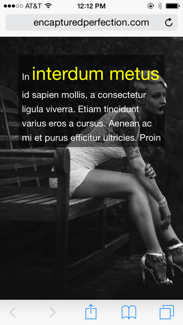
First we have to agree on the symptoms. When I view http://www.encapturedperfection.com/d4rkstorm/Fashion.php on mobile Safari, the paragraph looks fine. It's centered and there is an even margin around the edges. It looks the same on mobile Safari as it does on desktop Safari, Firefox and Chrome, except that it's smaller. On mobile Safari however the model in the background image is cut off on the right side. I don't need to change orientation to fix it, I just need a finger swipe on the screen. Then, when using my iOS Simulator, I see that when I change the units from vh, vw to %, that also fixes the issue.

 Perhaps you can post some pictures of the paragraph problem because I'm not seeing it.
Perhaps you can post some pictures of the paragraph problem because I'm not seeing it.
ASKER
Hi Tom,
I am so embarassed - your solution did work. Turns out, after updating the css as per your instruction, i was loading the wrong page on my iphone, which did not have the javascript called:
http://encapturedperfectio
I found out when i was trying to take a bunch of screenshot and realized i was loading the wrong page entirely. My bad, thanks for your patience, and help!!
ASKER
Changing the units from vh and vw to % did not work....
http://www.encapturedperfe
As you can see, when loaded on mobile safari, the paragraph box is still loading wrong initially. Actually, since i changed to %, it also now does not change to the correct size even after a change in orientation. When i was using vh, the paragraph would still change to the correct size after a change in orientation - through the jquery function above.
any ideas?