Member_2_99151
asked on
Struggling with CSS layout!
Hi all,
I am trying to create a menu on the left-hand side of a web page.
The menu should contain a number of sections laid out as follows:
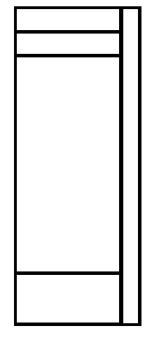 Depending on the overall height of the 4 stacked panels on the left (the 3rd one could grow quite tall) the right one needs to grow to the entire height.
This is fairly straightforward as a table, but it looks like DIV and CSS is the correct way to go.
I have got so far and struggling with the right column!
HTML
I have tried several combination of CSS but can't get it right :-(
Any help would be appreciated.
Thanks,
James
I am trying to create a menu on the left-hand side of a web page.
The menu should contain a number of sections laid out as follows:
Depending on the overall height of the 4 stacked panels on the left (the 3rd one could grow quite tall) the right one needs to grow to the entire height.This is fairly straightforward as a table, but it looks like DIV and CSS is the correct way to go.
I have got so far and struggling with the right column!
HTML
<!DOCTYPE html>
<html>
<head>
    <link rel="stylesheet" type="text/css" href="test.css">
</head>
<body>
<div id="lhs_container">
	<div id="rhs1">X</div>
	<div id="lhs1">Top Bit</div>
	<div id="lhs2">Another Top Bit</div>
	<div id="lhs3">Area that contains a dymamic menu
<br />This may get quite tall
<br />This may get quite tall
<br />This may get quite tall
<br />This may get quite tall
<br />This may get quite tall
	</div>
	<div id="lhs4">Bottom Bit</div>
</div>
</body>
</html>#lhs_container{
height: 100%;
background-color: red;
width: 300px;
}
#lhs1{
height:30px;
background-color: yellow;
width:270px;
}
#lhs2{
height:30px;
background-color: purple;
width:270px;
}
#lhs3{
background-color: orange;
width:270px;
}
#lhs4{
height:30px;
background-color: blue;
width:270px;
}
#rhs1{
height: 100%;
background-color: green;
width: 20px;
left: 280px;
}I have tried several combination of CSS but can't get it right :-(
Any help would be appreciated.
Thanks,
James
ASKER
Hi,
Thanks for the comment...
I'd like the right hand column (rhs1) to be the full height of the 4 on the left (as the image)
The code above actually shows rhs1 at the top.
I have played around with floating the panels, but I can't get them to interact correctly with the parent container.
I guess I am missing something silly, but I can't see it!
SOLUTION
![Avatar of Guy Hengel [angelIII / a3]](https://filedb.experts-exchange.com/files/public/2013/11/25/ddbe0ea6-aa6e-4279-b781-57b735dd3ea0.jpeg)
membership
This solution is only available to members.
To access this solution, you must be a member of Experts Exchange.
ASKER CERTIFIED SOLUTION
membership
This solution is only available to members.
To access this solution, you must be a member of Experts Exchange.
Actually the cleaner way to do it is to make rhs1 the last element in the container, and then float it left in stead of right. You should also allow for 3 or 4 pixels of slack to account for the minor rendering differences in browsers. If you want it non-responsive then pixels is fine but for responsive you should probably use vh/vw as the unit of measure, though em might also be an option. Using percentages will make it adaptive, but not responsive.
Cd&
Cd&
ASKER
Thanks for the input.
I think Carl's answer will suit what I need for now, but Guy's suggestion of using Flex looks like a sensible direction.
I will look into this one further, but for now I hope splitting the points is okay?
I think Carl's answer will suit what I need for now, but Guy's suggestion of using Flex looks like a sensible direction.
I will look into this one further, but for now I hope splitting the points is okay?
It is growing with your content as it is, but I suspect you're looking for something else?