HTML Width does not match Screen Resolution
Hi Experts,
I am starting a web application that will have a lot of forms for user input, and I want to get the page width correct before I start placing controls. The controls placement is very important to user.
The lowest resolution that the user wants this application accessed from is 1440 x 900, so I put together the following templates, which show great in IE, Chrome and Safari, but in Firefox it runs off to the right. All browsers are set to 100% view.
My html:
My CSS:
Thank you
I am starting a web application that will have a lot of forms for user input, and I want to get the page width correct before I start placing controls. The controls placement is very important to user.
The lowest resolution that the user wants this application accessed from is 1440 x 900, so I put together the following templates, which show great in IE, Chrome and Safari, but in Firefox it runs off to the right. All browsers are set to 100% view.
My html:
 <!DOCTYPE html>
<html lang="en">

 <head>
	<meta charset="utf-8">
        <title>$app_title</title>
	<link rel="stylesheet" href="../styles/main.css">

</head>

	<body>

                <h1>$app_title</h1><br>
                <h2>$page_title</h2>


            <!--Content Start-->

            <!--Content Finish-->

        </body>

</html>My CSS:
/* So the HTML5 structural tags work in older browsers */
article, aside, figure, footer, header, nav, section {
   display: block;
}
/* the styles for the elements */
*{
	margin: 0;
	padding: 0;
}
html{
    background-color: gray;
}

body{
    font-family: Arial, Helvetica, sans-serif;
    font-size: 100%;
    width: 1300px;
    height: 600px;
    margin: 10px auto;
    border: 2px solid black;
    background-color: white;
    padding: 20px 10px;
}

 h1{
    color: red;
    font-size: 120%;
    text-align: center;

}

h2{
    color: blue;
    font-size: 100%;
    text-align: center;
}Thank you
Dave Baldwin
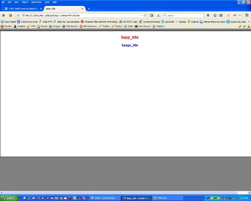
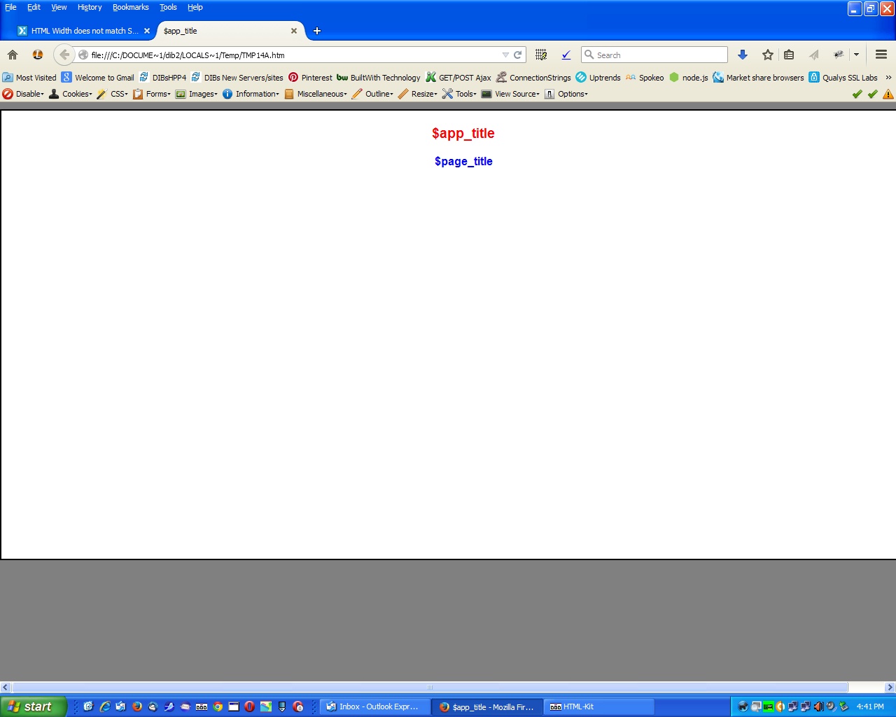
I only have 1280x1024 on this computer but your code in Firefox shows a perfectly normal 1300x600 body. It extends 20px off the page.
I tested this on Firefox on Mac OS X 10.9.5 and it displays correctly. Can you post a screen shot showing the difference between the browsers?
Screen-Shot-2015-02-17-at-8.11.58-AM.png
Screen-Shot-2015-02-17-at-8.11.58-AM.png
ASKER
Please see attached: Chrome and Safari OK, but Firefox way out.
Any ideas?
FireFox.png
chrome.jpg
Safari.jpg
Any ideas?
FireFox.png
chrome.jpg
Safari.jpg
Press Ctl-0 (zero) in Firefox to rest the zoom to normal.
ASKER
still not working
APD,
Are you using a Windows or Macintosh machine? On a Mac you would press CMD + 0 to view at 100%. Open the menu at the top right and see what your zoom level is set at. It should be 100%, but your screenshot does appear that it is higher than that.
If you look at my previous screenshot you will see that the site is displaying correctly per your CSS specifications.
Screen-Shot-2015-02-18-at-1.12.57-PM.png
Last time we had a question like this, the Zoom in Firefox was not at 'normal'. On my MacBook Pro with a 1440x900 screen, I get the same display in Firefox as you show for Chrome and Safari (which is also the same on my MacBook).
If you are on a Mac, press Cmd-0 (zero) in Firefox to reset the Zoom to 'normal'. Or you can go to the View -> Zoom menu and click on it.
If you are on a Mac, press Cmd-0 (zero) in Firefox to reset the Zoom to 'normal'. Or you can go to the View -> Zoom menu and click on it.
ASKER
If you see, per this snapshot, I am at 100% I even re-installed Firefox. Maybe its my computer.
FF100.png
FF100.png
Even when you re-install Firefox, it does not normally change your preferences which is where the Zoom setting would be stored. It's not your computer because the other browsers would have problems also. But it is something about the way your Firefox is set up. The rest of us see the same view in Firefox as we do in Chrome and Safari both on Macs and PCs.
ASKER CERTIFIED SOLUTION
membership
This solution is only available to members.
To access this solution, you must be a member of Experts Exchange.
ASKER
This did the trick!