How do I creat Pie Chart in a MS Access 2010 Form?
I am trying to place a pie graph of Market Values on a form in my database. This should be easy, but I just cannot get it to work.
Basic Information:
The database is used to report and analyze clients' investment holdings. The data is supplied by flat file exports from commercial software. That basic data is simply each "tax lot" of each holding in each client account. The database sums that information, grouping on various characteristics of the holdings, so we are able to analyze and report on these holdings as needed.
Axys_Link_Summary_Table is the "master table" generated, daily, by a MakeTable query supported by numerous queries alluded to above. The database runs smoother by having these comprehensive queries generate this table for further use, rather than running compounded queries, frequently .
After using the Chart Wizard to place a simple pie chart on a form that displays summary information about an account, I have this in Row Source:
SELECT Axys_Link_Summary_Table.MV
Column Count = 3
This is supposed to create a very basic chart showing "Stocks", "Bonds" and "Cash" as proportionate slices of their totals.
It doesn't. I get no slices, just a filled pie with a single radius line and a legend with the value of MV_Fx_Tot displayed (the total value of the "bonds" in the account).
To be clear, there is no need for Sum() since the table is data that has already been summed. I tried that, too.
I have tried all sorts of other approaches like creating a subform - get same result in that form, building a separate query from Axys_Link_Summary_Table - no luck.
What am I doing wrong??!!
Thanks in advance...
ASKER
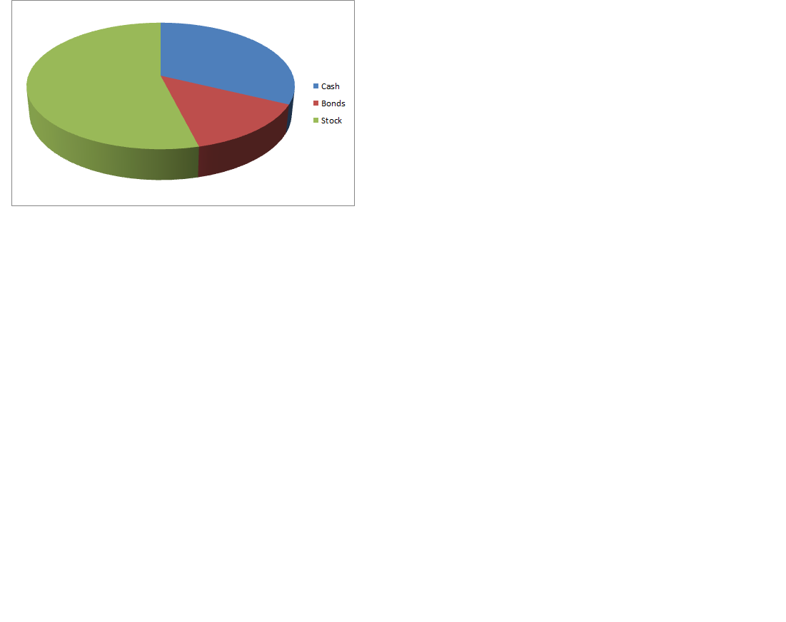
Here is a DB with a table using some of the fields from the actual table and an image of the basic pie chart I would like to generate. Once I am able to do this basic version, I can expand it, as needed.
For this situation, the chart is for each record. The table is populated with sums of all the positions in the client's accounts by simple category (Cash, Bonds, Stocks). The table also has sums that break out those categories into directly owned securities and mutual funds under those categories.
For now, I am only looking to chart the basic Cash, Bonds, Stocks groups which are [MV_Cash1], [MV_Fx_Tot ] and [MV_EQ_Tot], respectively.
The actual field names come from the following:
MV is Market Value
Fx is fixed income (Bonds)
EQ is equity (Stocks)
Tot is Total
 Sample-DB.accdb
Check this database, and comment, to clarify my understanding.
For a pie chart, you need one line of data. The values for it represent one data point in a series.
Sample-DB-2.accdb
For a pie chart, you need one line of data. The values for it represent one data point in a series.
Sample-DB-2.accdb
ASKER
Thank you for the reply. I am still stuck, though!
Below is a step-by-step review of my struggle to accomplish this basic task. This is as embarrassing as it is frustrating! I know this is simple, but I am not getting the right results.
I have arranged my objects just as you have in your Sample-DB-2.accdb .
I considered that Null values in some records might be a problem, so I tried a modified query using NewFieldName:IIF([Field] Is Null,0,[Field]) to place a 0 instead of a blank in the query results, but that did not make a difference.
So, what follows is, as well as I can tell, exactly as your example in Sample-DB-2, without any adjustments for Null values.
I used the “Chart Wizard” and chronicled those results with screenshots. Then I modified the design the Wizard made to duplicate your example. Neither works.
This is the SQL from “qry_Allocation_Chart_2”. This is equivalent to “Query1” in your example.
SELECT Axys_Link_Summary_Table.Ac
FROM Axys_Link_Summary_Table
GROUP BY Axys_Link_Summary_Table.Ac
Please refer to the attached Images. They are screen shots of the steps I took to get the design results and the output results.
Chart Wizard Step 1 v1 – shows fields selected from query (qry_Allocation_Chart_2)
Chart Wizard Step 2 v1 – shows 3D pie chart selection
Chart Wizard Step 3 v1 – shows fields in the chart (this is confusing, since it only allows the user to drag one data field to the chart)
Chart Wizard Step 4 v1 – shows the linking fields
Chart Wizard Step 5 v1 – shows legend option
Chart Wizard Design Result v1 – shows the design results of the Wizard
Chart Wizard Result v1 – shows the form’s “Form View” using Wizard’s design
Form Redesign v2 – shows the adjustments made to Row Source to mirror your example
Form Redesign Result v2 – shows the form’s “Form View” after Row Source adjustments
Chart-Wizard-Step-1-v1.png
Chart-Wizard-Step-2-v1.png
Chart-Wizard-Step-3-v1.png
Chart-Wizard-Step-4-v1.png
Chart-Wizard-Step-5-v1.png
Chart-Wizard-Design-Result-v1.png
Chart-Wizard-Result-v1.png
Form-Redesign-v2.png
Form-Redesign-Result-v2.png
ASKER CERTIFIED SOLUTION
membership
This solution is only available to members.
To access this solution, you must be a member of Experts Exchange.
ASKER
Solved.
Thank you hnasr!
I am eternally grateful and can move now move on in life!
Thank you hnasr!
I am eternally grateful and can move now move on in life!
ASKER
hnsar stayed with my problem and provided me a simple "workaround" for what appears to be a MS Access glitch.
Welcome!
Show an image of the required chart.
Is it a summary chart or one for each record?