Bootstrap 3 one table for lg and md, a different table for sm
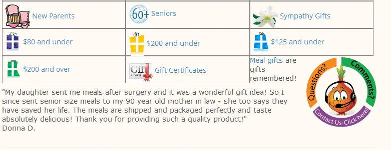
I have a table here: dev2.magickitchen.com/gift
Is that simple enough to do with bootstrap? Could you lend me a hand? Thanks.
Is that simple enough to do with bootstrap? Could you lend me a hand? Thanks.
ASKER
Thanks, I'll certainly give that a try!
ASKER
Wait.. I'm not certain how the html should look.
<div class="box:>item1</div><di
Like that? Thanks.
<div class="box:>item1</div><di
Like that? Thanks.
I recommend you to use Footable this is a fantastic script for table.
http://themergency.com/footable/
I'm using it with Bootstrap for all my project
http://themergency.com/footable/
I'm using it with Bootstrap for all my project
ASKER
Thanks, I'll look into that as well!
ASKER
Oh, no, I've looked into that and it won't work for this simple table I'm working on. I can't hide columns. Thanks, though.
Suggestion you can hide icon columns to save the space.
you may like this one Tablesaw
https://github.com/filamentgroup/tablesaw
you may like this one Tablesaw
https://github.com/filamentgroup/tablesaw
Almost complete, combine with first comment
instead of box I used giftitem
Replace whole table with:
instead of box I used giftitem
Replace whole table with:
<div style="giftscontainer">
<div style="" class="giftitem"><img src="images/gift-page/gift-card.jpg" alt="gift certificate">
<a href="/gift_certificates.html">Gift Certificates</a></div>
<div class="giftitem"><img src="images/gift-page/mom.jpg" alt="mother's day">
<a href="mothers-day.html">Mother's Day</a></div>
<div class="giftitem"><img src="images/gift-page/fathers-day.gif" alt="father's day food gift">
<a href="fathers-day.html">Father's Day</a></div>
<div class="giftitem"><img src="images/gift-page/anniversary.jpg" alt="roses">
<a href="/menu/anniversary.html">Anniversary</a></div>
<div class="giftitem"><img src="images/gift-page/baby-shower.gif" alt="baby shower gift">
<a href="/menu/baby-shower.html">Baby Shower</a></div>
<div class="giftitem"><img src="images/gift-page/birthday.jpg" alt="birthday gift">
<a href="/menu/birthday.html">Birthday</a></div>
<div class="giftitem"><img src="images/gift-page/college2.jpg" alt="college diploma">
<a href="/menu/back-to-school.html">Off to College</a></div>
<div class="giftitem"><img src="images/gift-page/congratulations.jpg" alt="congratulations gift">
<a href="/menu/congratulations.html">Congratulations</a></div>
<div class="giftitem"><img src="images/gift-page/corporate2.png" alt="corporate">
<a href="/menu/corporate.html">Corporate</a></div>
<div class="giftitem"><img src="images/gift-page/new-house-key.jpg" alt="housewarming gift">
<a href="/menu/house-warming-gifts.html" style="font-weight:bold; vertical-align:middle;">New Home</a></div>
<div class="giftitem"><img src="images/gift-page/get-well4.png" alt="doctor">
<a href="/menu/get-well.html">Get Well Gifts</a></div>
<div class="giftitem"><img src="images/gift-page/retirement.gif" alt="retirement">
<a href="/menu/retirement.html">Retirement Gift</a></div>
<div class="giftitem"><img src="images/gift-page/baby1.png" alt="baby">
<a href="/menu/new-parents.html">New Parents</a></div>
<div class="giftitem"><img src="images/gift-page/seniors2.jpg" alt="seniors">
<a href="/menu/seniors-gifts.html">Seniors</a></div>
<div class="giftitem"><img src="images/gift-page/sympathy.png" alt="mothers day">
<a href="/menu/sympathy-gifts.html">Sympathy Gifts</a></div>
<div class="giftitem"><img src="images/gift-page/8.gif" alt="gifts $75 and under">
<a href="/menu/75.html">$80 and under</a></div>
<div class="giftitem"><img src="images/gift-page/1.gif" alt="gift">
<a href="/menu/200.html">$200 and under</a></div>
<div class="giftitem"><img src="images/gift-page/4.gif" alt="student gift">
<a href="/menu/125.html">$125 and under</a></div>
<div class="giftitem"><img src="images/gift-page/7.gif" alt="gift box">
<a href="/menu/201.html">$200 and over</a></div>
<div class="giftitem"><img src="images/gift-page/gift-card.jpg" alt="gift certificate">
<a href="/gift_certificates.html">Gift Certificates</a></div>
</div>.giftscontainer {
display: block; overflow: hidden;
}
.box, .giftitem {
width: 33%;
float: left;
border: 1px solid gray;
height: 55px;
display: inline-block;
padding: 5px;
}ASKER
wow, thanks for that! Lots of work from you, I appreciate it.
ASKER
Hmm.. it looks good on desktop, but in mobile emulators it just gets smaller, doesn't stack. See here:
dev2.magickitchen.com/gift
dev2.magickitchen.com/gift
ASKER CERTIFIED SOLUTION
membership
This solution is only available to members.
To access this solution, you must be a member of Experts Exchange.
ASKER
Sorry I missed that! Brilliant, thanks very much.
ASKER
Whoops, one small problem, the next paragraph appears to be partly in the div.
.giftscontainer {
display: block; overflow: hidden;
}
it makes div appear as square box for full height.
display: block; overflow: hidden;
}
it makes div appear as square box for full height.
ASKER
Right, I already have that, please see here: dev2.magickitchen.com/gift
No, you don't have. <div style="giftscontainer"> should be <div class="giftscontainer"> (my mistake)
It works fine for any type of page.
Also, the new box unbalances the page in that it movs the right navigation down out of the page.Nothing, to do with that, you have "row" div and last column is outside of "row", need to check markup on extra or less divs.
It works fine for any type of page.
ASKER
Thanks, You're very patient with me! Will try this now and recheck the validation.
ASKER
Ok, I have <div class="giftscontainer"> , but I still see what my earlier image shows. Page is validated now, and other problem is gone, as you said. Thanks.
Don't use <!--table in css --> in your CSS files, it breaks rules, in our case:
.giftscontainer {
display: block; overflow: hidden;
}
use
.giftscontainer {
display: block; overflow: hidden;
}
use
/* Text here */ASKER
I'm afraid I don't understand. I can remove all css referencing tables, is that what I need to do? Thanks. By the way, I will be away from now until Monday, so won't make any more changes until then.
In your CSS file you have comments in this brackets <!-- -->, they used in HTML not CSS. So, please remove such brackets from you style.css file.
Remove:
<!--table swap--->
<!--table in css -->
Remove:
<!--table swap--->
<!--table in css -->
ASKER
Thanks so much. I learn new things every day.
ASKER
I still do have the same problem though. dev2.magickitchen.com/gift
/*table in css*/
@media screen and (min-width: 1201px) {
	.giftitem {  width: 33%; }
}
@media screen and (max-width: 1200px) {
	.giftitem {  width: 50%; }
}
@media screen and (max-width: 650px) {
	.giftitem { width: 50%; }
}
@media screen and (max-width: 480px) {
	.giftitem {  width: 100%; }
}With above code all looks good for me.
ASKER
Beautiful! Thanks so much, this will work very well for several places on the website. Thanks for your patience!
Open in new window