How do I make this page mobile friendly?
I have a page here:
http://nofryzone.com/faqs/
that when displayed on a mobile device is screwed up. The image of the girl should move to the top of the page and the faqs should resize and not overlap the bottom content.
http://mobiletest.me/iphone_5_emulator/#u=http://nofryzone.com/faqs/
the other pages on the site seem to work fine...just not this one.
Any help is appreciated.
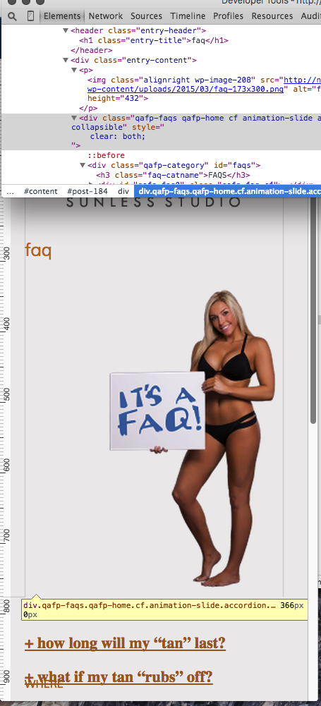
wait, I see what you mean. Youl'll need to add a @media query in for a breakpoint of less that 880px wide to allow the text to wrap under her by adding
Basically the div element below the paragraph tag you keep the girl in, is only supposed to be cleared when she runs into it.
@media all and (max-width: 880px)
{
    div.qafp-faqs.qafp-home.cf.animation-slide.accordion.collapsible { clear: both; }
}Basically the div element below the paragraph tag you keep the girl in, is only supposed to be cleared when she runs into it.
Like that correct?
ASKER
sort of. I applied your suggestions but it still overlaps what is the side content if you scroll down.
can the text be made smaller for the mobile devices?
can the text be made smaller for the mobile devices?
That content side, you mean the answers or questions? The questions don't overlap if you remove the font-size: 150% off of it. You don't size the viewport in the page header, which should be done. That can cause this too:
https://developers.google.com/speed/docs/insights/ConfigureViewport
change from this:
to this:
in your header file.
https://developers.google.com/speed/docs/insights/ConfigureViewport
change from this:
<meta name=viewport content="width=device-width">to this:
<meta name=viewport content="width=device-width, initial-scale=1">in your header file.
ASKER
no, If you look at the desktop version there is content on the right side.
that content is flowing beneath the faqs (look at faq number 3, 4, etc).
I replaced the <meta name=viewport content="width=device-widt
What am I doing wrong?
that content is flowing beneath the faqs (look at faq number 3, 4, etc).
I replaced the <meta name=viewport content="width=device-widt
What am I doing wrong?
When the table collapses, do you want the when and where, which is to the right now, to be below or above the FAQs?
Google reads your page as mobile friendly:
https://www.google.com/webmasters/tools/mobile-friendly/?url=http%3A%2F%2Fnofryzone.com%2Ffaqs%2F
I have developed mobile version for my company page, and a think I figured out is that you cant give your div fixed values like this one:
div#faqs.qafp-category { width: 390px }
iphone 5 has 320px of width if its on vertical... others like iphone 6 or galaxy s4 has 360px of width... then it makes your page bigger than the screen
you dont need to specify width if you make vertical content, if you need to float your divs then make their widths with percent and not px.
also, i give my body min-width: 320px; so you wont break your layout for old cellphones that has 240px of width (i really dont care then cause by looking analytics, there are 2% that is still using it).
If you define hard widths in pixels, then you need to use media queries like I mentioned above.
ASKER
Frank, I need the content that is on the right side (when viewed on a desktop) to go below the faqs.
The other pages do this but the faqs (probably because they expand?) do not.
The other pages do this but the faqs (probably because they expand?) do not.
No, I'm fairly certain the issues is with the girl's picture. It's set inside a paragraph tag, and it's not blocking the entire height of the image in the DOM. Give me a moment and I'll see what I can drum up, but I think a div tag instead of a paragraph, or moving it inside one of the existing should fix it.
ASKER
I also noticed that it is overlapping the footer instead of pushing it down.
yeah, OK. So there's no height attribute set for her picture in CSS, just in the image itself, but aside from that I found that if I gave a height to the accordion it would push the where content down underneath it. It wouldn't bend with it though as it flexed, so you have two options.
1. Easy fix is to wrap that accordion inside of a table element in a single row/column and it should block out the entirety of it without any issues.
2. Set the min-height attribute in CSS, blocking out where you want it to fall into at least, then track the height with javascript and modify the css accordingly.
All of your other pages work because they're in a table and not a div element. Different display attributes and priorities.
.... also, I found you have some bad code on your /prices/ page, and you're missing an opening to your html, it says this...
sweater tan
A tan just for turtleneck wearers! Face and Neck coverage only./font>
ASKER
cool. setting the faq and photo inside a table made the font smaller on the desktop and mobile.
however, only part of the right side content got pushed down. It is still overlapping the where and when.
I appreciate all your hard work on this Frank. Points are not enough.
however, only part of the right side content got pushed down. It is still overlapping the where and when.
I appreciate all your hard work on this Frank. Points are not enough.
ASKER CERTIFIED SOLUTION
membership
This solution is only available to members.
To access this solution, you must be a member of Experts Exchange.
You're very welcome! We've all been there, and personally I think it's easier to debug CSS with today's tools than it is javascript.... If you need to change the font size, set it in the table or element above the font.
ASKER
Thanks Frank! You da man!
When you use font-size, I would recommend not setting it to a percentage unless you have the surrounding elements encapsulated within the viewport. Same can be said for
Open in new window
That said, if you add this to your CSS (either at the bottom of the CSS itself, or in a style tag at the bottom of your html), it should fix it.
Open in new window