What is the best looking font for Access reports.
I recently was told that a competitor's software's reports looked better than mine. I generally use MS Sans Serif. It's not pretty
Any ideas?
(This could be the weirdest question ever asked of this site).
Any ideas?
(This could be the weirdest question ever asked of this site).
ASKER CERTIFIED SOLUTION
membership
This solution is only available to members.
To access this solution, you must be a member of Experts Exchange.
SOLUTION
membership
This solution is only available to members.
To access this solution, you must be a member of Experts Exchange.
For comparison, ...note that almost all common "Sans Serif" fonts look the same...
Can you look at all the fonts mentioned here and tell which is "better looking?"
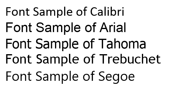
Can you look at all the fonts mentioned here and tell which is "better looking?"
Hey!
Where's the Comic Sans?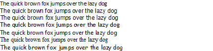 It's funny how different they all look in Word, compared to the paste into MS Paint
Same order.
Times New Roman and Comic Sans added.
Verdana and Lucida are also nice fonts.
Helvetica is a gold standard -- but requires purchase.
MS's corporate logo is in Helvetica.
Arial is MS's version of it.
Had MS not named it 'Comic' would snobbery hate it so?
I've known more than a few users and businesses that made it a default font.
Where's the Comic Sans?
It's funny how different they all look in Word, compared to the paste into MS PaintSame order.
Times New Roman and Comic Sans added.
Verdana and Lucida are also nice fonts.
Helvetica is a gold standard -- but requires purchase.
MS's corporate logo is in Helvetica.
Arial is MS's version of it.
Had MS not named it 'Comic' would snobbery hate it so?
I've known more than a few users and businesses that made it a default font.
Totally subjective question. Ask 20 people, get 21 answers.
The screenshot I took was from a word document...
My point was that pretty much all "sans serif" fonts look pretty much the same...
;-)
So similar, in fact, that I would never say that one looks any better than another...
So I am curious if the OP will post a sample of their report and the "better looking" report...
;-)
Jeff
My point was that pretty much all "sans serif" fonts look pretty much the same...
;-)
So similar, in fact, that I would never say that one looks any better than another...
So I am curious if the OP will post a sample of their report and the "better looking" report...
;-)
Jeff
<<Totally subjective question. Ask 20 people, get 21 answers. >>
Absolutely! +1
Jim.
Absolutely! +1
Jim.
I'm not so sure. Most people wouldn't know.
But most people can see the difference between a "neat" report and an "ugly" report. That's why graphic artists can earn a lot of money.
/gustav
But most people can see the difference between a "neat" report and an "ugly" report. That's why graphic artists can earn a lot of money.
/gustav
hum...well I've been on the subjective end too much I guess<g>.
In fact I once hired a professional artist to do my business cards. He added a black bar at the bottom "for balance". In my eyes (and everyone I showed it to), it looked totally ugly.
But I do agree to an extent with your point. There's been considerable study about how people determine beauty or handsomeness. Most can't state in words what the criteria is that they use, but they know the difference and all can agree for the most part (and FYI, the studies have shown that it's basically left/right symmetry in a face and the proportions of the features).
Jim.
@mx
Totally subjective question. Ask 20 people, get 21 answers.
And yet, by looking at those 21 answers, you've got some data to work with.
a competitor's software's reports looked better than mine.
There are some things, that although they are subjective, do tend to be universal.
I don't think anyone believes that mix-and-match fonting is a good idea.
Two fonts, maybe three at most. A switch in fonts should signal something.
With my stuff, the 'letterhead' stuff is Times New Roman because our third-party branding stuff is in a serif fort.
The body of the reports is generally Tahoma.
Font size should signal something -- along with whitespace. I use VBA to mess with font sizing to ensure that a header never wraps, but remains on a single line.
Access drives stuff vertically down the page.
I don't fight that, but ensure that I don't try to organize in columns. except if I can fully populate them, every time, and evenly across the full width of the page.
I have a footer with some color and it fits with the 'letterhead', so when the report is sparse it doesn't leave the 'whole' page looking blank. Try to have your content consume the entire page. Patches of content interspersed with whitespace look sloppy and the content doesn't jump off the page. Be consistent. Develop a flexible 'style' for your app and then stick with it.
Color schemes are important. You can generate quite pleasing ones based off a main color here.
http://www.paletton.com
Color is expensive. Don't go hog-wild with it.
Emphasize and frame, don't paint. What looks good on screen may not on paper.
Paper is meant to be content-on-white-backgroun
Font-size and font-weight changes should signal things, too.
I'm getting old. I never did use much 8pt font. 10pt minimum for screen. 12pt for printing if there's space for it.
I don't use anything above 24pt. It's content, not advertising.
Symmetry. We are programmed to find symmetry beautiful.
That's my two opinions, anyway.
Nick67
I think Gustav Jim and Nick have hit the nail on the head...
My guess is that some aspect of the report's over all "design" is what makes another report "look better", ...not really just the Font.
You can disregard my posts for any points considerations...
...as other experts have actually provided valid answers here.
Jeff
My guess is that some aspect of the report's over all "design" is what makes another report "look better", ...not really just the Font.
You can disregard my posts for any points considerations...
...as other experts have actually provided valid answers here.
Jeff
SOLUTION
membership
This solution is only available to members.
To access this solution, you must be a member of Experts Exchange.
In that case I use Courier New
That's a choice, but it looks very old-fashioned to many, and it eats a lot of space due to the wide characters.
/gustav
/gustav
ASKER
That was a lot more than I expected
Thank you all!
Thank you all!
Tahoma is good when space is limited, else Trebuchet MS.
If you wish to be at the edge, use the font of Metro/Modern: Segoe UI. Very light and beautiful on its own. Very well suited in large size for headings.
/gustav