SSRS chart where horizontal axis has numeric values, but would like to display varchar values
Hi All
I have an SSRS 2012 column chart with a horizontal axis that displays scores 1 to 20, and a final row that is intended to show '20+' for all scores above 20.
In T-SQL I have a Stored Procedure to pull this off, returning the set in the below image. For the moment, the entire purpose of the 'label' column is to show a 20+ (green rectangle), as if I don't do this there are scores up to 500 and that really skews the graph and makes the 1-20 scores hard to read.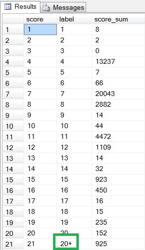
Question: In SSRS how can I indicate that the series values / horizontal axis is one column (score, int), but have it display another (label, varchar(5) ?
If I use the score column it shows a 21 for my '20+', and if I use the label column it sorts the graph in varchar order (1, 10, 11, 12) and not numeric (1, 2, 3, 4..)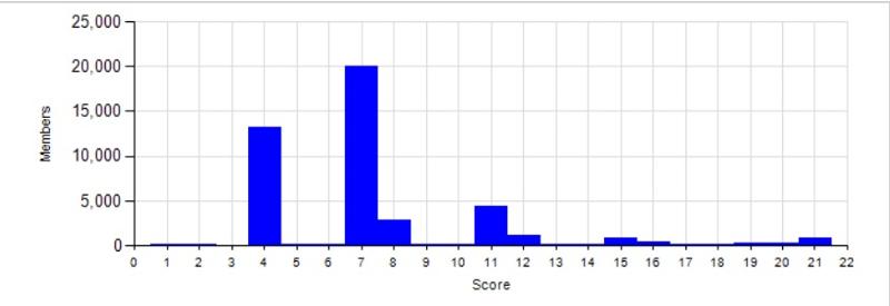
Thanks in advance.
Jim
I have an SSRS 2012 column chart with a horizontal axis that displays scores 1 to 20, and a final row that is intended to show '20+' for all scores above 20.
In T-SQL I have a Stored Procedure to pull this off, returning the set in the below image. For the moment, the entire purpose of the 'label' column is to show a 20+ (green rectangle), as if I don't do this there are scores up to 500 and that really skews the graph and makes the 1-20 scores hard to read.
Question: In SSRS how can I indicate that the series values / horizontal axis is one column (score, int), but have it display another (label, varchar(5) ?
If I use the score column it shows a 21 for my '20+', and if I use the label column it sorts the graph in varchar order (1, 10, 11, 12) and not numeric (1, 2, 3, 4..)

Thanks in advance.
Jim
ASKER CERTIFIED SOLUTION
membership
This solution is only available to members.
To access this solution, you must be a member of Experts Exchange.
SOLUTION
membership
This solution is only available to members.
To access this solution, you must be a member of Experts Exchange.
ASKER
>One side effect is now the bottom labels are staggered over two 'rows', which I'll play with to resolve.
Chart Axis > LabelsAutoFitDisabled = True took care of that.
Chart Axis > LabelsAutoFitDisabled = True took care of that.
ASKER
A few things to deal with, but I'm taking off for two weeks in a couple of hours, so splitting points here.
Thanks.
Thanks.
Sorry. I forgot to attach the example. I created a dataset with the columns score and score_sum. I created a column chart with this data and set the Label and 'Group on' expressions for the Category Group to:
=iif( Fields!score.Value<=20,Fields!score.Value,"20+")
ASKER
One side effect is now the bottom labels are staggered over two 'rows', which I'll play with to resolve.
@Nicobo - The expression works when I used it for data points, Chart Series > Label > Label (which also forces Chart Series > Label > UseValueAsLabel='False', but I am unable to locate the property to set this so the horizontal axis labels reflect the expression.
Thanks.