css table help
Hello,
i am trying to write CSS where i have items that are all in 1 row and i would like to place items side by side in a 3 column approach with CSS. i have not examples yet as i have no ideal how to make this happen.
i am trying to write CSS where i have items that are all in 1 row and i would like to place items side by side in a 3 column approach with CSS. i have not examples yet as i have no ideal how to make this happen.
This is a very simple way to show how to do that:
http://jsfiddle.net/AlexCode/xmykg5xt/
If you want to get more "responsive" I would suggest using one of the grid systems available.
Bootstrap
Foundation
960
http://jsfiddle.net/AlexCode/xmykg5xt/
If you want to get more "responsive" I would suggest using one of the grid systems available.
Bootstrap
Foundation
960
.cols-3 {
    width: 100%;
    overflow: hidden;
}

.cols-3 > div{
    float: left;
    width: 33.333%;
    box-sizing: border-box;
    border: 1px dashed #000;
}ASKER
Hello,
i am having issues with the column example you gave me can you give me a bit of help everything is falling on a new line.
i am having issues with the column example you gave me can you give me a bit of help everything is falling on a new line.
<!DOCTYPE html>
<html>
<head>
<style type="text/css">
.newspaper {
-webkit-column-count: 2; /* Chrome, Safari, Opera */
-moz-column-count: 2; /* Firefox */
column-count: 2;
}
div.columns {
column-width: 400px;
-moz-column-width:400px;
-webkit-column-width: 400px;
}
div.keeptogether {
display: inline-block;
width: 300px;
}
.timg img{
height: 300px;
width: 300px;
}
.timg{
height: 300px;
width: 300px;
}
</style>
</head>
<body>
<hr>
<div class="columns">
*|FEEDBLOCK:http://74.208.153.195/Proxy.ashx?u=https://ems.tamuc.edu/MasterCalendar/RSSFeeds.aspx?data=3O4bL1MF%2bEvmo4ssXvqg4VIdJVQ7Ikut|* *|FEEDITEMS:[$count=10]|*
<div class="keeptogether">
<table>
<tr>
<td class="timg">
*|FEEDITEM:IMAGE|*
</td>
</tr>
</table>
<table>
<tbody>
<tr>
<td>*|FEEDITEM:TITLE|*</td>
</tr>
<tr>
<td>*|RSSITEM:DATE|*</td>
</tr>
</tbody>
</table>
<table class="timg">
<tr>
<td>
*|FEEDITEM:CONTENT_TEXT|*
</td>
</tr>
</table>
<table>
<tbody>
<tr>
<td>*|FACEBOOK:LIKE|*</td>
<td>*|TWITTER:TWEET|*</td>
<td>*|TUMBLR:SHARE|*</td>
<td>*|GOOGLE:PLUSONE|*</td>
</tr>
</tbody>
</table>
</div>
*|END:FEEDITEMS|*
*|END:FEEDBLOCK|*
</div>
<center>
<table border="0" cellpadding="0" cellspacing="0" width="100%" id="canspamBarWrapper" style="background-color:#FFFFFF; border-top:1px solid #E5E5E5;">
<tr>
<td align="center" valign="top" style="padding-top:20px; padding-bottom:20px;">
<table border="0" cellpadding="0" cellspacing="0" id="canspamBar">
<tr>
<td align="center" valign="top" style="color:#606060; font-family:Helvetica, Arial, sans-serif; font-size:11px; line-height:150%; padding-right:20px; padding-bottom:5px; padding-left:20px; text-align:center;">
This email was sent to <a href="mailto:*|EMAIL|*" target="_blank" style="color:#404040 !important;">*|EMAIL|*</a>
<br>
<a href="*|ABOUT_LIST|*" target="_blank" style="color:#404040 !important;"><em>why did I get this?</em></a> <a href="*|UNSUB|*" style="color:#404040 !important;">unsubscribe from this list</a> <a href="*|UPDATE_PROFILE|*" style="color:#404040 !important;">update subscription preferences</a>
<br>
*|LIST:ADDRESSLINE|*
<br>
<br>
*|REWARDS|*
</td>
</tr>
</table>
</td>
</tr>
</table>
<style type="text/css">
@media only screen and (max-width: 480px){
table[id="canspamBar"] td{font-size:14px !important;}
table[id="canspamBar"] td a{display:block !important; margin-top:10px !important;}
}
</style>
</center></body>
</html>
From your code I don't understand what you want to achieve.
Are you trying to create a site layout with an header, a content with 3 columns and a footer?
Are you trying to create a site layout with an header, a content with 3 columns and a footer?
ASKER
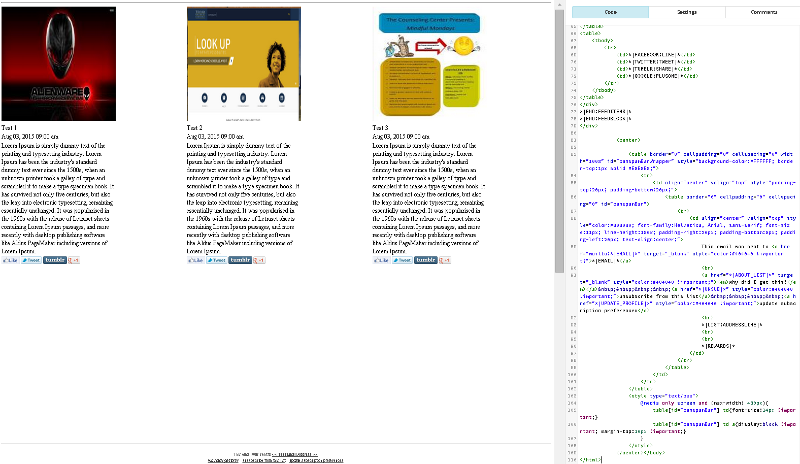
hello yes
i am trying to create the following in the image attached
i am trying to create the following in the image attached

I would recommend to avoid tables.
if you use the approach on my example or one of the grid systems I're mentioned above, you'll end up with a much better design.
Basically do layouts with divs instead of tables.
I've updated my example to look a bit more with what you want:
http://jsfiddle.net/AlexCode/xmykg5xt/
if you use the approach on my example or one of the grid systems I're mentioned above, you'll end up with a much better design.
Basically do layouts with divs instead of tables.
I've updated my example to look a bit more with what you want:
http://jsfiddle.net/AlexCode/xmykg5xt/
ASKER
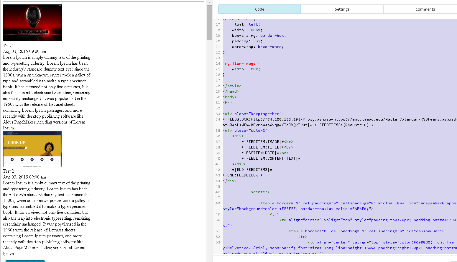
ok here is what i have now with your example but i am trying to repeat the column side by side as teh content changes form the RSS.
here is what i have now
<!DOCTYPE html>
<html>
<head>
<style type="text/css">
div.keeptogether {
display: inline-block;
width: 300px;
.cols-3 {
width: 200px;
overflow: hidden;
margin: 0 0 20px 0;
}
.cols-3 > div{
float: left;
width: 100px;
box-sizing: border-box;
padding: 5px;
word-wrap: break-word;
}
img.item-image {
width: 100%;
}
</style>
</head>
<body>
<hr>
<div class="keeptogether">
*|FEEDBLOCK:http://74.208.153.195/Proxy.ashx?u=https://ems.tamuc.edu/MasterCalendar/RSSFeeds.aspx?data=3O4bL1MF%2bEvmo4ssXvqg4VIdJVQ7Ikut|* *|FEEDITEMS:[$count=10]|*
<div class="cols-3">
<div>
*|FEEDITEM:IMAGE|*<br>
*|FEEDITEM:TITLE|*<br>
*|RSSITEM:DATE|*<br>
*|FEEDITEM:CONTENT_TEXT|*
</div>
*|END:FEEDITEMS|*
*|END:FEEDBLOCK|*
</div>
<center>
<table border="0" cellpadding="0" cellspacing="0" width="100%" id="canspamBarWrapper" style="background-color:#FFFFFF; border-top:1px solid #E5E5E5;">
<tr>
<td align="center" valign="top" style="padding-top:20px; padding-bottom:20px;">
<table border="0" cellpadding="0" cellspacing="0" id="canspamBar">
<tr>
<td align="center" valign="top" style="color:#606060; font-family:Helvetica, Arial, sans-serif; font-size:11px; line-height:150%; padding-right:20px; padding-bottom:5px; padding-left:20px; text-align:center;">
This email was sent to <a href="mailto:*|EMAIL|*" target="_blank" style="color:#404040 !important;">*|EMAIL|*</a>
<br>
<a href="*|ABOUT_LIST|*" target="_blank" style="color:#404040 !important;"><em>why did I get this?</em></a> <a href="*|UNSUB|*" style="color:#404040 !important;">unsubscribe from this list</a> <a href="*|UPDATE_PROFILE|*" style="color:#404040 !important;">update subscription preferences</a>
<br>
*|LIST:ADDRESSLINE|*
<br>
<br>
*|REWARDS|*
</td>
</tr>
</table>
</td>
</tr>
</table>
<style type="text/css">
@media only screen and (max-width: 480px){
table[id="canspamBar"] td{font-size:14px !important;}
table[id="canspamBar"] td a{display:block !important; margin-top:10px !important;}
}
</style>
</center></body>
</html>here is what i have now
ASKER
picture did not attach 
ASKER
the content is going out to email here is the source that is returned from my email
<img class="mc-rss-item-img" src="https://ems.tamuc.edu/MasterCalendar/imagewriter.aspx?imageId=515" height="125" width="200" style="height: 125;width: 200;">
Test 1
Aug 03, 2015 09:00 am
Lorem Ipsum is simply dummy text of the printing and typesetting industry. Lorem Ipsum has been the industry's standard dummy text ever since the 1500s, when an unknown printer took a galley of type and scrambled it to make a type specimen book. It has survived not only five centuries, but also the leap into electronic typesetting, remaining essentially unchanged. It was popularised in the 1960s with the release of Letraset sheets containing Lorem Ipsum passages, and more recently with desktop publishing software like Aldus PageMaker including versions of Lorem Ipsum.
<img class="mc-rss-item-img" src="https://ems.tamuc.edu/MasterCalendar/imagewriter.aspx?imageId=516" height="122" width="200" style="height: 122;width: 200;">
Test 2
Aug 03, 2015 09:00 am
Lorem Ipsum is simply dummy text of the printing and typesetting industry. Lorem Ipsum has been the industry's standard dummy text ever since the 1500s, when an unknown printer took a galley of type and scrambled it to make a type specimen book. It has survived not only five centuries, but also the leap into electronic typesetting, remaining essentially unchanged. It was popularised in the 1960s with the release of Letraset sheets containing Lorem Ipsum passages, and more recently with desktop publishing software like Aldus PageMaker including versions of Lorem Ipsum.
<img class="mc-rss-item-img" src="https://ems.tamuc.edu/MasterCalendar/imagewriter.aspx?imageId=517" height="200" width="154" style="height: 200;width: 154;">
Test 3
Aug 03, 2015 09:00 am
Lorem Ipsum is simply dummy text of the printing and typesetting industry. Lorem Ipsum has been the industry's standard dummy text ever since the 1500s, when an unknown printer took a galley of type and scrambled it to make a type specimen book. It has survived not only five centuries, but also the leap into electronic typesetting, remaining essentially unchanged. It was popularised in the 1960s with the release of Letraset sheets containing Lorem Ipsum passages, and more recently with desktop publishing software like Aldus PageMaker including versions of Lorem Ipsum.
This email was sent to joneschris903@gmail.com (mailto:joneschris903@gmail.com)
why did I get this? (http://tamuc.us11.list-manage.com/about?u=6ee33be9f5bc7ebb9e4fe2ea4&id=f3e4c91462&e=&c=ca0ff4bcfd) unsubscribe from this list (http://tamuc.us11.list-manage.com/unsubscribe?u=6ee33be9f5bc7ebb9e4fe2ea4&id=f3e4c91462&e=&c=ca0ff4bcfd) update subscription preferences (http://tamuc.us11.list-manage.com/profile?u=6ee33be9f5bc7ebb9e4fe2ea4&id=f3e4c91462&e=)
Tamuc . 2036 MEADOW VIEW DR . Mckinney, Tx 75070 . USA
Email Marketing Powered by MailChimp
http://www.mailchimp.com/monkey-rewards/?utm_source=freemium_newsletter&utm_medium=email&utm_campaign=monkey_rewards&aid=6ee33be9f5bc7ebb9e4fe2ea4&afl=1
--_----------=_MCPart_2020303792
Content-Type: text/html; charset="us-ascii"
<!DOCTYPE html>
<html>
<head>
<style type="text/css">
div.keeptogether {
display: inline-block;
width: 200px;
.cols-3 {
width: 200px;
overflow: hidden;
margin: 0 0 20px 0;
}
.cols-3 > div{
float: left;
width: 100px;
box-sizing: border-box;
padding: 5px;
word-wrap: break-word;
}
</style>
</head>
<body>
<hr>
<div class="keeptogether">
<div class="cols-3">
<div>
<img class="mc-rss-item-img" src="https://ems.tamuc.edu/MasterCalendar/imagewriter.aspx?imageId=515" height="125" width="200" style="height: 125;width: 200;"><br>
Test 1<br>
Aug 03, 2015 09:00 am<br>
Lorem Ipsum is simply dummy text of the printing and typesetting industry. Lorem Ipsum has been the industry's standard dummy text ever since the 1500s, when an unknown printer took a galley of type and scrambled it to make a type specimen book. It has survived not only five centuries, but also the leap into electronic typesetting, remaining essentially unchanged. It was popularised in the 1960s with the release of Letraset sheets containing Lorem Ipsum passages, and more recently with desktop publishing software like Aldus PageMaker including versions of Lorem Ipsum.
</div>
</div>
</div>
<div class="keeptogether">
<div class="cols-3">
<div>
<img class="mc-rss-item-img" src="https://ems.tamuc.edu/MasterCalendar/imagewriter.aspx?imageId=516" height="122" width="200" style="height: 122;width: 200;"><br>
Test 2<br>
Aug 03, 2015 09:00 am<br>
Lorem Ipsum is simply dummy text of the printing and typesetting industry. Lorem Ipsum has been the industry's standard dummy text ever since the 1500s, when an unknown printer took a galley of type and scrambled it to make a type specimen book. It has survived not only five centuries, but also the leap into electronic typesetting, remaining essentially unchanged. It was popularised in the 1960s with the release of Letraset sheets containing Lorem Ipsum passages, and more recently with desktop publishing software like Aldus PageMaker including versions of Lorem Ipsum.
</div>
</div>
</div>
<div class="keeptogether">
<div class="cols-3">
<div>
<img class="mc-rss-item-img" src="https://ems.tamuc.edu/MasterCalendar/imagewriter.aspx?imageId=517" height="200" width="154" style="height: 200;width: 154;"><br>
Test 3<br>
Aug 03, 2015 09:00 am<br>
Lorem Ipsum is simply dummy text of the printing and typesetting industry. Lorem Ipsum has been the industry's standard dummy text ever since the 1500s, when an unknown printer took a galley of type and scrambled it to make a type specimen book. It has survived not only five centuries, but also the leap into electronic typesetting, remaining essentially unchanged. It was popularised in the 1960s with the release of Letraset sheets containing Lorem Ipsum passages, and more recently with desktop publishing software like Aldus PageMaker including versions of Lorem Ipsum.
</div>
</div>
</div>
<center>
<table border="0" cellpadding="0" cellspacing="0" width="100%" id="canspamBarWrapper" style="background-color:#FFFFFF; border-top:1px solid #E5E5E5;">
<tr>
<td align="center" valign="top" style="padding-top:20px; padding-bottom:20px;">
<table border="0" cellpadding="0" cellspacing="0" id="canspamBar">
<tr>
<td align="center" valign="top" style="color:#606060; font-family:Helvetica, Arial, sans-serif; font-size:11px; line-height:150%; padding-right:20px; padding-bottom:5px; padding-left:20px; text-align:center;">
This email was sent to <a href="mailto:joneschris903@gmail.com" target="_blank" style="color:#404040 !important;">joneschris903@gmail.com</a>
<br>
<a href="http://tamuc.us11.list-manage.com/about?u=6ee33be9f5bc7ebb9e4fe2ea4&id=f3e4c91462&e=&c=ca0ff4bcfd" target="_blank" style="color:#404040 !important;"><em>why did I get this?</em></a> <a href="http://tamuc.us11.list-manage.com/unsubscribe?u=6ee33be9f5bc7ebb9e4fe2ea4&id=f3e4c91462&e=&c=ca0ff4bcfd" style="color:#404040 !important;">unsubscribe from this list</a> <a href="http://tamuc.us11.list-manage.com/profile?u=6ee33be9f5bc7ebb9e4fe2ea4&id=f3e4c91462&e=" style="color:#404040 !important;">update subscription preferences</a>
<br>
Tamuc · 2036 MEADOW VIEW DR · Mckinney, Tx 75070 · USA
<br>
<br>
<a href="http://www.mailchimp.com/monkey-rewards/?utm_source=freemium_newsletter&utm_medium=email&utm_campaign=monkey_rewards&aid=6ee33be9f5bc7ebb9e4fe2ea4&afl=1"><img src="http://cdn-images.mailchimp.com/monkey_rewards/MC_MonkeyReward_15.png" border="0" alt="Email Marketing Powered by MailChimp" title="MailChimp Email Marketing" width="139" height="54"></a>
</td>
</tr>
</table>
</td>
</tr>
</table>
<style type="text/css">
@media only screen and (max-width: 480px){
table[id="canspamBar"] td{font-size:14px !important;}
table[id="canspamBar"] td a{display:block !important; margin-top:10px !important;}
}
</style>
</center></body>
</html>
--_----------=_MCPart_2020303792--ASKER
hello,
here is what i can see from jfiddler but when it makes it to email it ignores the divs
https://jsfiddle.net/xmykg5xt/2/embedded/result/
here is what i can see from jfiddler but when it makes it to email it ignores the divs
https://jsfiddle.net/xmykg5xt/2/embedded/result/
ASKER CERTIFIED SOLUTION
membership
This solution is only available to members.
To access this solution, you must be a member of Experts Exchange.
ASKER
ok, i am sure the tool mail chimp i am using does something to teh email it just places everything in a single column still with your example.
The mail chimp test I cannot do.
Here's the same thing but with tables. Let me know if it works well.
https://jsfiddle.net/AlexCode/xmykg5xt/6/
Here's the same thing but with tables. Let me know if it works well.
https://jsfiddle.net/AlexCode/xmykg5xt/6/
ASKER
Open in new window