Changing the style of a calendar popup
Our online reservation system requires visitors to use a popup calendar form to enter dates of their proposed reservation. Someone recently complained that the calendar popups were too small, so I'm asking for Expert advice about how to enlarge them. For clarification, I'm not asking for alternative reservation systems -- just for technical advice about enlarging the popups in our existing system.
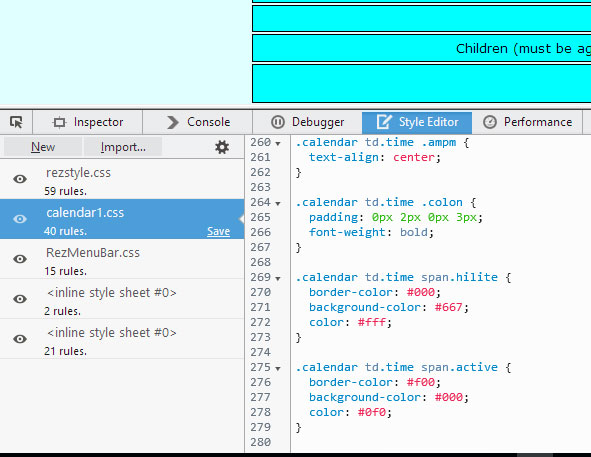
I believe the calendar popup styling is controlled by the attached css file. To reproduce the issue, please visit www.mauitradewinds.com/RezEasy/rezeasy.html and select New Booking from the menu. Please note that a different format is provided for tablet and mobile visitors, and nobody has complained about that. However, for notebook visitors with a small screen, it may be an issue. calendar1.css
Kindly be aware that the centering of the calendar popups was a challenging issue for me. In the past, the popups appeared too high, or entirely off the screen in some browsers or screen sizes. Whatever adjustments may be made to the size of the popups, it will be important that they continue to appear close to the center of the screen, regardless of the browser or screen size.
I did not read your post correctly and missed out that you have diff arrangement for mobile view.... a solution would be better if you target just the notebook size
@media only screen and (min-width:768px) and (max-width: 1024px) {
.calendar, .calendar table {
font-size: 13px;
}
}
@media only screen and (min-width:768px) and (max-width: 1024px) {
.calendar, .calendar table {
font-size: 13px;
}
}
ASKER
Hello Prasadh: Thank you for your comments. I just asked the customer who complained about the calendar size, as to what device he was using. He said it is a Windows Surface Pro 3 with a small screen. Will the CSS code you provided help with that?
well I did not know surface pro resolution or screen size so I checked on google and here is what I found:
Screen size:
12"
Resolution:
2160 x 1440
no wonder... if someone has 2160 x 1440 resolution on a 12 inch screen everything is gonna look small and our text of 11px is definitely going to look even smaller.
and my earlier code is not going to help your client.
but we cannot have diff css for every client... what may help you is font sizes in em but let me think on it a bit more and I will get back to you soon.
thanks,
Prasadh
ASKER
Very kind of you to take an interest. I'll await your feedback.
ASKER CERTIFIED SOLUTION
membership
This solution is only available to members.
To access this solution, you must be a member of Experts Exchange.
my above css suggestion is based on GUESSWORK... so it needs to be tested before we finalize the diff resolutions and text sizes.
ASKER
Thank you for your research and styling proposal. It's been implemented now. Please let me know how it looks to you.
I temporarily removed the media query which presents the mobile version to iPad visitors, so I could look at the calendar popup on my iPad. I could not see any difference in the calendar popup size or font, whether or not the calendar stylesheet contained the code which you supplied. I was expecting to see larger font/popup on the iPad with the new CSS code. Maybe I am overlooking something.
I temporarily removed the media query which presents the mobile version to iPad visitors, so I could look at the calendar popup on my iPad. I could not see any difference in the calendar popup size or font, whether or not the calendar stylesheet contained the code which you supplied. I was expecting to see larger font/popup on the iPad with the new CSS code. Maybe I am overlooking something.
I checked and I did not find any difference in the calendar font size.... means the CSS is not targeting the diff resolutions and increasing the text font size as per css.
your page is loading in a frame I guess and your page does not have any CSS link in its source, so I cant make out if the CSS you said is indeed loading with the page.
your page is loading in a frame I guess and your page does not have any CSS link in its source, so I cant make out if the CSS you said is indeed loading with the page.
ASKER
The page which contains the calendar popups is loading in a frame. However, the "child" page which appears in that parent frame is loading the stylesheet which now contains the adjustments you provided:
<link rel="stylesheet" type="text/css" media="all" href="http://www.mauitradewinds.com/RezEasy/style/calendar1.css">
I checked using Inspect Element in Firefox... I see 3 stylesheets here... but I dont see my code added to the calendar1.css
I can be sure its added only when I can see it in the right hand window in the inspect element.
I checked again by refreshing the page and reloading by Ctrl+F5, I still cant see the media queries in the stylesheet.
I checked again by refreshing the page and reloading by Ctrl+F5, I still cant see the media queries in the stylesheet.
ASKER
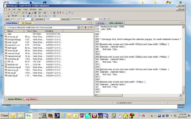
That's confusing! Here is a screenshot of the end of the css file as it appears on the server, viewed from my FTP client...

ASKER
You can also navigate to http://www.mauitradewinds.com/RezEasy/style/ and download calendar1.css
I can see anything inside the folder in above link... but when i checked this link - I got the CSS.... but WITHOUT the media queries in it.
here is a link you can check the CSS yourself: http://www.mauitradewinds.com/RezEasy/style/calendar1.css
plus I checked again with FIREBUG tool... I see the CSS but again without the medeia queries... so my conclusion is that maybe some confusion is talking place in uploading the file...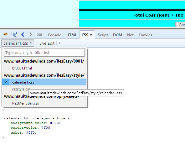
here is a link you can check the CSS yourself: http://www.mauitradewinds.com/RezEasy/style/calendar1.css
plus I checked again with FIREBUG tool... I see the CSS but again without the medeia queries... so my conclusion is that maybe some confusion is talking place in uploading the file...
so unless we both see my code in the CSS in this link http://www.mauitradewinds.com/RezEasy/style/calendar1.css, we cant be 100% sure its added on the server :)
ASKER
I can't understand why there is a discrepancy. I followed the link you provided in your comment #40951187, opened the file, then copied the last section to my clipboard. I'll paste it here:
/* Use larger font, which enlarges the calendar popups, for small notebook screens */
@media only screen and (min-width:1024px) and (max-width: 1280px) {
.calendar, .calendar table {
font-size: 12px;
}
}
@media only screen and (min-width:1280px) and (max-width: 1440px) {
.calendar, .calendar table {
font-size: 14px;
}
}
@media only screen and (min-width:1441px) and (max-width: 1768px) {
.calendar, .calendar table {
font-size: 15px;
}
}
@media only screen and (min-width: 1769px) {
.calendar, .calendar table {
font-size: 17px;
}
}
Great ! I checked and now the file is showing the media queries AND the font is increasing as per the resolution :)
now I see the size of calendar in 1920 X 1080 resolution is DECENT TO READ.
so I guess now you can ask your client to check if its readable now....
now I see the size of calendar in 1920 X 1080 resolution is DECENT TO READ.
so I guess now you can ask your client to check if its readable now....
I also checked on my mobile which is a calling-tab 7 inches and the calendar is definitely readable now.
check on your ipad... the size of calendar should look bigger now.
check on your ipad... the size of calendar should look bigger now.
ASKER
I think this has really helped. I can see the difference under IE11, Firefox and Chrome, when the screen resolution is high. Unfortunately, there doesn't seem to be any difference under Safari, so my iPad doesn't demonstrate the change. If you have any suggestion about that, please let me know. I'll also ask the guest who mentioned this issue to check on his device.
I'm happy with the result -- it enlarged the popups and font, and didn't displace them from near the screen center.
I'm happy with the result -- it enlarged the popups and font, and didn't displace them from near the screen center.
my safari browser on desktop shows the increased font size fine, but safari on iPad and iPhone has to be targeted with a little bit different media query., it uses min-device-width .... the word device is extra
/* Use larger font for iPad and iPhone */
@media only screen and (min-device-width:768px) and (max-device-width: 1024px) {
.calendar, .calendar table {
font-size: 12px;
}
}
for further reference: here you will get a list of all different IOS media queries
hope this helped and let me know if you have any further questions.
thanks,
Prasadh
ASKER
Thank you. So, for every instance of min-width or max-width, shall I replace those with min-device-width and max-device-width? Or will that interfere with all the other browser's behavior?
well the deeper you dig, more queries you will find for numerous devices and resolutions :)
as per me most of ios devices will be covered by that one single query I gave. I guess you should add that new query and stop at that for now.
in future if any new complaint comes again, you know how to deal with it now... just ask the customer his device and resolution... and you can take it from there i guess :)
but remember that you cannot satisfy each and everyone with his own different device...
ASKER
Understood. You've been a great help.
you are welcome :)
since you are looking into the calendar popup size issue on smaller screens, I suggest you use media queries and have 3 different sizes for desktops, notebooks/tabs & small screen mobiles.
after checking the CSS... I observed that most content in the tables is TEXT and you have used font-size in only 2 classes at start of the CSS (2 more classes for the arrows and combo )
so I guess if you add a few lines of CSS with media queries, it will increase the TEXT font-size and in turn push the table size to accommodate them... in turn making the table a bit bigger and more readable.
can you add below lines after all code in css and check how it looks on a smaller width devices
Open in new window
let me know your views.
thanks,
Prasadh