misplaced footer on several pages.
Hi, on mobile, a lot of pages are showing the footer floating up over the content on http://clinica-americas.com/. I'll upload the client's screenshots, and name them the url they reference.
ON the second shot, it could be: http://clinica-americas.com/english/services-dr-noe.html, but it could be any of the links on the left. I'll try to narrow it down.
Screenshot-2015-08-30-21-01-25.png
Screenshot-2015-08-30-21-06-19.jpg
Screenshot-2015-08-30-21-06-40.jpg
Screenshot-2015-08-30-21-08-56.jpg
ASKER
Thanks, and no problem, I'm very glad to hear from you. :) I''ll go over those pages now.
ASKER
OK... I'm not seeing what you're seeing at the moment. If I look at it in bootstrap, and click the wrapper, I don't see a height.
ASKER
OK, I took everything from end of content down from this page: http://clinica-americas.com/english/about.html
and put it into http://clinica-americas.com/english/about-dr-nena.html.
I think that worked, would you mind checking http://clinica-americas.com/english/about.html on your phone? Thanks.
and put it into http://clinica-americas.com/english/about-dr-nena.html.
I think that worked, would you mind checking http://clinica-americas.com/english/about.html on your phone? Thanks.
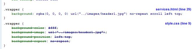
Sure, in the meantime, the issue was on line 37 of style.css:
@media only screen and (max-width:529px) {
	.wrapper, #Stage {
		background-size: 145% 100% !important;
        height: 75px;
	}
    #logo-responsive{
        width: 70%;
    }
}ASKER
Thanks, I'll remove that.
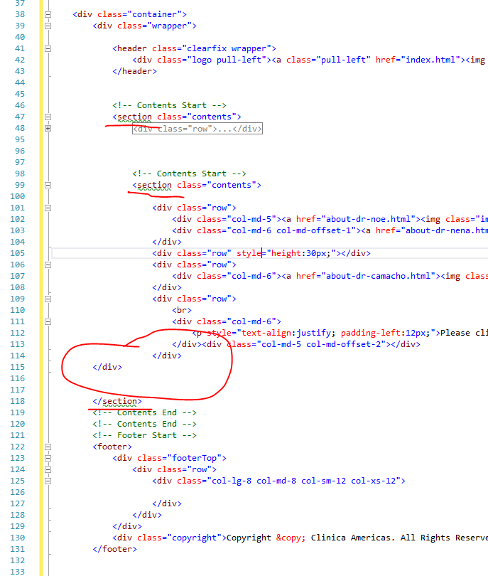
Have a look at the screen cap, there's still a few orphaned / missing end tags:
ASKER
Thanks, I'll get rid of those.
ASKER
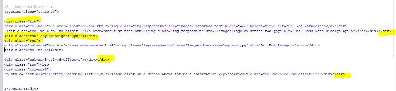
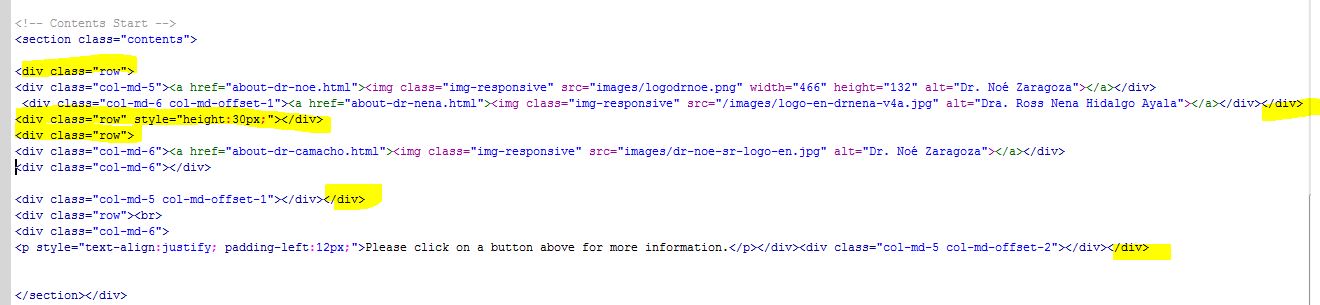
Hi, I went through it. On the lower section, I now have it like this. I've highlighted the beginnings and ends or rows, and it looks right to me, How does it look on a phone? My emulator still says it isn't fixed. Thanks
ASKER CERTIFIED SOLUTION
membership
This solution is only available to members.
To access this solution, you must be a member of Experts Exchange.
ASKER
Thanks a bunch! I'll ask the client if it works on his phone now, and we'll go from there. Thanks for all the help.
Sorry for delay, been a "fun" day. So it looks like you have a few issues going on.
The first one you posted works fine for me, but probably shouldn't...
In that one, you have the main footer INSIDE the .wrapper object, which semantically it probably shouldn't be. But that one displays fine for me.
For the other two, which are overlapping (meaning #3 and #4, no url provided for #2), you have a specific height:75px set for .wrapper which is what's messing up the footer. if you remove that height element, it seems to display properly.