Is there a way to push text to the bottom of the div without using <p>'s....
Hello
I am trying to make this page "more responsive".
Test page on site
This test page consists of three (yes) big images. and to the right is some text.
I need to have the text align with the bottom of the div, instead of the top. Right now I'm using <p>'s to do that, and that is not the ideal way to do this, I know. It especially becomes apparent as the page narrows to tablet -- and cell phone (ugh).
So my initial question is how can I make the text align with the bottom of the div :EditorialArticleWrapper: -- instead of the top of that div.
Thanks
Rowby
SOLUTION
membership
This solution is only available to members.
To access this solution, you must be a member of Experts Exchange.
Rowby, I use bootstrap as you know but the grid your template uses is very similar in how it works https://formstone.it/components/grid/. One of my pet peeves is when they change the names to make it their own. Always throws you off so the class names in that sample have been changed.
I agree that you need to split your image into two. Next you need to make a "row" and inside the row 3 columns. The first two columns for each of the two images and the third column for the text.
Below is how I would mark up the row of data. For the desktop, 3 columns. For the tablet, 2 columns of images withe the text under both columns and for mobile 3 rows. Notice on the 3rd column I have tablet-full. That will force a new row below the two divs above. Here is a working sample http://jsbin.com/yomacoveci/edit?output Narrow and widen your browser to see what happens.
Finally, you have 3 rows, so just repeat. Then the code above will be fully responsive for 3 different viewports.
I have a feeling for getting the text to the bottom we may need to use a media query and for desktop position the text in the third column absolute and perhaps use some jquery to detect the height of the image and make the div the same height.
I agree that you need to split your image into two. Next you need to make a "row" and inside the row 3 columns. The first two columns for each of the two images and the third column for the text.
Below is how I would mark up the row of data. For the desktop, 3 columns. For the tablet, 2 columns of images withe the text under both columns and for mobile 3 rows. Notice on the 3rd column I have tablet-full. That will force a new row below the two divs above. Here is a working sample http://jsbin.com/yomacoveci/edit?output Narrow and widen your browser to see what happens.
<div class="row">
        <div class="desktop-third tablet-half  mobile-full ">Image one</div>
        <div class="desktop-third tablet-half  mobile-full ">Image two</div>
        <div class="desktop-third tablet-full mobile-full ">text</div>
</div>Finally, you have 3 rows, so just repeat. Then the code above will be fully responsive for 3 different viewports.
I have a feeling for getting the text to the bottom we may need to use a media query and for desktop position the text in the third column absolute and perhaps use some jquery to detect the height of the image and make the div the same height.
ASKER
Thanks Scott and mimcc
Looks like good solutions here. I'll resume later today.
Rowby
Looks like good solutions here. I'll resume later today.
Rowby
ASKER
Hi Scott (and mlmcc)
Finally back to this. Here's the current version with Scott's markup (and a div to give the section the gray background color the client wants:
Current version
One minor issue is why the bottom padding (with the gray color is not working. (That's my css that's suppose to do that.)
In any case now we're dealing with getting the text to the right, at the bottom. Mimcc had a solution, not sure how that would be adapted in this current html markup.
BTW I can tell the client that all images need to be the same height. But if Jquery can detect image height for for the right text area I guess that would be ideal.
Reminder of how the layout needs to look at desktop level: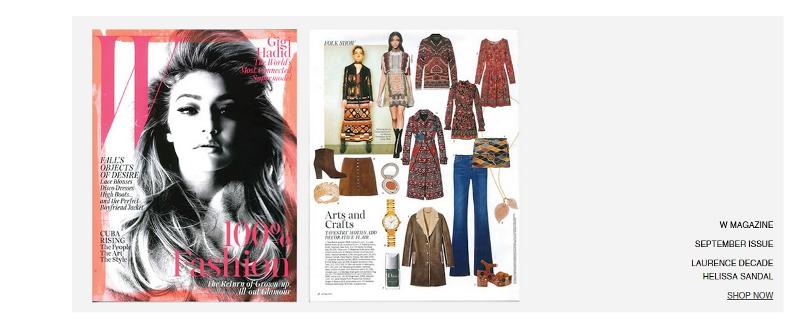 Thanks
Rowby
Finally back to this. Here's the current version with Scott's markup (and a div to give the section the gray background color the client wants:
Current version
One minor issue is why the bottom padding (with the gray color is not working. (That's my css that's suppose to do that.)
In any case now we're dealing with getting the text to the right, at the bottom. Mimcc had a solution, not sure how that would be adapted in this current html markup.
BTW I can tell the client that all images need to be the same height. But if Jquery can detect image height for for the right text area I guess that would be ideal.
Reminder of how the layout needs to look at desktop level:
 Thanks
Rowby
The only way I can think of is to give that 3rd div a class. Then wrap the text in a span.
http://jsbin.com/yaredihuke/1/edit?html,output
.testimage_text{position: relative}
.testimage_text span{position: absolute;bottom: 0;}
<div class="testimage_text"><span>test</span></div> $(function() {
// get height on window load
var shopHeight = $('.testimage').height();
// set the height
setText(shopHeight);
$(window).resize(function() {
// get height on window resize
shopHeight = $('.testimage').height();
setText(shopHeight);
});
function setText(h) {
// set the height of our testimage_text div
$('.testimage_text').height(h);
}
});http://jsbin.com/yaredihuke/1/edit?html,output
<!DOCTYPE html>
<html>
<head>
<script src="https://code.jquery.com/jquery-1.11.3.js"></script>
<link href="//cdn.shopify.com/s/files/1/0928/3584/t/11/assets/stylesheet.css?1265178211241863678" rel="stylesheet" type="text/css" media="all" />
<style>
.testimage_text{position: relative}
.testimage_text span{position: absolute;bottom: 0;}
</style>
<script>
$(function() {
var shopHeight = $('.testimage').height();
setText(shopHeight);
$(window).resize(function() {
shopHeight = $('.testimage').height();
setText(shopHeight);
});
function setText(h) {
$('.testimage_text').height(h);
}
});
</script>
<meta charset="utf-8">
<title>28711695</title>
</head>
<body class="gridlock page">
<div class="row">
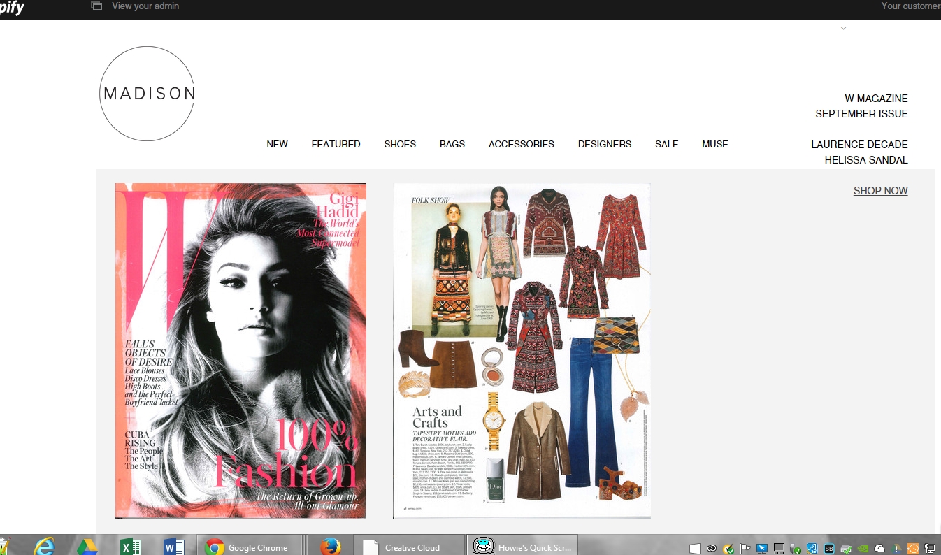
<div class="desktop-third tablet-half mobile-full testimage "><img src="//cdn.shopify.com/s/files/1/0928/3584/files/September._2015_W_Magazine_large.jpg?18385267466936673850"></div>
<div class="desktop-third tablet-half mobile-full testimage"><img src="//cdn.shopify.com/s/files/1/0928/3584/files/September._2015_W_Magazine_page1_large.jpg?18385267466936673850"></div>
<div class="desktop-third tablet-full mobile-full testimage_text" style="
vertical-align: text-bottom;
"><span>text</span></div>
</div>
</body>
</html>
One thing you will notice is the text is at the bottom for mobile. Probably best to just remove the height below a certain threshold.
ASKER
. If there is a larger image and not the same ratio, would you make how would you want to handle the width?First I would tell them never to make an image taller than the current test image.
I could also tell them that the widths of the image must be the exact same as the test -- and to add to the image if necessary to keep the width the same.
I think I should just tell them that. Otherwise theses "page" could end up being a mess.
The images they have sent me in general have all the approximate same dimensions including aspect ratio.
UPDATE I have just sent them an email that all images must be the same height and width (and of course the same aspect ratio.)
Rowby
ASKER
One thing I am trying to do is float the text to the right.
I've tried text align right, and float right, but that doesn't seem to affect anything.
And yes, on cell I guess I'm thinking I would use media query to eliminate the height for the text. Maybe give it a little top padding so it's not bumping its head on the bottom of the image....
Rowby
I've tried text align right, and float right, but that doesn't seem to affect anything.
And yes, on cell I guess I'm thinking I would use media query to eliminate the height for the text. Maybe give it a little top padding so it's not bumping its head on the bottom of the image....
Rowby
ASKER CERTIFIED SOLUTION
membership
This solution is only available to members.
To access this solution, you must be a member of Experts Exchange.
I got the 980 from the style sheet
@media screen and (min-width: 980px) {
  .gridlock .row .desktop-1 {
    width: 6.25%;
  }
.gridlock .row .desktop-2 {ASKER
Hee hee
I put it in, but now the right alight is "off to the right" too far.
I tried putting in padding or margin. Won't nudge.... :)
Text align too far right....
I put it in, but now the right alight is "off to the right" too far.
I tried putting in padding or margin. Won't nudge.... :)
Text align too far right....
try playing with padding right
.testimage_text {
    position: relative;
    text-align: right;
    padding-right: 30px;
}ASKER
Interestingly if I just have the one word "text" the right padding is honored.
But as soon as I add more words to the text, it pushes back to the right (losing the padding). Also the three little words wrap. I guess I need to add some with to the text area???
http://madisonstyle.myshopify.com/pages/press-test
Rowby
But as soon as I add more words to the text, it pushes back to the right (losing the padding). Also the three little words wrap. I guess I need to add some with to the text area???
http://madisonstyle.myshopify.com/pages/press-test
Rowby
SOLUTION
membership
This solution is only available to members.
To access this solution, you must be a member of Experts Exchange.
ASKER
Looking good, Scott. Latest version
What's the best way to handle multi line text within the span
Or should all the <br/>'s and <p>'s be within one overall span?
(or am I totally wrong)
Rowby
What's the best way to handle multi line text within the span
<div class="desktop-third tablet-full mobile-full testimage_text" style="vertical-align: text-bottom;"><span>W MAGAZINE<br/></span><span>Second Line</span><span><p>THIRD LINE WITH Paragraph</p></span></div>Or should all the <br/>'s and <p>'s be within one overall span?
<div class="desktop-third tablet-full mobile-full testimage_text" style="vertical-align: text-bottom;"><span>W MAGAZINE<br/>Second Line<p>THIRD LINE WITH Paragraph</span></div>(or am I totally wrong)
Rowby
If you want to force multiple lines with a span tag, then you have to use br's and not p's or div's. See Contexts in which this element can be used: https://html.spec.whatwg.org/multipage/semantics.html#the-span-element which links to https://html.spec.whatwg.org/multipage/dom.html#phrasing-content-2
Otherwise, you just need to change the span tag to a div, give it a class and target the div.class in the css above instead of the span.
Otherwise, you just need to change the span tag to a div, give it a class and target the div.class in the css above instead of the span.
ASKER
Hi Going with the span tag with brs.
I'm noticing, including this morning that the text doesn't always go to the "bottom". It is doing this sometimes.
Perhaps the javascript needs to be before the body tag?
Or maybe we need to incorporate mimcc's vertical align solution near the beginning of this thread?
Rowby
I'm noticing, including this morning that the text doesn't always go to the "bottom". It is doing this sometimes.
Perhaps the javascript needs to be before the body tag?
Or maybe we need to incorporate mimcc's vertical align solution near the beginning of this thread?
Rowby
ASKER
Hi everyone
Hold off for now on more comments. Client is now considering doing each "item" as a big jpg including embedding the text in the image.
:)
Rowby
Hold off for now on more comments. Client is now considering doing each "item" as a big jpg including embedding the text in the image.
:)
Rowby
Look at your browser console and see what is going on. As far as js in the head or below the body, as long as everything is in the head or everything is above the body tag and not mixed up you probably will not see much of a difference.
Give the other solution a try. But testing it out without all of your other code first http://jsbin.com/fuwosinowo/edit?html,output
Give the other solution a try. But testing it out without all of your other code first http://jsbin.com/fuwosinowo/edit?html,output
ASKER
Hi Scott,
I'll keep your solution and mlmcc's solution on hold for now. You may have missed my earlier comment where the client is going for a png with embedded text for now.
:)
Here it is -- new page;;;; Link to "jpg" version
I'll be awarding the points in a few days -- in case the client decides to go back to the html/javascript version. :)
Rowby
ASKER
Hi Scott and mlmcc
For now the client is using images to do this. But the solutions are sound and at some point they may switch to text and images.
Thanks for your patience and expert help!
Rowby
For now the client is using images to do this. But the solutions are sound and at some point they may switch to text and images.
Thanks for your patience and expert help!
Rowby
ASKER
Vertical align (especially in your first example link) seems like a good solution....
And I think it would look good on a cell too, based on me narrowing the browser on that first example....
I am also thinking that the two images which are currently 'merged together", should be separated so that the page will resize more gracefully as it approaches cell phone width
I.E.
Mag cover image on top
Interior page image below that
Clickable Text below that.
This should not affect your vertical align solution. But thought you should know my updated thoughts on splitting the one combo image into two images with text on the bottom for cell resolution.
Just some thought as I think through the overall responsive issue.
And your "vertical align" seems like a promising start.
I'll work on this tomorrow.
Thanks!
Rowby