Bootstrap
I am just learning Bootstrap.
Please look at http://rkassoc.org/Lakos_config/index.htm
At wide screen widths, this is perfect. However, as I narrow the width, there are 3 issues:
(1) The "xs" classes kick in at much greater than 768.
(2) The menu items (top right), scrunch up to & overlay the logo image; I would rather they slip underneath the logo. I had that working once, but I lost it.
(3) As the window becomes narrower, the item "register" starts to disappear.
Source attached.
How can I fix these things? Is there a way to use a smaller version of the logo if the width is less than xxx?
Thanks
index.htm
(1) the xs class kicks in by default. "mobile first" means that xs will show if nothing else is specified. It kicks in, in your case, because you've only specified "md", which kicks in at 992px. Anything less than that will be treated as "xs". Change "md" to "sm" and that will solve your issue
(3) Remove the padding-left. It is pushing it outside the scope of the box.
<span style="padding-left:120px;
To get it laid out the way you want, use the "row" and "col-" classes and div tags
<span style="padding-left:120px;
To get it laid out the way you want, use the "row" and "col-" classes and div tags
ASKER
Rob,
(1) & (2) fixed; perfect.
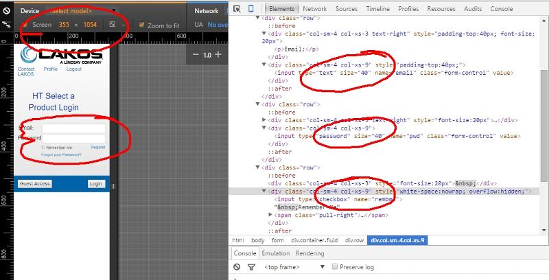
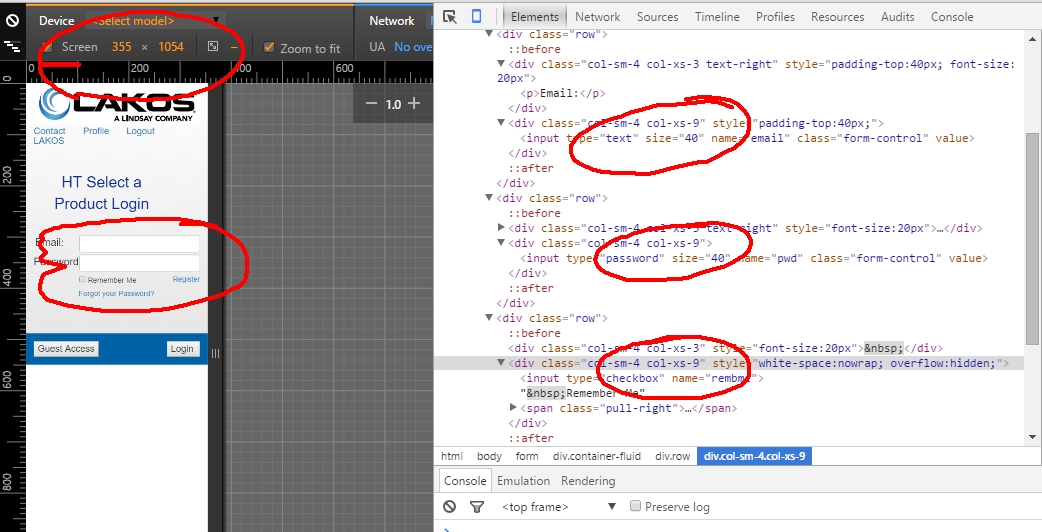
I cannot get (3) to work correctly. I am trying to get the word "register" to right align (just like "Forgot your password" does beneath it) with the right end of the input box for password. When I used the left padding, it worked fine until it got too narrow.
I can't see how to make it work. I though text-right would do it but I'm thinking the size of the input boxes is messing it up. Can I make the input boxes auto fill the column without adding space between the captions? The size 40 is arbitrary.
(1) & (2) fixed; perfect.
I cannot get (3) to work correctly. I am trying to get the word "register" to right align (just like "Forgot your password" does beneath it) with the right end of the input box for password. When I used the left padding, it worked fine until it got too narrow.
I can't see how to make it work. I though text-right would do it but I'm thinking the size of the input boxes is messing it up. Can I make the input boxes auto fill the column without adding space between the captions? The size 40 is arbitrary.
ok for (3):
change that row to this:
change that row to this:
<div class="row">
<div class="col-xs-3" style="font-size:20px"> </div>
<div class="col-xs-6" style="white-space:nowrap; overflow:hidden;"><input type="checkbox" name="rembme"> Remember Me<span class="pull-right"><a href="register.php">Register</a></span></div>
</div>ASKER CERTIFIED SOLUTION
membership
This solution is only available to members.
To access this solution, you must be a member of Experts Exchange.
ASKER
Rob:
It sort of works (I didn't change Forget Your Password yet), but register is on the line BELOW "Remember me".
rkassoc.org/Lakos_config
I decided to move the "Remember Me" to a prior column (because nothing else was working), I got this, rkassoc.org/Lakos_config/i
Thanks
It sort of works (I didn't change Forget Your Password yet), but register is on the line BELOW "Remember me".
rkassoc.org/Lakos_config
I decided to move the "Remember Me" to a prior column (because nothing else was working), I got this, rkassoc.org/Lakos_config/i
Thanks
It sort of works (I didn't change Forget Your Password yet), but register is on the line BELOW "Remember me".Looks fine to me (and on the same line). what browser and what screen width are you viewing it at?
rkassoc.org/Lakos_config
ASKER
Rob,
First, thanks so much for all your effort on this. It's close (probably OK as is).
The only issue I see now is the fact that it creates a new line (like it's a new row) for the register link. I guess it has to do with the Remember Me because it doesn't do that with the "Forgot Password" row.
See attached, one at a "wide" screen rendition & one at a "narrow" one.
Any thoughts?
logon_narrower.jpg
logon_wider.jpg
Check the padding and margin on the "remember me". They should be zero. Same goes for the "register" link.
Add the class "pull-right" to the register span element.
Add the class "pull-right" to the register span element.
ASKER
OK, checked those. All OK.
Still blank line.
rkassoc.org/Lakos_config
Thanks
Still blank line.
rkassoc.org/Lakos_config
Thanks
yep. change your col-xs-6 classes (two input elements and remember me/register) to col-xs-9
ASKER
I did that, it's still the same.
Let's just accept it, if the client has issues, I will revisit with another question.
Thanks
Let's just accept it, if the client has issues, I will revisit with another question.
Thanks
It still looks like you've got it at col-xs-6? When I change it to col-xs-9 it looks good! :)
Thanks for the points too :)
Thanks for the points too :)
ASKER
Mine are both col-xs-9.
Are you using FireFox? I haven't looked in Chrome, etc.
Are you using FireFox? I haven't looked in Chrome, etc.
white-space: nowrap; that's your issue. Remove that :)
ASKER
Rob,
Yes, removing white-space: nowrap; does it
FYI, it's all somewhat confusing because of the nomenclature.
My gut feel is that white-space: nowrap; implies NOT line wrapping, looks like just the opposite.
I knew Bootstrap was NOT going to be easy to learn, but I admit, it's VERY powerfull, with all the classes.
Bootstrap is great until you start adding your own css. It's designed for you to just use its classes, especially for layout.
Remember that bootstrap is for mobile first so that means that firstly, every column (<div>) in a row will automatically be col-xs-12 without you having to add the class. In your case you wanted a label and then an input box on the same row. So you specify col-xs-3 and col-xs-9. This is automatically applies that width to col-sm, col-md, col-lg etc without you having to specify. If you find that at a larger resolution you do not need that larger width, then you change it, e.g. col-md-5
Remember that bootstrap is for mobile first so that means that firstly, every column (<div>) in a row will automatically be col-xs-12 without you having to add the class. In your case you wanted a label and then an input box on the same row. So you specify col-xs-3 and col-xs-9. This is automatically applies that width to col-sm, col-md, col-lg etc without you having to specify. If you find that at a larger resolution you do not need that larger width, then you change it, e.g. col-md-5
If you want the menu to wrap to another line, remove the xs spec from the class:
<div class="col-md-6"><img src="images/logo.jpg" class="img-responsive"></d