CSS Layout 3 x 33% boxes with margin HELP!
I am trying to create this:
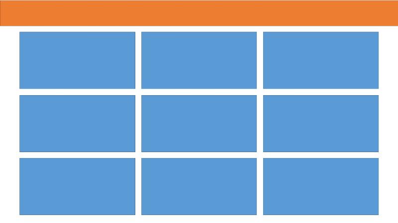
It needs to be responsive so I thought i could use width and height 33% but im not sure the best way to do it.
My css skills are very trial an error...
Any anyone help.
Thanks
Steve
It needs to be responsive so I thought i could use width and height 33% but im not sure the best way to do it.
My css skills are very trial an error...
#boxes {
	height: 100%;
}

#boxes .answers {
	display: inline-flex;
	width: 33%;
	height: 33vh;
	font-size:26px;
	color:#FFFFFF;
	border: 1px solid red;
    background: blue;
}Any anyone help.
Thanks
Steve
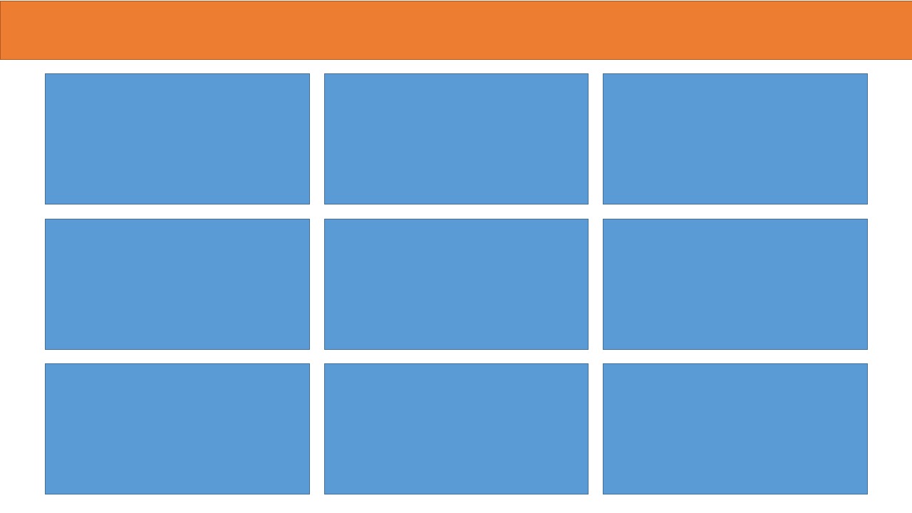
SOLUTION
membership
This solution is only available to members.
To access this solution, you must be a member of Experts Exchange.
Marco Gasi
Oops, I forgot to say: at the top I used the standard Bootstrap navbar. Obviously you can use another element: it was just to show you your layout :)
ASKER CERTIFIED SOLUTION
membership
This solution is only available to members.
To access this solution, you must be a member of Experts Exchange.
ASKER
This is great! Thankyou!
There are many, many , many CSS tutorial web sites that you can go through and learn about using CSS, here are three you might look at -
http://www.w3schools.com/css/
https://developer.mozilla.org/en-US/docs/Web/CSS/Tutorials
http://www.tutorialspoint.com/css/
http://www.w3schools.com/css/
https://developer.mozilla.org/en-US/docs/Web/CSS/Tutorials
http://www.tutorialspoint.com/css/