Jack
asked on
Problems converting pure CSS responsive menu for mobile
I have existing pure CSS menu for the desktop which expands from left to right when hover.
HTML:
CSS:
I tried to change it so that the left-to-right menu will become Accordion menu going down in mobile mode.
I used this as a base but was not able to make it work properly.
My attempt is shown in this fiddle. To see the mobile version, resize the window. The issue is:
I have tried many ways but can't seems to get it to work properly. Any help or suggestion is much appreciated.
HTML:
<nav id="nav">
  <a href="#nav" title="Show navigation"></a>
  <a href="#" title="Hide navigation"></a>
  <ul class="dropdown dropdown-vertical">
    <span class="clearfix">
        <li class="dir">ITEM 1
            <ul>
                <li class="dir">SUB ITEM 1
                    <ul>
                        <li><a href="">SUB MENU 1</a></li>
                        <li><a href="">SUB MENU 2</a></li>
                    </ul>
                </li>
                <li class="dir">SUB ITEM 2
                    <ul>
                        <li><a href="">SUB MENU 1</a></li>
                        <li><a href="">SUB MENU 2</a></li>
                    </ul>
                </li>
            </ul>
        </li>
        <li class="dir"><a href="">ITEM 2</a>
            <ul>
                        <li><a href="">SUB MENU 1</a></li>
                        <li><a href="">SUB MENU 2</a></li>
            </ul>
        </li>
        <li class="dir"><a href="/dev/tradeshows.htm">ITEM 3</a>
            <ul>
                        <li><a href="">SUB MENU 1</a></li>
                        <li><a href="">SUB MENU 2</a></li>
            </ul>
        </li>
        <li class="dir">ITEM 4
            <ul>
                        <li><a href="">SUB MENU 1</a></li>
                        <li><a href="">SUB MENU 2</a></li>
            </ul>
        </li>
        <li><a href="">ITEM 5</a></li>
        <li class="dir">ITEM 6
            <ul>
                        <li><a href="">SUB MENU 1</a></li>
                        <li><a href="">SUB MENU 2</a></li>
            </ul>
        </li>
        <li><a href="">ITEM 6</a></li>
        <li class="dir">ITEM 7
            <ul>
                        <li><a href="">SUB MENU 1</a></li>
                        <li><a href="">SUB MENU 2</a></li>
            </ul>
        </li>
        <li><a href="">ITEM 8</a></li>
            </span>
  </ul>
</nav>CSS:
@charset "UTF-8";
body {
  padding: 1.25em;
  /* 20 */
}

ul.dropdown,
ul.dropdown li,
ul.dropdown ul {
  list-style: none;
  margin: 0;
  padding: 0;
}

ul.dropdown {
  position: relative;
  z-index: 597;
  float: left;
}

ul.dropdown li {
  float: left;
  line-height: 1.3em;
  vertical-align: middle;
  zoom: 1;
}

ul.dropdown li.hover,
ul.dropdown li:hover {
  position: relative;
  z-index: 599;
  cursor: default;
}

ul.dropdown ul {
  visibility: hidden;
  position: absolute;
  top: 100%;
  left: 0;
  z-index: 598;
  width: 100%;
}

ul.dropdown ul li {
  float: none;
}

ul.dropdown ul ul {
  top: 0px;
  left: 99%;
}

ul.dropdown li:hover > ul {
  visibility: visible;
}

ul.dropdown-vertical {
  width: 110px;
}

ul.dropdown-vertical ul {
  top: 0px;
  left: 99%;
}

ul.dropdown-vertical li {
  float: none;
}

ul.dropdown {
  font-weight: normal;
  font-family: arial, verdana, sans-serif;
  font-size: 12px;
}

ul.dropdown li {
  padding: 4px 5px;
  border-style: solid;
  border-width: 0px 0px 1px 0;
  border-color: #fff #d9d9d9 #d9d9d9;
  background-color: #ffffff;
  color: #000;
}

ul.dropdown li.hover,
ul.dropdown li:hover {
  background-color: #eee;
  color: #000;
}

ul.dropdown a:link,
ul.dropdown a:visited {
  color: #000;
  text-decoration: none;
}

ul.dropdown a:hover {
  color: #000;
}

ul.dropdown a:active {
  color: #ffa500;
}


/* -- level mark -- */

ul.dropdown ul {
  width: 110px;
  margin-top: 0px;
}

ul.dropdown ul li {
  font-weight: normal;
}


/*-------------------------------------------------/
 * @section     Support Class `dir`
 * @level sep   ul, .class
 */

ul.dropdown *.dir {
  padding-right: 15px;
  background-image: url(https://www.thesnowpros.org/DesktopModules/CISS.SideMenu/styles/BrandonTab/css/dropdown/themes/default/images/nav-arrow-right.png);
  background-position: 100% 50%;
  background-repeat: no-repeat;
}


/* -- Components override -- */

ul.dropdown-horizontal ul *.dir {
  padding-right: 10px;
  background-image: url(https://www.thesnowpros.org/DesktopModules/CISS.SideMenu/styles/BrandonTab/css/dropdown/themes/default/images/nav-arrow-right.png);
  background-position: 100% 50%;
  background-repeat: no-repeat;
}

.clearfix:after {
  visibility: hidden;
  display: block;
  font-size: 0;
  content: " ";
  clear: both;
  height: 0;
}I tried to change it so that the left-to-right menu will become Accordion menu going down in mobile mode.
/* for mobile devices */

@media only screen and ( max-width: 40em)
/* 640 */

{
  html {
    font-size: 75%;
    /* 12 */
  }
  #nav > a {
    display: none;
    }
  #nav {
    position: relative;
    top: auto;
    left: auto;
  }
  #nav > a {
    width: 3.125em;
    /* 50 */
    height: 3.125em;
    /* 50 */
    text-align: left;
    text-indent: -9999px;
    background-color: #000;
    position: relative;
  }
  #nav > a:before,
  #nav > a:after {
    position: absolute;
    border: 2px solid #fff;
    top: 35%;
    left: 25%;
    right: 25%;
    content: '';
  }
  #nav > a:after {
    top: 60%;
  }
  #nav:not(:target) > a:first-of-type,
  #nav:target > a:last-of-type {
    display: block;
  }
  /* first level */
  #nav > ul {
    height: auto;
    display: none;
    position: absolute;
    left: 0;
    right: 0;
  }
  #nav:target > ul {
    display: block;
  }
  #nav > ul > li {
    width: 100%;
    float: none;
  }
  #nav > ul > li > a {
    height: auto;
    text-align: left;
    padding: 0 0.833em;
    /* 20 (24) */
  }
  #nav > ul > li:not(:last-child) > a {
    border-right: none;
    border-bottom: 1px solid #cc470d;
  }
  /* second level */
  #nav li ul {
    position: static;
    padding: 1.25em;
    /* 20 */
    padding-top: 0;
  }
}I used this as a base but was not able to make it work properly.
My attempt is shown in this fiddle. To see the mobile version, resize the window. The issue is:
- all the menu and sub-menus expanded when click on the icon instead of showing when selected
I have tried many ways but can't seems to get it to work properly. Any help or suggestion is much appreciated.
ASKER
Hi Kim, that only made the menu the same as the desktop version. I need to make the menu becoming Accordion in mobile mode.
If I understand correctly what accordion is, it will be difficult to do in pure css. Accordion menus rely on click events to expand. The only way I know to do that would be to hide a checkbox in each menu item and then use the :clicked pseudo selector in CSS the way CSS sprites are used to customize checkboxes or you could make each menu subcategory a link and use the :target pseudo selector the way the show menu icon is. Either way, this is going to require a rework of your HTML.
ASKER
Hi Kim, did you get a chance to look at http://codepen.io/massiebn
It is done without javascript.
It is done without javascript.
Have you tried that codepen page on a mobile device? I tried it on my android phone and it would never expand the sub-submenus except for a split second as it was navigating to the link in the submenu.
It relies on the hover state which doesn't exist in the touchscreen realm. However, a tap triggers the hover state on a touchscreen device. The problem is that same tap triggers the click event which in this case activates the link. If the submenu categories do not have links as your sample does not, we may be able to overcome that.
What troubles me is that, at least in my experience, triggering the hover state with a touchscreen tap is not always reliable.
Give me a little while to ponder this. In the meantime, there may be other experts who have more experience with this who will offer advice.
I was wrong. It appears that some of your submenu categories are links and some are not. This is good because you can see how it works in some places and doesn't in others. The fix is quite simple. Add the property display: none; to your #nav li ul rule in the section you've labeled second level and add one new property for the hover state.
	/* second level */
	#nav li ul {
		position: static;
		padding: 1.25em;
		/* 20 */
		padding-top: 0;
		display: none;	/* new property here */
	}
	/* NEW RULE HERE */
	#nav ul.dropdown li:hover > ul {
		display: block;
	}
It appears that it does work on the linked subcategory items if you click to the right of the words in the clear space. Just not if you click on the menu item words themselves. It might be worthwhile to include an arrow to tap on to expand the menu in the clear space to the right of the menu text instead of using the entire <li> element.
By the way, if you view your fiddle on a touchscreen device with a screen wider than 640 pixels, you will see that even your desktop version of the menu has these problems on touchscreen devices.
I'd also like to point out that the span element with the class clearfix in your fiddle is improper. The only element that can be a direct descendant of the <ul> element is an <li> element.
ASKER
Thanks Kim. The site where I got the arrow was offline. I have added the arrow from another site so now it's showing.
I have updated the fiddle https://jsfiddle.net/u2k50
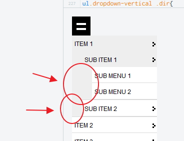
When selected ITEM 1 -
I am not clear about the clearfix. If I remove it, it will display an underline on the menu. Not sure how to fix it but it doesn't seems to cause any problem.
I have updated the fiddle https://jsfiddle.net/u2k50
When selected ITEM 1 -
- the right arrow for Item 1 is off to the center, instead of remaining on right of ITEM 1
- there is a line display after expanding ITEM 1 right below SUB ITEM 2
- the arrow for SUB ITEM 1 disappeared when I select it
- SUB ITEM 1 and SUB ITEM 2 background should be all white and their arrow should be all the way to the right showing that there is another level, but it seems that there is a "border"
- similarly if I extend SUB ITEM 1, the SUB MENU 1 and SUB MENU 2 background is showing half grey half white rather than all white
- if I select SUB ITEM 2 there are now 2 line spaces showing below SUB MENU 2
I am not clear about the clearfix. If I remove it, it will display an underline on the menu. Not sure how to fix it but it doesn't seems to cause any problem.
the right arrow for Item 1 is off to the center, instead of remaining on right of ITEM 1This is because of the 50% vertical positioning of the arrow. When the submenu becomes visible, the <li> element expands vertically, causing 50% vertical position to move downward. You will have to change the vertical position to about 10px (line 136).
background-position: 100% 10px;there is a line display after expanding ITEM 1 right below SUB ITEM 2Are you referring to the line at the bottom of the white space around SUB ITEM 2 or are you referring to the extra space between that line and the line above ITEM 2? That space is being generated by the 1.25em padding at the bottom of rule #nav ul li (line 224) and the 4px padding at the bottom of rule ul.dropdown li from the desktop style properties (padding-bottom: 0; will need to be added to the mobile media query rule on line 235)
  #nav li ul {
    position: static;
    padding: 0 1.25em;            /* line 224 */
    /* 20 */
    display: none;
  }
...
ul.dropdown li{                   /* line 235 */
line-height: 2.3em;
padding-bottom: 0;
}the arrow for SUB ITEM 1 disappeared when I select itIt actually moved down behind the sub menu items. Changing the vertical positioning of the arrow in the first point above will fix this too.
SUB ITEM 1 and SUB ITEM 2 background should be all white and their arrow should be all the way to the right showing that there is another level, but it seems that there is a "border"This is caused by the 1.25em right padding of the rule #nav li ul (line 224 again) and the width of 110px in rule ul.dropdown ul from the desktop style rules (a new rule will need to be added to the mobile media query to override this width to 100%)
  #nav li ul {
    position: static;
    padding: 0 0 0 1.25em;                  /* line 224 */
    /* 20 */
    display: none;
  }
...
ul.dropdown ul{                             /* new rule, line 238 */
  width: 100%;
}similarly if I extend SUB ITEM 1, the SUB MENU 1 and SUB MENU 2 background is showing half grey half white rather than all whiteI'm not seeing this. Can you post a screen capture?
if I select SUB ITEM 2 there are now 2 line spaces showing below SUB MENU 2This is all that extra padding from the second item above. When those are eliminated, this will be eliminated too.
I am not clear about the clearfix. If I remove it, it will display an underline on the menu. Not sure how to fix it but it doesn't seems to cause any problem.True it doesn't cause any problems today because the browser forgives the infraction...today. But at some point in the future, probably not soon, that forgiveness could be exhausted.
What's causing this, though, are a couple of obscure rules in your CSS that don't appear to apply to your code. These rules are on lines 211 and 217. Removing these rules will eliminate the extra space on the left and the red underline below the links.
  #nav > ul > li > a {                         /* line 211 */
    height: auto;
    text-align: left;
    padding: 0 0.833em;
    /* 20 (24) */
  }
  #nav > ul > li:not(:last-child) > a {        /* line 217 */
    border-right: none;
    border-bottom: 1px solid #cc470d;
}ASKER
Thanks Kim! It works good. This is the updated fiddle https://jsfiddle.net/u2k50
I noticed ITEM 5, 7 and 9 are shorter.
I am attaching the screen shot what I mean. When the SUB ITEM 1 or SUB MENU are not selected, they shall all have white background all the way, but it is showing leading grey color spaces.
One other dumb question. How do I make the "hamburger menu" icon into 3 bars instead of the current 2?
I see what you mean now. These are the padding properties of the parent affecting the position of the child. The <ul> tags are aligned with the text above it and have padding properties of their own that generate the indents. It may be necessary to remove the padding from the <li> elements and use text-indent to offset the words from the left margin. This will take some more deep thought. I'll be back this evening with a suggestion.
ASKER CERTIFIED SOLUTION
membership
This solution is only available to members.
To access this solution, you must be a member of Experts Exchange.
Re: adding a third patty to the hamburger icon. I believe the triple-hamburger icon is represented with an image. The double-hamburger icon you have in your code is pure CSS. One patty is generated with a ::before content insertion selector and the other is generated with an ::after content insertion selector. It might be difficult to add a third.
To add a third line to the icon, add a <span> to the links (and adjust the styles as needed). Also it's best to use more than the title attribute to provide text for an element. When you don't want to have text inside the element, use the "aria-label" attribute.
This looks like a good menu system: http://www.smartmenus.org/
I'm glad to see Kim pointed out that ":hover" is not well-suited for use on mobile devices.
	<a href="#nav" title="Show navigation" aria-label="Show navigation"><span></span></a>
<a href="#" title="Hide navigation" aria-label="Hide navigation"><span></span></a>This looks like a good menu system: http://www.smartmenus.org/
I'm glad to see Kim pointed out that ":hover" is not well-suited for use on mobile devices.
ASKER
Hi Kim,
I think you are right about the grey indent. It's more obvious the way it was. In addition, this new way of indentation does not work on the browser that came with my Note 2. All the sub items and sub menu are not indented.
If we revert back to the original way at least it will also work on my mobile browser, how do we make ITEM 5, 7 and 9 the same length?
How to use an graphic instead of the css code for the hamburger icon or can it be simply created with other way using css?
ASKER
Hi David,
I am not sure how to get a third line by adding <span>? Is there way to disable hover on mobile? I would prefer user touch the whole menu to activate the item rather than the word.
I actually have two sets of the same menu on site. One is shown for desktop and one is for mobile. The reason is on mobile, I am hiding the left section where the menu is, thus the menu won't show. So I added the second set on the header for the mobile which will hide on desktop mode. I am not sure if there is a way to simply use one set of menu while they are in two different sections of the page.
how do we make ITEM 5, 7 and 9 the same length?The <li>s with the dir class are getting an extra 15px padding-right. Add that padding to all first generation <li>s in the mobile media query to get the others to the same width. You can add it to the rule on line 205 of your fiddle which only applies to the top-level menu items.
  #nav > ul > li {
    width: 100%;
    float: none;
    padding-right: 15px;
  }
This question seems to be branching off in multiple directions now. I recommend you create a new question about creating a non-image triple-hamburger icon. It will make it easier for someone searching for hamburger icon suggestions in the future.
ASKER
Thanks so much Kim. You have solved my immediate issue. The hamburger icon is indeed a different issue.
One related issue I have discovered as you have pointed out, is that one have to touch the "word" on the menu item to activate the menu. Is there way to fix it so that it activates when they touch the menu bar?
Another small issue is the 1px border bottom of li. It separates the menu items from one another. However if you get to SUB MENU 2 level, one can see that there is a 1px border line for the SUB MENU 2, 1px for the for SUB ITEM 2 and 1px for ITEM 1, all 3 px are below SUB MENU 2. Is there way to get rid of 2 of the border lines? I have changed the color of the menu on the fiddle https://jsfiddle.net/u2k50
Is there way to fix it so that it activates when they touch the menu bar?This is the whole issue with the pure CSS menu and touchscreen devices. If you make it so that it activates when you touch the menu bar, you won't be able to expand the menu. You may be able to extend the menu item selection area by adding a display: block; property to the <a> tag or giving it a fixed width. But this reduces the area they can touch to expand the menu. (See line 237 in your fiddle)
ul.dropdown-vertical a:link,
ul.dropdown-vertical a:visited,
ul.dropdown-vertical a:hover{
  color: #fff;
  display: block;
}Another small issue is the 1px border bottom of li.This can be eliminated by removing the border-bottom on the last <li> of the group. (Add new rule to your mobile media query section)
ul.dropdown li:last-of-type {
  border-bottom: none 0 transparent;
}ASKER
Other comments from Kim solved the issues related to the post. Thanks Kim.
You're welcome.
Open in new window