Mike Moore
asked on
URGENT HELP WITH CSS WHITESPACE
Hi all,
Anyone know why my website doesn't fit my screen?? it has this white space going down the right side and I can't work out how to get rid of it so my website is full width.
Any help would be appreciated thanks, here is an example of what it looks like.


Here is my Code
HTML
CSS
Thanks
Anyone know why my website doesn't fit my screen?? it has this white space going down the right side and I can't work out how to get rid of it so my website is full width.
Any help would be appreciated thanks, here is an example of what it looks like.
Here is my Code
HTML
<!DOCTYPE html>
<html>
<head>
<link rel="stylesheet" type="text/css" href="style.css">
<link href="https://fonts.googleapis.com/css?family=Ek+Mukta" rel="stylesheet">
<link href="https://fonts.googleapis.com/css?family=Muli" rel="stylesheet">
<meta charset="utf-8">
</head>
<!-- START CONTAINER -->
<body>
<div id="container">
<!-- START HEADER SECTION -->
<div id="header">
<!-- Logo -->
<div id="topsection">
<div id="logo">
<a href="index.html"><img src="Assets/logo.png"></a>
</div>
<!-- Main Nav Bar -->
<div id="mainnav">
<ul>
<li><a href="index.html" accesskey="1">Home</a></li>
<li><a href="about.html" accesskey="2">About</a></li>
<li><a href="features.html" accesskey="3">Features</a></li>
<li><a href="reviews.html" accesskey="4">Reviews</a></li>
<li><a href="pricing.html" accesskey="5">Pricing</a></li>
<li class="download"><a href="#" accesskey="6">Download</a></li>
</ul>
</div>
</div>
<!-- Header text -->
<div id="headtext">
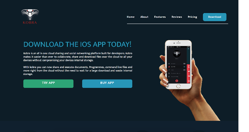
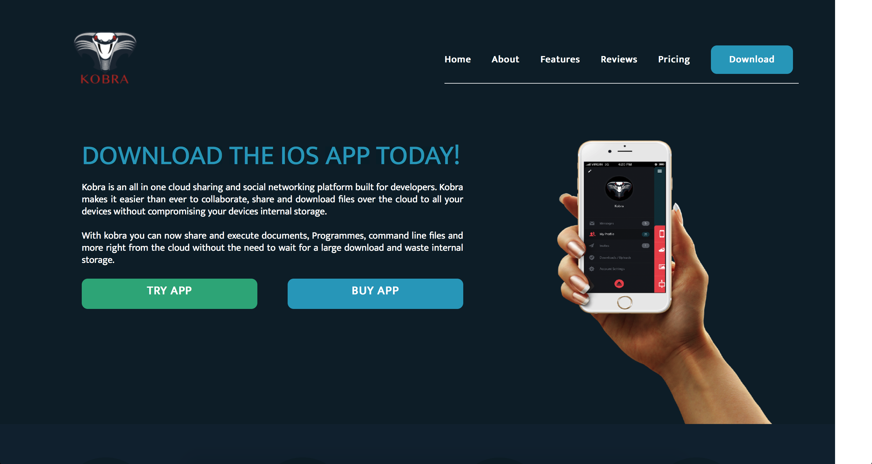
<h1>Download The IOS App Today!</h1>
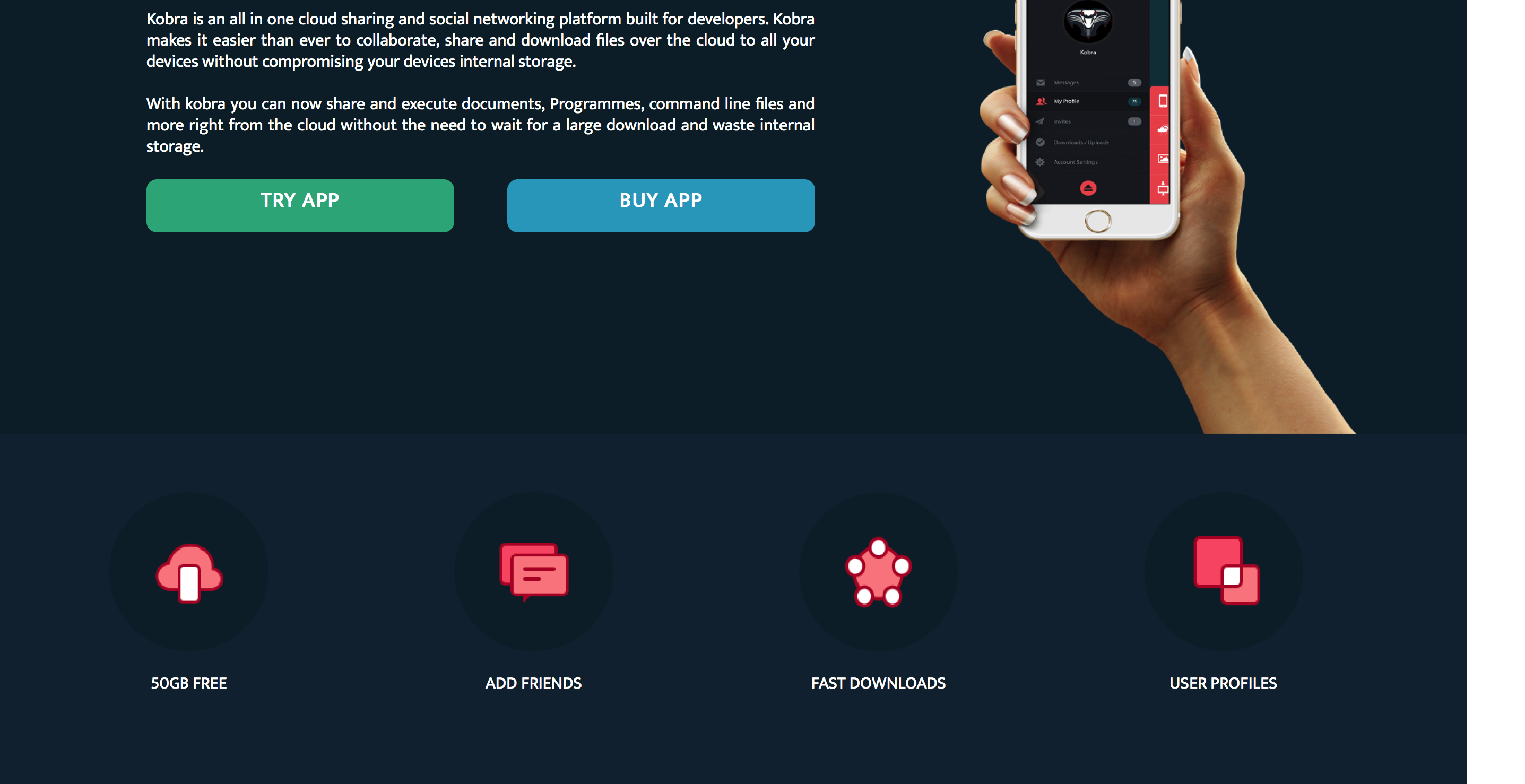
<p>Kobra is an all in one cloud sharing and social networking platform built for developers. Kobra makes it easier than ever to collaborate, share and download files over the cloud to all your devices without compromising your devices internal storage.
</p>
<p>With kobra you can now share and execute documents, Programmes, command line files and more right from the cloud without the need to wait for a large download and waste internal storage. </p>
<!-- Header Buttons -->
<div class="button1">TRY APP</div>
<div class="button2">BUY APP</div>
</div>
<!-- Header Image -->
<div id="head"><img src="Assets/iphone-hand.png" alt="Kobra Iphone APP Demonstration"></div>
<!-- END HEADER SECTION -->
<div id="clear"></div>
<!-- START FEATURES SECTION -->
<div id="features">
<div class="feature"><img src="Assets/f1.png" onmouseover="this.src='assets/asset7.png'" onmouseout="this.src='assets/f1.png'" />
<div class="featuretitle">50GB FREE</div>
</div>
<div class="feature"><img src="Assets/f2.png" onmouseover="this.src='assets/asset8.png'" onmouseout="this.src='assets/f2.png'" />
<div class="featuretitle">ADD FRIENDS</div>
</div>
<div class="feature"><img src="Assets/f3.png" onmouseover="this.src='assets/asset9.png'" onmouseout="this.src='assets/f3.png'" />
<div class="featuretitle">FAST DOWNLOADS</div>
</div>
<div class="feature"><img src="Assets/f4.png" onmouseover="this.src='assets/asset10.png'" onmouseout="this.src='assets/f4.png'" />
<div class="featuretitle">USER PROFILES</div>
</div>
</div>
<!-- iphone infographic -->
<div id="iphoneinfo"><img src="assets/iphoneinfo.png" </div>
<!-- END FEATURES SECTION -->
<div id="clear"></div>
<!-- START DOWNLOAD SECTION -->
<div id="downloadsection">
<div id="downloadtext">
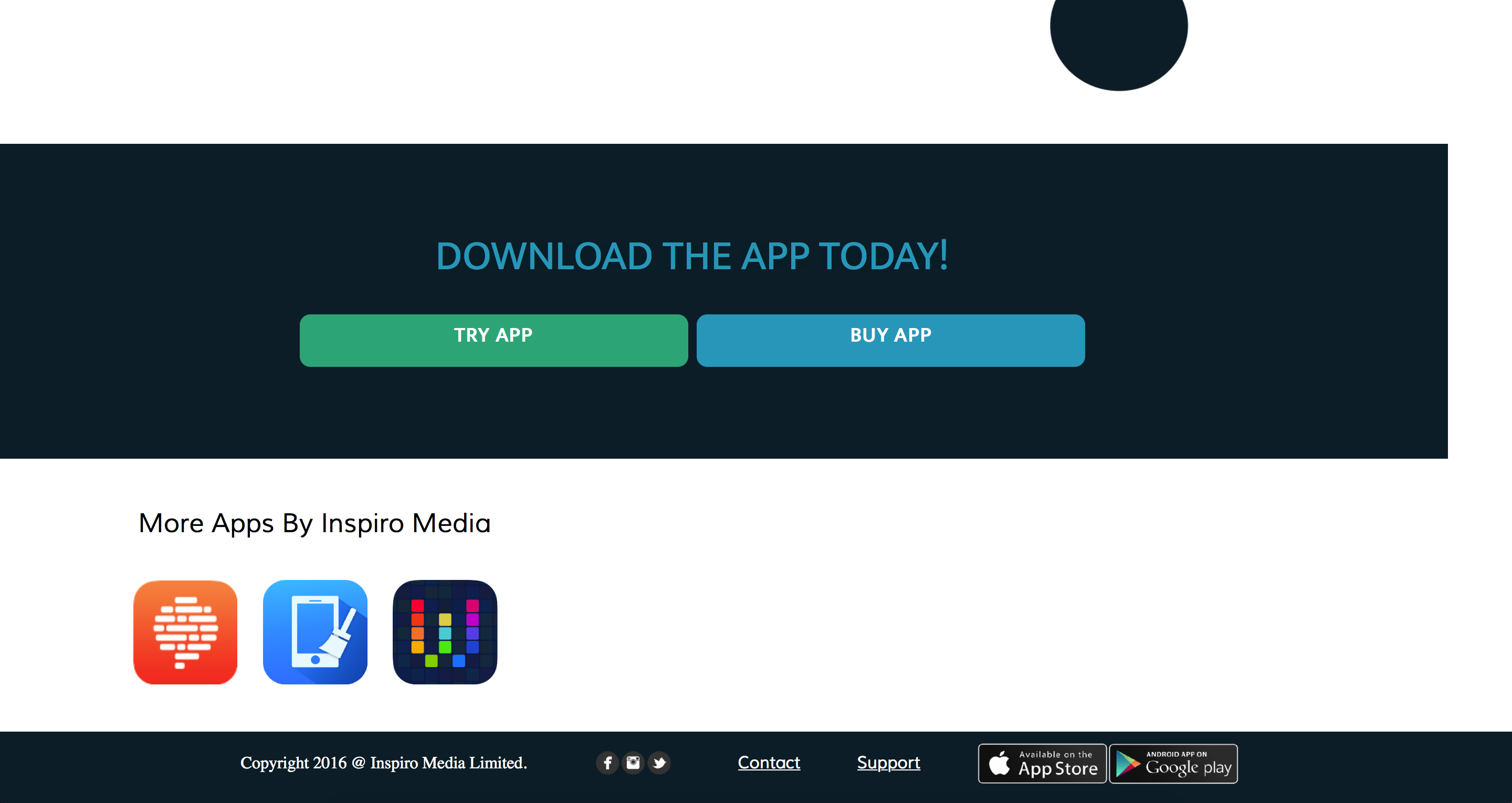
<h1>Download the app Today!</h1>
<div class="button3">TRY APP</div>
<div class="button4">BUY APP</div>
</div>
</div>
<!-- END DOWNLOAD SECTION -->
<!-- START FOOTER SECTION -->
<div id="footer">
<div id="appsection">
<h1>More Apps By Inspiro Media</h1>
<div class="iapp"><img src="Assets/Asset13.png"></div>
<div class="iapp"><img src="Assets/Asset14.png"></div>
<div class="iapp"><img src="Assets/Asset15.png"></div>
</div>
<div id="copyright">
<ul>
<li>Copyright 2016 @ Inspiro Media Limited.</li>
<li>
<a href="http://facebook.com">
<div class="bottomimg"><img src="Assets/Asset17.png"></div>
</a>
</li>
<li><a href="contact.html" accesskey="6">Contact</a></li>
<li><a href="support.html" accesskey="7">Support</a></li>
<li>
<a href="download.html">
<div class="bottomimg"><img src="Assets/Asset16.png"></div>
</a>
</li>
</ul>
</div>
</div>
</div>
<!-- END FOOTER SECTION -->
<!-- End Container -->
</body>
</html>CSS
/* START CSS RESET */


/* http://meyerweb.com/eric/tools/css/reset/
   v2.0 | 20110126
   License: none (public domain)
*/

html,
body,
div,
span,
applet,
object,
iframe,
h1,
h2,
h3,
h4,
h5,
h6,
p,
blockquote,
pre,
a,
abbr,
acronym,
address,
big,
cite,
code,
del,
dfn,
em,
img,
ins,
kbd,
q,
s,
samp,
small,
strike,
strong,
sub,
sup,
tt,
var,
b,
u,
i,
center,
dl,
dt,
dd,
ol,
ul,
li,
fieldset,
form,
label,
legend,
table,
caption,
tbody,
tfoot,
thead,
tr,
th,
td,
article,
aside,
canvas,
details,
embed,
figure,
figcaption,
footer,
header,
hgroup,
menu,
nav,
output,
ruby,
section,
summary,
time,
mark,
audio,
video {
    margin: 0;
    padding: 0;
    border: 0;
    font-size: 100%;
    font: inherit;
    vertical-align: baseline;
}

/* HTML5 display-role reset for older browsers */

article,
aside,
details,
figcaption,
figure,
footer,
header,
hgroup,
menu,
nav,
section {
    display: block;
}
body {
    line-height: 1;
}
ol,
ul {
    list-style: none;
}
blockquote,
q {
    quotes: none;
}
blockquote:before,
blockquote:after,
q:before,
q:after {
    content: '';
    content: none;
}
table {
    border-collapse: collapse;
    border-spacing: 0;
}

/* END CSS RESET */


/* START CONTAINER  */

#container {
    width: 1439px;
}

/* END CONTAINER  */


/* START HEADER SECTION  */

#header {
    background-color: #0C2633;
    height: 700px;
    width: 100%;
}

/* END HEADER SECTION  */


/* START LOGO  */

#logo {
    float: left;
    Width: 200px;
    height: 200px;
    padding: 10px;
    margin: 5px;
    margin-left: 80px;
}

/* END LOGO  */


/* START MAIN NAV  */

#mainnav {
    margin-right: 10px;
}
#mainnav ul {
    float: right;
    margin-top: 90px;
    margin-right: 50px;
    padding-bottom: 30px;
    width: 585px;
    word-spacing: 30px;
    border-bottom: 1px solid white;
}
#mainnav ul li {
    display: inline;
    list-style-type: none;
    font-weight: bold;
    margin-left: 0px;
    margin-right: 0px;
    font-family: 'Ek Mukta', sans-serif;
}
#mainnav ul li a {
    color: white;
    text-decoration: none;
}
#mainnav ul li a:hover {
    color: #AF2621;
}

/* END MAIN NAV  */


/* START DOWNLOAD BUTTONS */

.download {
    padding: 10px 30px;
    border-radius: 10px;
    background-color: #1DA6C4;
    height: 70px;
    text-align: center;
    margin-left: 350px;
    margin-right: 80px;
}
.download:hover {
    padding: 10px 30px;
    border-radius: 10px;
    background-color: #c0392b;
    height: 70px;
    text-align: center;
    margin-left: 350px;
    margin-right: 80px;
}

/* END DOWNLOAD BUTTONS */


/* START HEADER */

#head img {
    float: left;
    width: 360px;
    height: 470px;
    padding: 0px;
}
#headtext {
    float: left;
    width: 630px;
    height;
    300px;
    padding: 5px;
    clear: both;
    margin-right: 150px;
    margin-left: 190px;
    text-align: justify;
    font-family: 'Ek Mukta', sans-serif;
}
#headtext p {
    color: white;
    margin-bottom: 20px;
    line-height: 20px;
}
#headtext h1 {
    margin-bottom: 20px;
    color: #1da6c4;
    font-size: 45px;
    text-transform: uppercase;
}
#clear {
    clear: both;
}
#header {
    width: 1439px;
}

/* Styling for header Buttons */

.button1 {
    width: 230px;
    float: left;
    padding: 10px 30px;
    border-radius: 10px;
    background-color: #1fb18a;
    height: 30px;
    text-align: center;
    color: white;
    font-weight: bold;
    font-size: 20px;
}
.button1:hover {
    width: 230px;
    float: left;
    padding: 10px 30px;
    border-radius: 10px;
    background-color: #c0392b;
    height: 30px;
    text-align: center;
    color: white;
    font-weight: bold;
    font-size: 20px;
}
.button2 {
    float: right;
    width: 230px;
    padding: 10px 30px;
    border-radius: 10px;
    background-color: #1DA6C4;
    height: 30px;
    text-align: center;
    color: white;
    font-weight: bold;
    font-size: 20px;
}
.button2:hover {
    float: right;
    width: 230px;
    padding: 10px 30px;
    border-radius: 10px;
    background-color: #c0392b;
    height: 30px;
    text-align: center;
    color: white;
    font-weight: bold;
    font-size: 20px;
}

/* END HEADER */


/* START FEATURES */

#features {
    height: 330px;
    width: 100%;
    background-color: #112a3c;
    margin-bottom: 50px;
}
.feature {
    float: left;
    padding: 15px;
    margin-left: 145px;
    margin-top: 40px;
    color: white;
}
.feature img {
    width: 150px;
    height: 150px;
    margin-bottom: 20px;
}

/* Feature Image Animation */

.feature img:hover {
    width: 150px;
    height: 150px;
    margin-bottom: 20px;
    -webkit-animation: spin 4s linear infinite;
    -moz-animation: spin 4s linear infinite;
    animation: spin 4s linear infinite;
}
@-moz-keyframes spin {
    100% {
        -moz-transform: rotate(360deg);
    }
}
@-webkit-keyframes spin {
    100% {
        -webkit-transform: rotate(360deg);
    }
}
@keyframes spin {
    100% {
        -webkit-transform: rotate(360deg);
        transform: rotate(360deg);
    }
}
.featuretitle {
    text-align: center;
    font-family: 'Ek Mukta', sans-serif;
}
#iphoneinfo img {
    width: 80%px;
    height: 800px;
    display: block;
    margin: 0 auto;
    margin-bottom: 50px;
}

/* END FEATURES */


/* START DOWNLOAD SECTION */

#downloadsection {
    background-color: #0C2633;
    height: 300px;
    width: 100%;
    display: flex;
    flex-direction: column;
    justify-content: center;
}

/* Download Section Title */

#downloadsection h1 {
    margin: top: 50px;
    text-align: center;
    margin-bottom: 35px;
    color: #1da6c4;
    font-size: 40px;
    text-transform: uppercase;
    font-family: 'Ek Mukta', sans-serif;
}

/* Download Section Text */

#downloadtext {
    width: 52%;
    display: block;
    margin: 0 auto;
    font-family: 'Ek Mukta', sans-serif;
}

/* Button Styling */

.button3 {
    width: 310px;
    float: left;
    padding: 10px 30px;
    border-radius: 10px;
    background-color: #1fb18a;
    height: 30px;
    text-align: center;
    color: white;
    font-weight: bold;
    font-size: 20px;
}

/* Button Hover Styling */

.button3:hover {
    width: 310px;
    float: left;
    padding: 10px 30px;
    border-radius: 10px;
    background-color: #c0392b;
    height: 30px;
    text-align: center;
    color: white;
    font-weight: bold;
    font-size: 20px;
}

/* Button Styling */

.button4 {
    float: right;
    width: 310px;
    padding: 10px 30px;
    border-radius: 10px;
    background-color: #1DA6C4;
    height: 30px;
    text-align: center;
    color: white;
    font-weight: bold;
    font-size: 20px;
}

/* Button Hover Styling */

.button4:hover {
    float: right;
    width: 310px;
    padding: 10px 30px;
    border-radius: 10px;
    background-color: #c0392b;
    height: 30px;
    text-align: center;
    color: white;
    font-weight: bold;
    font-size: 20px;
}

/* END DOWNLOAD SECTION */


/* START FOOTER SECTION */

#footer {
    height: 250px;
    width: 100%;
}

/* APP Images */

.iapp img {
    max-width: 100px;
    max-height: 100px;
}
.iapp {
    width: 100px;
    height: 100px;
    display: inline-block;
    margin: 0 auto;
    padding: 10px;
}
#appsection {
    width: 368px;
    height: 150px;
    margin: 0 auto;
}
#appsection h1 {
    text-align: center;
    font-size: 25px;
    margin-bottom: 30px;
    margin-top: 50px;
    font-family: 'Muli', sans-serif;
}
.iapp h1 {
    font-size: 30px;
    text-align: center:
}

/* footer Images */

.bottomimg img {
    max-width: 250px;
    max-height: 40px;
    display: inline;
}
#copyright {
    width: 1500px;
    height: 70px;
    margin-top: 60px;
    text-align: center;
    background: #0C2633;
}

/* Copyright Text */

#copyright ul li {
    display: inline-block;
    height: 15px;
    margin-left: 30px;
    padding: 10px;
    color: white;
    list-style-type: none;
}
#copyright ul li a {
    color: white;
    font-family: 'Muli', sans-serif;
}

/* END FOOTER SECTION */

/* START MEDIA QUERIES */

/* TABELTS 1024px */

@media screen and (max-width: 1024px){

    #header {width: 100%; margin: 0;  }
    #mainnav {width: 100%;}
    #head img {display: none;}
    #headtext {width: 70%;}
    #headtext h1 {font-size: 2.5em;}
    .button1 {width: 39%;}
    .button1:hover {width: 39%;}
    .button2 {width: 39%; margin-bottom: 50px;}
    .button2:hover {width: 39%;}
    #features {width: 100%}
    .feature {width: 30px; height: 30px;}
    .featuretitle {width: 120px; font-size: 0.8em; margin-left: 15px;}
    #iphoneinfo {width:100%;}
    #downloadsection {width: 100%;}
    #footer {width: 100%;}
    #copyright {width: 100%}
    #copyright ul li {margin-left: 10px;}
}Thanks
ASKER CERTIFIED SOLUTION
membership
This solution is only available to members.
To access this solution, you must be a member of Experts Exchange.
SOLUTION
membership
This solution is only available to members.
To access this solution, you must be a member of Experts Exchange.
SOLUTION
membership
This solution is only available to members.
To access this solution, you must be a member of Experts Exchange.
ASKER
Hi guys, I just figured it out, basically it was the ul in the footer that had a width of 1500px which was pushing out the white space so I changed that to width: 100% and it got rid of the white space thanks for all your help tho
ASKER
Thanks again guys I really appreciate your effort to help.