create excel pivot chart
Hi,
I need help creating project management timeline .
i have attached a file explaing what i need.
A1:G5 is the data table.
and
A12: i14 is what i need the pivot chart to look like.
for each project i need to have a graphical timeline showing the date process of the project for each type:requests,developement
Howto.xlsx
Hello,
What you describe can easily be done with a regular chart and Excel functions, no VBA required. Some preparation of the data and chart specific layout is all. Why do you use the term "pivot chart"? It does not look as if you are aggregating any data.
In your sample data, some of the time frames overlap, but your Gantt chart mockup does not reflect this. For example, Project1 development starts one month before the Project1 requests end. How would you like to show that overlap?
If you can explain that in more detail, I'd be happy to show you a few things about charts.
cheers, teylyn
ASKER
hi teylyn,
if you can any idea how to fix a problem of the time frames overlap ,i will be very glad .
If not, then assume that there is no time overlap, and that starting and ending for each section will be one after the other..
if you can any idea how to fix a problem of the time frames overlap ,i will be very glad .
If not, then assume that there is no time overlap, and that starting and ending for each section will be one after the other..
You need a few helper columns to calculate the duration of each phase and any gaps between the phases. Just subtract the end date of the phase from the start date. To calculate a gap between two phases I used =IF(E3>C3,E3-C3,0) for the gap after the request.
Then select the project name and start date columns, hold down Ctrl and select the gap and duration columns and insert a stacked horizontal bar chart. The screenshot shows the columns selected in gray. If you don't see the project names on the vertical axis of the chart, switch row and columns with the ribbon command in the chart ribbon. Then format the series for the start date and the gaps with no fill, which leaves the duration for each phase.
Format the X axis to start at a particular date, for example 1/1/2017, or its equivalent number 42736.
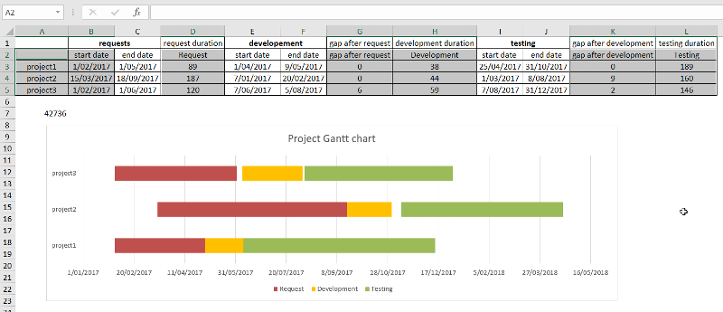
The formulas are in the attached file.
If you want to display phase overlap you need to add more columns and data series. The logic for the formulas is this: If the start date of the next phase is earlier than the end date of the current phase, then subtract the earlier date from the later date. That is the overlap amount. This amount must be subtracted from the current phase duration and put in its own cell, so it can be its own series with a special color for overlap. If you need more details for that, pipe up.
The helper columns can be hidden or the chart could be shown on a different sheet.
cheers, teylyn
Teylyn_Howto.xlsx
ASKER
That's a good start. Everything you need is in the chart. The start date series is blue. You need to format this with no fill to make it invisible, so the development bars start to "float". You need to select each "gap" series and format it with no fill as well. It looks like you formatted only a single data point instead of the whole series for "gap after request". If there is only one data point for the gap series, it may be a bit hard to select the whole series and instead you may have selected only the one data point. To select a series you can
- click the chart
- on the Format ribbon click the dropdown with the chart elements and select the series you want
- click the "Format Selection" command below the dropdown
When you have formatted all the gaps with no fill, select the gap series in the legend. Click it once to select the legend, then click it again to select only the series entry in the legend. Then hit the delete key on the keyboard to remove it from the legend.
Also, you need to format the X axis labels with a date format that works for you. I get weird looking dates when I open your file, but that may be because my locale and regional settings are different from yours.
Does that help?
- teylyn
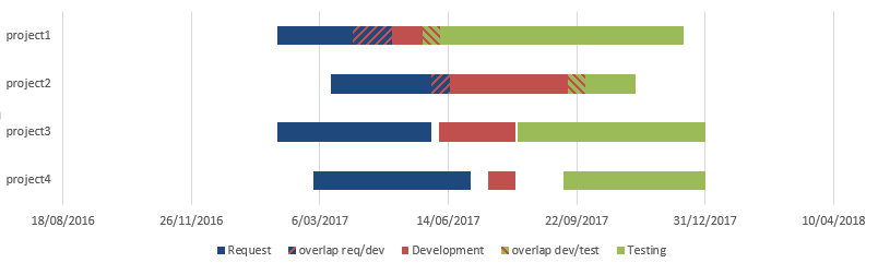
Just for fun: here is a Gantt chart with overlapping project phases:

I changed the calculation for the durations of request and development and added columns and series for the two possible overlaps.
It is important, though, that each phase must be after one another. There can be an overlap, but development cannot start before Request, and testing cannot start before development.
I also changed the plot order of the series. Format the vertical axis and select "Categories in reverse order" and "Horizontal axis crosses at maximum category". See attached.
- teylyn
2017-01-18_9-19-05.png
ASKER
Ingeborg Hawighorst <- GREAT ANSWER!
it worth the 500 points..
please provide me with the sample code for Expert Commentby:Ingeborg Hawighorst
it worth the 500 points..
please provide me with the sample code for Expert Commentby:Ingeborg Hawighorst
ASKER
Ingeborg Hawighorst should have the 500 point.
ASKER CERTIFIED SOLUTION
membership
This solution is only available to members.
To access this solution, you must be a member of Experts Exchange.
ASKER
GREAT BEST Ingeborg Hawighorst !!!
https://products.office.com/en-us/project/project-and-portfolio-management-software
Also your data format will not work do creating a pivot table.
Please see my excel example
My_Example_How_to.xlsx