Why do I run out of room at the bottom of my screen?
Take a look at the screenshot below and notice how the word "hello" is hanging off to the right hand side...
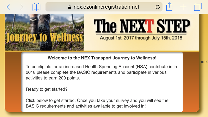
It only occurs in Landscape mode. Otherwise, it's centered beneath the rest of the content like you would expect of a footer.
It will look OK when I just have the word "hello" in place. As soon as introduce a line break, it gets kicked off to the side.
Why? And how can I fix it?
Here's my code:

It only occurs in Landscape mode. Otherwise, it's centered beneath the rest of the content like you would expect of a footer.
It will look OK when I just have the word "hello" in place. As soon as introduce a line break, it gets kicked off to the side.
Why? And how can I fix it?
Here's my code:
<html>
<head>
<title>NEX Transport Employees - EZOnlineRegistration</title>
<meta name="viewport" content="width=device-width, initial-scale=1">
<style type="text/css">
html, body {
margin: 0px;
padding:0px;
font: 14px sans-serif;
height:100%;
background:#eaad02;
background: -webkit-linear-gradient(#eaad02, #ffe39a); /* For Safari 5.1 to 6.0 */
background: -o-linear-gradient(#eaad02, #ffe39a); /* For Opera 11.1 to 12.0 */
background: -moz-linear-gradient(#eaad02, #ffe39a); /* For Firefox 3.6 to 15 */
background: linear-gradient(#eaad02, #ffe39a);
min-height: 100%; /* Fallback for vh unit */
min-height: 100vh;
}
h4 {
margin: 10px 0;
color: #1823a0;
}
.container {
height:100%;
display:flex;
justify-content: center;
align-items: center;
flex-flow:column wrap;
flex-direction:column;
}
.content {
max-width:625px;
border:1px solid #7b5b01;
-moz-border-radius: 14px 14px 14px 14px;
border-radius: 14px 14px 14px 14px;
box-shadow:7px 7px 10px #7b5b01;
display:flex;
justify-content: center;
align-items: center;
flex-flow:column wrap;
flex-direction:column;
}
.form_label {
display:inline-block;
text-align:left;
font-weight:bold;
}
.orange_row {
background:#934e00;
background: -webkit-linear-gradient(#934e00, #f26a00); /* For Safari 5.1 to 6.0 */
background: -o-linear-gradient(#934e00, #f26a00); /* For Opera 11.1 to 12.0 */
background: -moz-linear-gradient(#934e00, #f26a00); /* For Firefox 3.6 to 15 */
background: linear-gradient(#934e00, #f26a00);
border-radius: 0px 0px 14px 14px;
width: 100% !important;
}
.white_background {
margin:0 auto;
background-color:#ffffff;
box-shadow: 3px 3px 5px #7d7d7d inset;
padding:10px;
border-radius:5pt;
}
table.olympic {
border: 2px solid #ffffff;
}
table.olympic td {
font-size:9pt;
border: 2px solid #ffffff;
text-align:center;
font-weight:bold;
}
.watermark {
position:absolute;
margin-left:80%;
margin-top:-50px;
}
</style>
<link href="style/bootstrap.css" rel="stylesheet">
<link href="style/elegant.css" rel="stylesheet">
<!-- jQuery (necessary for Bootstrap's JavaScript plugins) -->
<script src="https://ajax.googleapis.com/ajax/libs/jquery/1.12.4/jquery.min.js"></script>
<script src='ezjs/jquery.maskedinput.min.js'></script>
<!-- Latest compiled and minified JavaScript -->
<script src="https://maxcdn.bootstrapcdn.com/bootstrap/3.3.7/js/bootstrap.min.js" integrity="sha384-Tc5IQib027qvyjSMfHjOMaLkfuWVxZxUPnCJA7l2mCWNIpG9mGCD8wGNIcPD7Txa" crossorigin="anonymous"></script>
</head>
<body>
<div class="container">
<div class="content">
<div class="row">
<div class="col-xs-12">
<img src="https://nex.ezonlineregistration.net/img/jtw.jpg" class="img-responsive" style="border-radius:14px 14px 0px 0px;">
</div>
</div>
<div class="row orange_row">
<div class="col-xs-10 col-xs-offset-1 white_background">
<p style="text-align: center; font-weight:bold;">Welcome to the NEX Transport Journey to Wellness!</p>
To be eligible for an increased Health Spending Account (HSA) contribute in in 2018 please complete the BASIC requirements and participate in various activities to earn 200 points.
<br><br>Ready to get started?
<br><br>Click below to get started. Once you take your survey and you will see the BASIC requirements and activities available to get involved in!
</div>
</div>
</div>
<div class="row">
<div class="col-xs-12"> <br>hello</div>
</div>
</div>
</body>
</html>ASKER CERTIFIED SOLUTION
membership
This solution is only available to members.
To access this solution, you must be a member of Experts Exchange.
Alternately, if you really want the width to max out at 625px, you could restore the Bootstrap standard format by adding the "content" class to the top "container".
<div class="container content">
    <div class="row">
        <div class="col-xs-12">
            <img src="https://nex.ezonlineregistration.net/img/jtw.jpg" class="img-responsive" style="border-radius:14px 14px 0px 0px;">
        </div>
    </div>

    <div class="row orange_row">
        <div class="col-xs-10 col-xs-offset-1 white_background">
            <p style="text-align: center; font-weight:bold;">Welcome to the NEX Transport Journey to Wellness!</p>
                To be eligible for an increased Health Spending Account (HSA) contribute in in 2018 please complete the BASIC requirements and participate in various activities to earn 200 points.
            <br><br>Ready to get started?
            <br><br>Click below to get started. Once you take your survey and you will see the BASIC requirements and activities available to get involved in!
        </div>
    </div>
    <div class="row">
        <h4>how about this?</h4>
    </div>
</div>
<div class="container">
    <div class="row">
        <h4>how about this?</h4>
    </div>
</div> .container {
height:auto;
display:flex;
justify-content: center;
align-items: center;
flex-flow:column wrap;
flex-direction:column;
}
.content {
max-width:625px;
border:1px solid #7b5b01;
-moz-border-radius: 14px 14px 14px 14px;
border-radius: 14px 14px 14px 14px;
box-shadow:7px 7px 10px #7b5b01;
}SOLUTION
membership
This solution is only available to members.
To access this solution, you must be a member of Experts Exchange.
ASKER
Gentlemen!
Thanks so much for your time. After reading through your commentary, I'm stoked about getting back to my desk to implement your suggestions.
I think my problem is that I wanted to build the desktop version in a way where the content was centered on the screen. The page itself is a landing page and I liked the idea of positioning, what is a very small amount of content, in the center of the browser. I used the "flex" dynamic after seeing it do what I wanted it to do. I could minimize the size of the desktop screen and see everything "behave" exactly like I expected it to.
It proved to be problematic, however, when I went to view the site on my phone. In landscape mode, it was fine. But when I flipped the phone to portrait, anything that was processed as beyond the parameters of the viewport's height was kicked off to the side. In addition, as you've already read, the background image's gradient went as far as the viewport's height, but then reverted back to the starting color once you scrolled past the boundaries of the viewport.
What I'm hearing you say is that I need to stop trying to combine Bootstrap with the flex dynamic. That makes sense, actually. I haven't done much research as far as flex. Perhaps it's something that you don't attempt to throw in the Bootstrap mix?
Is there another way to center the content vertically in Bootstrap?
I'll work on this some more once I get to my office. Thanks again for weighing in!
SOLUTION
membership
This solution is only available to members.
To access this solution, you must be a member of Experts Exchange.
Take a look at the examples page http://getbootstrap.com/getting-started/#examples for how they structure html.
If you use the container class built in bootstrap it should just work. Below is in the css.
If you use the container class built in bootstrap it should just work. Below is in the css.
.container {
    padding-right: 15px;
    padding-left: 15px;
    margin-right: auto;
    margin-left: auto;
}ASKER
I reconfigured my site so I wasn't attempting to combine Flex with Bootstrap and that made all the difference.
Thanks!
Thanks!
ASKER
Here's the latest step of progress:
It's the same thing in that I'm trying to get the text centered within the light orange "container" section. It looks fine in portrait, but when you go to landscape, it goes into a new dynamic where it's almost as if you're starting at the top of the body with the darker color and...
I've got no idea why.
Here's my newest code:
Open in new window
Same question: How can I get the "how about this?" centered directly underneath my content with seemingly starting all over again with the original darker color of the body section?