MS Excel chart
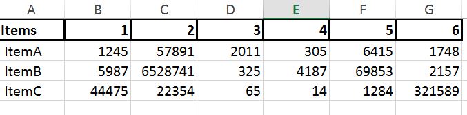
have an Excel Spreadsheet, to which I used a Pivot Table to come up with the Data I have attached in the screenshot below.
As you can see I have one column for Items and have other columns representing the Month , I displayed just 6 months for the sake of brievity (from January to June or 1 to 6 as displayed on the column headers)
on each month, an item has a different cost.
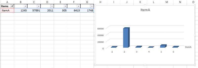
I would like to filter on Items. for instance when I filter just on ItemA , it will display the row for ItemA and on the right it will display a graph with the Fluctuation of the Cost from January to June.
How can this be accomplished without inserting the graph manually for each Row that I filter on ?
Thank you
As you can see I have one column for Items and have other columns representing the Month , I displayed just 6 months for the sake of brievity (from January to June or 1 to 6 as displayed on the column headers)
on each month, an item has a different cost.
I would like to filter on Items. for instance when I filter just on ItemA , it will display the row for ItemA and on the right it will display a graph with the Fluctuation of the Cost from January to June.
How can this be accomplished without inserting the graph manually for each Row that I filter on ?
Thank you

Ryan Chong
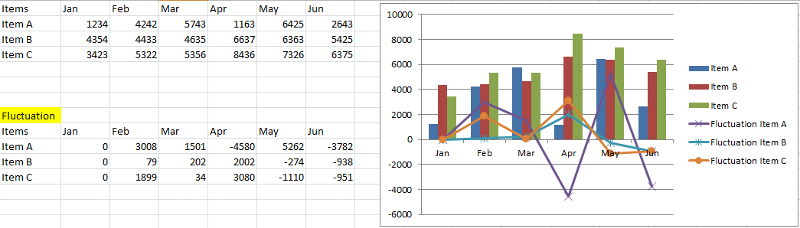
you probably need to calculate the Fluctuation of the Cost first before you can show it in the graph
ASKER
you probably need to calculate the Fluctuation of the Cost first before you can show it in the graphhow can this be done ?
Thank you
check out this article on how to add the second chart into an existing chart.
How to create combination charts and add secondary axis for it in Excel?
https://www.extendoffice.com/documents/excel/1267-excel-create-combination-chart.html
to come out something like this:
 29075577.xlsx
How to create combination charts and add secondary axis for it in Excel?
https://www.extendoffice.com/documents/excel/1267-excel-create-combination-chart.html
to come out something like this:
 29075577.xlsx
ASKER CERTIFIED SOLUTION
membership
This solution is only available to members.
To access this solution, you must be a member of Experts Exchange.
ASKER
Will take a look at it later.
Thank you
Thank you